12 Best Benjamin Moore White Dove Complementary Colors Guide

Staring at your freshly painted White Dove walls, wondering what colors will make them pop? You’re not alone in this decorating dilemma.
Many homeowners struggle with color pairing because they don’t understand White Dove’s warm undertones. The wrong shade can make white walls look dull or mismatched.
I’ve tested dozens of White Dove pairings and found the shades that create balanced, polished spaces. These combinations can make any room feel more complete and inviting.
In this guide, I’ll share standout complementary colors that work beautifully with White Dove, along with practical tips for selecting the perfect match for your specific space and style.
What is Benjamin Moore White Dove?
Benjamin Moore White Dove (OC-17) stands as one of the most beloved warm white paint colors in interior design. This soft, creamy white brings comfort and refinement to any space without feeling stark or cold.
Unlike pure whites that can feel harsh, White Dove offers the perfect balance between clean and cozy. It has subtle warm undertones that prevent it from looking sterile under different lighting conditions.
Characteristics of Benjamin Moore White Dove
| Feature | Details |
|---|---|
| Paint Code | OC-17 |
| Color Name | White Dove |
| Color Type | Warm White |
| Undertones | Cream and beige |
| LRV | 85.38 |
| Hex Code | #EFEEE5 or #F0EDE4 |
| RGB Values | RGB(239, 238, 229) or RGB(240, 237, 228) |
What Makes White Dove So Popular?
White Dove’s popularity comes from its unique ability to adapt to different spaces and lighting conditions while maintaining its warm, welcoming character.
- Perfect Warm Undertones: White Dove has soft cream and beige undertones that keep it warm, soft, and inviting.
- Excellent Light Reflection: It reflects natural light beautifully without creating harsh glare or heavy dark shadows.
- Versatile Design Compatibility: White Dove works with styles from modern to farmhouse and pairs easily with most décor styles.
- Consistent Color Performance: The color stays balanced and clean under both warm and cool lighting conditions.
- Timeless Appeal That Lasts: White Dove remains a classic paint choice that stays stylish and relevant for years.
White Dove remains one of the most reliable white paint colors for creating warm, balanced spaces. With the right color pairings, it can make any room feel brighter, softer, and more polished.
Benjamin Moore White Dove Complementary Colors
White Dove pairs beautifully with the right colors to create warm, balanced spaces. These shades add contrast, depth, and a clean, polished look to any room.
Read the list below to find the best colors that pair beautifully with White Dove.
1. Revere Pewter (HC‑172)

A warm beige that creates perfect balance with White Dove. This versatile color works beautifully for trim, accent walls, or furniture, adding warm contrast while keeping White Dove’s soft, inviting look.
It also adds depth to bright spaces without making the room feel too dark or heavy. The combination feels clean, comfortable, and easy to style in everyday living spaces.
2. Hale Navy (HC‑154)

A rich, classic navy blue that brings bold drama to White Dove palettes. This timeless shade creates bold contrast for cabinets, doors, or accent walls while highlighting White Dove’s warm undertones.
The deep navy adds a clean, polished look without feeling overly bold or overwhelming. It works especially well in dining rooms, kitchens, and modern farmhouse interiors.
3. Kendall Charcoal (HC‑166)

Deep, cultivated charcoal that adds modern grace when paired with White Dove. Perfect for accent walls, built-ins, or exterior trim, this shade creates bold contrast while keeping the palette clean and modern.
The dark charcoal brings depth and structure without making the space feel too heavy or closed in. It pairs especially well with modern, industrial, and minimalist interiors.
4. Palladian Blue (HC‑144)

A soft, gray-blue that brings calm coastal style to White Dove spaces. This soothing shade works beautifully in bathrooms and bedrooms while complementing White Dove’s warm, welcoming look.
The muted blue-gray adds a light, airy feel without making the space feel cold or washed out. It pairs especially well with natural textures, light wood tones, and soft neutral décor.
5. Saybrook Sage (HC‑114)

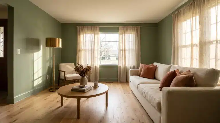
Earthy green with natural, calming qualities that pair beautifully with White Dove. This soft sage shade brings a fresh, organic feel to bedrooms, living spaces, or kitchens while complementing White Dove’s warm character.
The muted green adds subtle color without overpowering the space or making it feel too dark. It pairs especially well with wood accents, woven textures, and warm neutral décor.
6. Edgecomb Gray (HC‑173)

A gentle beige that enhances White Dove’s warm neutrality. This balanced shade works beautifully on walls, trim, or furniture, creating cozy, polished spaces with a timeless feel.
The soft beige adds warmth and depth without making rooms feel overly dark or heavy. It pairs easily with both modern and traditional home styles.
7. Newburyport Blue (HC‑155)

A bold, refined blue that creates stunning focal points with White Dove. Perfect for front doors, kitchen cabinets, or statement walls, this rich shade adds personality while letting White Dove’s softness balance the overall design.
The deep blue creates a clean, elegant contrast without feeling too overpowering in the space. It works especially well in coastal, modern, and classic home styles.
8. Balboa Mist (OC‑27)

Soft, light gray-beige that complements White Dove with subtle warmth. This gentle shade creates a smooth flow between rooms while adding slightly more depth than White Dove itself.
The soft greige keeps spaces feeling warm, bright, and comfortable without looking too cool or flat. It pairs especially well with layered neutrals, wood finishes, and modern farmhouse décor.
9. Wythe Blue (HC‑143)

Muted blue-green that brings coastal vintage charm to White Dove palettes. This soft, weathered shade works beautifully for furniture, cabinets, or accent walls while creating a relaxed, airy feel.
The muted tones add subtle color and character without overpowering White Dove’s soft warmth. It pairs especially well with natural wood, woven textures, and coastal-inspired décor.
10. Wrought Iron (2124‑10)

Near-black charcoal that creates intense, modern contrast with White Dove. This bold shade works perfectly for trim, doors, or built-ins while adding dramatic sophistication to the space.
The deep charcoal gives rooms a sleek, high-contrast look without making White Dove feel too stark or cold. It pairs especially well with modern, industrial, and contemporary interiors.
11. Manchester Tan (HC‑81)

Warm, inviting beige that enhances White Dove’s soft, cozy character. This comfortable shade creates seamless, monochromatic palettes perfect for living rooms, bedrooms, or dining spaces focused on warmth and comfort.
The warm beige adds gentle depth without creating harsh contrast or making the space feel too dark. It pairs especially well with soft textures, layered neutrals, and traditional home décor.
12. Shaker Beige (HC‑45)

Timeless beige-gray that creates classic, refined combinations with White Dove. This refined neutral works beautifully for trim, furniture, or accent walls while adding soft contrast to the overall palette.
The balanced beige-gray tones keep spaces feeling warm, polished, and easy to style in different home settings. It pairs especially well with traditional, transitional, and modern farmhouse interiors.
Design Pairing Examples with White Dove color
These real-world pairings show how White Dove works beautifully across different rooms and styles. Each combination adds warmth, balance, and a welcoming feel to the space.
| ROOM TYPE | WHITE DOVE APPLICATION | COMPLEMENTARY COLOR | COLOR APPLICATION | DESIGN EFFECT |
|---|---|---|---|---|
| Living Room | Main walls | Revere Pewter (HC-172) | Accent wall, furniture | Cozy, sophisticated atmosphere |
| Kitchen | Cabinets | Hale Navy (HC-154) | Island or lower cabinets | Classic, timeless contrast |
| Bedroom | Walls | Palladian Blue (HC-144) | Bedding, curtains | Serene, restful retreat |
| Bathroom | Walls | Kendall Charcoal (HC-166) | Vanity, trim | Modern, spa-like feel |
| Dining Room | Walls | Saybrook Sage (HC-114) | Built-ins, wainscoting | Natural, calming grace |
| Home Office | Walls | Edgecomb Gray (HC-173) | Desk, shelving | Warm, productive workspace |
| Entryway | Walls | Newburyport Blue (HC-155) | Front door, console | Welcoming, bold first impression |
| Master Suite | Walls | Balboa Mist (OC-27) | Trim, furniture | Soft, monochromatic comfort |
These proven pairings showcase White Dove’s versatility as both a main and an accent color. Use them as inspiration for creating warm, balanced color schemes throughout your home.
Tips for Choosing the Best White Dove Color Pairings
Choosing the right complement to White Dove can redo your space from ordinary to extraordinary. These essential tips will guide you toward confident color decisions.
- Assess Your Natural Light Sources: North-facing rooms suit warm tones, while south-facing spaces suit cooler shades.
- Match Colors to Your Design Aesthetic: Traditional homes suit Shaker Beige, while modern spaces pair well with Kendall Charcoal.
- Consider Room Function and Mood: Bedrooms require calming Saybrook Sage, kitchens work with statement Hale Navy.
- Test Before You Commit: Paint large samples and observe how they interact with White Dove under different lighting.
- Apply the 60-30-10 Design Rule: Use White Dove for 60%, a complementary color for 30%, and accents for 10%.n’t
These guidelines ensure harmonious color schemes that make White Dove shine beautifully. They also help create spaces that feel balanced, warm, and easy to style.
Conclusion
Benjamin Moore White Dove complementary colors can completely change the feel of your home when paired thoughtfully with your lighting, décor, and room style.
From soft neutrals to bold navy and charcoal shades, the right combination helps White Dove feel warmer, brighter, and more balanced in every space.
Small color changes can make rooms look more polished, comfortable, and timeless without overwhelming the design.
Test a few shades in your space, compare them under natural and artificial light, and choose combinations that match your home’s style and mood.
Start using these Benjamin Moore White Dove complementary colors today to create a space that feels more refined, welcoming, and professionally designed.
Frequently Asked Questions
Does White Dove Look Yellow in Some Lighting?
Yes, White Dove can look creamier in warm lighting and softer white in bright natural light. Testing samples in your room helps you see the true color throughout the day.
Is White Dove Good for Exterior Paint?
Yes, White Dove works well on exteriors because it feels warm without looking too bright. It pairs nicely with black shutters, wood accents, and charcoal roof colors.
Do Benjamin Moore White Dove Complementary Colors Work with Black Accents?
Yes, black fixtures and décor pieces create a clean contrast alongside White Dove complementary colors.
This mix helps rooms feel modern while still keeping the overall palette warm.