Manchester Tan Benjamin Moore HC-81: Color Review

Picking a neutral paint color is harder than it looks.
You find a beige swatch that feels warm and calm. Then it goes on your wall and looks yellow. Or flat. Or just wrong.
Here is what changes that: a paint color with the right undertone balance. Manchester Tan Benjamin Moore (HC-81) holds its warmth without going golden. It reads as a soft beige in most rooms. It works across styles, finishes, and lighting conditions.
This review covers everything you need. You will learn the undertones, LRV, best rooms, trim pairings, comparisons, and how to test them correctly before committing.
What Color Is Manchester Tan Benjamin Moore?
Benjamin Moore Manchester Tan HC-81 is a warm beige paint color. It belongs to Benjamin Moore’s Historical Collection.
This group includes classic shades inspired by traditional architecture. The color takes its name from Manchester Town Hall in England.
At first glance, it reads as a soft tan or beige. On closer inspection, it shows a yellow-beige base with a subtle green influence. That combination keeps it from looking too yellow or too gray.
People often describe it as earthy, muted, and creamy. It is not overly bright, but it reflects a good amount of light.
Color Details at a Glance:
| Property | Details |
|---|---|
| Brand | Benjamin Moore |
| Color Name | Manchester Tan |
| Color Code | HC-81 |
| Collection | Historical Collection |
| Color Family | Yellow-beige neutral |
| LRV | 63.24 |
| RGB Values | 222 / 216 / 198 |
| HEX Code | #DED8C6 |
| Overall Feel | Warm, earthy, muted |
Manchester Tan Undertones Explained
Undertones sit beneath the main color you see on the wall. They shift based on lighting, surrounding colors, and the finishes nearby.
Manchester Tan HC-81 has two undertones:
- Yellow-beige is the primary undertone. It gives the color its warmth. Rooms feel inviting without going orange or golden.
- A subtle green note appears in certain lighting conditions. This happens because the paint formula contains very little red. In cool north-facing light, the green can become more visible. In bright south-facing rooms, the yellow takes over.
That green note actually works in your favor. Green undertones can sit alongside both warm yellow tones and cooler colors. That makes Manchester Tan one of the more flexible beige shades.
The yellow undertone is easy to see when you place Manchester Tan next to a pink-based beige like Muslin. The green note is easier to spot when you compare it to a warmer tan like Bleeker Beige.
Manchester Tan LRV and What It Means for Your Rooms
Manchester Tan has an LRV of 63.24.
LRV (Light Reflectance Value) measures how much light a color bounces back. The scale runs from 0 (pure black) to 100 (pure white).
At 63.24, Manchester Tan sits in the light-to-medium range. That means:
- It keeps rooms from feeling dark
- It adds warmth without making walls feel heavy
- It works in average-sized rooms with normal ceiling heights
- It has more depth than very light neutrals like Pale Oak or Muslin
In very bright rooms flooded with direct sunlight, the color can look washed out. In darker rooms with limited natural light, it may read as slightly drab. The color performs best in rooms with good but not excessive natural light.
Is Manchester Tan a Warm or Cool Color?
Manchester Tan is a warm paint color.
Its yellow-beige base keeps it firmly on the warm side. It reads warmer than most gray-based neutrals but softer than strong cream or golden tan shades.
| Comparison | Where Manchester Tan Lands |
|---|---|
| vs Cool gray | Much warmer |
| vs Greige | Less gray, more beige |
| vs Traditional tan | Softer, less orange |
| vs Cream | Less yellow |
How Manchester Tan Looks in Different Lighting
Room direction changes how this color reads on your walls. Testing in your specific room matters more than any swatch or screen.
- North-Facing Rooms: North-facing rooms receive cool, blue-toned natural light. Manchester Tan adds warmth here. It reads as softer and more muted, which works well to balance the coolness.
- South-Facing Rooms: South-facing rooms receive strong, warm sunlight for much of the day. The yellow undertones become more visible. Pair with cooler accents like blue cushions, gray furniture, or charcoal accessories to keep balance.
- East-Facing Rooms: East-facing rooms receive bright morning light and softer afternoon light. Manchester Tan looks fresh and warm in the morning. Later in the day, it shifts to a quieter neutral. Bedrooms and home offices work well here.
- West-Facing Rooms: West-facing rooms receive stronger afternoon and evening sunlight. The color deepens and looks richer later in the day. Cooler accessories or darker accent pieces prevent the space from feeling overly warm.
Best Rooms for Manchester Tan Benjamin Moore
This color works throughout the home. It creates a consistent flow from room to room while keeping each space feeling like its own.
1. Living Room
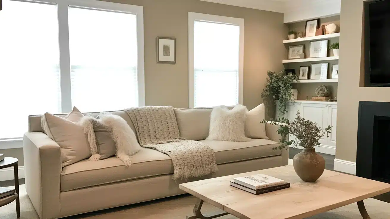
Manchester Tan creates a warm, welcoming backdrop in living rooms. It holds its character throughout the day, feeling open in sunlight and cozier in the evening.
White trim creates clean lines while wood accents blend naturally with the paint.
It works well with natural wood furniture, linen fabrics, leather seating, stone fireplaces, and black accents. For modern spaces, pair it with simple furniture and darker contrast pieces.
Pro Tip: Use different textures in pillows and throws to add visual interest without overwhelming the wall color.
2. Bedrooms
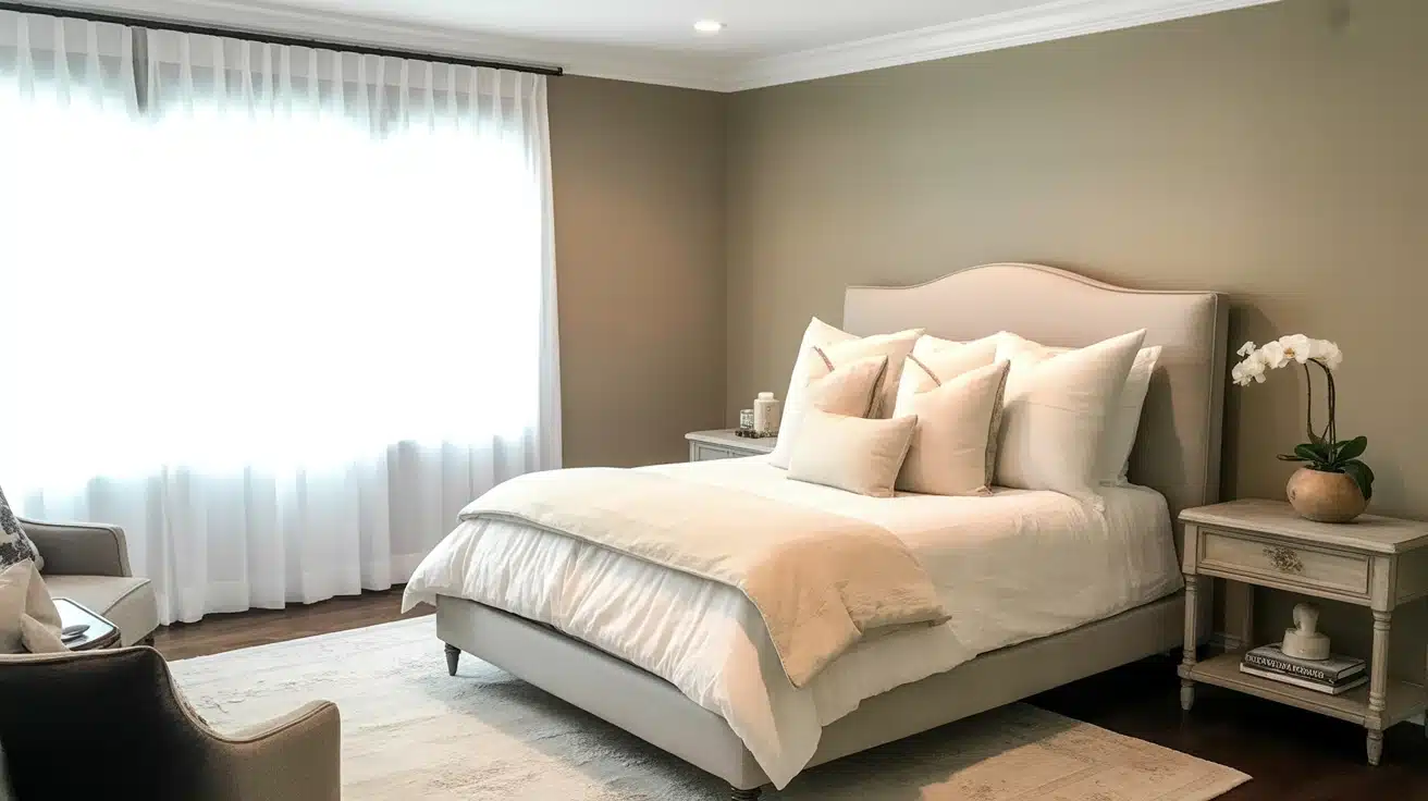
In bedrooms, this color creates a gentle, warm environment that helps quiet busy minds. Morning light brings subtle warmth, making wake-up time more pleasant.
Pair it with soft whites in bedding for a clean look that never feels stark.
It also pairs well with soft gray fabrics, sage green accents, and dusty blue decor. The warmth makes rooms feel cozy without the need for dark wall shades.
Pro Tip: Add accent colors through artwork and accessories to shift the room’s mood without repainting.
3. Kitchen and Dining Rooms
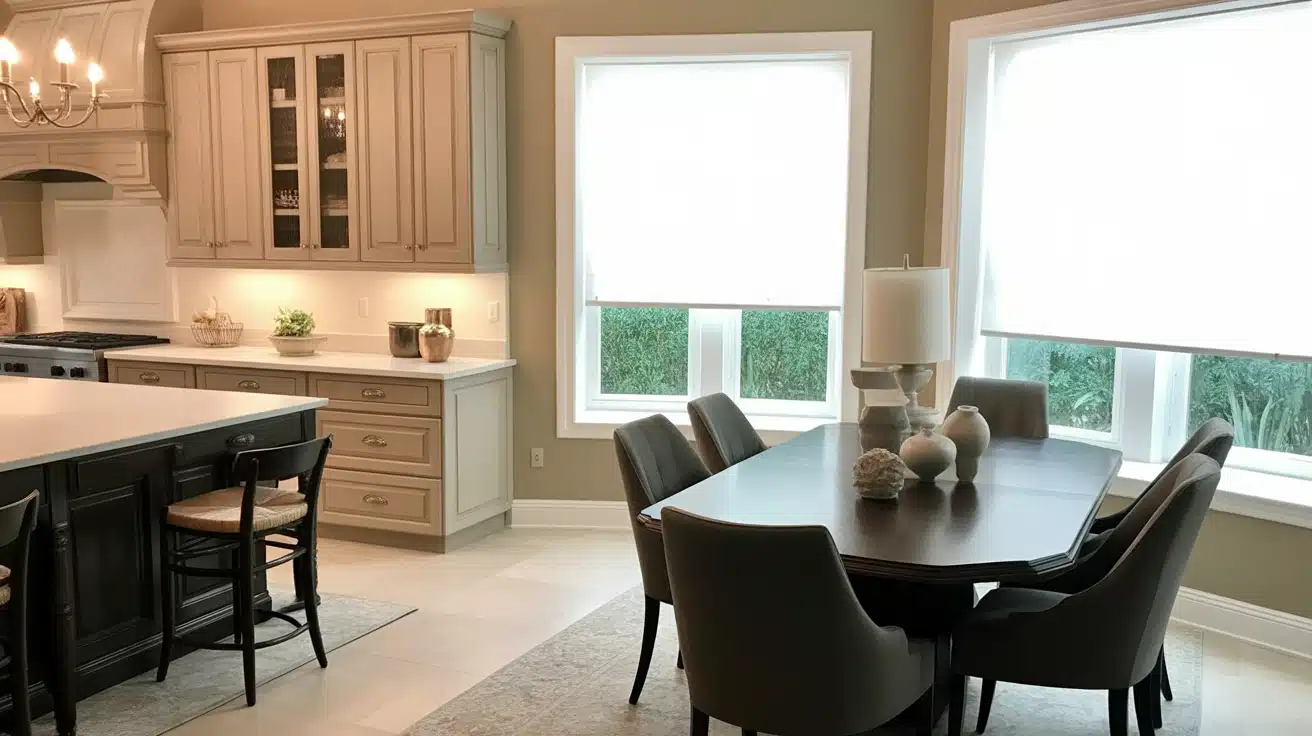
Manchester Tan works well in kitchens by creating a warm background that does not compete with food or decor. It pairs well with both painted and natural wood cabinets.
White countertops look fresh while darker surfaces feel grounded.
It also works with oak cabinets, marble countertops, granite surfaces, and brass hardware. Be careful pairing it with very yellow wood cabinets or warm beige flooring. Those combinations can push the overall warmth too far.
Pro Tip: Install under-cabinet lighting to bring out the subtle depth and warmth in the color.
In dining rooms, Manchester Tan creates a warm atmosphere that pairs naturally with dark wood tables, traditional furniture, and warm lighting. The neutral background lets artwork and decorative pieces stand out.
4. Entrance and Hallway Areas
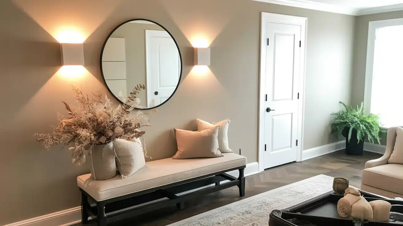
Manchester Tan creates a consistent visual flow in transitional spaces. The color makes narrow hallways feel more open while providing a warm welcome in entryways.
It works well with both natural and artificial light, maintaining character in windowless spaces.
Pro Tip: Use this color to connect different rooms in your home for a pulled-together, cohesive look.
Coordinate Manchester Tan with Other Paint
These proven color combinations help you create cohesive exterior designs that enhance your home’s architectural features and style.

1. Bleeker Beige HC-80
- Slightly deeper with gray undertones
- Adds soft contrast when used on trim or nearby walls
- Works well in shared spaces for subtle color shifts
- Blends smoothly with wood, stone, or metal finishes
2. Georgian Brick HC- 50
- Classic red with earthy tones that pair nicely with tan
- Ideal for front doors, shutters, or accent walls
- Adds warmth without overpowering nearby neutrals
- Complements homes with traditional or rustic details
3. White Ice OC-58
- Light, cool white that brightens any space
- Sharpens trim lines and highlights window frames
- Balances Manchester Tan’s warmth for a cleaner look
- Pairs well with stainless steel, tile, and marble
4. Constellation AF-540
- Soft blue with a gentle green tint
- Adds a calming contrast in bedrooms or offices
- Pairs nicely with light wood or natural textures
- Offers a cool balance to Manchester Tan’s warm tone
Manchester Tan on Kitchen Cabinets
Manchester Tan works well on kitchen cabinets. It gives cabinets a warm, refined look without the strong yellow tone that puts people off traditional beige finishes.
It looks rich against white countertops and ceramic tile backsplashes. Hardwood floors with walnut or hickory tones bring out the warmth in the paint.
If you want a lighter, crisper version for cabinets, ask your paint store to reduce the tint by 50 percent. The hue stays the same, but the result feels brighter. Always sample a custom mix before committing to full cans.
Use an eggshell or satin finish on cabinets. These wipe clean and hold up to daily use better than flat or matte finishes.
Manchester Tan on Exteriors
Manchester Tan works as an exterior paint color. In direct sunlight, it lightens and reads more like a cream than a tan. That effect can look very clean on stucco and siding.
It suits homes with warm stone, brick accents, or traditional architecture. On red brick, be careful: the underlying red in the brick can pull out the green and khaki notes in the paint. Test on a small, hidden area before painting the full surface.
Also note: if your home has large windows with dense green trees outside, reflected light from the foliage can bring out the green undertone on interior walls near those windows. Test on the affected walls before committing.
Pair the exterior with warm white trim and a bold front door color, such as Georgian Brick HC-50 or Hale Navy HC-154, for the best results.
How to Test Manchester Tan Before You Paint
Here are some effective tips for sampling Manchester Tan (HC-81) by Benjamin Moore to ensure you choose the right color for your space:
- Always get a real paint sample. Purchase an actual sample pot. Paint chips and screen colors do not show how the paint behaves on your actual walls.
- Test in multiple locations. Paint swatches at least 12 inches by 12 inches on several walls, including areas near windows and corners. See how Manchester Tan responds to both natural and artificial light.
- Check at different times of day. Look at the swatches in morning, midday, and evening light. The yellow-beige undertones shift across different light conditions. Some rooms will show more green. Some will show more warmth. Both observations matter.
- Use two coats for accuracy. Paint at least two coats so the color shows true and is not affected by the underlying wall color.
- Compare with your trim. Paint the swatch near the actual trim in your room. This reveals subtle undertone clashes before you commit.
- Leave it up for a few days. Live with the swatches for several days. Observe how the color feels as the light changes with weather and time of day.
- Try peel-and-stick samples (optional). These move easily from wall to wall. They offer a mess-free way to test the color in different spots around your room.
By following these sampling tips, you’ll get a much clearer sense of how Manchester Tan will look and feel in your actual space before making a final commitment.
Conclusion
Benjamin Moore Manchester Tan HC-81 earns its reputation as a reliable warm neutral.
Its yellow-beige base with a subtle green note holds well across most lighting conditions. The LRV of 63.24 keeps rooms feeling open without washing out. It works in living rooms, bedrooms, kitchens, hallways, and exteriors without losing its character.
The right pairing makes all the difference. Use warm-white trim, such as White Dove or Cloud White. Test on all four walls. Live with the sample for at least a week before buying full cans.
Get a sample pot from your local Benjamin Moore store and test it next to your trim. That one step will save you from a costly repaint.