Kendall Charcoal HC-166 Benjamin Moore: Paint Color Review

Dark gray paint is one of the hardest color decisions to get right. Too cold, and it reads like a concrete wall. Too muddy, and it kills every other color in the room.
Kendall Charcoal HC-166 sits in neither of those camps. This deep charcoal gray brings depth and character to a space while avoiding the harsh look that many darker colors can create.
With a Light Reflectance Value (LRV) of 14.61, Kendall Charcoal creates a bold presence on walls, cabinets, doors, and exteriors. Its green undertones keep it from reading as cold or stark, though it leans cool rather than warm, which surprises many people.
This review covers undertones, lighting behavior, room applications, coordinating colors, head-to-head comparisons, and common mistakes, everything you need before committing to this color.
What Color Is Kendall Charcoal Benjamin Moore?
Benjamin Moore Kendall Charcoal HC-166 is a deep charcoal gray from the Historical Collection. It is inspired by America’s historic architecture and has been a designer staple for years.
Unlike pure black, it has enough depth and complexity to feel layered rather than flat. Depending on the light in your room, it can appear as:
- A deep, true charcoal in natural light
- A slate blue-gray in cool north-facing rooms
- A softer neutral gray next to lighter furnishings
- A richer, moodier shade in rooms with limited natural light
| Property | Detail |
|---|---|
| Color Name | Kendall Charcoal |
| Color Code | HC-166 |
| Collection | Historical Collection |
| RGB | 103, 102, 98 |
| Hex Code | #676662 |
| LRV | 14.61 |
| Undertones | Green (primary), with occasional brown influence, leans cool |
| Best Surfaces | Cabinets, accent walls, bedrooms, offices, exteriors |
What Are the Undertones in Kendall Charcoal?
Kendall Charcoal’s primary undertone is green. That green influence is what gives it a slate-like, earthy quality, but it also makes this a cool-leaning gray, not a warm one.
A small number of sources also note a very faint brown influence under certain conditions, but green remains the dominant color. The green undertone will never make your room look green. What it does is stop the color from feeling icy or blue-toned.
Because it leans cool, it pairs especially well with:
- Warm whites on trim and ceilings (White Dove OC-17, Simply White OC-117)
- Natural wood tones that add warmth back into the space
- Brass or bronze hardware that contrasts with the cool base
- Cream and linen textiles to soften the overall feel
How Does Kendall Charcoal Look in Different Lighting?
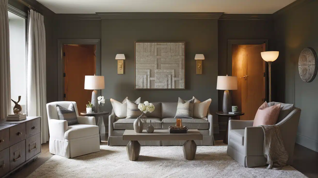
Dark colors shift more noticeably across lighting conditions than mid-tone shades. Testing in your actual room is the only reliable way to judge this color before committing.
1. North-Facing Rooms
North-facing rooms receive cool, indirect light throughout the day. In these spaces, Kendall Charcoal may read as deeper and bluer-gray than in other rooms. Pair it with warm lighting, creamy whites, and natural wood furniture to offset the cool effect.
2. South-Facing Rooms
South-facing rooms get warm, strong sunlight for most of the day. Here, the color reads slightly lighter and more neutral. This is one of the best exposures for a dark charcoal.
3. East-Facing Rooms
East-facing rooms get bright morning light that fades to a cooler, shadowy tone by afternoon. In the morning, Kendall Charcoal can look fresh and slightly warmer. By afternoon, it settles back into its cool slate character.
4. West-Facing Rooms
West-facing rooms are cool and dim in the morning, then flooded with warm, red-tinged light by evening. Kendall Charcoal can look quite cool and somber early in the day, then pick up a warmer, richer quality as evening light hits the walls.
5. Under Artificial Lighting
Warm bulbs can bring out a slight brown undertone in the surface and create a cozier feel. Cool LED bulbs push the green undertone further, making the color feel cleaner and more modern. Always check samples under the bulbs you actually use.
Where Can You Use Kendall Charcoal: Room-by-Room
This color works on a wide range of surfaces and in multiple design styles, from modern farmhouse to traditional and contemporary spaces.
1. Living Room
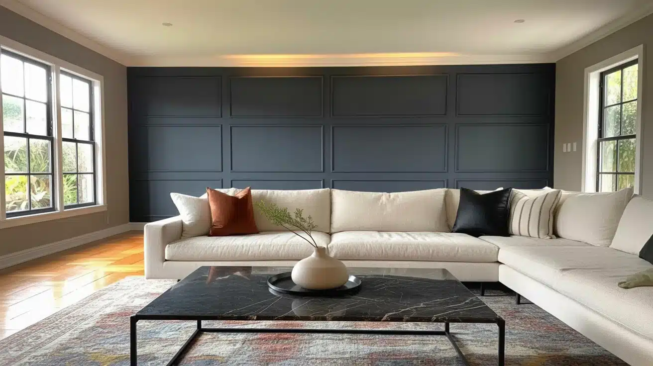
Kendall Charcoal creates strong definition in open living spaces. Use it on fireplace walls, built-in shelving, media walls, or a single accent wall. It frames the room without boxing it in.
Pro Tip: Pair with white trim like Chantilly Lace OC-65 for maximum contrast. Add cream sofas and light oak furniture to keep the space from feeling h
2. Bedrooms
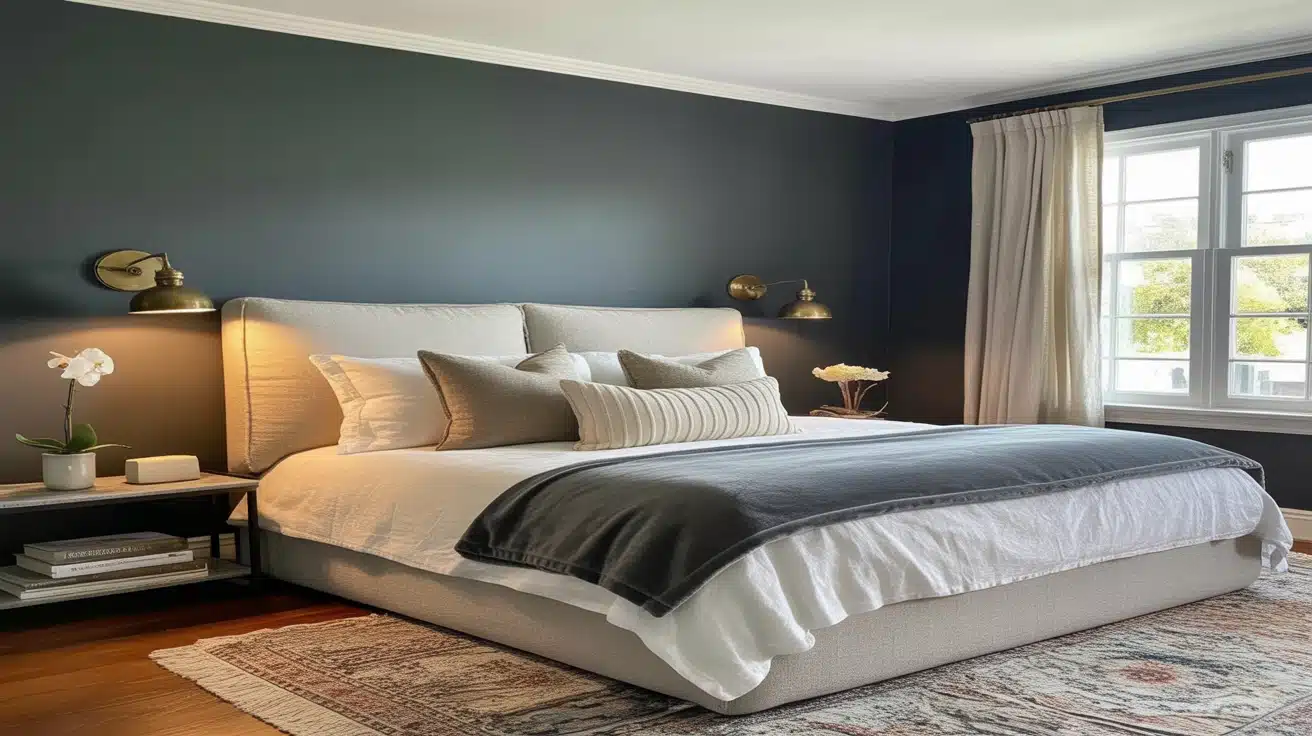
A dark, rich gray behind the bed creates a cocooning feel that works well for sleep. Use it on the headboard wall as a statement, or on all four walls in a larger room with good natural light.
Pro Tip: Use white bedding, linen textures, and warm lamps to prevent the room from feeling closed in.
3. Kitchen Cabinets
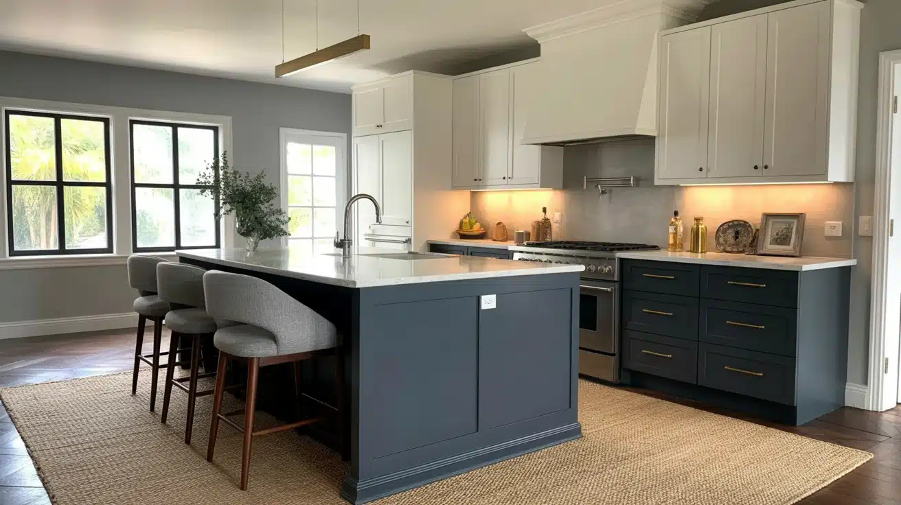
Kendall Charcoal is one of the most popular choices for kitchen cabinetry. It works on islands, lower cabinets, or full cabinet layouts. A satin finish withstands daily use while keeping the color looking sharp.
Pro Tip: Pair with white countertops and subway tile backsplash for classic contrast. Brass hardware adds warmth that balances the cool gray base.
4. Bathrooms and Spa-Like Retreats
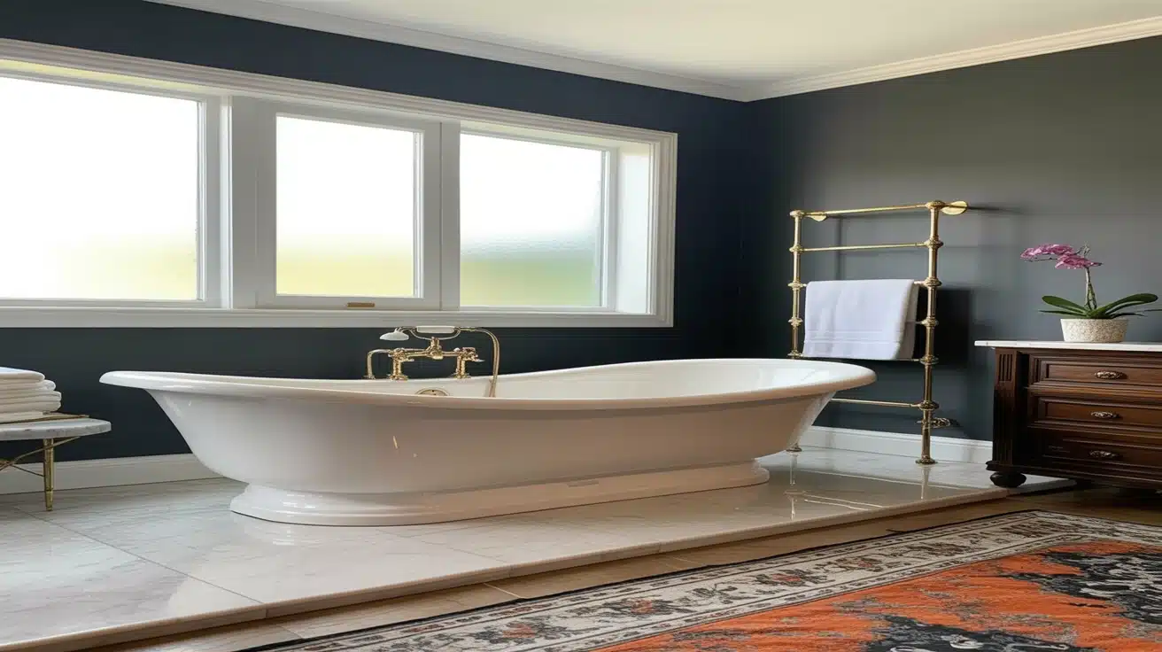
On a vanity or an accent wall, Kendall Charcoal creates a finished, spa-like quality next to white tile, marble surfaces, and brushed brass fixtures. Good lighting matters here; windowless bathrooms need layered artificial light to prevent the color from becoming overpowering.
5. Exterior Surfaces

It works on siding, shutters, garage doors, front doors, and exterior trim. Exterior light often makes dark colors read lighter than interior swatches suggest, so always test a large sample outside before committing to the full surface.
For guidance on exterior color combinations and which siding shades work with dark charcoals, see paint colors that complement red brick; several of those dark neutral pairings translate directly to charcoal siding applications.
How Does Kendall Charcoal Compare to Similar Colors?

1. Deep Creek 1477
This is a slightly warmer gray with brown undertones that bring softness to interior walls and exteriors. It works well in cozy living spaces or areas with lots of natural wood, offering a grounded and calming look without appearing too dark.
2. Kitty Gray 1589
Kitty Gray sits in a soft, slate-like zone with a gentle blue tint that feels polished without being too sharp. It’s ideal for bedrooms, bathrooms, or laundry rooms where a touch of coolness helps keep the space feeling airy yet composed.
3. Stormy Sky 1616
With its moody, navy-gray mix, Stormy Sky is perfect for bold interior walls or statement ceilings. It has a noticeable cool lean that plays well with metal finishes and light upholstery, especially in contemporary or coastal interiors.
4. Bear Creek 1470
Bear Creek leans into a deep taupe direction with subtle earth tones that feel welcoming. It’s an excellent choice for exterior trim or living spaces that require definition without the cool edge often associated with many charcoal shades.
Coordinating Colors for Kendall Charcoal

1. Hawthorne Yellow HC-4
This warm yellow adds a cheerful contrast when paired with dark grays, making it a smart choice for accent furniture or smaller walls. It creates a friendly balance that keeps spaces from feeling too serious or muted.
2. Simply White OC-117
A go-to soft white that works well on trim, ceilings, or cabinetry. It has a hint of warmth that prevents it from feeling stark, especially when paired with richer wall colors or wood floors.
3. Harbor Haze 2136-60
This muted blue is gentle and clean, making it a smart companion for deep gray walls or built-ins. It’s especially effective in bedrooms or offices where calm color schemes are preferred.
4. Snow White OC-66
A classic clean white with no obvious undertones, Snow White brings sharp definition to dark tones and helps reflect light. It works on walls, trim, and ceilings where a clear, fresh backdrop is needed.
Pairing Kendall Charcoal with Decor Items
Its refined depth creates the perfect backdrop for striking decorative contrasts and complements.
- Metallic Accents: Brass fixtures add luxurious warmth, while brushed nickel creates contemporary elegance. Copper brings unexpected richness.
- Textiles: Cream throw pillows and natural linen soften the drama. Velvet accessories in jewel tones like emerald create a layered, refined look.
- Artwork: White-matted photography looks gallery-worthy, while colorful abstract pieces pop beautifully against the dark backdrop.
- Furniture: Light oak creates a stunning contrast, while cream upholstery brightens spaces. Natural rattan adds organic texture.
- Lighting: Brass pendants become focal points, while white lampshades provide ambient balance.
The key is balancing its drama with lighter textures and warm metallics to prevent heaviness. This thoughtful contrast creates spaces that feel both refined and inviting.
The Bottom Line
Benjamin Moore Kendall Charcoal HC-166 is a deep, layered gray that works across a wide range of surfaces and design styles. Its LRV of 14.61 creates a bold, substantial presence, while its green undertone gives it character and stops it from reading as flat or cold.
Before you buy a full gallon, test a large sample in the actual room. Check it in the morning, at midday, and at night under your artificial lights. The color you see on a chip in the store is rarely the color you see on your walls.
Pair it with warm whites on trim, brass or bronze hardware, and natural wood surfaces to get the most out of its depth without the heaviness. And if full walls feel like too much, kitchen cabinets or a single fireplace wall are excellent starting points.
If you are exploring other bold Benjamin Moore options in this same gray-green family, the Benjamin Moore Sage Wisdom guide covers a lighter, green-leaning shade that shares some of the same earthy undertone qualities at a brighter LRV, a useful comparison if Kendall Charcoal feels one step too dark for your space.