What Is a Monochromatic Color Scheme and How Does It Work in Every Room?

I go monochromatic more often than any other palette, and it never gets old. One color, in lighter, darker, and softer versions of itself, carries the whole room.
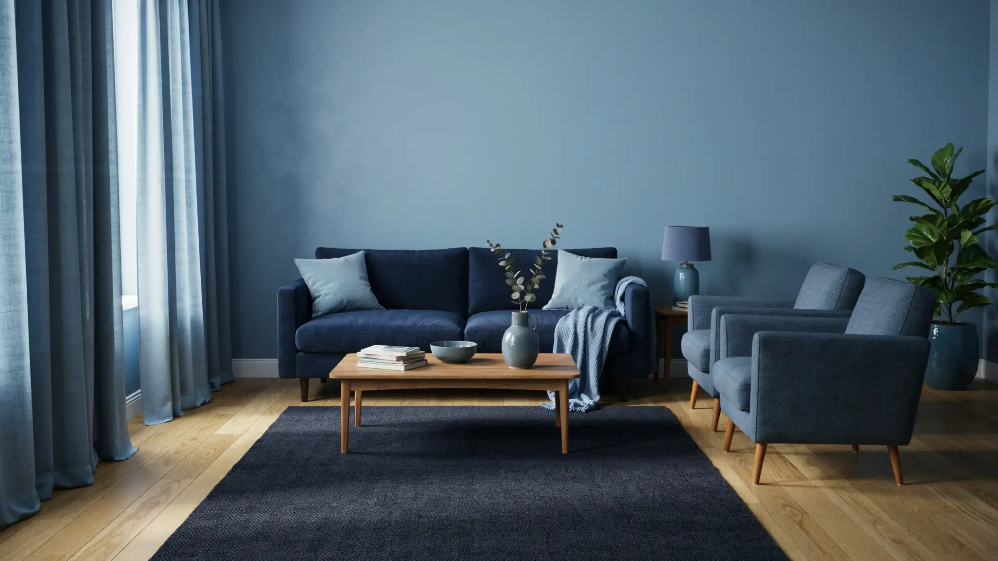
Pale blue walls next to a deep navy sofa. Soft green cushions resting on a darker green rug. Same family, different depths.
What surprises people is that it never looks boring. Texture does the work color alone can’t. A linen cushion, a glossy vase, a wool throw, all in the same shade, still read as separate pieces.
That’s the trick I keep coming back to. One color gives a room order, and texture keeps it from going flat.
What Is a Monochromatic Color Scheme?
A monochromatic color scheme is a decorating approach built on one base color. Designers expand that single hue into lighter tints, darker shades, and muted tones.
The palette can also mix saturation levels, materials, and finishes. A blue scheme, for example, might use pale blue walls, a navy sofa, dusty-blue curtains, and blue-gray accessories.
Every color in the scheme comes from the same spot on the color wheel. Nothing shifts to a different hue family. Only the lightness, darkness, and intensity change from piece to piece.
A monochromatic palette always traces back to one exact hue, not a group of colors that simply look similar. Getting that starting hue right matters more than people expect, since everything else in the room builds from it.
A green version might follow the same pattern. Sage walls, a moss-green chair, olive cushions, and deep forest-green trim can all come from one base green.
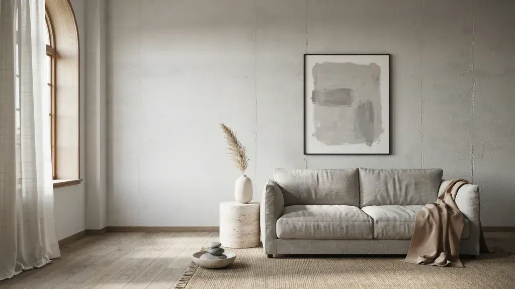
Neutrals work the same way. Beige, gray, or brown can each anchor a full palette, as long as every piece shares that same base tone.
What Makes Up a Monochromatic Color Palette
Four simple terms describe how a monochromatic palette grows from one color. Each term changes the base hue in its own specific way, without introducing a new color.
-
Hue: The pure base color, with nothing added or taken away. Every other shade in the palette grows from this single starting point. Blue itself is the hue in a blue scheme.
-
Tint: A lighter version of the hue, made by adding white to the base color. Powder blue is a common, softer tint of blue.
-
Shade: A darker version of the hue, made by adding black to the base color. Navy blue is a familiar shade, deeper and richer than plain blue.
-
Tone: A muted version of the hue, made by adding gray to the base color. Slate blue is one example, calmer and less bright than pure blue.
Why Monochromatic Color Schemes Work So Well
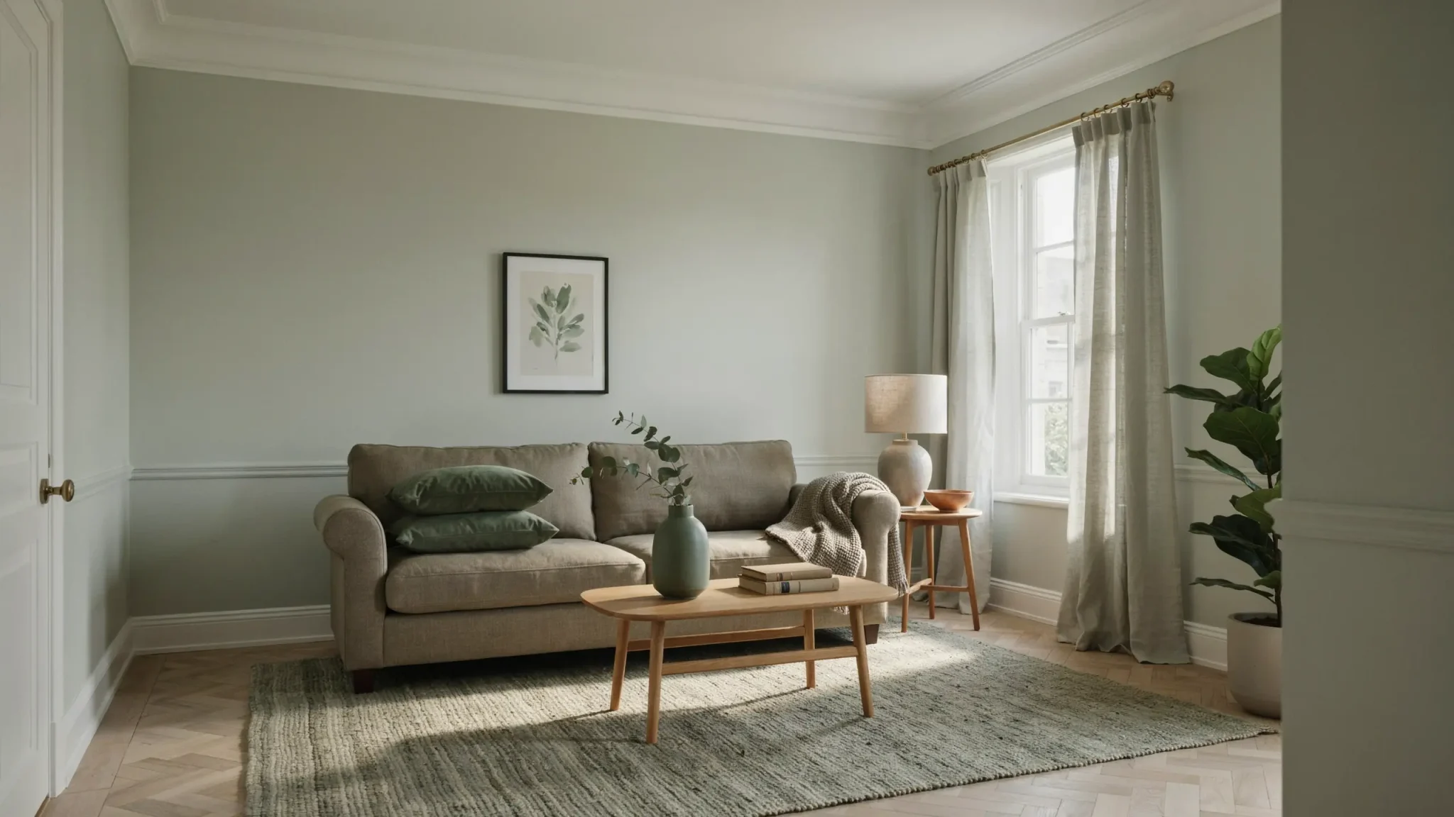
A monochromatic color scheme brings more to a room than a simple, safe look. Designers reach for this approach because it solves real decorating problems, not just aesthetic ones.
It won’t work for every space, but the benefits below explain why so many rooms are built this way.
1. Creates a Cohesive Appearance
Colors from the same family naturally connect walls, furniture, and textiles. Nothing fights for attention, so every piece feels like it belongs.
A pale blue wall, a slate-blue chair, and navy pillows all read as one plan, not separate purchases. This visual agreement is one reason a monochromatic color scheme photographs so well.
Rooms built this way tend to feel finished the moment the last piece is placed. You don’t need to add anything extra right away.
2. Makes Small Rooms Feel Less Broken Up
Fewer color changes create a smoother visual flow through a room. This can make a small space feel more open than it actually is.
Sharp contrasts between walls, trim, and furniture chop a room into visual sections. That reads as smaller and busier.
A monochromatic palette removes most of those hard breaks. Dark colors can still make a poorly lit room feel closed in. Natural light and window size matter just as much as color choice.
3. Keeps Decorating Decisions Manageable
One base hue narrows your choices right away, so decorating feels less overwhelming from the start. Instead of comparing dozens of unrelated colors, you only need to test tints, shades, and tones of one.
You still get real variation through value, texture, and finish, so the room never feels boring.
Fewer decisions also mean fewer chances for a costly mismatch between paint, fabric, and flooring. That makes a monochromatic color scheme a practical choice for anyone decorating on their own.
4. Directs Attention Toward Shape and Texture
With fewer competing hues, other details in the room start to stand out more. Furniture shapes, molding, artwork, and material differences become easier to notice once color stops pulling focus.
A carved chair leg or a textured throw pillow gets attention it might lose in a busier, multicolor room.
This is one reason designers use a monochromatic color scheme to highlight architecture or a single striking piece. The room still feels calm, but nothing interesting gets lost in the mix.
Monochromatic Color Scheme Examples for Every Room
Color theory makes more sense once you see it in a real room. Here are five spaces, each built around one hue, taken from start to finish.
1. Monochromatic Blue Living Room
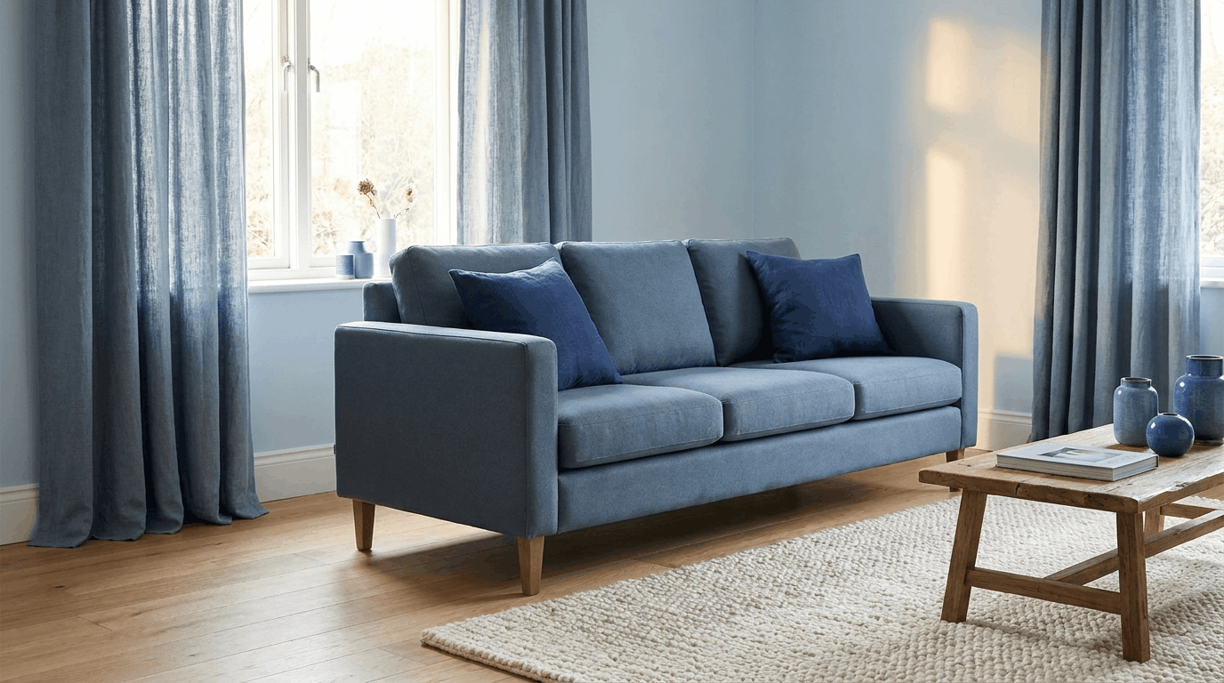
Pale blue walls make a living room feel wide open, even before you add anything else. Add a slate-blue sofa and the space settles into itself, still light but no longer bare. Navy pillows sink into the darkest corner of that same blue.
Soft blue-gray curtains catch whatever daylight comes through, and the eye never wanders off elsewhere.
2. Monochromatic Green Bedroom
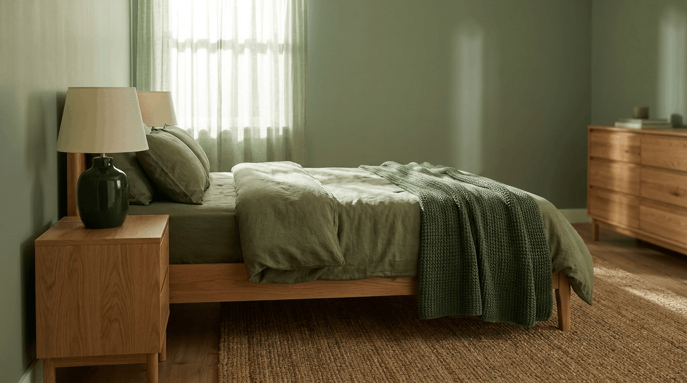
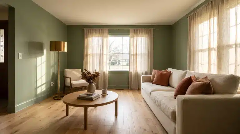
A bedroom painted in sage rarely feels heavy, no matter how much it holds.
Olive bedding lands somewhere in the middle, close enough to the walls to feel familiar. Then a forest-green throw or a lamp base pushes into darker territory.
Nearby wood furniture keeps the whole thing feeling lived in, rather than staged for a photo.
3. Monochromatic Beige Kitchen
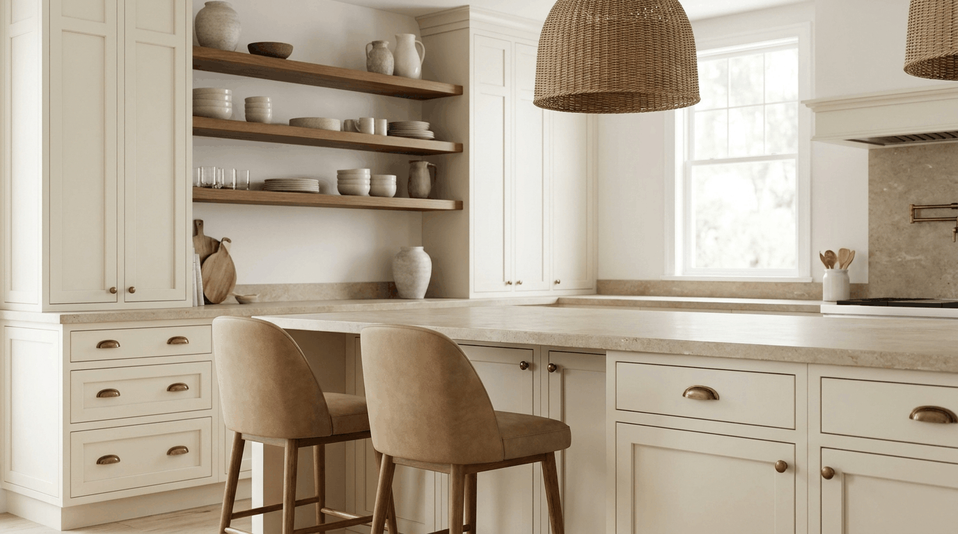
Cream cabinets rarely draw attention on their own. Paired with beige stone across the counters, the kitchen starts to feel like one continuous surface. Tan stools break that up just enough to give the eye a place to rest.
Nearby brown shelving or hardware keeps things from sliding into something too pale to notice.
4. Monochromatic Bathroom
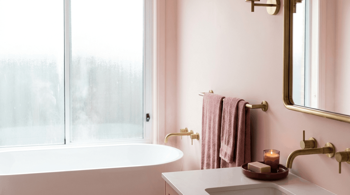
A monochromatic bathroom with blush on the walls can read as almost too soft on its own. Rose towels add a shade with more presence.
A burgundy tray or mat sits deeper into that family. It holds its ground rather than fading into the pink around it. Warm metal fixtures finish the room off with something sturdier than the color alone provides.
5. Monochromatic Gray Home Office
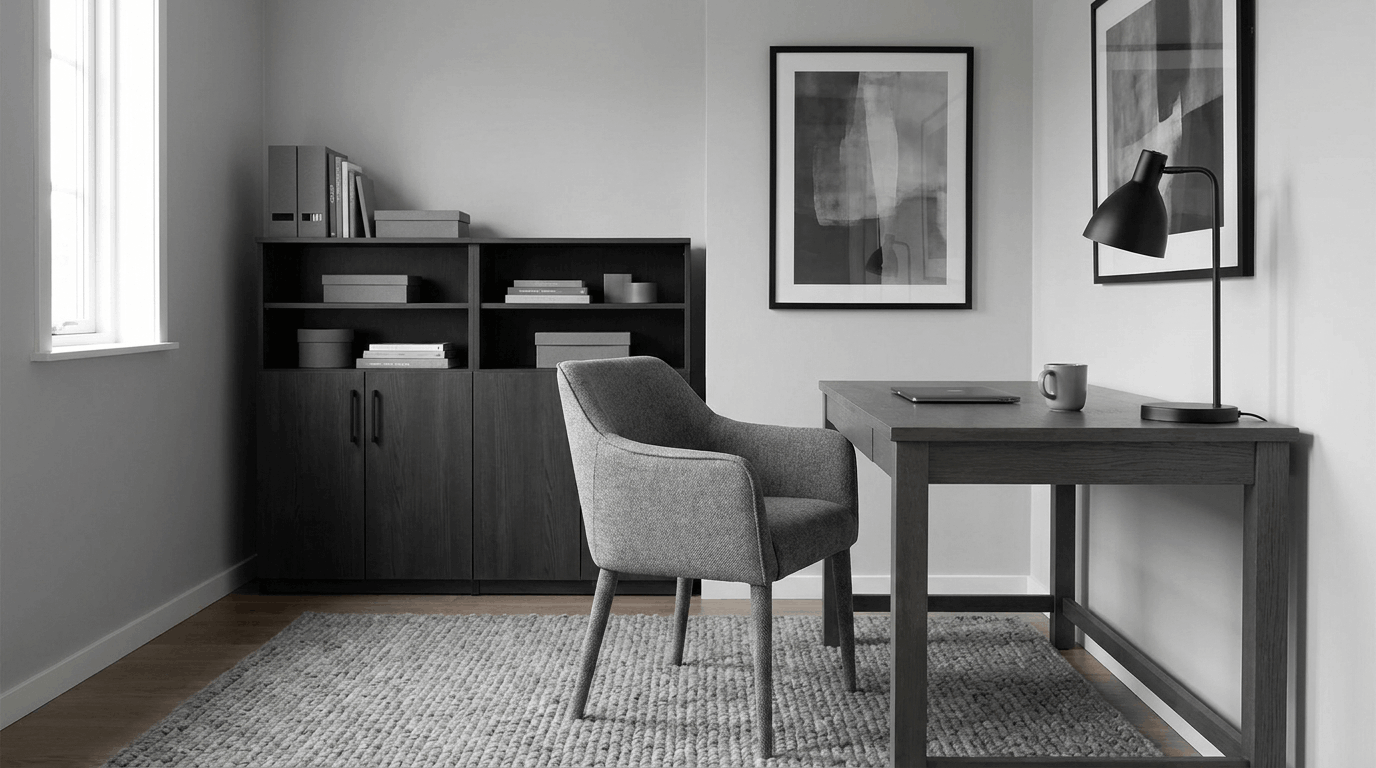
Light gray on the walls keeps a home office from feeling closed in, even on a gray afternoon. Charcoal storage lower in the room pulls the eye down and adds weight to the space.
A mid-gray chair sits between the two, softening what could otherwise feel like a sharp jump. Black accents nearby, a lamp or a frame, pull the whole thing into focus.
How Monochromatic Compares to Analogous and Complementary Palettes
|
Color scheme |
Colors used |
Overall effect |
Example in a room |
|---|---|---|---|
|
Monochromatic |
Different shades and tones of one hue |
Cohesive and controlled |
Pale blue walls with a navy sofa and blue-gray curtains |
|
Colors sitting next to each other on the color wheel |
Soft, with more variation than monochromatic |
Sage green paired with mustard yellow and warm cream |
|
|
Complementary |
Colors sitting opposite each other on the wheel |
Bold and high contrast |
Navy walls with burnt orange or terracotta accents |
|
Achromatic |
Black, white, and gray, with no hue at all |
Neutral and graphic |
A charcoal sofa against white walls with black frames |
When to Skip a Monochromatic Color Scheme
Skip it if the space already has several fixed finishes that clash. Those are hard to pull into one hue. It may not suit a household that likes visible color variety, either. Some colors feel heavy once they cover large surfaces.
Contrast matters too. A palette with too little contrast between light and dark values can make a room harder to read.
Lighting plays a role as well. If a room’s lighting shifts the undertone you picked, the scheme can look off. Weigh these signs together before you commit one hue to the whole room.
Wrapping It Up
Variation is what makes a monochromatic color scheme work. One hue can still feel rich when you mix value, undertone, texture, and finish.
Light changes everything, so always test your choices inside the actual room. A pale tint on the walls, a deeper shade on the sofa, and a muted rug can all sit together.
None of them need to match exactly to belong in the same room. That’s the real goal: one color family, many personalities.
Once tint, shade, and tone work together, that kind of room gets much easier to plan. What hue would you choose to build yours around?
Frequently Asked Questions
What Are the 7 Types of Color Schemes?
The seven main types are monochromatic, analogous, complementary, split-complementary, triadic, tetradic, and achromatic. Each one arranges colors on the wheel in a different pattern.
What Are the Disadvantages of Using a Monochromatic Color Scheme?
A monochromatic color scheme can look flat without enough contrast or texture. Some rooms feel too matched, and hues may clash under different lighting.
How to Create a Monochromatic Color Scheme?
Pick one base hue, then build in lighter tints, darker shades, and muted tones. Test paint and fabric samples in real light before you commit.
How Do I Make My Own Color Scheme?
Start with one hue you like, then try its analogous, complementary, or monochromatic neighbors on the color wheel. Test your choices in real daylight.