23 Living Room Color Ideas That Look Good for Years

The color on your living room walls does more than set a mood. It shapes how furniture reads and how the room feels at night. Get it wrong, and no throw pillow will fix it.
The problem is that people often pick from a small paint chip under store lighting. That chip looks completely different on the wall three days later.
This list covers living room color ideas designers are actually using. Each one includes specific paint names and honest guidance on where it works best.
23 Living Room Color Ideas for Every Style and Mood
These are the living room paint colors and palettes that designers consistently return to, sourced from current US design practice and the color directions dominating residential interiors in 2026.
1. Sage Green
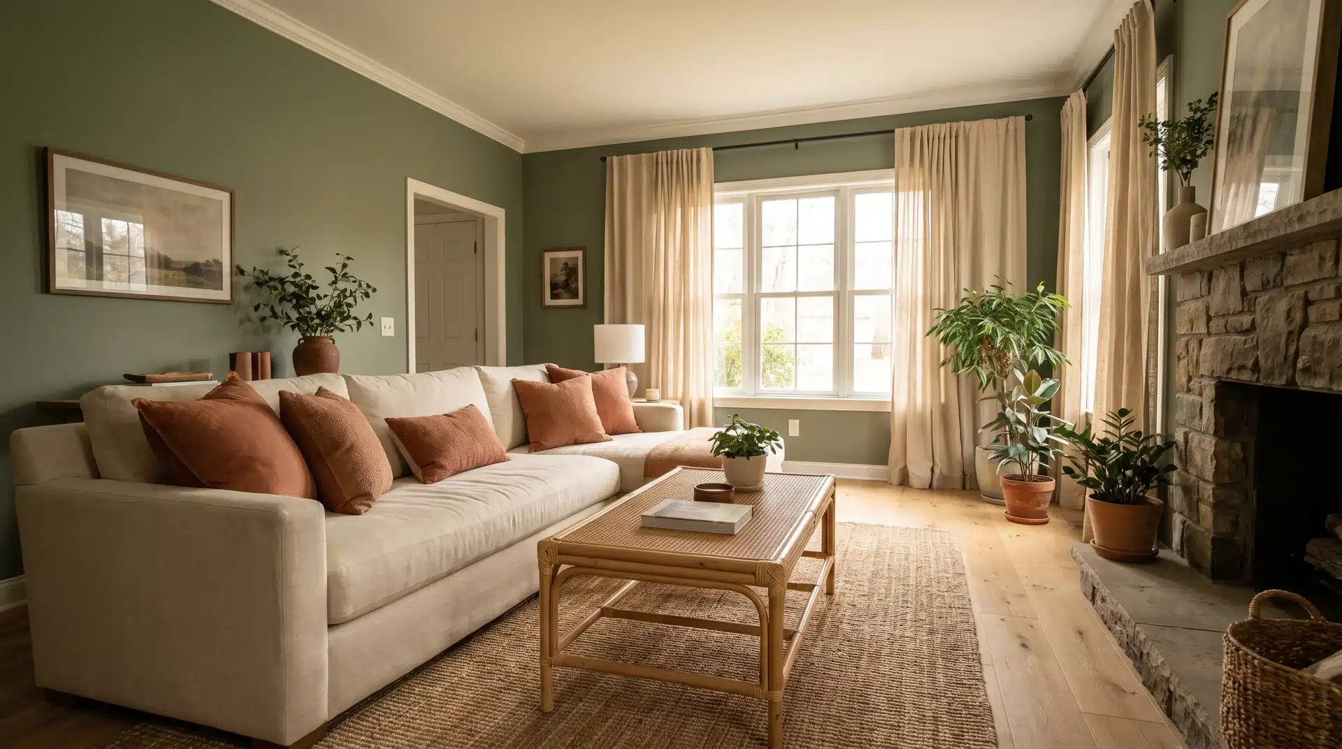
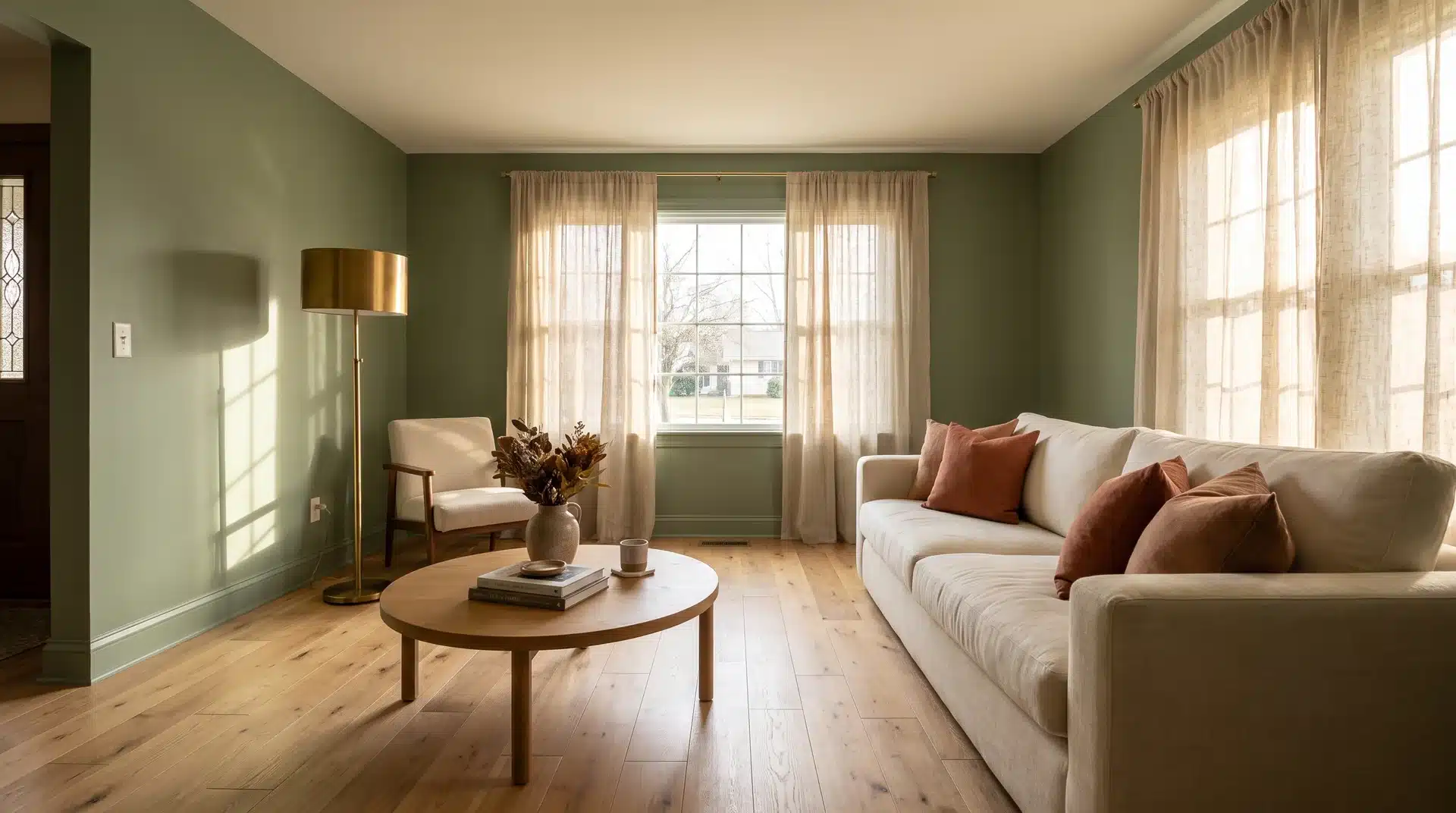
Sage green is the standout living room color of 2026. It adds a natural, organic presence without the aggressive coolness of stronger greens.
It pairs well with warm wood tones, cream, and terracotta across every lighting condition. It works especially well in sage green living rooms styled with natural wood furniture and linen textiles.
Try Benjamin Moore Creekside Green or Sherwin-Williams Muddled Basil for a color that feels both fresh and grounded at the same time.
2. Warm White
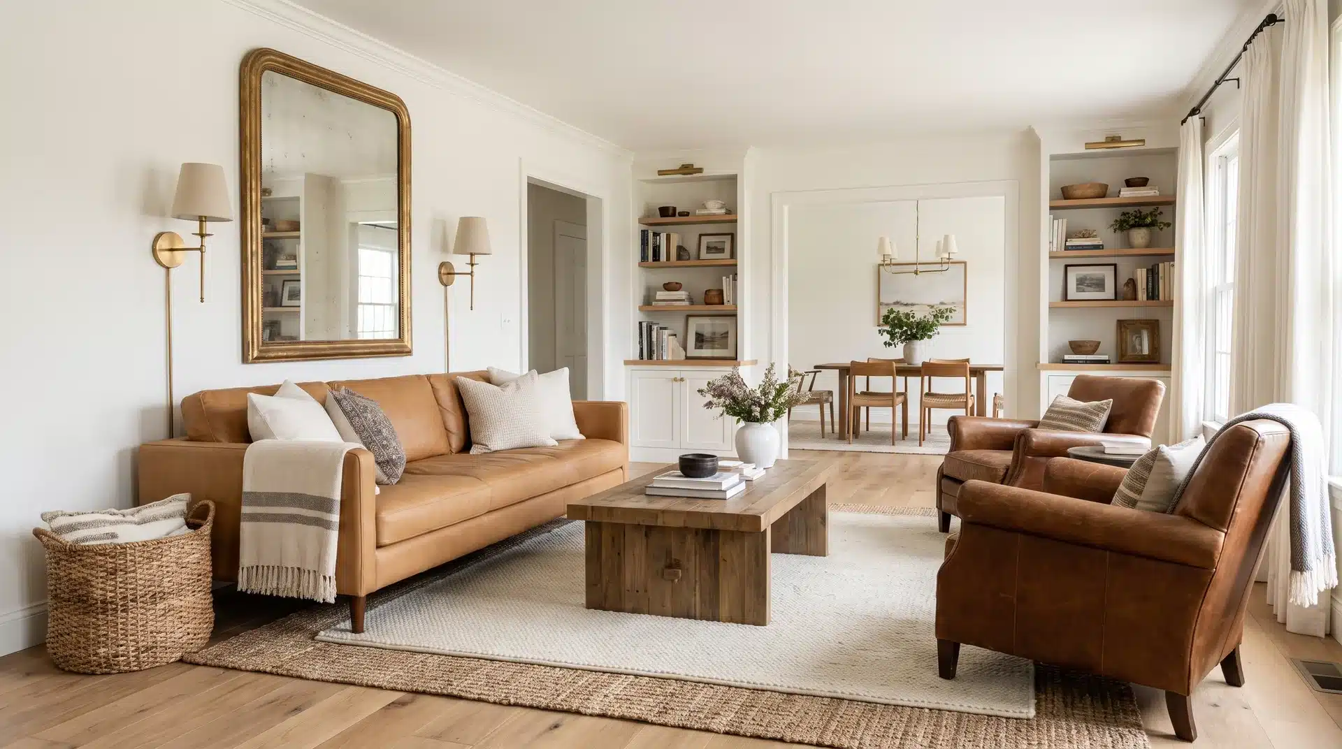
Cool white walls are fading fast in 2026. Warm white replaces them with softness and coziness while keeping the room light and airy.
Benjamin Moore White Dove and Sherwin-Williams Accessible Beige are the two most recommended warm whites in US design.
Both photograph well and hold steady across seasonal decor changes without demanding updates to the rest of the room.
3. Moody Oxblood
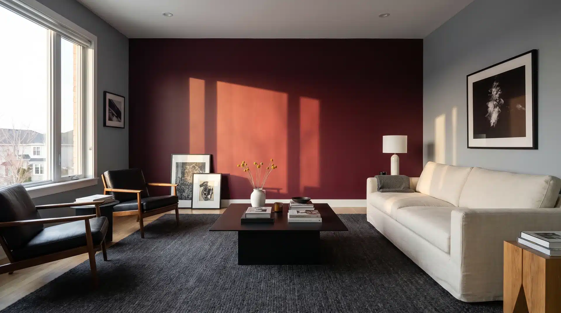
Oxblood works best as an accent color rather than a wall color. Paired with cool gray and matte black, it adds richness and drama without overwhelming the room.
Use it in upholstery, a statement chair, or a large rug and let the neutral backdrop do the heavy lifting.
For walls, Sherwin-Williams Antique Red and Benjamin Moore Sangria both sit in the oxblood range and work well in rooms where a deeper, wine-toned accent wall is the goal.
It is one of the more unexpected color directions that impresses in person more than in photographs.
4. Warm Terracotta
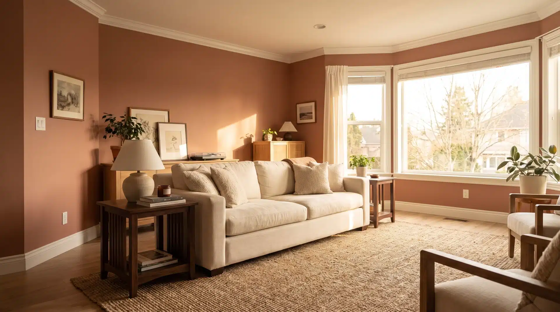
This version of terracotta is muted and dusty rather than bold. Think sun-baked clay rather than pumpkin orange.
It pairs well with white trim and dark wood furniture. This color suits living rooms with Southwestern, Mediterranean, or maximalist design directions. It also fits well with cottage color palettes that lean warm and earthy.
Behr Burnished Clay and Sherwin-Williams Reddened Earth both sit in this range and pair well against white trim and dark wood furniture.
Best suited to living rooms with Southwestern, Mediterranean, or maximalist design directions in mind.
5. Honey Amber
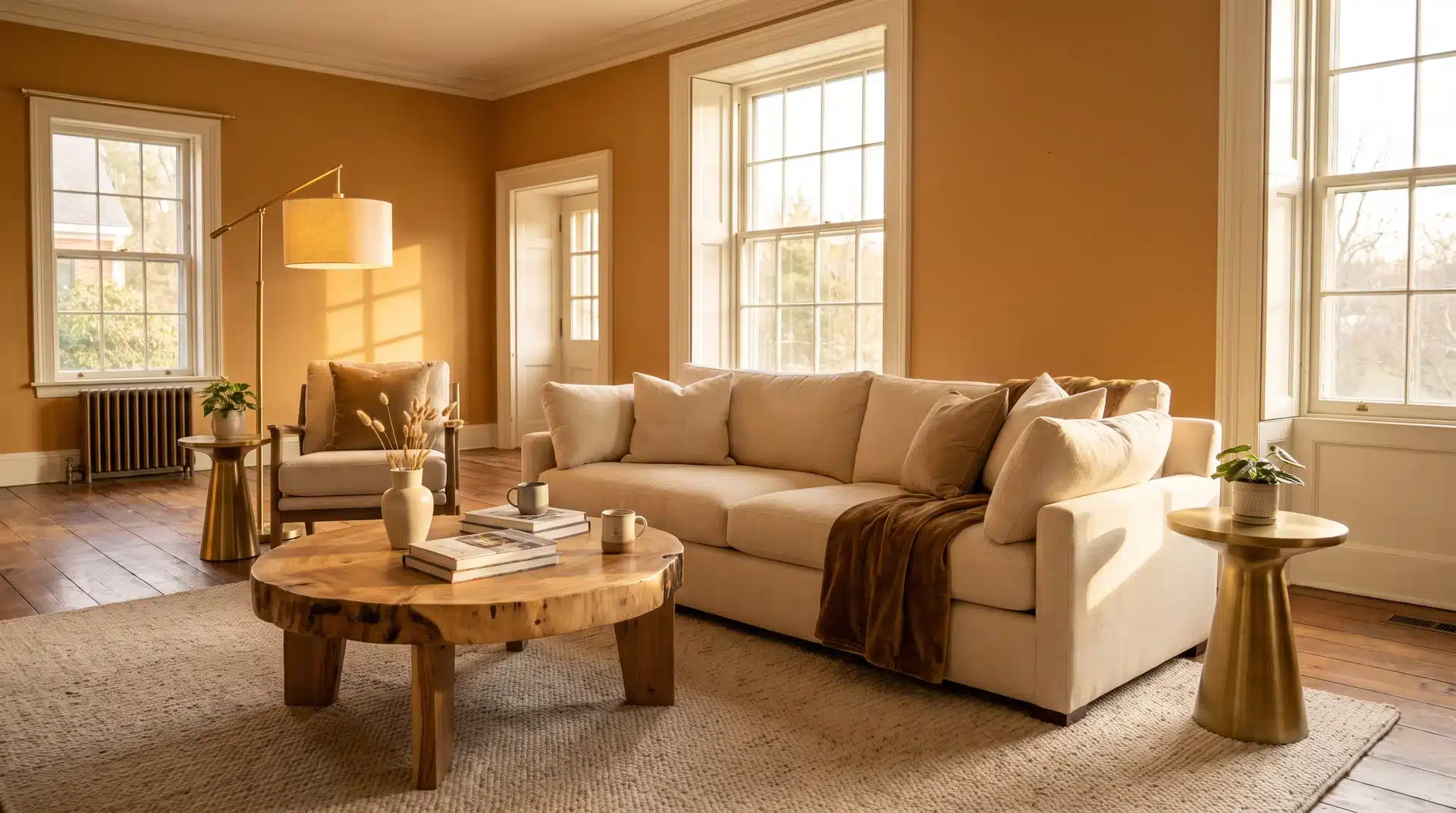
Multiple design forecasters named honey amber as a key trending color for 2026. Bobby Berk notes that a room painted in this shade feels like permanent late-afternoon golden hour regardless of actual light conditions.
Try Benjamin Moore Fall Harvest or Sherwin-Williams Caramelized. Both pair with cream, natural wood, and brushed brass without pulling too orange or too yellow under artificial light.
6. Deep Navy
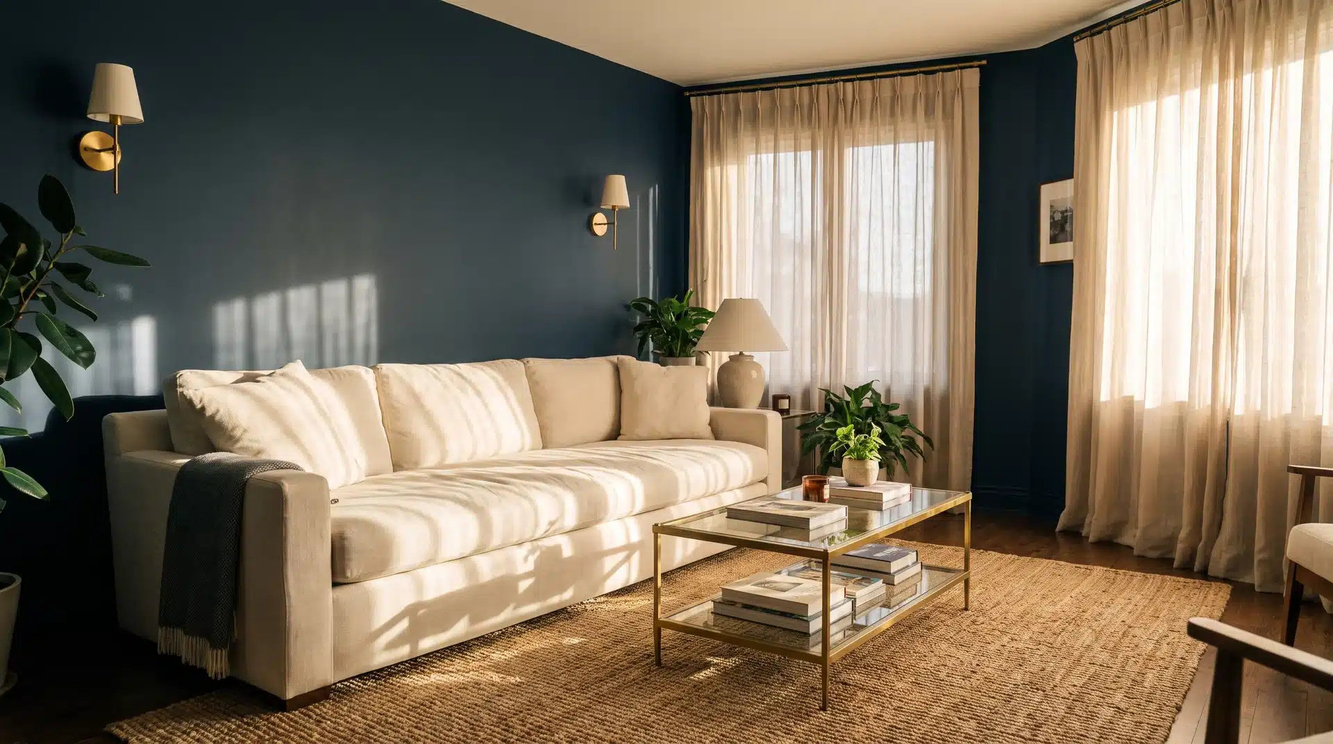
Navy functions as a neutral as much as a statement, which is why it has real staying power in living room design.
Deep navy walls paired with warm brass accents and cream upholstery feel both classic and current.
Try Benjamin Moore Hale Navy or Sherwin-Williams Naval. Both suit smaller rooms, creating a cocooning effect, and larger rooms that need strong visual weight throughout.
7. Charcoal
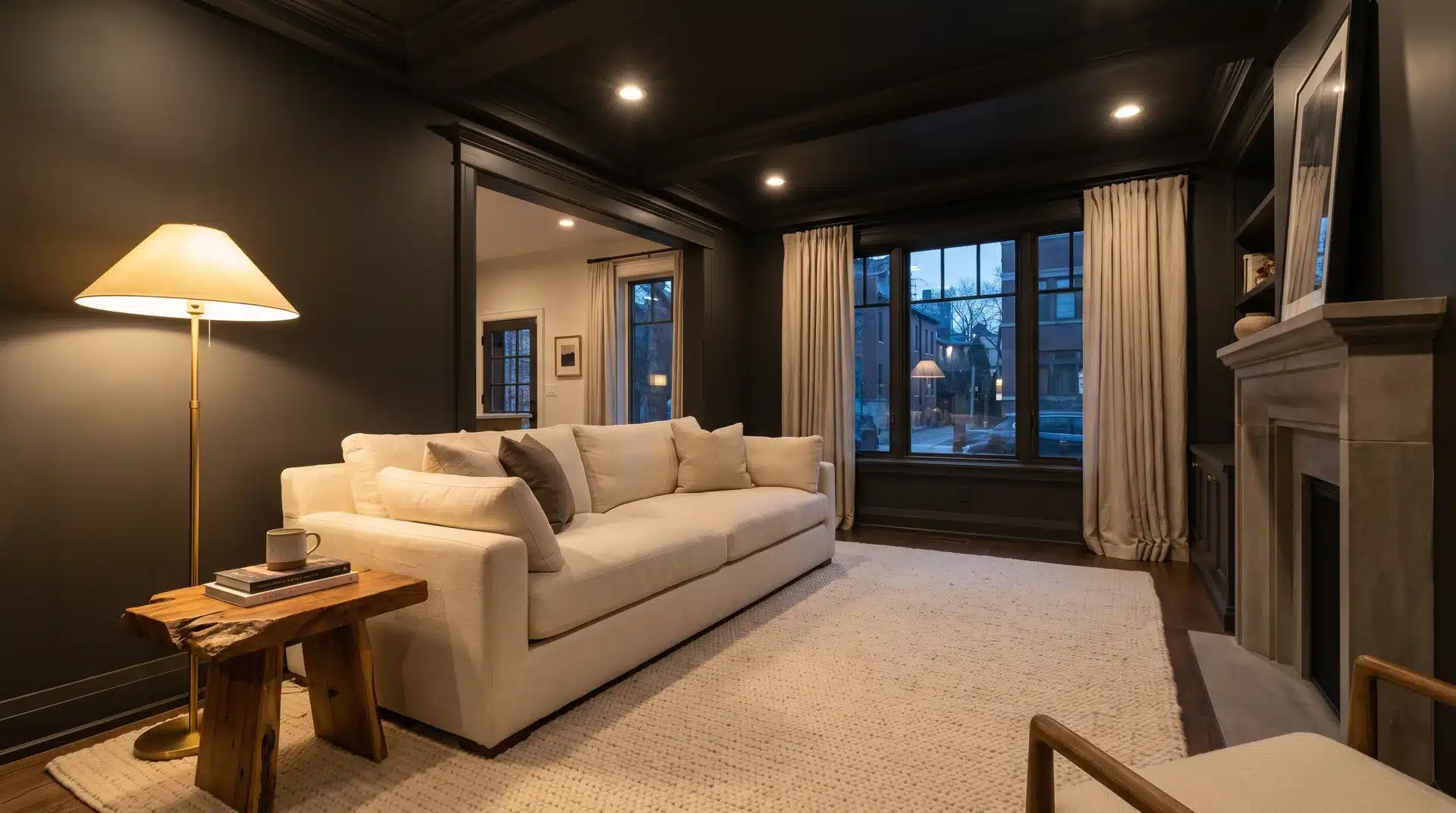
Sherwin-Williams Iron Ore is a charcoal-rich shade that creates a sculptural quality in low light and reveals subtle warmth in brighter conditions.
Designers cite it as one of the leading choices for high-end interiors because it delivers confident drama while staying polished.
Use it on walls, trim, or cabinetry for maximum impact without tipping into harshness across different room sizes.
8. Soft Blush Pink
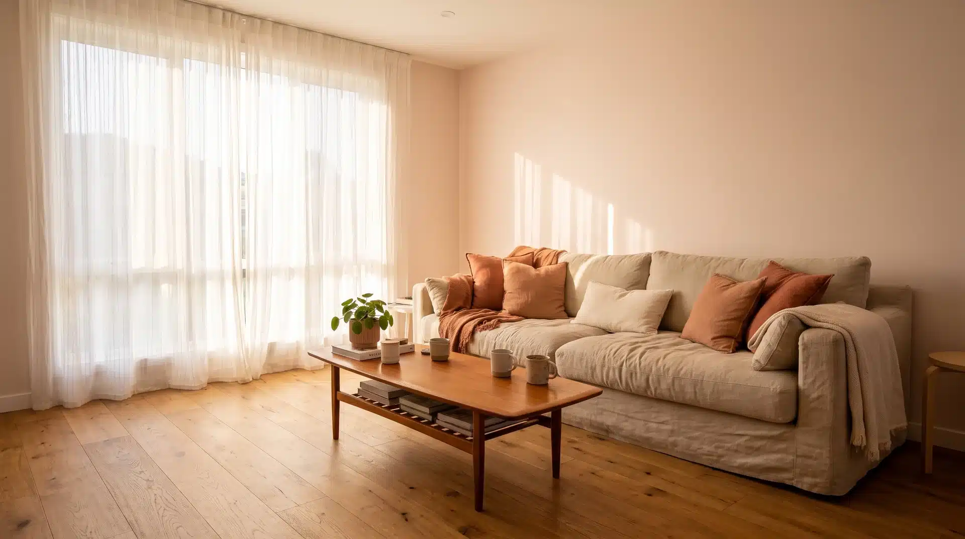
Soft blush is a surprisingly livable living room color. The lightest shades feel playful and light-filled while deeper, dustier pinks sit as uplifting without skewing feminine.
Try Benjamin Moore Soft Pink or Sherwin-Williams Cosmetic Blush. Pair with warm neutrals and natural wood rather than bright white. Works especially well in east-facing rooms that catch morning light.
9. Aubergine
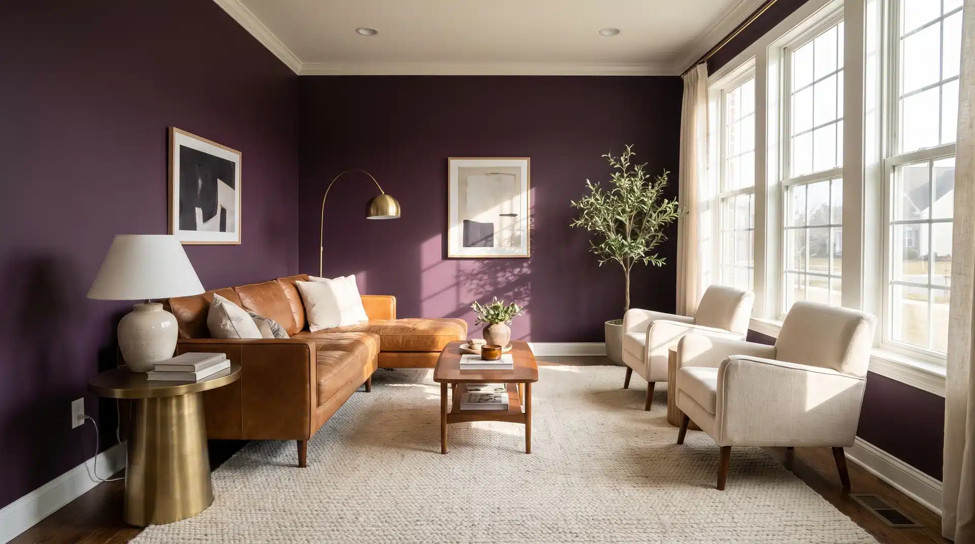
Aubergine has a warm, earth-toned base that feels luxurious and just slightly unconventional in a living room.
Use it on a single feature wall or throughout a space with strong natural light. Try Sherwin-Williams Quixotic Plum or Benjamin Moore Plum Raisin.
Pair with cognac leather, warm brass, and cream for a palette that feels curated rather than heavy.
10. Olive Green
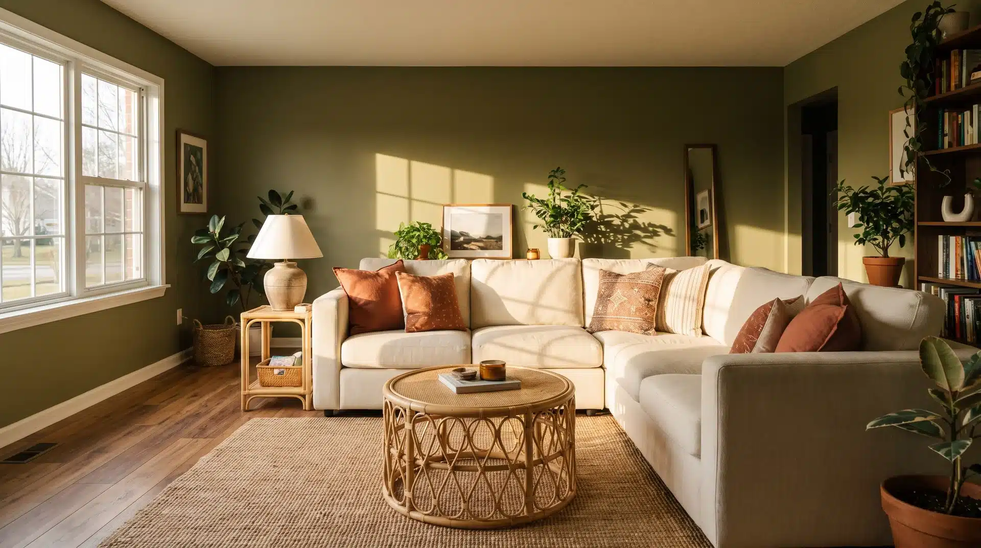
Richer and more grounded than sage, olive green lends a saturated, earthy quality to a living room that sage cannot match.
It works as a wall color, a drenched ceiling color, or through decor in cushions and art.
Try Benjamin Moore Dried Thyme or Sherwin-Williams Relentless Olive, both strong picks for staying power well into the years ahead.
11. Warm Taupe and Cognac
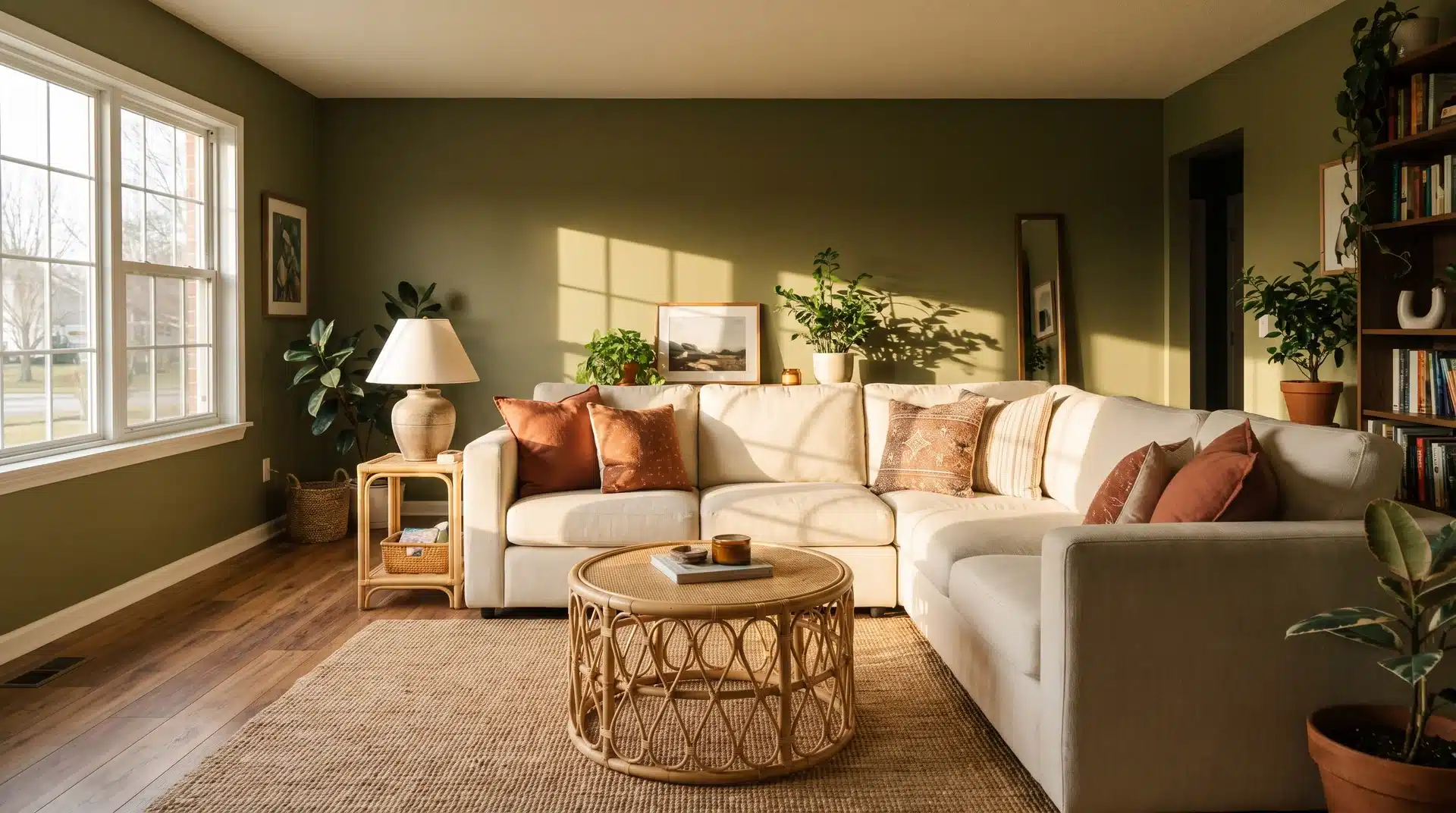
Warm taupe walls paired with cognac leather upholstery and natural wood produce a living room with texture-rich character that ages well across years rather than seasons.
The combination feels current when paired with modern furniture profiles and matte black hardware.
Try Sherwin-Williams Tony Taupe or Benjamin Moore Weimaraner as the taupe anchor in this palette.
12. Moody Blue-Gray
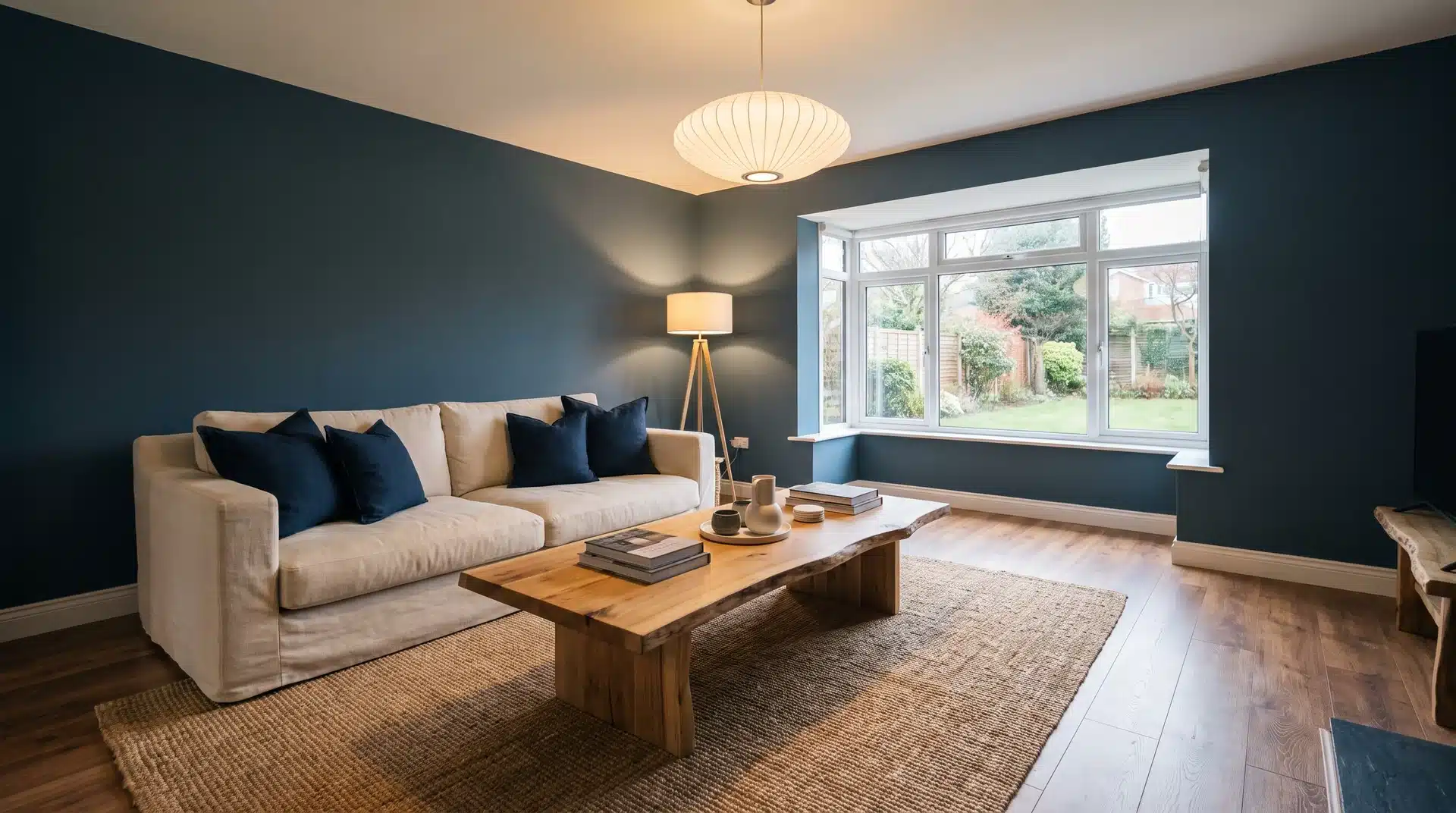
Nuanced colors like Farrow and Ball Inchyra Blue feel timeless and classic rather than intimidating, and homeowners are moving away from all-white walls toward tones that carry personality.
A strong direction for transitional living rooms where understated character is the goal.
Sherwin-Williams Moody Blue is a widely available alternative that sits in the same tonal range.
13. Smoky Jade Blue-Green
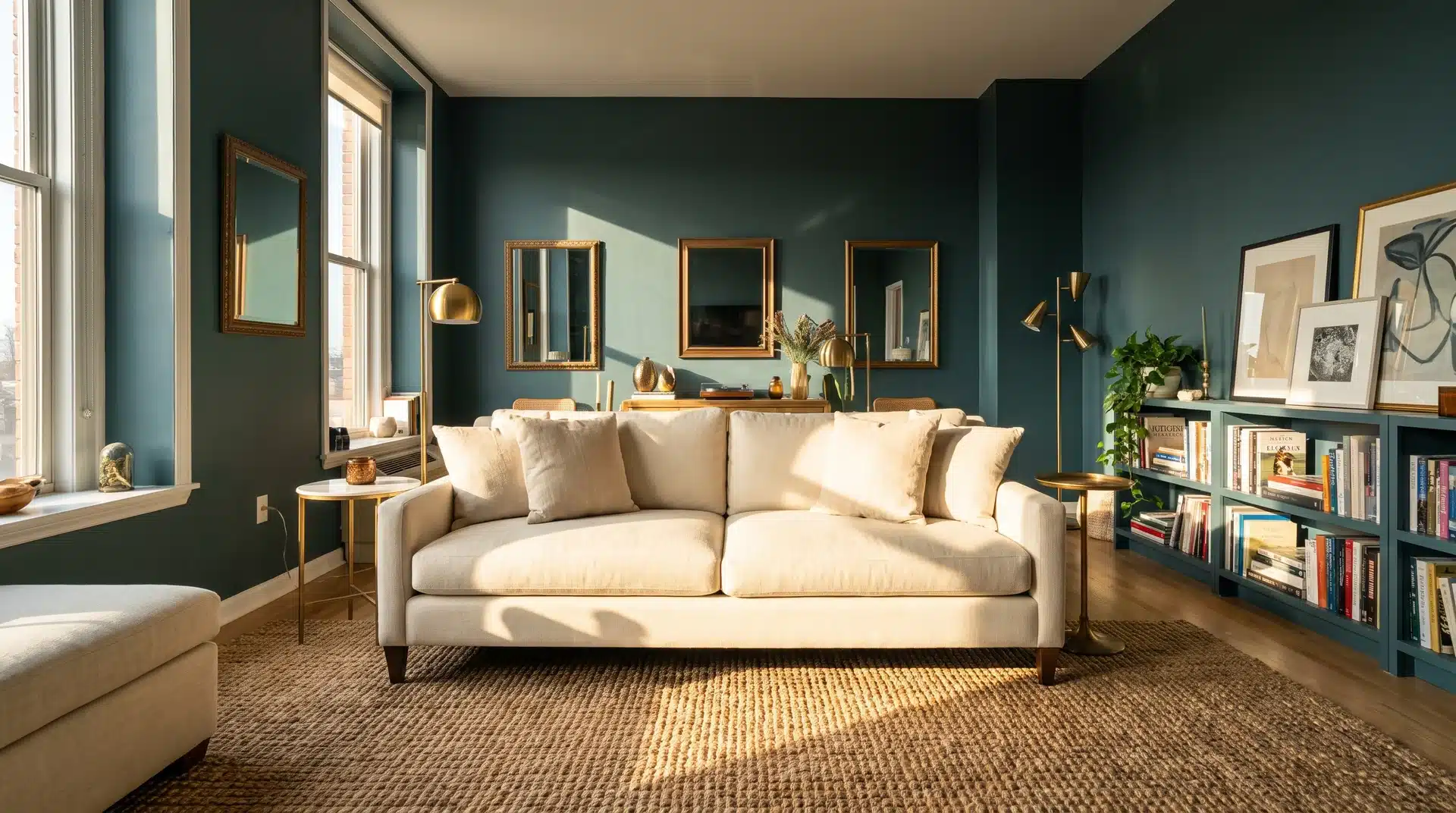
Behr named Hidden Gem, a smoky jade blue-green, as its 2026 Color of the Year. The color feels both dramatic and soothing, a rare quality for a wall color.
It suits living rooms with good natural light where the smoky undertone shifts from deep and rich in the morning to luminous and warm in full afternoon sun.
14. Warm Neutral Earth Tones
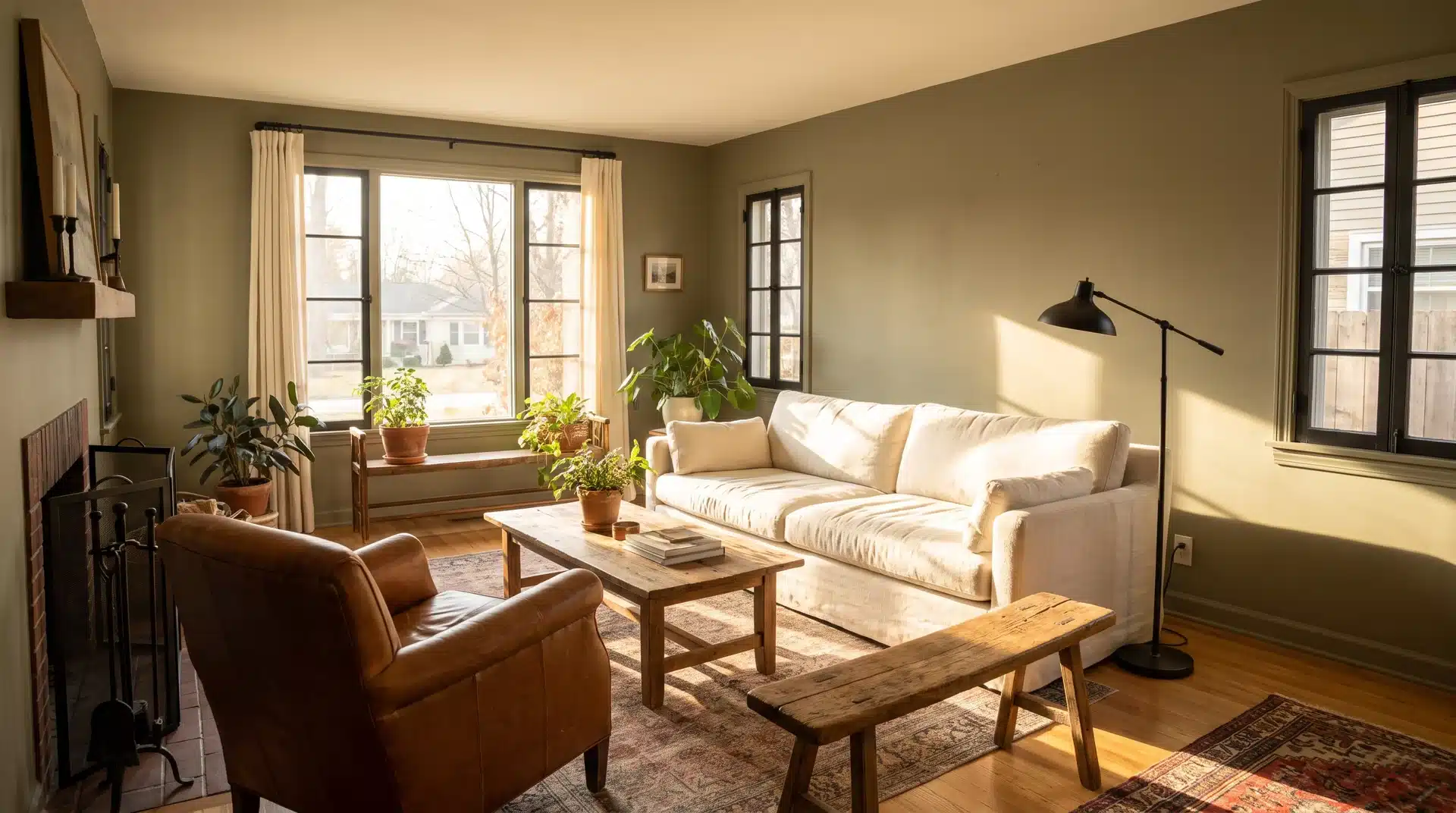
Muddled olive, soft ivory, warm cognac, and a touch of black work together as one of the most enduring living room color palettes available.
Try Benjamin Moore Camouflage for the olive note and Sherwin-Williams Warm Winter as the ivory base.
This combination suits organic modern, warm minimalist, and modern-traditional interiors without needing core palette updates over time.
15. Crisp White With Bold Accents
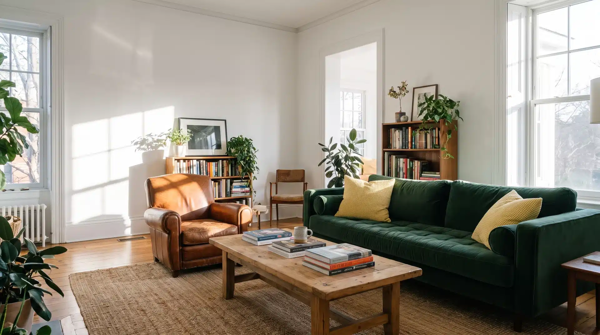
Crisp white walls with one strong accent color remain among the most versatile living room color ideas in use.
Benjamin Moore Chantilly Lace and Sherwin-Williams White Snow are the two most recommended crisp whites in current US design.
Use the accent in upholstery, a large rug, or a single painted wall rather than spreading it across multiple surfaces at once.
16. Forest Green
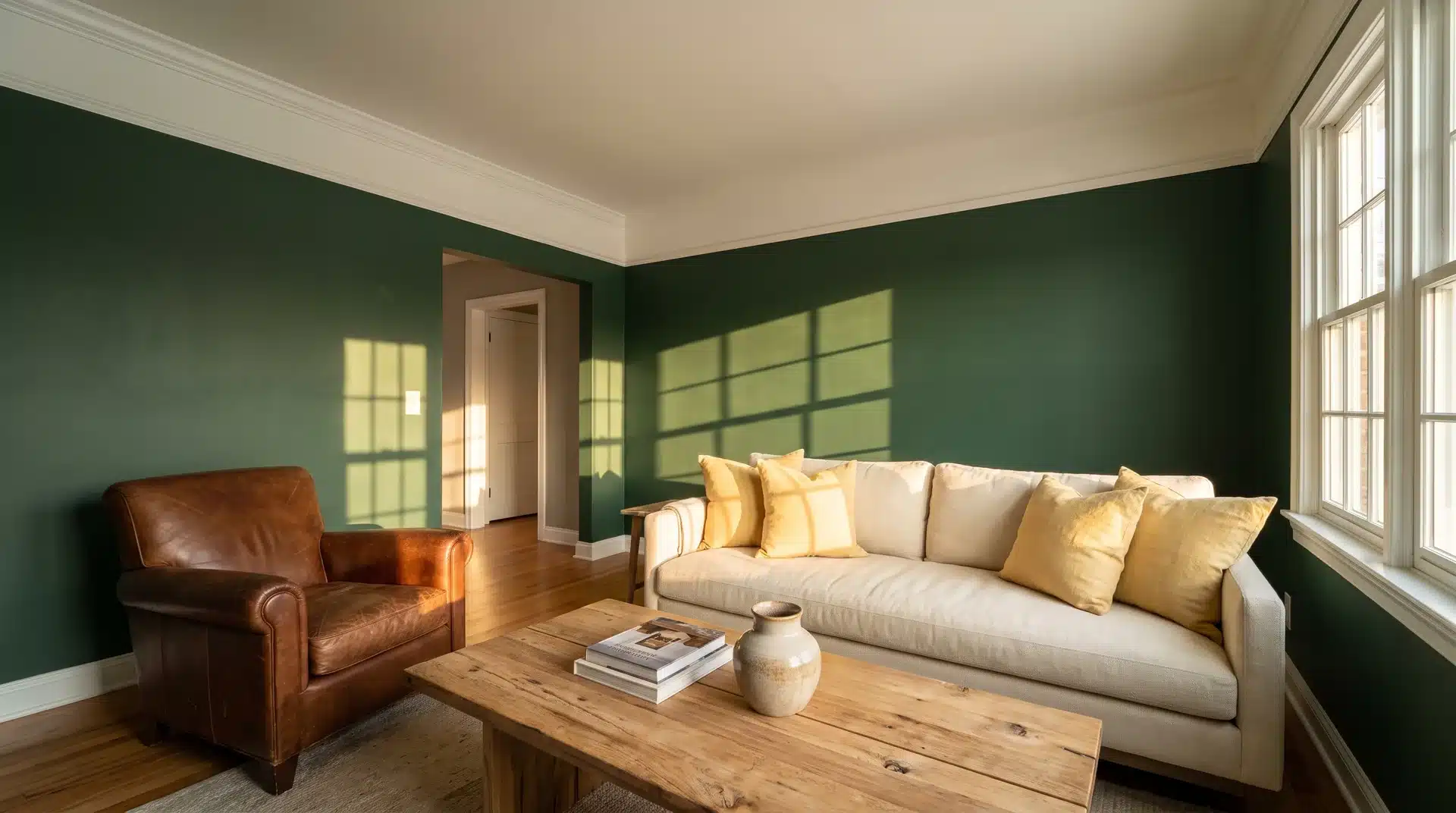
A deep forest green sofa against warm brown, soft yellow, and crisp white walls creates a living room with eye-catching dimension that still sits in the earth-tone family.
Try Sherwin-Williams Cascades or Benjamin Moore Forest Green for the deepest, richest version of this color.
Forest green upholstery draws strong positive responses from designers reviewing completed rooms in 2026.
17. Layered Blues
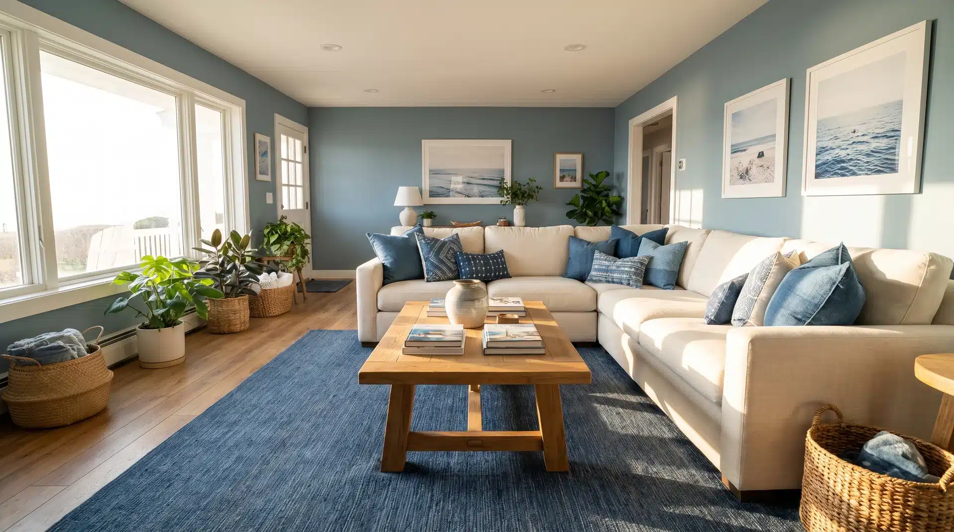
Soft blue paint, bold denim in rugs and throw pillows, and warm wood tones produce a living room that feels coastal without leaning into coastal clichés.
The warm wood adds ochre contrast that keeps the palette from reading cold.
Try Benjamin Moore Buxton Blue or Sherwin-Williams Honest Blue as the wall anchor in this layered palette.
18. Warm High-Contrast Black and White
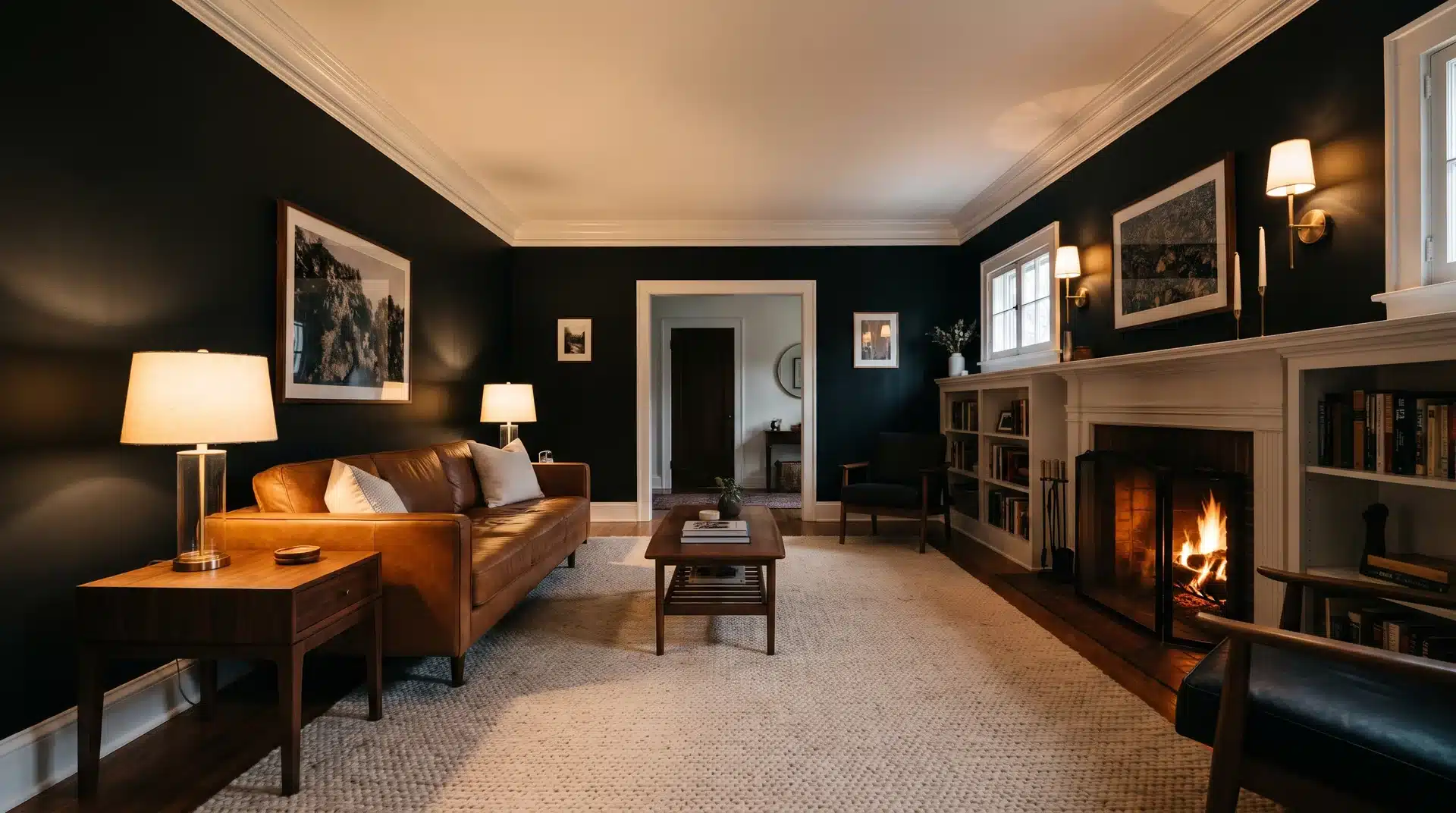
Black, charcoal, and crisp white as a high-contrast foundation with cognac leather and warm wood as the softening elements produce a living room that feels modern without sterility.
Try Sherwin-Williams Tricorn Black or Benjamin Moore Onyx for the black anchor. The texture of warm materials prevents the palette from becoming a design exercise rather than a livable room.
19. Teal
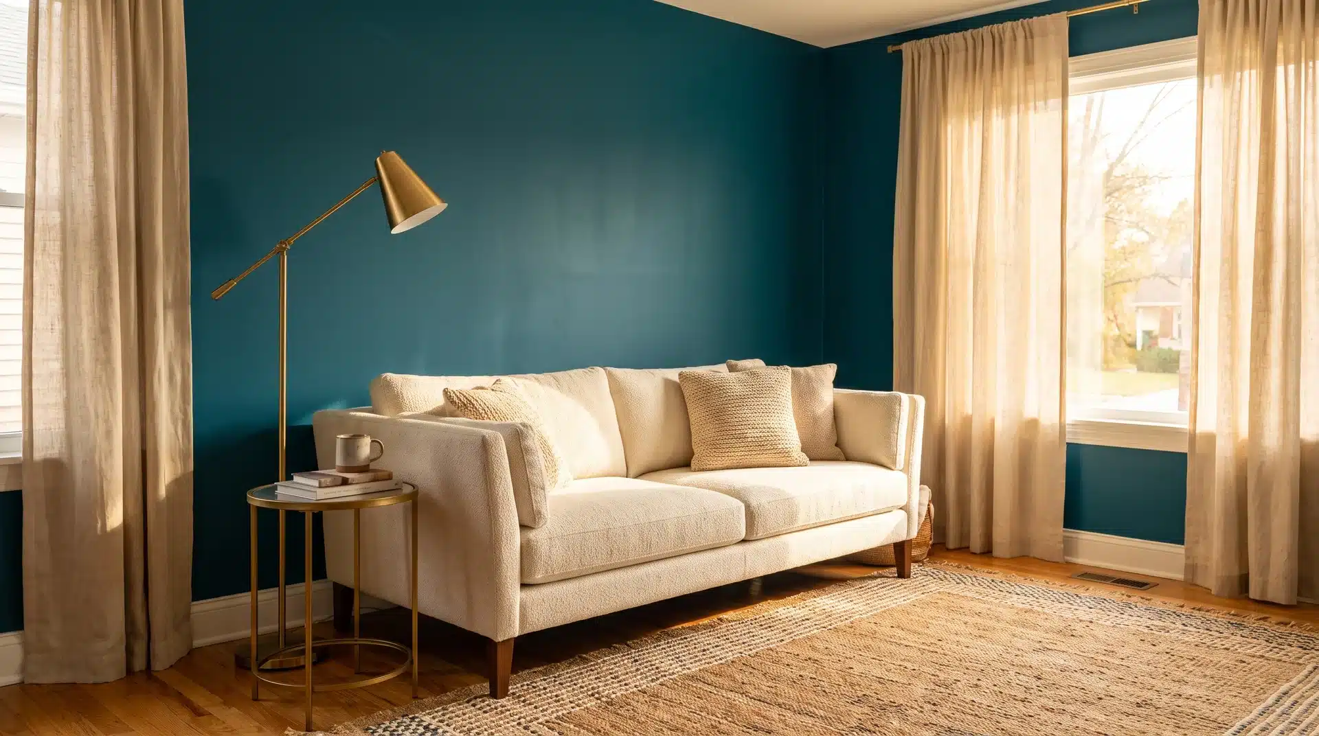
Teal is the blue-green hybrid that manages to feel calming and bold at the same time, and comes across as more current than dark green walls in 2026.
Try Benjamin Moore Teal Ocean or Sherwin-Williams Oceanside. Use it on a single wall or in upholstery rather than drenching the full room for a result that holds across different light conditions.
20. Dusty Mauve
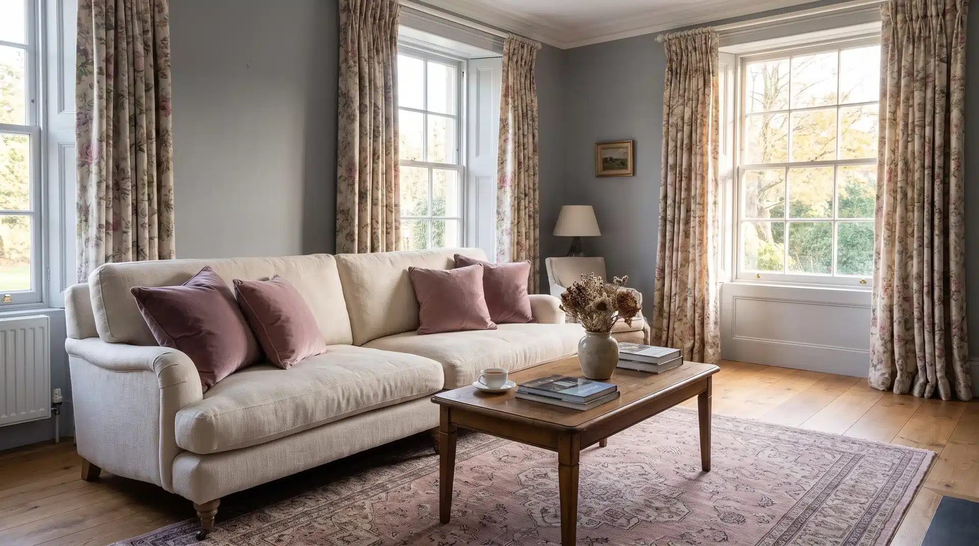
Layered into a cool blue-gray room through throw pillows, a rug, or floral drapes, dusty mauve adds warmth without requiring a full color shift.
Try Benjamin Moore Pale Berry or Sherwin-Williams Mauve Finery for the mauve note.
It suits transitional interiors where the goal is warmth without commitment to a saturated color on the walls.
21. Coastal Neutrals
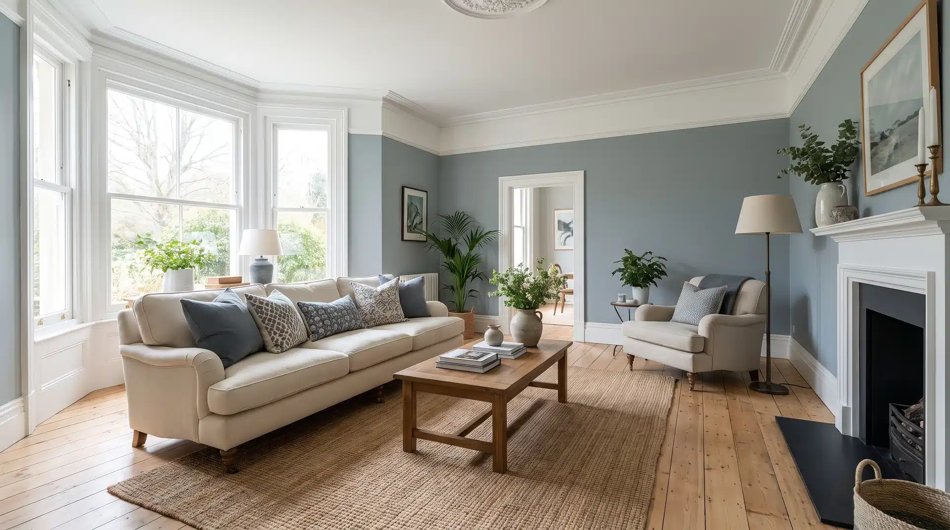
White and blue-gray together produce a living room that feels serene, classic, and slightly preppy without full coastal theming.
Try Sherwin-Williams Tradewind for the blue-gray note and Benjamin Moore Little Falls as the white anchor.
Shades of white and ivory set the stage while blue-gray pillows and textured accents add the subtle dimension the palette needs.
22. Warm Ochre and Retro Marigold
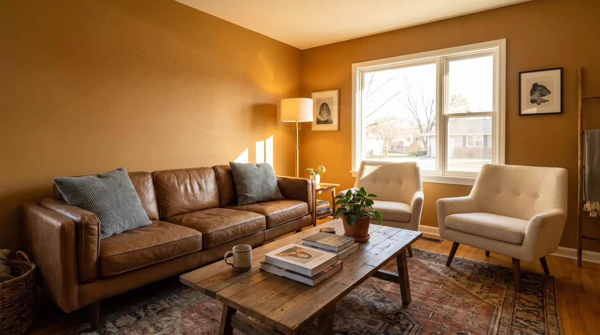
Rich marigold and warm shades of brown together produce a living room that leans retro 1970s in the most appealing way.
Try Benjamin Moore Mustard Olive or Sherwin-Williams Sunflower for the ochre anchor.
Hints of gray-blue and crisp ivory add cool contrast that keeps the warmth in check across the full palette.
23. Monochromatic Warm Cream
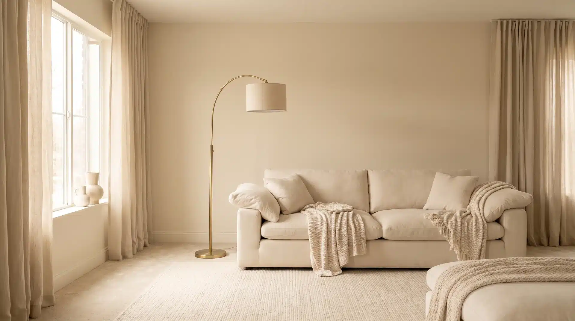
A fully monochromatic warm cream room, with walls, upholstery, rugs, and drapes sitting in the same tonal family, communicates quiet luxury without requiring expensive materials.
Try Benjamin Moore White Wisp or Sherwin-Williams Creamy as the wall anchor.
One metallic accent in brushed brass or aged silver functions as the only color break and lands as deliberate rather than incidental.
Living Room Color Ideas by Room Lighting
Light conditions are a materials science variable as much as a design preference. The same color behaves differently on a north-facing wall versus a south-facing one
Understanding that relationship prevents the most common living room color mistake: choosing a paint that looks nothing like the swatch once it is on your specific wall.
Colors for Low-Light Living Rooms
North-facing and low-light living rooms punish the wrong color choice faster than any other condition. Here is what works and what to avoid before you commit to a can:
| Color Direction | Works in Low Light | Why |
|---|---|---|
| Warm white | ✓ Yes | Reflects available light without reading cold or flat |
| Pale ochre | ✓ Yes | Adds warmth without absorbing what little light exists |
| Honey amber | ✓ Yes | Builds warmth into the wall so the room feels lit even when it is not |
| Cool gray | ✗ No | Falls flat and reads cold under limited natural light |
| Bright white | ✗ No | Looks stark and clinical without strong daylight to soften it |
| Deep navy | ✗ No | Absorbs too much light and makes the room feel compressed |
| Charcoal | ✗ No | Best reserved for rooms with strong natural light to balance the weight |
Colors for Bright, Light-Filled Living Rooms
Strong natural light is the permission slip for every color on this list. Here is how the top-performing colors behave in bright, south-facing, and light-filled living rooms:
| Color Direction | Works in Bright Light | Why |
|---|---|---|
| Charcoal | ✓ Yes | Reveals subtle warmth in bright conditions and creates sculptural dimension throughout the day |
| Deep Navy | ✓ Yes | Shifts from rich and dramatic in morning light to deep and luminous in afternoon sun |
| Aubergine | ✓ Yes | Earth-toned base absorbs and reflects bright light without feeling oppressive or flat |
| Forest Green | ✓ Yes | Strong light brings out the richness of the green without the color reading muddy or heavy |
| Full Color Drenching | ✓ Yes | Walls, ceiling, and trim in the same deep tone work in bright rooms without compressing the space |
| Cool Gray | ✗ No | Loses personality in strong light and reads flat rather than nuanced in south-facing rooms |
| Pale Neutrals | ✗ Caution | Can wash out entirely in very bright rooms, making the space feel overexposed rather than airy |
Frequently Asked Questions
How Do I Match Living Room Paint to Existing Furniture?
Pull the undertone from your largest furniture piece and build the wall color around it. Warm wood tones pair with warm wall undertones. Cool gray upholstery pairs with blue-leaning neutrals.
Can I Use Dark Paint in a Living Room With Low Ceilings?
Yes, but paint the ceiling a shade lighter than the walls to draw the eye upward. Avoid full color drenching in rooms under nine feet as it compresses the perceived height considerably.
What Is LRV and Why Does It Matter When Choosing a Living Room Color?
LRV stands for Light Reflectance Value, a number from 0 to 100 measuring how much light a paint color reflects. Higher LRV means a lighter, brighter result on the wall. Check it before committing to any shade.
How Many Colors Should a Living Room Have?
A living room palette works best with three color roles. A dominant color at 60 percent, secondary at 30 percent, and accent colors at 10 percent. More than three base colors tends to break the visual order of the room.
Is It Better to Use Warm or Cool Colors in A Living Room?
Warm colors suit low-light, north-facing rooms and spaces where coziness is the goal. Cool colors can work in bright, south-facing rooms with strong natural light. The finish and undertone of any shade matter as much as whether it reads warm or cool on a chip.
Final Thoughts on Living Room Color Ideas
The right living room color ideas are the ones that make you want to spend time in the room, not just the ones that look good in a screenshot.
The most important step is not choosing the color. It is testing it on your specific wall, under your specific light, before committing to a full gallon. Paint a large swatch. Live with it for three days.
Check it at every hour of the day. The color you land on at the end of that process is the right one.