How to Build a Gallery Wall With Exhibition Posters

A blank wall is like a canvas waiting for your creativity. Most of us get that, but turning that idea into reality can feel overwhelming. Where do you even begin? What should you hang up? How do you ensure it looks intentional instead of just thrown together? These are all valid concerns, but here’s the good news: exhibition posters can simplify the whole process more than you might expect.
They come in standard sizes, boast striking visual styles, and have enough history and character to stand out on their own. When you arrange a few of them thoughtfully, you create a display that truly feels curated. Here’s how to do it right.
Start with A Loose Theme
One of the biggest blunders people make with gallery walls is picking pieces that don’t relate to each other at all. The end result can look chaotic and disorganized instead of thoughtfully arranged. You don’t have to match everything perfectly, but having a common thread running through your collection can make a world of difference.
With exhibition posters, finding that thread is a breeze. You might opt for posters from a specific time period, like the vibrant graphic designs of mid-20th century modernism. Alternatively, you could focus on a color scheme—think warm earth tones, cool blues and greens, or even just black and white. Another approach is to group by theme, such as all portraits, all abstract pieces, or all nature prints. Any of these strategies can give your wall a sense of purpose without making it feel too rigid.
You don’t have to have everything figured out from the start. Begin with one or two prints that you absolutely adore and let the rest of your collection evolve around them. The most stunning gallery walls often develop over time rather than being meticulously planned all at once.
Choosing Your Prints
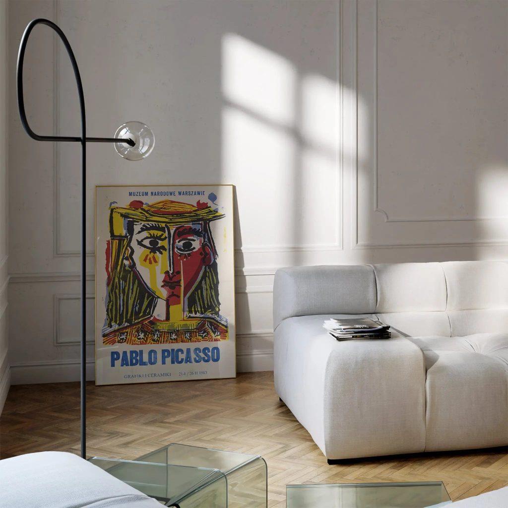
For a gallery wall, you want prints that can shine on their own but also complement each other beautifully. Exhibition posters are perfect for this because they’re designed to convey a message clearly. A strong composition, a unique color palette, a recognizable style—these traits make it easy to group them together without creating a cluttered look.
Mixing scales works well. A large anchor print in the centre or at one end, surrounded by smaller prints, gives the wall a natural focal point. Sticking to the same size throughout is a clean look too, especially in a more minimal interior where you want the arrangement itself to make the statement.
If you are not sure where to begin, browsing a curated art exhibition poster collection is a good way to get a feel for what is available and start spotting the pieces that keep catching your eye.
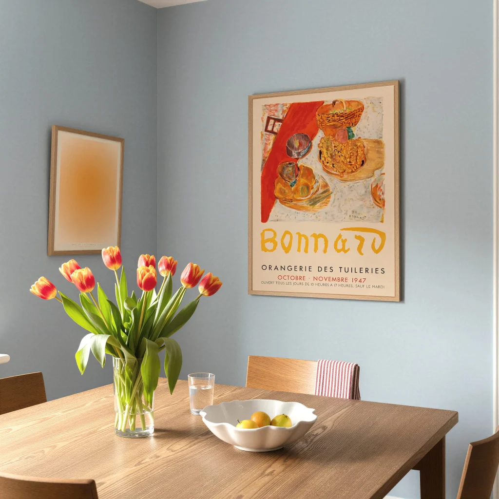
Framing for Consistency
Frames are the magic ingredient that brings a gallery wall to life. Even if your prints hail from different times and styles, sticking to the same frame can create a cohesive look that transforms your collection from a random mix into a thoughtfully curated display.
Black frames are incredibly versatile and can complement nearly any interior design. If your space leans towards a lighter, Scandinavian vibe, natural wood or white frames are a great choice. On the other hand, if your home has a warmer or more eclectic feel, you might want to opt for a sleek brass or dark wood frame.
One thing to steer clear of is mixing too many different frame styles. A couple of variations can add some character, but too many can make the wall feel chaotic. When in doubt, choose one frame style and use it consistently throughout your arrangement.
Planning the Layout Before You Hang Anything
This approach can save you from making unnecessary holes in the wall. Before you grab the hammer, try laying your prints out on the floor to mimic the size and shape of the wall space you’re working with. Rearrange them until the layout feels just right. Snap a photo for reference when you’re ready to move to the wall.
A handy tip is to create paper templates that match the size of each framed print and use masking tape to stick them to the wall. This way, you can play around with spacing and positioning without any commitment. Spend a few minutes getting this right, and you’ll find that the actual hanging process is much quicker and less stressful.
Aim for consistent gaps between each print—about five to eight centimeters usually works well for most setups. Too much space can make the pieces feel disconnected, while too little can make the wall feel cramped.
Where in The Home Does This Work Best
A gallery wall featuring exhibition posters can fit beautifully in almost any room, but some spots really shine. The classic choice is a living room wall behind the sofa, and for good reason. It’s a large area that benefits from some visual flair, and it’s where people tend to focus when they’re seated.
A hallway is another excellent option. It is often an underused space and a run of exhibition posters along a longer wall makes a strong first impression when you walk into a home. Staircases work well too for the same reason.
Bedrooms are worth considering as well. A more intimate grouping of two or three prints above a bed can feel just as considered as a large living room arrangement, with a quieter and more personal quality to it.
Whatever room you are working with, the most important thing is that the prints mean something to you. A gallery wall built around art you actually care about will always look better than one put together just to fill a space. If you want to explore a broad range of options before committing, Poster Room brings together prints across styles and periods in one place, which makes it easier to find pieces that genuinely speak to you.