Principles of Design Unity: How to Create Harmony in Any Design

Some rooms feel right the moment you walk in. Others feel off, even when every piece looks fine on its own. The reason is almost always the same thing: unity.
Unity is the design principle that connects separate parts into one cohesive whole. It does not mean every color or texture has to match. It means the parts feel like they belong together, even with variety between them.
This post covers what unity means in design, the five core principles that create it, how Gestalt theory supports it, and practical steps to apply it in your own space or project.
What Are the Principles of Design Unity?
The principles of design unity are the guidelines that make every element in a composition feel connected. When a design has unity, you see the whole before you notice any single part.
Designers use unity across almost every visual field. That includes interior design, graphic design, architecture, fine art, UI design, and web design. In each field, unity gives the viewer a sense that nothing is out of place, even in a design with a wide mix of colors, textures, or shapes.
Unity is closely related to other design principles. It works hand in hand with harmony in interior design, which focuses on how well the connected elements work together. A design can have unity without perfect harmony, but strong harmony nearly always depends on unity underneath it.
Why Does Unity Matter?
Unity is not just about looks. It changes how people process and respond to a design.
The practical benefits include:
- Creates visual balance and organization
- Makes designs easier to understand at a glance
- Improves readability in both print and digital layouts
- Creates a stronger emotional impact
- Stops a design from feeling scattered or confusing
How Gestalt Theory Explains Unity in Design
Before looking at the five principles, it helps to understand why unity works at all. The answer comes from Gestalt theory.
According to Gestalt theory, a framework developed by German psychologists Max Wertheimer, Kurt Koffka, and Wolfgang Köhler in the 1920s, the brain naturally looks for a whole rather than a collection of separate parts. It groups elements automatically based on shared traits.
Four Gestalt principles shape how people read unity in any design:
- Similarity: Elements that share a color, shape, or style appear grouped.
- Proximity: Elements placed close together read as related, even if they look different.
- Continuity: The eye follows lines and curves naturally from one element to the next.
- Closure: The brain fills in gaps and completes incomplete shapes, making the design feel whole.
When a design supports these instincts, it feels natural. When it works against them, it feels confusing or incomplete.
The 5 Core Principles That Create Design Unity

These five principles appear across every design field. Understanding them gives you a repeatable way to build unity into any project.
1. Repetition Creates Connection
Repetition is the most direct way to create unity. When the same color, shape, font, or material appears more than once, the eye groups those instances together.
Common ways to use repetition include:
- Repeating a single color across furniture, accessories, and textiles
- Using the same font family across all headings
- Repeating a shape (such as a circle or arch) in frames, mirrors, and cushions
- Matching materials across a space, such as the same wood tone in flooring and shelving
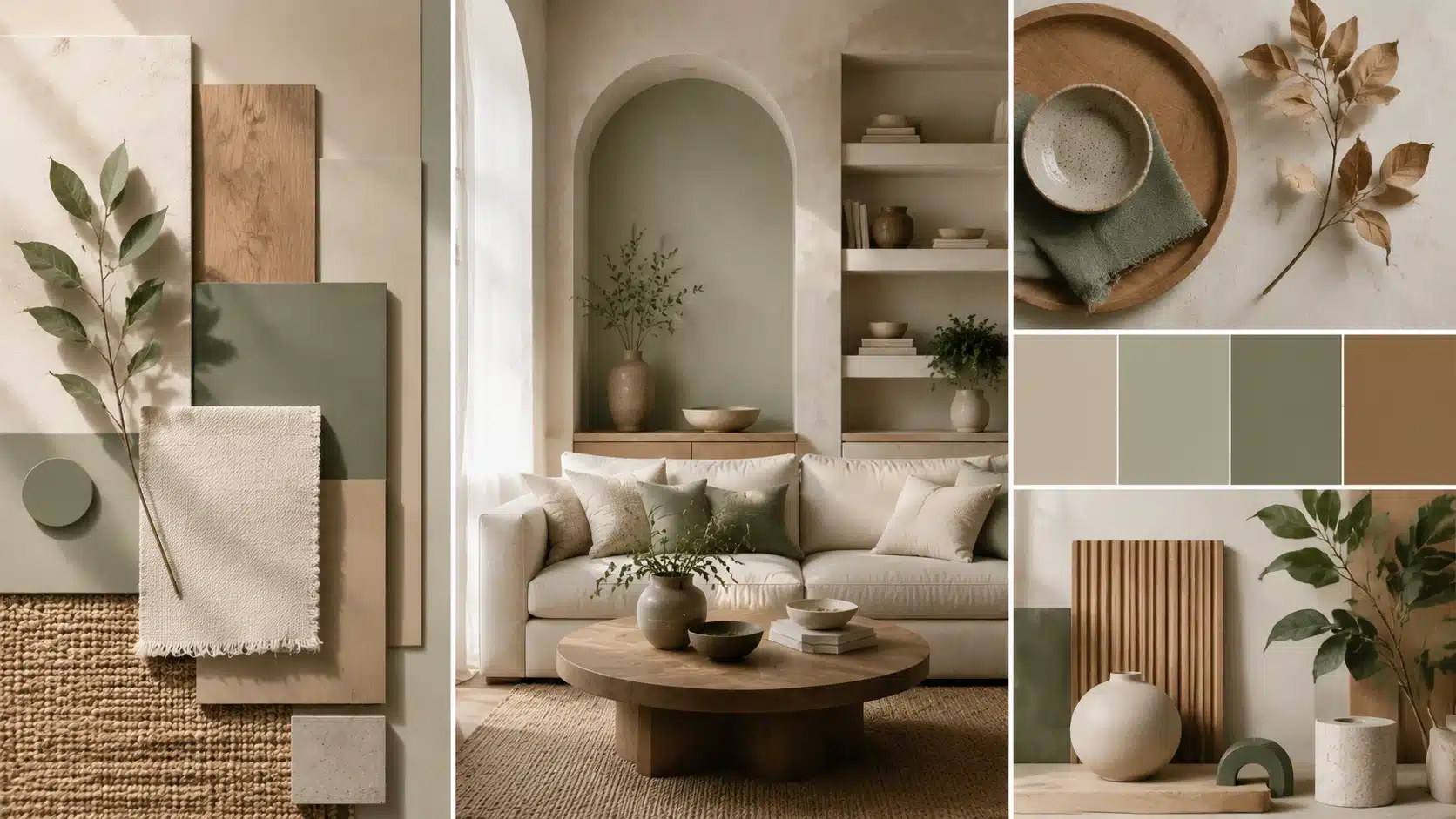
Example: A living room with the same wood tone on the floor, coffee table, and shelving instantly feels put together. Change one of those tones and the space feels less settled.
2. Proximity Helps Related Elements Feel Connected
Proximity is about physical closeness. When related items sit near each other, the brain reads them as a group, even if they look different from one another.
You can see proximity at work in:
- Furniture groupings in a room
- Sections of a website that are organized close together
- Text and images placed near each other on a page
3. Consistency Builds a Recognizable Style
Consistency means sticking to a shared visual language across the whole design. Switching styles halfway through breaks the connection between elements.
This shows up as:
- Matching design styles across a space or project
- Consistent typography choices
- Similar finishes and textures are used throughout
4. Alignment Creates Order
Alignment guides the eye along a shared edge or axis. Without it, well-chosen elements still look randomly placed.
Alignment appears in:
- Grid-based layouts
- Symmetrical furniture placement
- Structured page designs with clear columns and margins
5. Balance Supports Visual Harmony
Balance is about how visual weight sits across a design. A well-balanced design feels stable. A poorly balanced one draws your eye to one corner, leaving the rest feeling empty.
There are three main types of balance:
- Symmetrical balance, both sides mirror each other
- Asymmetrical balance: different elements carry equal weight without mirroring
- Radial balance, elements spread outward from a central point
Balance connects closely to how emphasis works in a room. When one element draws the eye more than the others, the surrounding space needs to carry equal visual weight.
See how emphasis shapes a room’s focal point for a practical breakdown.
Design Elements That Build Unity
A handful of core design elements do most of the work in connecting a composition. Each one can be used alone or combined with others for a stronger result.
| Design Element | How It Creates Unity | Practical Example |
|---|---|---|
| Color | Connects areas through a shared palette | Same accent color in cushions, artwork, and a throw |
| Texture | Adds consistency and visual flow | Linen, jute, and woven cotton are used in one room |
| Shape | Repeats recognizable forms | Arched mirrors, arched doorways, curved cushions |
| Space (White Space) | Creates breathing room and reduces clutter | Consistent margins and spacing across a webpage or shelf display |
| Pattern | Builds rhythm and visual connection | A repeated stripe in curtains, rugs, and bedding |
| Material | Creates a consistent visual identity | Brushed brass is used across taps, handles, and light fittings |
None of these elements has to work alone. Most well-unified designs lean on two or three of them at once.
Three Types of Unity in Design

Unity does not always come from appearance. It can be visual, conceptual, or functional, and strong designs often use more than one type at once.
1. Visual Unity
Visual unity comes from how a design looks. It is built through shared color schemes, shapes, textures, and patterns. It is the most immediately obvious type; you see it the moment you look at a room or layout.
2. Conceptual Unity
Conceptual unity comes from a shared idea or theme rather than just appearance. A coastal-themed room that uses ocean-inspired colors and natural materials has conceptual unity, even if the individual pieces look quite different. A brand that consistently reflects a clear mission across its products, packaging, and messaging does the same thing.
3. Functional Unity
Functional unity occurs when elements work together in practice, not just visually. A kitchen layout where the stove, sink, and counter space are arranged for an efficient workflow has functional unity. So does a website where the navigation supports how people actually move through the content.
Unity vs Other Design Principles
| Comparison | Key Difference |
|---|---|
| Unity vs Harmony | Unity = elements feel connected as a group. Harmony = how pleasant that connection feels. A design can have unity but poor harmony if the colors work together structurally yet feel unpleasant. |
| Unity vs Balance | Unity = elements belong together. Balance = visual weight is distributed evenly. A balanced design can still feel disjointed if the elements are unrelated. |
| Unity vs Consistency | Consistency = repeated patterns and rules (buttons always look the same). Unity = the whole composition feels cohesive. Consistent elements don’t guarantee a unified overall design. |
| Unity vs Variety | Unity = cohesion. Variety = visual interest. Too much unity feels predictable. Too much variety feels chaotic. Good design balances both. |
How to Apply Unity in Your Own Design Projects

Understanding the theory is one thing, but putting it into practice is what actually improves your work. Here’s a simple process to follow.
Step 1: Choose a Clear Design Theme
Decide on the mood, style, or purpose of the project before you start choosing individual elements.
This is often the first real step toward applying the principles of design unity to your own work, since it gives you a filter to test every future decision against, from color choices to furniture shapes.
Step 2: Create a Consistent Color Palette
Pick primary, secondary, and accent colors, and stick to them throughout the project.
Limiting yourself to a small, defined color palette makes it much easier to keep every room, page, or asset feeling connected.
Step 3: Repeat Key Elements
Use similar shapes, textures, patterns, or materials in multiple places so the eye can connect them.
Even repeating just one or two details across a project can make a noticeable difference in how cohesive it feels.
Step 4: Remove Elements That Feel Out of Place
Look at each piece of the design and ask whether it genuinely supports the overall theme.
If it doesn’t, it may be worth removing, even if you like the piece on its own. A design is only as strong as its weakest, most out-of-place element.
Step 5: Add Variety Without Breaking the Theme
Once the foundation is solid, introduce small doses of contrast to keep the design from feeling flat.
A single accent color, an unexpected texture, or one bolder shape is usually enough to add interest without undoing the unity you have built.
Unity Across Different Design Fields

The principles of design unity show up differently depending on the field. The underlying idea stays constant: make the parts feel like they belong together.
1. Unity in Interior Design
Interior designers rely on a repeated color palette across rooms, matched materials (same wood tone or metal finish), and a consistent furniture style. The 60-30-10 color rule is a practical starting point: use your dominant color for 60% of the space, a secondary color for 30%, and an accent for the remaining 10%.
This same principle applies whether you are styling a single room or connecting an open-plan living and dining space.
You can read more about applying these ideas in this breakdown of harmonious interior design principles.
2. Unity in Graphic Design
In graphic design, unity comes from a defined color system, a consistent typographic structure, and repeated layout patterns across all assets.
Two practical rules help here. First, limit your palette to two to three colors per project. Second, stick to a maximum of two fonts, one for headings and one for body text. These constraints ensure consistency and make it easier to maintain unity across large projects.
3. Unity in UI and Web Design
UI and web design rely on design systems to maintain unity across every screen and page. A design system defines typography rules, color tokens, button styles, spacing values, and component layouts. When every part of a digital product pulls from the same system, the whole experience feels connected.
Unity in digital design also reduces cognitive load. When navigation, buttons, and layouts behave consistently, users spend less mental effort figuring out where to go next. That makes the product easier and more satisfying to use.
Unity in Architecture
Architects build unity through repeated structural elements such as columns and window shapes, material consistency across a building’s exterior, and a clear relationship between a building and its surroundings.
Real-World Examples of the Unity Principle in Design
Seeing the principle in real brands and spaces makes it easier to apply in your own work.
- Apple: A minimal color palette, consistent spacing, and uniform product photography across all pages and campaigns. Remove any single element and the brand identity stays clear.
- Spotify: Repeated card layouts, the same brand color palette, and consistent navigation patterns across the app, the website, and printed campaigns. The visual language is instantly recognizable anywhere it appears.
- IKEA: Consistent Scandinavian style, repeated product photography angles, and a unified grid system across every catalog and store display.
- Coca-Cola: The same red-and-white color scheme, consistent script typography, and a unified bottle silhouette have been used across all media for over a century.
Design Unity Checklist
Run through these questions before finishing any project.
- Do all elements support the same theme?
- Is there a consistent color or material connection throughout?
- Are repeated elements used intentionally, not just by accident?
- Does anything feel visually disconnected from the rest?
- Is there enough variety to keep the design interesting?
- Would a first-time viewer understand the design without explanation?
- Does the design still feel balanced if you remove one element?
If you can answer yes to most of these, your design likely reflects the principles of design unity in a practical way.
Final Thoughts
Unity is what turns a collection of colors, shapes, and materials into a single, cohesive design. It is built through repetition, proximity, consistency, alignment, and balance, and it works best when paired with just enough variety to stay interesting.
Whether you are decorating a room, designing a brand, or laying out a webpage, the same idea holds: start with a clear theme, repeat what supports it, and remove anything that doesn’t belong.
Once you start looking for unity, you will notice it everywhere, and you will find it a lot easier to build into your own work too.
Frequently Asked Questions
What Are the Principles of Unity in Design?
The core principles are repetition, proximity, consistency, alignment, and balance. Together, they help elements feel connected as one whole.
What Is an Example of Unity in Design?
A living room using the same wood tone across the flooring, furniture, and shelving is a simple example of visual unity in practice.
What Are the Five Ways to Achieve Unity in Design?
Repetition, proximity, consistency, alignment, and balance are the five primary ways designers create unity in any visual composition.
Why Is Unity Important in Art and Design?
Unity helps viewers process a design as a single cohesive idea rather than scattered parts, improving clarity and emotional impact.
What Is the Difference Between Unity and Balance in Design?
Unity is the overall sense that elements belong together, while balance specifically refers to how visual weight is distributed across a design.