Sherwin Williams Iron Ore SW 7069: Before You Paint
Picking the right dark paint can be tricky. Too harsh, and a room feels small or cold. Too light, and it loses impact.
Sherwin-Williams Iron Ore is a soft, near-black with warm charcoal undertones. It works on walls, doors, mantles, and exterior features, adding depth and sophistication without overwhelming a space.
You’ll see how lighting, surfaces, and surrounding colors change its look and how to combine it with other tones for a balanced, inviting space.
What is Sherwin-Williams Iron Ore SW 7069?
Sherwin-Williams Iron Ore (SW 7069) is a soft near-black paint color with subtle charcoal and gray undertones, suitable for both interior and exterior use.
It belongs to the dark neutral color family, carrying warm undertones that prevent it from reading as a flat or harsh black.
While charcoal shades are noticeably lighter and clearly gray, Iron Ore sits just above true black, darker than charcoal but warmer and softer than absolute black.
This balance is what makes Iron Ore a refined and adaptable choice for modern interiors and exteriors alike.
| Property | Details |
|---|---|
| LRV | 6 |
| Color Type | Soft near-black |
| Undertones | Warm charcoal, subtle gray |
| Color Family | Dark neutral |
| Interior/Exterior | Both |
| Mood | Sophisticated, grounded |
| Finish Effect | Glossy: lighter/dynamic, Matte: darker/heavy, Textured: multi-tonal |
How Lighting and Surfaces Affect Iron Ore’s Appearance
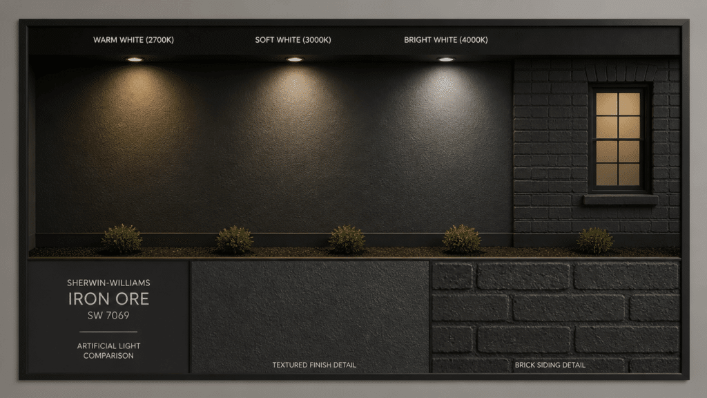
Iron Ore never looks exactly the same twice: its perceived darkness shifts depending on the type of light hitting it and the surface it covers.
Understanding this helps you predict how the color will truly perform in your specific space before you commit.
| Factor | How Iron Ore Looks | What to Expect |
|---|---|---|
| Low or artificial light | Very dark and heavy | Can look close to true black |
| Natural daylight | Softer warm charcoal | Shows more warmth and depth |
| Interior surfaces | Dark charcoal to near-black | Looks warmer near windows and natural light |
| Exterior surfaces | Warm dark charcoal | Sunlight makes it look lighter outdoors |
| Time of day | Shifts through the day | Looks deeper in the morning and dusk, softer at midday |
| Glossy finish | Slightly lighter | Reflects more light and feels less heavy |
| Matte finish | Darker and flatter | Absorbs light and feels deeper |
| Textured surfaces | Multi-tonal charcoal | Brick |
Best Uses for Iron Ore in Home Projects
Iron Ore’s depth and warmth make it one of the most versatile dark neutrals for both interior and exterior home projects.
Whether used as a bold accent or as a full-surface color, it consistently delivers a sophisticated, grounded look across a wide range of applications.
1. Living Room
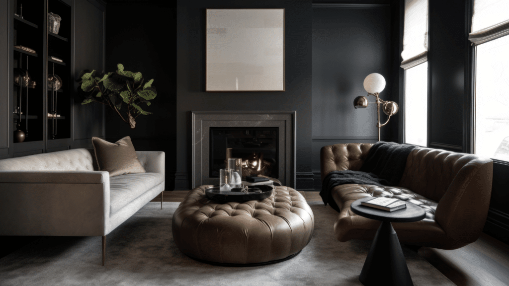
Transform your living room with a touch of bold color. Iron Ore works beautifully on an accent wall, fireplace mantle, or paneling to create a striking focal point.
Pair this deep, rich hue with warm whites or soft greiges. This combination balances the dark tone while keeping the space feeling open and inviting.
2. Bedroom
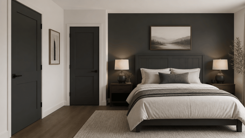
Iron Ore brings a sense of depth and warmth to the bedroom. Use it on interior doors, headboards, or a single accent wall for a cozy, intimate feel.
Balance the dark shade with lighter walls elsewhere. This keeps the room bright while adding sophistication and character.
3. Kitchen
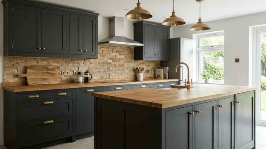
Iron Ore adds a bold, modern touch to the kitchen. Apply it on cabinets or a kitchen island to create a strong, stylish foundation.
Combine with natural wood countertops, warm stone, and brass hardware. This pairing creates a cohesive, welcoming, and timeless kitchen design.
4.Bathroom
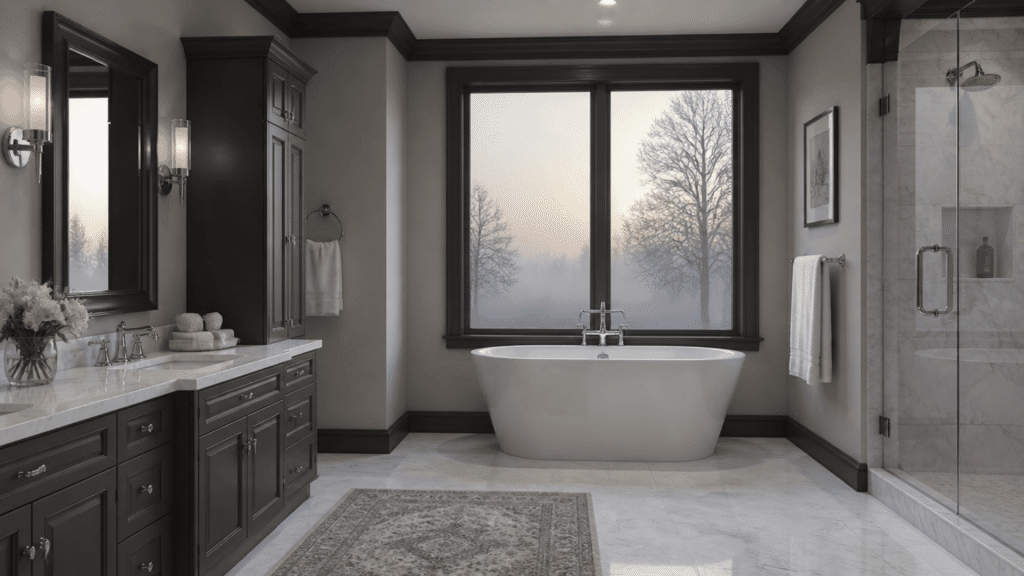
Iron Ore brings a sleek, contemporary touch to the bathroom. Apply it on cabinetry, vanity panels, or trim to create contrast with lighter walls and fixtures.
Keep the dark color limited in small bathrooms. This ensures the space feels modern and grounded without appearing cramped.
5. Exterior Features
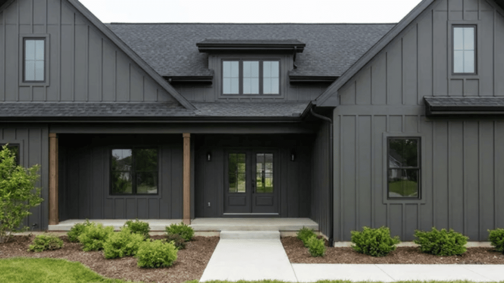
Iron Ore makes a bold statement on exterior features. Use it on siding, trim, or front doors to enhance your home’s curb appeal with a modern, sophisticated look.
Its rich depth adapts beautifully to changing light. This ensures your home looks striking and stylish at any time of day.
6. Mantles and Fireplaces
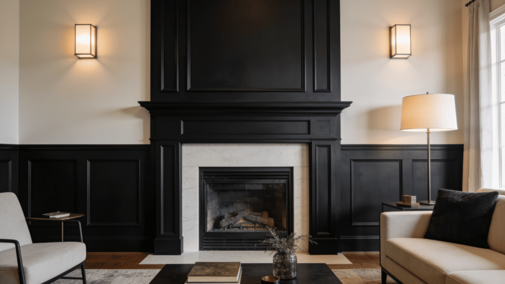
Iron Ore transforms mantles and fireplaces into dramatic focal points. Apply it here rather than on entire walls to highlight these architectural features.
The deep, rich tone naturally draws attention. It adds sophistication and warmth without overwhelming the surrounding space.
What Colors Go With Iron Ore?
Iron Ore’s warm, near-black depth makes it one of the more forgiving dark neutrals to pair with, but get the undertone wrong and even a simple white trim can work against it. The key is matching its warmth, not just its darkness.
Crisp whites like High Reflective White or Extra White make Iron Ore read darker and bolder, while Alabaster softens the boundary and reduces perceived heaviness.
Warm wood tones and brass or gold hardware share compatible warmth with Iron Ore, making the overall palette feel intentional and cohesive.
When Iron Ore is the dominant surface, pairings should stay light and warm, but when it is the accent, surrounding neutrals can run slightly deeper without competing.
| Color | LRV / Features | Notes |
|---|---|---|
| High Reflective White | 92 | Bright contrast; trim, ceilings, doors |
| Extra White | 89 | Crisp neutral; walls or accents |
| Alabaster | 82 | Softens contrast; surrounding walls |
| Accessible Beige | 58 | Warm backdrop; prevents muddy undertones |
| Oak / Walnut / Maple | – | Warm wood tones: flooring, cabinets, mantles |
| Brass / Gold | – | Warm metallics; hardware, fixtures |
Comparing Iron Ore with Similar Dark Paint Colors
Not all dark paint colors are the same; subtle differences in undertone, depth, and lighting behavior can make one feel warm and inviting while another feels cold and flat.
Comparing Iron Ore with similar dark shades helps you choose the right color for your specific space, style, and lighting conditions.
| Color | Undertone | LRV | Best For | Choose When |
|---|---|---|---|---|
| Iron Ore SW 7069 | Warm charcoal | 6 | Warmth with near-black depth | You want soft black, not flat black |
| Tricorn Black SW 6258 | Neutral | 3 | Maximum contrast | You want true black with no warmth |
| Wrought Iron BM 2124-10 | Cool blue-gray | 6 | Modern, industrial spaces | You want near-black with a cool edge |
| Peppercorn SW 7076 | Neutral gray | 10 | Softer dark spaces | You want dark but not near-black |
| Urbane Bronze SW 7048 | Warm brown-gray | 9 | Earthy, organic palettes | You want dark with visible brown warmth |
Conclusion
Sherwin-Williams Iron Ore SW 7069 is a strong choice for a dark paint color that still feels warm and usable. It works well on interior doors, fireplaces, cabinets, accent walls, siding, shutters, and trim.
Because it can shift from soft charcoal to near-black, always test it in your own lighting before painting a full surface.
Pair it with warm whites, wood tones, stone, or brass for a clean and balanced look. Used in the right place, Iron Ore can give a room or exterior a bold finish without making the space feel too sharp or cold.
Share your project results or questions in the comments below!
Frequently asked questions
Does Iron Ore Work Well in a Room with No Natural Light?
Iron Ore in a Windowless Room Will Read Almost Entirely as Flat, Near-Black, with Little Warmth Visible. Compensate with Warm-Toned Bulbs (2700 K–3000 K) and limit them to a single surface rather than to full walls.
Does Iron Ore Work on Kitchen Cabinets?
Iron Ore is a Strong Cabinet Color; Its Warmth Prevents the Harshness that True Blacks can Create Against Countertops and Backsplashes. Pair it with Warm Stone Countertops and Brass Hardware for The Most Cohesive Result.
Can Iron Ore be Used on Ceilings?
Iron Ore on a ceiling creates a dramatic, cocooning effect best suited to dining rooms, home theaters, or spaces where intimacy is the goal. Avoid it on low ceilings; it will visually compress the room significantly.