Have you ever stared at color samples for your outdoor pavers, feeling completely at a loss?
I know that sinking feeling. Picking the wrong paver color can haunt you every time you pull into your driveway or step onto your patio.
But what if selecting the perfect paver color doesn’t have to be so stressful? The right color not only complements your home but also sets the emotional tone for your entire outdoor space.
I’ve helped hundreds of homeowners make this critical decision, and I’ve identified key factors that distinguish lasting choices from fleeting fads.
Read on to learn my practical framework for choosing paver colors that will look just as appealing a decade from now as they do on installation day.
The Psychology of Color: Setting the Mood with Pavers
Color isn’t just about looks; it affects how we feel in a space. When planning your outdoor area, the colors of pavers play a significant role in creating the right mood and atmosphere.
Warm vs. Cool Tones: The Emotional Impact
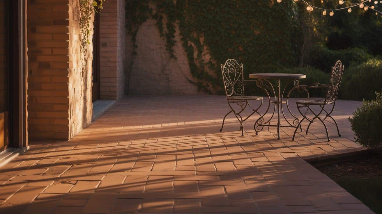
- Warm colors, such as terracotta, rust, and amber, tend to evoke feelings of energy and comfort. I’ve noticed that outdoor spaces with warm-toned pavers naturally become gathering spots.
- They create areas that feel more intimate and inviting, making them perfect for entertainment spaces where you want people to feel both relaxed and stimulated simultaneously.
- Cool colors, such as slate blue, gray, and soft green, have a calming effect. They make spaces feel larger and more open. I’ve found that homeowners seeking a peaceful retreat often gravitate toward these cooler shades. They work beautifully in meditation gardens or around water features where relaxation is the goal.
Color isn't just about looks; it affects how we feel in a space. For a deeper jump into Mastering Mood with Color Palettes, this guide offers valuable insights into how different hues can transform your outdoor environment.
Creating Specific Moods With Color Choices
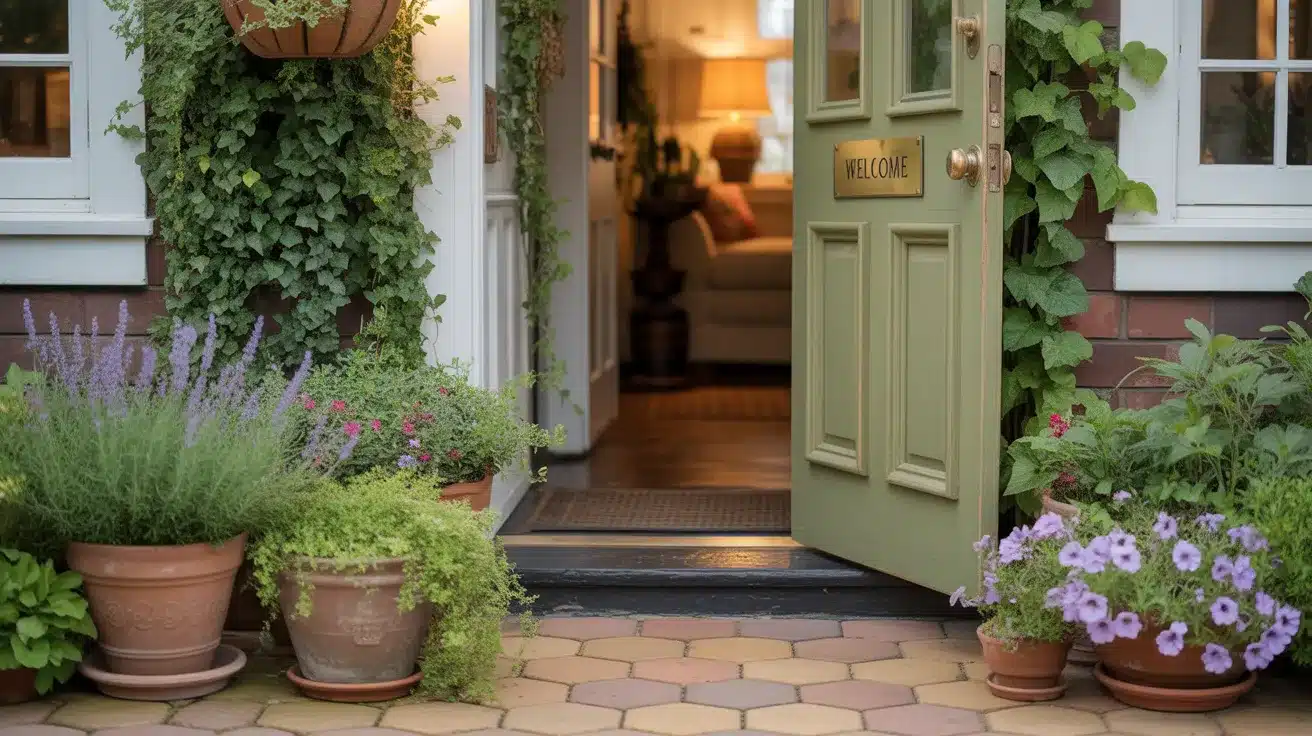
- For an inviting entranceway, rich warm browns and tans create a welcoming feeling that naturally draws people in. One of my clients used a honey-toned sandstone for their front walkway, and visitors always comment on how friendly their home feels from the first step.
- If you’re after a serene, spa-like backyard, light grays with blue undertones work wonders. This palette naturally creates a sense of calm. A recent project I completed used pale bluestone pavers around a pool area, and the homeowner says it’s become their favorite spot to unwind after work.
- Your color choice should reflect how you plan to use the space and the feelings you want to encourage when people enter that area. The right paver color doesn’t just complement your home—it sets the emotional tone for every outdoor experience.
Match Your Home, Nail the Tone
Your paver choices should tell the same visual story as your home’s architecture. Creating harmony between your hardscaping and home exterior is essential for a polished, intentional look. When pavers clash with your home’s style, the disconnect is immediately noticeable, even if people can’t quite put their finger on why something feels “off.”
Start by identifying the dominant colors in your home’s exterior. Inspect your siding, roofing, stonework, and trim for clues. For homes with brick or stone elements, try to match one of the undertones present in those materials. This creates a subtle connection that feels natural rather than forced. For example, if you have a home with reddish-brown brick, pavers with warm undertones will create a seamless visual flow from house to landscape.
Consider the level of contrast you want to achieve. High-contrast pairings, such as dark pavers against a light-colored home, create drama and definition, while low-contrast choices offer a more subtle and elegant feel. Neither is wrong, and it depends on your style and the architectural statement you want to make.
Daylight Drama: Color Shift Secrets
Natural light significantly alters the appearance of paver colors throughout the day. What appears perfect at noon might look completely different at sunset. This shifting appearance is why considering light conditions is just as important as the color itself.
1. Morning Light Effects
Early morning sun casts a soft, golden glow that warms up all paver colors. Even cool-toned grays and blues take on a slightly warmer appearance during these hours. This gentle light is flattering to most colors but can make very light pavers appear washed out.
Pro Tip: Take photos of your paver samples around 7-9 AM to see how they’ll look during breakfast on your patio or when you’re leaving for work. Morning impressions matter!
2. Midday Sun Impact
Under the harsh midday sun, colors show their truest form but often appear more washed out. Dark pavers absorb heat and can become uncomfortably hot to walk on during summer months. Light-colored pavers reflect more sunlight, keeping your outdoor spaces cooler but sometimes creating glare.
Pro Tip: Test barefoot comfort by placing dark and light samples in direct sun for an hour, then feeling the temperature difference with your hand. This simple test can prevent creating a space that’s too hot to enjoy.
3. Evening Light Transformation
As the sun sets, pavers take on richer, more saturated tones. The low-angle light creates longer shadows that emphasize texture and can make a flat surface appear more dimensional. Warm-toned pavers really shine during this “golden hour,” while cool tones may appear darker than expected.
Pro Tip: If you mainly use your outdoor space for evening entertaining, prioritize how colors look at sunset rather than midday. Place sample pavers in your yard during dinner time to see their true evening personality.
4. Seasonal Light Variations
Remember that sunlight intensity changes with seasons, too. Those perfect summer evening colors might look dull during winter’s shortened days. If you live in an area with distinct seasons, opt for colors that perform well year-round rather than focusing on just one season.
Pro Tip: Check your samples after rainfall to see how they look when wet. Some pavers darken significantly when damp, which can be a preview of how they might appear during rainy seasons.
Color Call: DIY vs. Pro Insight
Choosing paver colors involves balancing personal preference and practical expertise. Here’s a straightforward comparison to help you decide on your approach.
| Aspect | DIY Color Selection | Professional Consultation |
|---|---|---|
| Advantages |
|
|
| Challenges |
|
|
Whether you go solo or seek expert guidance, remember that color choices for pavers are both a design decision and an investment in your home’s character. Take the time to get it right.
Maintenance Matters: Choosing Colors for Longevity
- Dark colors show less dirt and staining but can fade more noticeably over time, especially in areas with intense sun exposure.
- Light-colored pavers hide salt residue and efflorescence (that white chalky deposit) better than dark pavers, making them ideal for pool surrounds and areas where water evaporates frequently.
- Colors with natural variation and texture mask dirt, leaves, and normal wear patterns much better than solid, uniform colors.
- Regional climate affects color longevity – darker pavers fade faster in sunny southern regions, while lighter pavers can show more organic staining in heavily wooded northern areas.
- Avoid extremely saturated colors if longevity is your priority, as they tend to fade the most dramatically over time.
- Blended colors with multiple tones hide stains and maintain their appearance longer than single-color pavers.
- Manufacturer sealing technology matters more than color choice – invest in quality pavers with integrated color protection, regardless of which shade you select.
Conclusion
Choosing the right paver colors is a balancing act between personal style and practical considerations. Throughout this guide, we’ve explored how colors affect mood, complement architecture, interact with sunlight, and withstand the test of time.
Remember that your color selection sets the emotional tone for your outdoor space while also determining how easy it will be to maintain.
Whether you decide to trust your instincts or seek professional guidance, take time to view samples in your actual space at different times of day.
The perfect paver color creates harmony between your home’s architecture and the surrounding outdoor environment, while reflecting your style. Make your selection with both current appeal and long-term satisfaction in mind, and you’ll enjoy your outdoor space for years to come.
Frequently Asked Questions
What Is the Best Pattern for Pavers?
The best paver pattern depends on your space and style. Herringbone offers strength for driveways, while running bond creates clean lines for modern homes.
Do Dark Pavers Get Hot?
Yes, dark pavers get hotter than light-colored ones because they absorb more sunlight. On hot summer days, dark pavers can become uncomfortable to walk on.
Are Pavers Still in Style?
Yes, pavers remain very popular and stylish for outdoor spaces. They offer durability, design flexibility, and add value to homes.