Dark, rich colors can make a home feel small and gloomy this is what many people think.
I understand this worry. When used properly, moody color schemes can turn any room into a warm, inviting space full of character. In this guide, I’ll show you how to work with deeper tones to build rooms that feel both cozy and stylish.
You’ll learn which colors form the base of a moody palette, where these colors work best in your home, and how to mix them with light for balance.
I’ll also share practical color combinations and texture tips to help you avoid common mistakes when working with darker shades.
Why Choose a Moody Color Palette for Your Home?
Darker color schemes bring warmth and comfort to any space. They make large rooms feel more snug and personal while adding depth to smaller areas. These tones create a sense of calm that helps reduce stress after a busy day.
Moody colors make a strong statement about your style. They show confidence and create a lasting impression on guests. These deeper tones also hide marks and stains better than lighter shades, making them practical for busy homes.
Dark walls in living rooms are perfect backdrops for artwork and photos. They make colors pop and help furniture stand out. In bedrooms, these rich tones promote better sleep by blocking light and setting a restful mood.
Kitchens with moody cabinets or walls feel more luxurious and less clinical. When painted in deeper shades, bathrooms become spa-like retreats. Even hallways gain purpose and charm with these colors.
The best part? You can start small. Try an accent wall or dark furniture pieces before fully changing your space.
Key Colors in a Moody Palette
Deep blues are the heart of most moody color schemes. Navy offers a touch of class, while midnight blue brings drama without the harshness of black. These blues pair well with almost any accent color.
Charcoal grays work as solid base colors. They feel less stark than black but still add weight to a room. These grays look great on walls or as main furniture pieces.
Rich green tones bring nature indoors. Forest and pine greens connect your space to the outdoors while adding depth. These greens feel both modern and timeless.
Muted burgundies and wine tones add warmth to cool-toned rooms. They feel mature and refined without being loud or showy. These reds work well in dining rooms and living spaces.
For accent colors, use copper, brass, or gold to add light and shine. Soft pinks and peaches can soften darker tones. Even clean whites have a place in moody rooms; they create contrast and prevent spaces from feeling too dark or closed in.
Mixing in wood tones helps ground these colors and adds natural warmth to your moody palette.
Best Rooms to Use a Moody Color Palette
1. Living Room

Deep, rich colors can truly make your living room shine. Dark walls make furniture and art stand out more clearly. Try navy or dark green on the main walls, and keep the trim lighter for contrast.
This mix creates a space that feels both cozy for movie nights and smart for guests. Add warm lamps rather than bright overhead lights to build a soft glow throughout the room.
2. Bedroom

The bedroom is perfect for dark tones. Deep blues, soft blacks, and dark greens help block out morning light and signal your brain that it’s time to rest.
Paint all walls in your chosen shade for a cocoon-like effect, or just the wall behind your bed for a focal point. Pick bedding in slightly lighter shades of your wall color for a pulled-together look that isn’t too matched.
3. Dining Room

Darker colors work wonders in dining rooms. They create a special feel for meals and talks. Deep reds or browns make food look better and spark hunger.
Since most dining happens in the evening, low light paired with rich colors creates a space that feels both fancy and homey. Since you don’t spend all day there, this room can handle the boldest colors in your home.
To further boost the atmosphere in these rooms, consider incorporating moody accents to complement your color choices and add layers of depth and personality to the space.
How to Balance Moody Colors with Natural Light
- For rooms with little natural light, choose dark colors with warm undertones like brown-blacks instead of blue-blacks.
- Paint trim and doors in bright white to create clean lines against dark walls.
- Use mirrors across from windows to double the natural light in darker rooms.
- Pick light wood floors to contrast with moody walls – oak and maple work well.
- Choose matte or eggshell finishes for dark paint to reduce glare and soften the look.
Moody Color Combinations to Try
1. Navy and Brass

Navy blue walls create a strong base that feels both classic and current. Add brass lighting fixtures, mirror frames, and small items like bowls or trays.
The warm metal tones pop against the cool blue background. For balance, include some cream or off-white in rugs or throw pillows.
This combo works best when navy takes up about 70% of the visual space, brass 15%, and lighter neutrals the rest.
2. Charcoal and Pine Green

Charcoal gray is neutral but still adds depth. Pair it with pine green furniture like a sofa or accent chairs. To warm up this combo, add touches of tan leather in smaller pieces.
For small pops of contrast, add bits of cream or ivory to the pillows or artwork. Keep wood tones medium to dark to maintain the moody feel.
3. Burgundy and Slate Blue
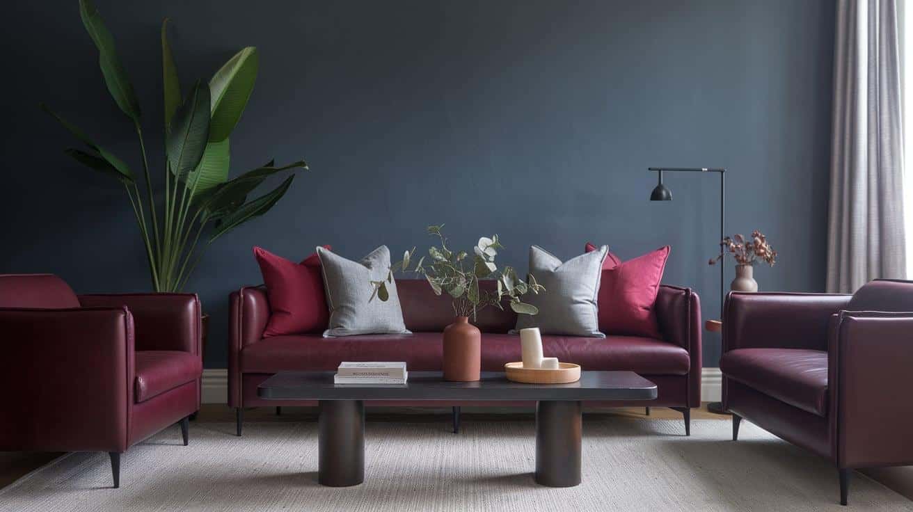
This less common pairing creates rich, layered spaces. Use burgundy for main furniture pieces against slate blue walls. Add small touches of warm browns in wood and leather.
To keep the mood growing, avoid too many patterns. Instead, focus on different textures in the same color family. Light gray or cream accents help break up the intensity.
4. Black and Warm White

For a high-contrast look, pair soft black (with brown undertones) with warm whites (never stark white). Add natural wood elements to soften the contrast.
This classic combo lets you feature interesting shapes and textures without color competition. Small amounts of green plants add life without changing the color story.
Alternate Ideas Needed for a Lighter Mood
- During spring and summer, swap dark pillows and throws for cream, light blue, or soft pink versions. This simple change brightens the room without repainting.
- During warmer months, use white or light-colored slipcovers on furniture to instantly lighten the mood while keeping your dark walls.
- Hang large mirrors across from windows to double the natural light in the room. The reflective quality helps counteract the absorbing nature of dark walls.
- Add metallic accessories in silver, gold, or copper that catch and reflect light throughout the space, creating bright spots against dark backgrounds.
- Install additional lighting fixtures, such as table lamps, floor lamps, or sconces, to create pools of light that balance dark walls and furnishings.
Incorporating Textures and Fabrics to Improve a Moody Palette

| Texture/Fabric | Description | Suggestions |
|---|---|---|
| Velvet | Velvet captures and reflects light, making dark colors look rich and full. It also adds softness to moody rooms, preventing them from feeling cold or hard. | Choose velvet in deep blues, greens, or purples for chairs, sofas, or small pillows and throws. |
| Leather | Leather ages well and gets better over time, making it ideal for moody spaces that tell a story. Creates contrast with rougher textures. | Opt for dark brown or black leather sofas. Leather warms up and becomes more welcoming with use. |
| Dark Woods | Woods like walnut, mahogany, and oak with dark stains bring natural warmth to moody palettes. Wood grain adds subtle patterns without overwhelming the space. | Try wooden side tables, bed frames, shelving units, or smaller accessories like bowls and picture frames. |
| Wool and Knits | Chunky knit throws and wool rugs add tactile comfort to dark rooms. Natural fibers help with room acoustics, reducing echoes. | Layer different wool textures, such as throws and rugs, for added depth while maintaining the color scheme. |
Common Mistakes to Avoid with Moody Colors
- Using dark colors on every surface can make rooms feel smaller and cave-like.
- Choosing cool, dark tones for rooms with little natural light can create a cold, unwelcoming feel.
- Forgetting to include proper lighting – dark rooms need more light sources, not fewer.
- Painting the trim and doors the same dark color as the walls removes visual breaks for the eye.
- Selecting too many different dark colors instead of a focused palette of 2-3 main shades.
Conclusion
Dark colors build homes with depth and feeling. Throughout this guide, we’ve seen how deep tones can turn ordinary rooms into special spaces.
The right mix of dark walls, varied textures, and thoughtful lighting creates rooms that feel both bold and welcoming.
Remember that balance matters most when working with darker shades. Light accents, natural woods, and careful placement help prevent spaces from feeling too heavy or closed in.
Start small if you’re unsure; an accent wall or a few dark furniture pieces will let you test these ideas without full commitment. As you grow more comfortable, you might find yourself drawn to the rich, lived-in feeling that only moody colors provide.
Dark colors aren’t just a style choice; they’re a way to make your home truly yours.
Frequently Asked Questions
1. What Color Paint Does Joanna Gaines Use in Her House?
Joanna Gaines often uses soft, neutral colors like whites, greens, and grays. Her personal favorite is reportedly “Shiplap,” a creamy white from her paint line.
2. What Kind of Countertops Does Joanna Gaines Use?
Joanna Gaines typically uses natural stone countertops like marble and quartz. She also incorporates concrete and butcher block for varied looks in different spaces.
3. What Race Is Joanna from Fixer Upper?
Joanna Gaines has a mixed heritage. Her mother is Korean and her father is half Lebanese and half German, giving her a multicultural background.