Kitchen Counter Decor Ideas for Every Home

You glance at your kitchen counter, and something feels wrong. Not broken. Just off. Maybe it looks bare, or maybe so packed you can barely chop a vegetable.
The good news? A few smart swaps fix that fast.
This post walks you through various ideas for everyday counter styling, picks for every kitchen personality, farmhouse, modern, minimalist, and more, plus a full section on island setups, tight spaces, and styling on a tight budget.
No complicated rules. No expensive hauls. Just honest, real-life suggestions that make your counter work and look good at the same time.
Ready to finally feel good about that strip of space every morning? Happy reading!
What Makes Good Kitchen Counter Decor?
Good kitchen counter decor does more than look nice in a photo. It holds up on a Tuesday morning when you are making coffee before work.
Here is what separates a well-styled counter from one that looks busy:
- Function first: Every item on your counter should earn its place. If you reach for it daily, it stays. If it just sits there collecting dust, it does not belong on the counter.
- Easy to clean around: Counters get messy. Things that are hard to move or have lots of small parts make cleaning a real chore. Group items on trays so you can lift the whole thing with one hand.
- Visual balance: Your eye moves across the counter from one end to the other. If one side is packed and the other is empty, it feels uncomfortable. Spread items out with intention.
- Space left for cooking: A counter with no free space is not really usable. Leave at least two clear feet of prep space near your stove or main work area.
- A look that matches your kitchen: A rustic wooden board looks out of place in a sleek all-white kitchen. Your decor should feel like it belongs, not like it was dropped in from a different room.
23 Best Kitchen Counter Decor Ideas for Everyday Use
These ideas work in real kitchens. Each one adds something to the space, whether that is texture, warmth, color, or a bit of organization, without taking over.
Your counter decor should match the overall feel of your kitchen. Here is how to approach it for the most common styles.
1. Modern Minimalist Kitchen Counter

A modern minimalist counter works on one rule: if it does not have a job, it does not stay.
What to put on it:
- One tray in marble or concrete holding only daily-use items
- A single architectural plant in a cylinder pot
- Matching canisters in one finish, one color
What to avoid:
- Decorative objects with no function
- Mixed materials or finishes
- More than three visible items at any time
2. Rustic Farmhouse Kitchen Counter

A rustic farmhouse counter looks like it has been collecting good things slowly over time. Nothing matches perfectly. Everything feels warm.
What to put on it:
- A large hand-carved wooden dough bowl holding fruit or garlic
- A ceramic crock of utensils with a slightly worn glaze
- Mason jars in different sizes holding dry goods
What to avoid:
- Anything sleek, shiny, or machine-perfect
- Matching sets that look too new
- Chrome or black metal finishes
3. Coastal / Beach Kitchen Counter

A coastal counter feels like someone brought a few things back from a trip to the coast and never put them away. Light, airy, and slightly sun-bleached.
What to put on it:
- A whitewashed or driftwood-finish tray
- A wide glass jar or clear vase holding white sand and a few shells
- A small potted succulent or air plant
What to avoid:
- Dark wood tones
- Heavy ceramic or cast iron pieces
- Busy patterns or bold colors
4. Boho Kitchen Counter

A boho counter layers texture, color, and natural materials in a way that looks collected rather than styled. It should feel personal and slightly unpredictable.
What to put on it:
- A rattan or woven tray as the base
- Terra cotta pots with trailing or leafy plants
- A handmade ceramic bowl in a warm glaze
What to avoid:
- Matching sets
- Anything in chrome or high gloss
- Plain white or grey without texture
5. Scandinavian Kitchen Counter

Scandinavian style is not the same as minimalist. It is warm minimalism. Clean surfaces, with natural wood, soft textures, and a quiet coziness that pure minimalism often lacks.
What to put on it:
- A light birch or pale ash wood tray
- A simple white ceramic mug holder or crock
- One small potted plant in a plain pot, a small fern or eucalyptus
What to avoid:
- Ornate or decorative objects
- Bright colors
- Plastic or synthetic materials of any kind
6. Industrial Kitchen Counter

An industrial counter leans into raw materials and utility. Concrete, dark metal, exposed brick, and worn wood surfaces all suit this style. Nothing is there to look pretty. Everything looks like it means business.
What to put on it:
- A matte black or gunmetal tray
- A raw concrete or cast-iron utensil holder
- A dark glass bottle for olive oil
What to avoid:
- Anything soft, floral, or delicate
- Light wood or rattan
- White or pastel ceramics
7. Mediterranean Kitchen Counter

A Mediterranean counter is warm, generous, and food-forward. It looks like someone is always about to cook a large meal. Deep blues, warm terracotta, sun-faded whites, and natural textures all belong here.
What to put on it:
- A wide ceramic bowl in cobalt blue or a hand-painted pattern holding lemons or figs
- A large olive oil bottle in dark glass or ceramic with a pour spout
- A bunch of fresh or dried herbs tied with twine
What to avoid:
- Sparse arrangements
- Cold modern finishes
- Anything that does not suggest food or cooking
8. Cottagecore Kitchen Counter

A cottagecore counter looks like it belongs in a small stone cottage surrounded by a garden. Floral, soft, slightly wild, and full of things that came from nature or feel like they did.
What to put on it:
- A ceramic pitcher holding fresh wildflowers or garden stems
- A small wicker basket holding eggs or small fruits
- A glass jar of homemade jam with a fabric lid tied with twine
What to avoid:
- Anything modern or sleek
- Uniform matching sets
- Dark or industrial materials
9. French Country Kitchen Counter

A French country counter is refined but relaxed. It has more than a minimalist counter, but everything sits with quiet confidence. Think aged copper, soft cream, deep blue, and natural linen.
What to put on it:
- A copper or brass pot used as a utensil holder
- A wide ceramic bowl in soft cream or Provencal blue, holding fruit
- A tall glass jar of dried lavender
What to avoid:
- Anything too rustic or rough
- Modern finishes like matte black or chrome
- Plastic of any kind
10. Coffee Lover’s Counter

A coffee station counter is one of the most popular themed counter setups,s and for good reason. When everything you need for your morning routine lives in one dedicated corner, the whole kitchen runs better.
What to put on it:
- A quality espresso machine or pour-over setup as the anchor
- A small tray holding everything else
- A clear glass jar of whole coffee beans
What to avoid:
- Spreading coffee items across different parts of the counter
- Keeping pods or packets loose on the surface
- Mixing the coffee zone with other counter functions
11. Plant Parent Kitchen Counter

A plant parent counter turns the kitchen surface into a living space. The plants are not decorative accents here. They are the main feature, re and everything else works around them.
What to put on it:
- A trailing pothos or ivy in a hanging pot or elevated on a small stand
- A cluster of three herb pots in terracotta near the window
- One larger statement plant, like a monstera or fiddle leaf, in a floor pot nearby
What to avoid:
- Synthetic or faux plants
- Too many pots of the same size and shape
- Plants that need low light should be placed away from the window
12. Baker’s Counter

A baker’s counter is set up for someone who actually bakes. It is not styled around baking. It is organized around it. The items on the surface are there because they get used regularly, not because they look good in a flat lay.
What to put on it:
- A large ceramic or glass canister set holding flour, sugar, and baking soda
- A ceramic utensil crock holding wooden spoons, a whisk, and a spatula
- A kitchen scale in white or stainless steel
What to avoid:
- Items unrelated to baking
- Overcrowding the prep surface
- Decorative pieces that get in the way of working
13. Wine and Entertaining Counter

An entertaining counter is set up for the moments when people gather in the kitchen. It works as a drinks station, a serving area, and a styled surface all at once.
What to put on it:
- A slim wine rack or two bottles of wine displayed upright
- A set of wine glasses stored upside down on a small rack or hung from a ceiling mount
- A marble or slate serving board as the surface anchor
What to avoid:
- Plastic items of any kind
- Mixing everyday kitchen clutter with the entertaining zone
- Overcrowding the board with too many objects
14. Bookshelf Cook’s Counter

A bookshelf cook’s counter is styled around someone who treats cooking as a genuine interest. Recipes are not searched on a phone. They are pulled from a real book, marked with a folded page, and propped open while cooking.
What works here:
- Two or three cookbooks stacked flat with a fourth propped open on a stand
- A small notebook with a pen for jotting down modifications and notes
- A ceramic mug holding pens and a small ruler nearby
What to avoid:
- Too many books crowd the prep space
- Books placed purely for their cover color, with no relation to cooking
- A pristine, never-opened look
15. Vintage Collector’s Counter

A vintage collector’s counter looks like someone who has been gathering interesting objects for years and finally found them a home. Nothing was bought as a set. Everything has a story, or at least appears to.
What to put on it:
- A vintage enamel canister or bread box with original lettering
- An old ceramic mixing bowl used as a fruit bowl
- A glass milk bottle or vintage jar holding fresh stems
What to avoid:
- Anything that looks too new or too perfect
- Matching modern sets
- Overcrowding with too many vintage finds at once
16. Spice Lover’s Counter

A spice lover’s counter is built around the collection. If you cook with a wide range of spices daily, keeping them all in a cabinet means you will use them less often.
Bringing them out in an organized, good-looking way means they become part of the kitchen’s character.
What to put on it:
- A tiered wooden or metal spice rack holding labeled jars of a consistent size
- A small tray grouping the most-used spices near the stove
- Uniform glass spice jars with simple black labels throughout
What to avoid:
- Mixed jar sizes and shapes that make the rack look messy
- Storing spices in direct sunlight, which fades their potency
- Overcrowding the rack so jars cannot be read easily
17. All White Kitchen Counter

An all-white counter is not empty. It is controlled. Every object is white or very close to it, so the surface reads as a single, continuous, clean plane. The interest comes from texture and shape rather than color.
What to put on it:
- White ceramic canisters in varying heights
- A white marble or white stone tray
- A single white ceramic vase with white or cream stems
What to avoid:
- Any strong color, even in small amounts
- Natural wood tones, which read as a contrast here
- Metallic finishes other than brushed chrome or soft silver
18. Sage Green Counter

Sage green is one of those colors that makes a kitchen feel immediately calmer. It sits somewhere between grey and green, warm enough to feel inviting, cool enough to feel fresh. It does not compete with food, natural wood, or white ceramics. It just makes everything around it look better.
What works here:
- Cream or off-white ceramic canisters with brass or cork lids
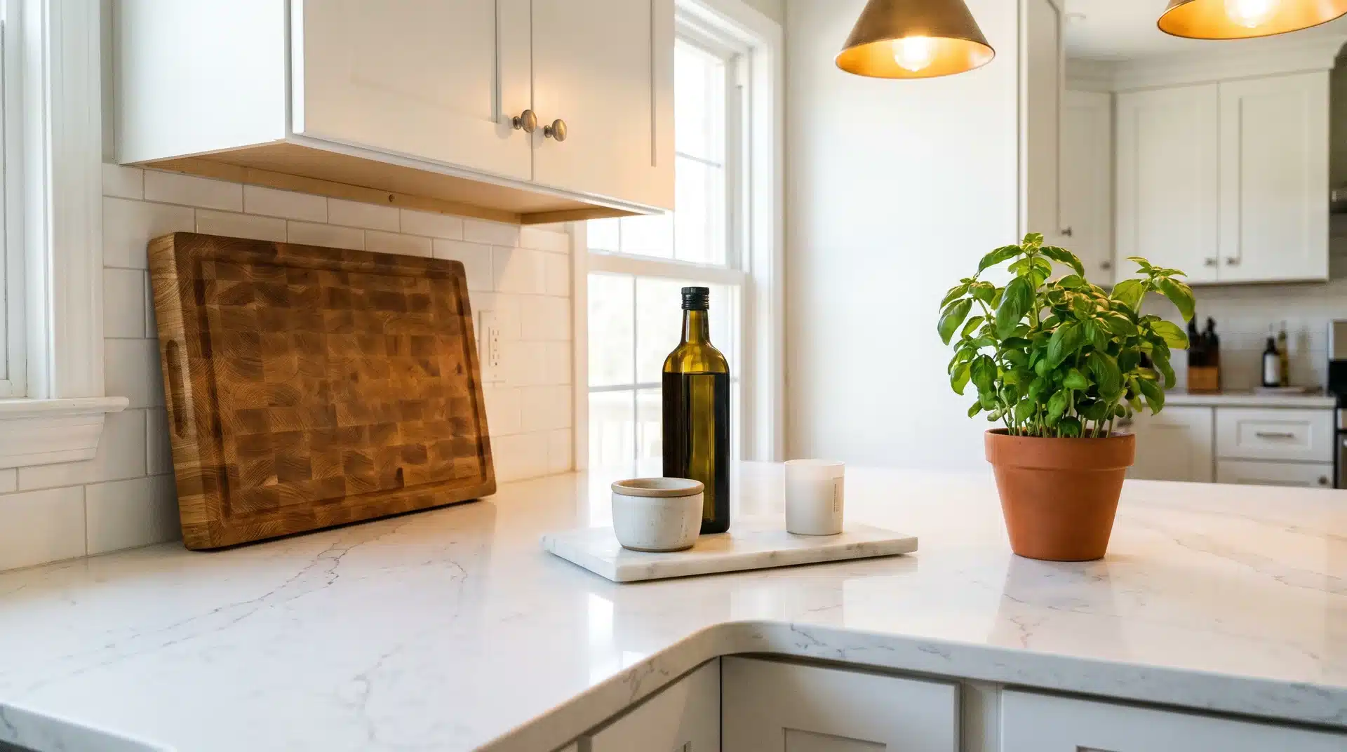
- A warm honey wood cutting board propped against the backsplash
- A terracotta or cream ceramic utensil croc
What to avoid:
- Cool white or grey accessories that pull the warmth out of sage
- Chrome finishes that fight the organic quality of the color
- Bold or bright accent colors that overpower the subtlety of sage
19. Terracotta and Cream Counter

Terracotta and cream are among the most sought-after kitchen color combinations right now, and for good reason. The warmth of terracotta against the softness of cream creates a counter that feels both Mediterranean and modern at the same time.
What to put on it:
- A terracotta tray as the anchor
- Cream or off-white ceramic canisters
- A terracotta pot with a trailing or leafy plant
What to avoid:
- Cool, white, which drains the warmth from terracotta
- Black or dark metal, which makes the palette feel heavy
- Too many terracotta pieces, which tip the balance
Small Kitchen Counter Decor Tips
A small kitchen counter is one of the most frustrating design challenges in a home. You want it to look good, but there is almost no room to work with.
Here is what actually helps:
1. Use vertical storage: A tall utensil holder, a wall-mounted magnetic knife strip, or a tiered spice rack all move items up rather than out. This frees up the actual counter surface.
2. Choose compact trays: A small 8×12-inch tray does the same job as a large one. Do not let the tray take over. Its job is to contain a few items, not cover the whole counter.
3. Avoid oversized appliances: A large coffee machine, a big stand mixer, and a full toaster oven on a small counter leave no room for anything else. If you have a small kitchen, appliances need to earn their spot.
4. Use wall shelves where possible: Open shelves above the counter take items off the surface. Cups, mugs, and jars of spices can live above the counter rather than on it.
5. Keep only high-use items out: In a small kitchen, the rule is even stricter. If you do not use it every day, put it in a cabinet. No exceptions.
Conclusion
Your counter does not need a full makeover to look good. A wooden board here, a small plant there, a tray that pulls everything together, that is honestly all it takes.
Start with one idea from this list. Try the tray method, swap out a plastic bottle for a ceramic dispenser, or clear that one corner you have been ignoring for months. Small changes add up faster than you think.
The best kitchen counter decor is the kind that fits your life, not just your feed.
Got five minutes right now? Pick one thing off your counter that does not belong there. That is your starting point.
Frequently Asked Questions
What Countertop Colors Are Considered Outdated?
Beige laminate, solid black granite, and busy multicolor speckled surfaces feel dated. Clean whites, warm creams, and soft greys read as current.
Should a Countertop Be Lighter or Darker than The Floor?
Lighter countertops against darker floors create contrast and visual balance. Most designers recommend going at least two shades apart.
How Do I Decide Where to Put Things in My Kitchen?
Place items closest to where you use them. Coffee maker near the mugs. Knives near the stove. Everything else is in a cabinet.