Colors speak louder than words in the world of design. They set the mood, tell stories, and guide users through experiences.
Among the many color combinations available to designers, the tetradic color scheme stands out for its balance of contrast and harmony.
In this guide, we’ll walk you through everything you need to know about tetradic color schemes—what they are, how to use them, and why they might be perfect for your next project.
What Is a Tetradic Color Scheme?

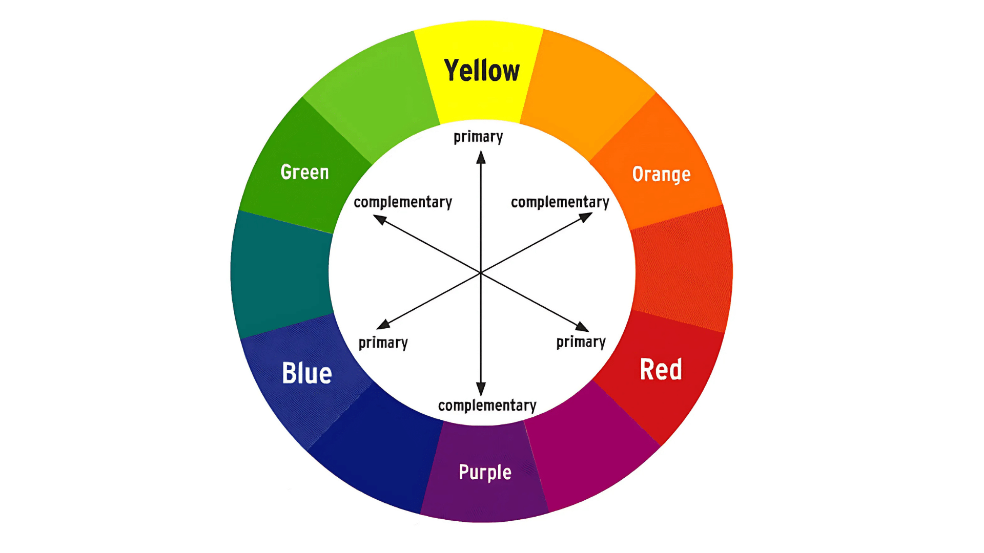
A tetradic color scheme consists of four colors that form a rectangle on the color wheel. It combines two pairs of complementary colors (opposite each other on the wheel). This creates a rich palette with plenty of contrast while maintaining visual balance.
Unlike simpler combinations like analogous or monochromatic schemes, tetradic color schemes offer more creative freedom with four distinct shades to work with. This makes them ideal for complex designs that need visual interest and depth.
The formula is simple: pick a color, then select the shade directly opposite it on the wheel, then shift 90 degrees to find the third color, and finally select the shade opposite the third color to complete the rectangle.
The 3 Core Concepts of Tetradic Color Schemes
1. Understanding the Color Wheel
The color wheel shows how colors relate to each other. Tetradic schemes use four colors that form a rectangle on the wheel – essentially two pairs of colors that sit opposite each other. This creates natural contrast while maintaining visual harmony.
2. Choose the Right Colors
To build a tetradic scheme, pick your first color, find its opposite, move a quarter turn to find the third color, and then add its opposite.
Keep some colors less bright than others – use your boldest color for important elements and softer versions for supporting areas.
3. Balance the Scheme
Use the 60-30-10 rule: 60% main color, 30% secondary color, and 10% for the remaining two colors as small touches.
Pick one color to be dominant and use the others sparingly. Mix warm colors (reds, yellows) and cool colors (blues, greens) to create depth and guide attention.
Why Choose a Tetradic Color Scheme?
Tetradic color schemes offer several advantages:
- Visual richness: With four colors, you have enough variety to create interesting and complex designs.
- Built-in contrast: The complementary pairs provide natural contrast, making elements stand out.
- Versatility: These schemes work well for playful and sophisticated designs, depending on the colors chosen.
- Balance: Despite the contrast, the rectangular arrangement creates a sense of harmony.
8 Popular Tetradic Color Combinations
Tetradic color combinations use four colors that form a rectangle or two pairs of complementary colors on the color wheel. These combinations offer balance and variety for designers who want rich color schemes without losing harmony.
- Navy, Mustard, Coral, Teal: A sophisticated blend that works well for modern corporate brands seeking to appear trustworthy yet forward-thinking.
- Plum, Olive, Peach, Sky Blue: A subtle, muted palette perfect for health and wellness brands wanting to convey comfort and credibility.
- Burgundy, Forest Green, Gold, Navy: A rich, classic combination ideal for luxury brands or academic institutions.
- Salmon, Mint, Lavender, Amber: A soft, welcoming palette suitable for childcare, food, or hospitality businesses.
- Brick Red, Hunter Green, Cobalt Blue, Marigold: A bold, traditional combination that communicates strength and reliability.
- Rose, Slate Blue, Lemon, Sage: A fresh, contemporary palette that balances feminine and masculine elements.
- Chocolate, Turquoise, Rust, Jade: An earthy yet vibrant combination that works well for outdoor or natural product brands.
- Indigo, Copper, Moss Green, Blush: A trendy mix that pairs deep and metallic tones with soft accents for modern design applications.
Real-World Examples of Tetradic Color Schemes
Several successful brands use tetradic color schemes in their visual identities. Google, Microsoft, and NBC are good examples of companies that apply this color method well in their logos and brand materials.

Google’s logo features a tetradic color scheme of blue, red, yellow, and green. Notice how they use these colors across their products with varying emphasis, creating unity while maintaining visual interest.
Microsoft Windows

The Windows logo incorporates a tetradic scheme of blue, red, green, and yellow. Microsoft balances these colors carefully across its interface design, using them to distinguish between different applications and functions.
NBC

The NBC peacock logo is a classic example of a tetradic color scheme, contrasting complementary pairs to create a memorable and distinctive brand mark.
Tools for Creating Tetradic Color Schemes
Several online tools can help you generate and refine tetradic color schemes:
- Adobe Color – Offers various color harmony rules, including tetradic schemes
- Coolers – Provides a simple interface to generate and adjust color palettes
- Color Hunt – Features curated palettes created by designers
- Paletton – Specializes in advanced color scheme generation with fine-tuning options
These tools make it easy to experiment with combinations until you find the perfect tetradic scheme for your project.
Common Mistakes to Avoid
When working with tetradic color schemes, watch out for these common pitfalls:
| Mistake | What to Do Instead | When Not to Use |
|---|---|---|
| Using all four colors equally | Establish a clear color hierarchy. | For minimalist designs or when subtlety is needed. |
| Choosing overly bright colors | Desaturate some colors to avoid competition. | When a more subtle or professional look is required. |
| Forgetting about white space | Use neutral areas to give your design room to breathe. | If your design is already visually complex. |
| Neglecting color psychology | Consider the cultural meanings of colors for your target audience. | When your project’s audience or purpose requires specific color associations. |
| Ignoring context | Match your color selection to your brand’s personality and target audience. | When the design context doesn’t align with bold color contrasts. |
Conclusion
Tetradic color schemes offer a powerful tool for designers seeking a balance between contrast and harmony.
By understanding the principles behind these four-color combinations and applying best practices in their use, you can create visually striking and functionally effective designs.
Remember that color theory provides guidelines, not rigid rules. Feel free to adjust and experiment with your tetradic palette until it perfectly suits your specific project needs.
The most successful designs often come from understanding and adapting the principles creatively.
Have you used tetradic color schemes in your work? What combinations have you found most effective?
Share your experiences in the comments below!