Choosing the perfect paint color can feel overwhelming with endless options at the paint store.
I’ve spent countless hours staring at color swatches, second-guessing my choices, and worrying if the shade will look right in my home.
I’m excited to share my findings about Sherwin Williams’ Porpoise, a versatile neutral that might solve your color dilemmas.
In this post, I’ll explain everything you need to know about this paint color: its basic specs, best applications, ideal color pairings, honest pros and cons, and similar alternatives if you’re still deciding.
By the end, you’ll know if Porpoise is the right choice for your home.
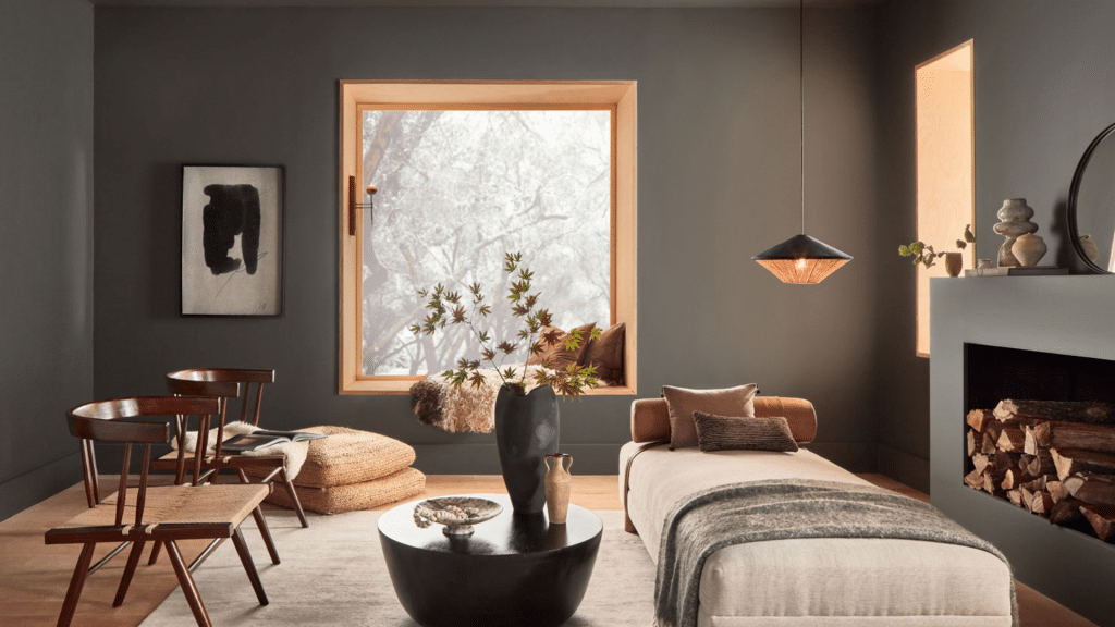
The Sherwin Williams’ Porpoise (SW 7047)
Sherwin Williams’ Porpoise (SW 7047) is a medium-dark neutral with a low Light Reflectance Value (LRV) of 13. This means it absorbs more light than it reflects, creating a rich, deep look on your walls.
What makes Porpoise stand out is its ability to shift between appearing as a warm gray or a subtle brown depending on your lighting conditions and nearby colors. Despite its depth, it maintains a welcoming feel that works in many spaces.The hex code of Sherwin-Williams’ Porpoise is #6b645b
Why Choose SW Porpoise?
Porpoise offers a perfect compromise for those who find black too harsh but want something more substantial than light gray.
Its main appeal lies in its adaptability; it pairs beautifully with various colors while creating a solid foundation for any room or exterior.
Homeowners often select Porpoise when they want a color that feels grounded and calm but not boring. It creates a sense of comfort and stability without overwhelming a space.
I’ve found it’s especially loved by those who want a color that feels current but won’t look dated in a few years.
Porpoise’s Undertones & Warmth
Understanding Porpoise’s undertones helps you use it successfully. With a hue of 34° according to HSL color measurements, Porpoise falls into the warm color family.It contains subtle red undertones that give it a cozy feel compared to cooler grays.
This warmth makes Porpoise shine in north-facing rooms that typically receive cooler light.
The brown undertones become more noticeable in south-facing spaces with warm yellow sunlight.
East-facing rooms will show Porpoise at its most balanced in the morning light, while west-facing rooms bring out its richest tones in the afternoon sun.
The color temperature of your lighting also affects how the Porpoise appears.
Under warmer bulbs (2700K-3000K), it leans more brown, while cooler lighting (4000K+) emphasizes its gray side.
Best Applications of SW Porpoise
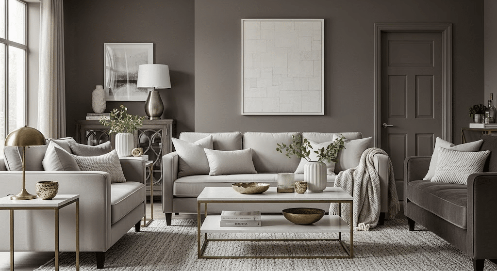
Sherwin-Williams Porpoise, a versatile taupe with warm gray undertones, shines in creating classy, neutral backdrops for modern interiors. Its adaptability makes it ideal for living rooms, bedrooms, or accent walls, effortlessly blending with decor styles.
1. Exterior Uses

Porpoise works wonderfully as an exterior paint color across various home styles, from modern to craftsman to historic. As a main exterior color, it creates a strong presence without feeling too dark or heavy.It pairs beautifully with wood or metal accents, adding texture and visual interest.
Many homeowners use Porpoise for exterior trim and shutters against lighter siding, creating pleasant contrast.
Modern homes can highlight architectural details while maintaining a cohesive look.
2. Interior Applications

Porpoise increases various home spaces with its versatile charm. In living rooms, it fosters a cozy, inviting ambiance, while in kitchens, it complements white cabinets or natural wood tones.
Dining rooms gain beauty without stuffiness, and bedrooms become peaceful retreats. Ideal for home offices, Porpoise promotes focus.
Use it as an accent wall in small or dimly lit spaces for depth without feeling enclosed. Applied to cabinetry, furniture, or doors, it adds visual weight and interest, creating a custom, thoughtful aesthetic when used on built-ins or millwork
SW Porpoise in Different Lighting Conditions
SW Porpoise changes under varying light, appearing as a warm, inviting taupe in natural daylight and a cooler, muted gray in artificial or low-light settings. This quality ensures that it increases the ambiance across various environments.
1. Natural Light Impact

The direction of natural light dramatically changes how Porpoise appears on your walls.Porpoise maintains its gray tones in north-facing rooms but might feel slightly cooler. These spaces receive consistent but less intense light throughout the day, making the color look more uniform.
South-facing rooms bring out Porpoise’s warmth and brown undertones.Strong, direct sunlight intensifies the color, making it appear richer and more defined. A south-facing room is ideal for highlighting the warm aspects of Porpoise.
East-facing spaces show Porpoise at its brightest in the morning when filled with yellow light, gradually shifting to a deeper tone as the day progresses.
West-facing rooms experience the opposite effect – Porpoise looks more subdued in the morning but warms up considerably with the orange-red afternoon sunlight.
2. Artificial Lighting Recommendations
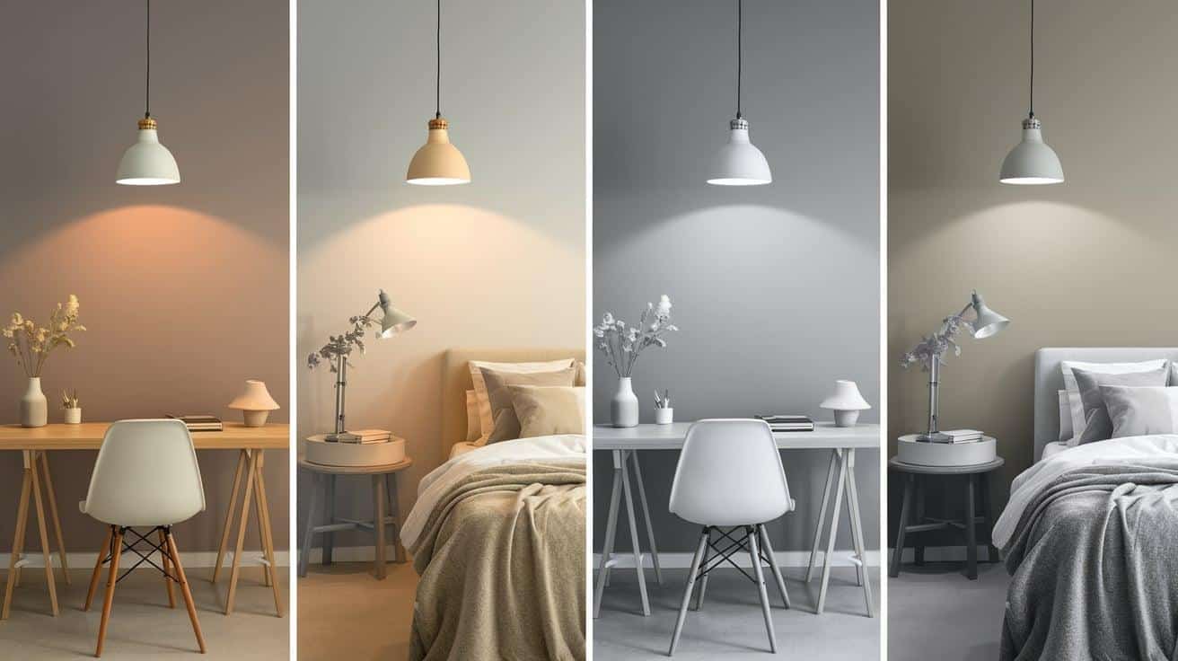
Your choice of artificial lighting significantly impacts how Porpoise presents in your home.Under 2000K-3000K bulbs (warm white/soft white), Porpoise leans into its brown undertones, creating a cozy, intimate feeling perfect for bedrooms and living areas.
With 3500K-4000K lighting (cool white), Porpoise maintains a balanced appearance, showing both its gray and brown aspects.
This lighting works well in kitchens and bathrooms where you want a neutral but warm atmosphere.
Under 5000K+ bulbs (daylight), the color appears cooler and more gray-dominant, which can be helpful in workspaces or areas where you need clear, bright light.
Color Pairings & Complementary Shades
SW Porpoise pairs beautifully with crisp whites, soft creams, or bold jewel tones like navy or emerald for a balanced, beautiful look. Complementary shades like blush pinks or sage greens increase its warm-cool versatility, creating harmonious color schemes.
1. Monochromatic Schemes
For a subtle, layered look, pair Porpoise with lighter and darker shades in the same color family.Lighter options like Sherwin Williams Agreeable Gray contrast gently, while darker options like Sherwin Williams Peppercorn create depth.
This approach creates a cohesive space that feels put together without being boring.
2. Complementary Colors
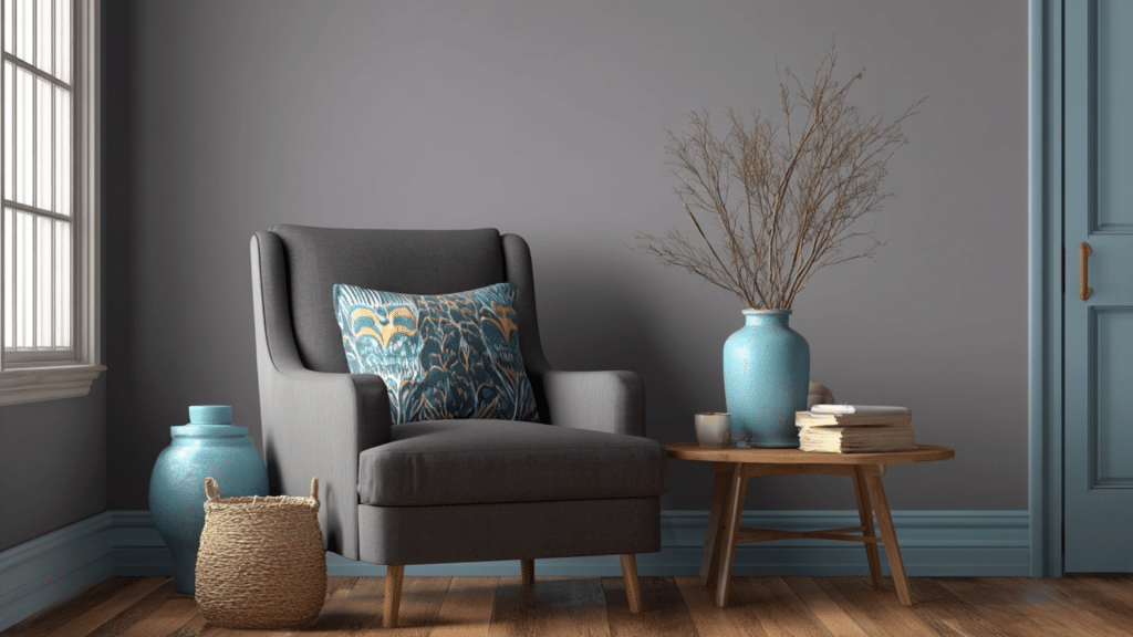
Porpoise works exceptionally well with blues in the Mount Etna and Debonair families, which sit opposite on the color wheel from its orange undertones.These pairings create visual energy while still feeling balanced.
Soft blues with gray undertones provide a pleasant counterpoint for a more relaxed complementary scheme without creating a stark contrast.
3. Contrast Pairings
For high-impact combinations, pair Porpoise with crisp whites like Sherwin Williams Pure White or Alabaster on trim, ceilings, and cabinetry. The contrast highlights architectural features and prevents the space from feeling too dark.
Metallic brass, copper, or bronze accents bring out Porpoise’s warmth, while silver or nickel hardware emphasizes its cooler gray tones.Natural wood tones, particularly medium to light finishes, create a balanced, grounded look alongside Porpoise.
Comparative Analysis: SW Porpoise vs. Alternatives
Compared to alternatives like SW Repose Gray or Benjamin Moore Edgecomb Gray, SW Porpoise offers a richer taupe base with stronger brown undertones. Its unique depth provides a more grounding effect, making it a standout choice for cozy spaces.
1. Sherwin Williams Urbane Bronze
Urbane Bronze is slightly darker than Porpoise, with an LRV of 8 compared to Porpoise’s 13. While both colors have warmth, Urbane Bronze leans more distinctly toward green-brown undertones, giving it an earthy, natural feel.
Where Porpoise maintains versatility across many design styles, Urbane Bronze makes a stronger statement and pairs exceptionally well with natural elements like stone, wood, and plants.
Consider Urbane Bronze when you want something more dramatic and nature-inspired than Porpoise.
2. Sherwin Williams Anonymous

Anonymous is notably lighter than Porpoise, with an LRV of 20. This makes it more reflective and suitable for spaces where depth without darkness is desired.It is a true brown-green-gray blend that shifts significantly based on surrounding colors.
While Porpoise maintains a consistent identity across different lighting, Anonymous is more chameleon-like. Choose Anonymous over Porpoise when you need a lighter touch but still want that neutral versatility.
The Pros & Cons of the Sherwin Williams’ Porpoise (SW 7047)
Porpoise is a choice that brings both comfort and style to various design styles. With its unique blend of gray and brown undertones, it adapts well to different materials, making it an excellent choice for open floor plans.
However, while Porpoise offers numerous benefits, it also comes with certain considerations. The following is a breakdown of the pros and cons of using Porpoise in your space.
| Pros | Cons |
|---|---|
| Versatile and adaptable to various design styles. | It may appear too dark in low-light rooms. |
| Balances gray and brown undertones for a sophisticated feel. | Undertones can vary depending on lighting. |
| Coordinates well with materials like wood, stone, and metal. | It can feel too neutral for those seeking a bold color. |
| Works well in open floor plans and large spaces. | Small spaces may feel constricted when fully painted in Porpoise. |
| Has depth without feeling too dark or closed in. | May show imperfections in wall surfaces more than lighter colors. |
Conclusion
Choosing Sherwin Williams’ Porpoise means embracing a color that balances warmth and depth while remaining adaptable to various spaces.
This timeless paint shade works with many home styles without feeling trendy or dated.
After examining its undertones, lighting effects, and color pairings, it’s clear why Porpoise has earned its place as a favorite neutral.
The color’s ability to shift subtly while maintaining its character makes it special among medium-dark neutrals.
Whether you plan to use it on exterior trim, kitchen cabinets, or as a full wall color, Porpoise offers that rare mix of sophistication and comfort.
For homeowners seeking a color with staying power and flexibility, Porpoise delivers a reliable, attractive solution worth considering for your next painting project.