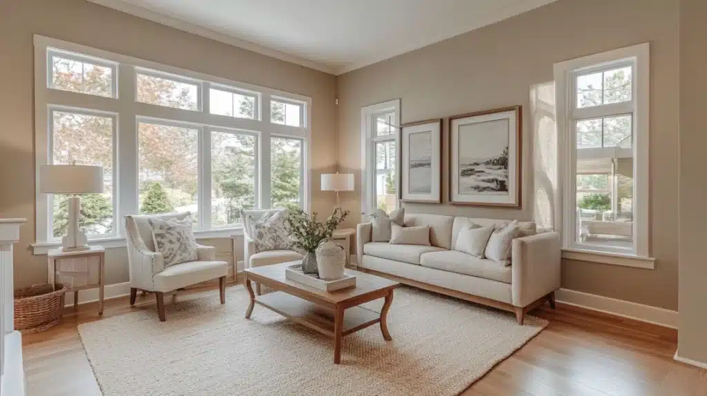
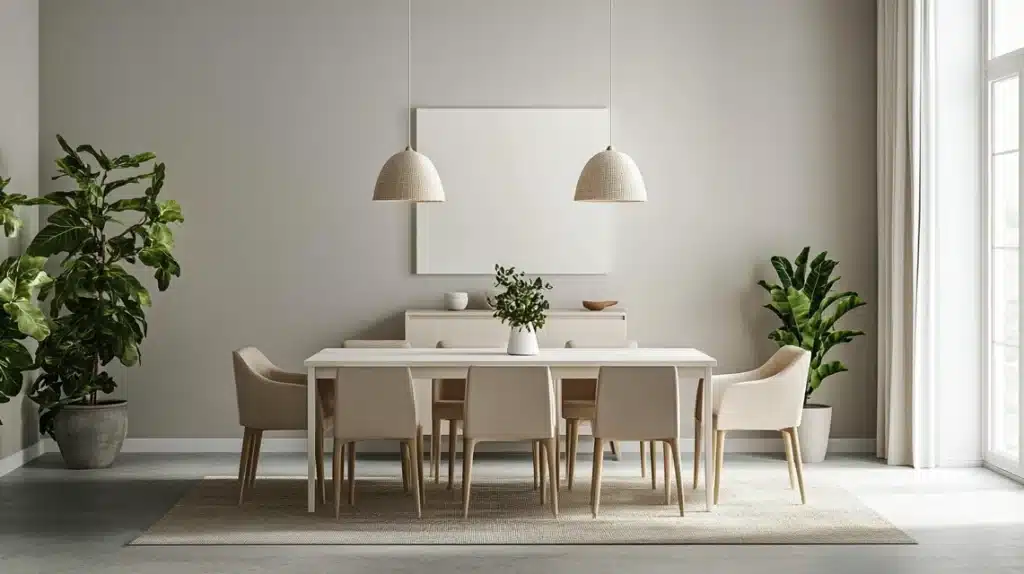
Having spent over eight years testing paint colors in real homes, I keep returning to two favorites: homeowners often ask me about Sherwin Williams Accessible Beige vs. Agreeable Gray.
I’ve watched these colors work magic in hundreds of spaces, from small bathrooms to large living rooms.
After writing about many paint color comparisons and helping clients through my online consulting service, I can tell you that these two shades appear in almost every conversation.
Let me share what I’ve learned about picking between them based on real-world results in actual homes, not just theory.
Understanding the Basics of Accessible Beige
What is Accessible Beige?
Sherwin Williams Accessible Beige is a modern neutral paint color that brings warmth to spaces without being too intense.
This color is more subtle than older beige shades from the early 2000s. It combines a gentle gray tone with an orange base, making it well-balanced and flexible.
It will often not lean too much toward green or pink tones, though the exact appearance can change based on your room’s setup.
LRV (Light Reflectance Value) of Accessible Beige
The Light Reflectance Value (LRV) of Accessible Beige is 58. This number tells us how much light the color sends back into the room.
At 58, it falls in the light range of colors but sits toward the lower end. This means it won’t make your room feel bright and sunny.
Instead, it adds some depth and will create clear differences when paired with white trim.
Key Characteristics of Accessible Beige
This paint color shows its best qualities in well-lit spaces. However, it can look flat and dim in rooms with limited light. Good lighting makes a big difference if you use it in a darker room.
For the best results, use light bulbs with a Kelvin rating of around 3,000, which gives off a comfortable light that works well with this shade.
The color responds differently to various types of natural light:
- In north-facing rooms, it works well if the room is bright, but it might not give as much warmth as you want
- In east/west-facing rooms, it makes a good choice when you want subtle warmth
- The gray undertone balances the room in south-facing rooms, preventing it from feeling too warm even in bright sunlight.
Understanding the Basics of Agreeable Gray
What is Agreeable Gray?
Sherwin Williams Agreeable Gray is a balanced blend of gray and beige tones. While its name suggests a purely gray shade, it offers more complexity.
This paint color includes a mild green undertone that sits so far in the background that most people won’t notice it.
The color works especially well in homes built between 2010 and 2020 that want to move away from cooler gray walls while maintaining a current look.
LRV (Light Reflectance Value) of Agreeable Gray
With an LRV of 60, Agreeable Gray sits in what many experts call the “happy range” (60-70). This number shows it reflects a good amount of light while maintaining enough depth to create interest.
At this level, it works well in most average rooms, making it a reliable choice for homeowners who want a balanced look that’s neither too light nor too heavy.
Key Characteristics of Agreeable Gray
This paint color changes its appearance based on the light it receives:
In natural light:
- North-facing rooms: Keeps some warmth while showing more of its gray side
- South-facing spaces: Maintains balance without getting too warm
- East/west-facing areas: Shifts throughout the day but stays pleasant
Good interior lighting prevents a flat look in rooms with limited natural light.
Using light bulbs with 3,000 Kelvin helps bring out its best qualities. The color shines brightest in spaces with adequate lighting, whether from windows or fixtures.
Comparison Table: Accessible Beige vs. Agreeable Gray
| Feature | Accessible Beige | Agreeable Gray |
|---|---|---|
| Color Family | Beige with gray undertones and an orange base | Greige (gray + beige) with subtle green undertones |
| LRV (Light Reflectance Value) | 58 (Light, but on the lower end of the light range) | 60 (Light, with a slightly brighter feel than Accessible Beige) |
| Undertones | Balanced with gray, hints of warmth from its orange base | Subtle green undertones; leans slightly cooler |
| Ideal Lighting | Works best in bright, south- or west-facing rooms | Versatile; suits north- or south-facing rooms |
| Performance in Low Light | Can appear drab or flat without adequate lighting | It may look dull or dingy in poorly lit rooms |
| Warmth | Warm and muted, it offers subtle comfort | Warmer than traditional grays but cooler than true beiges |
| Room Suitability | Living rooms, bedrooms, or spaces with warm, golden light | Kitchens, bathrooms, or balanced-light spaces |
| Trim Color Pairings | Best with whites like Sherwin Williams Pure White or Alabaster | Best with Benjamin Moore White Dove or Chantilly Lace |
| Challenges | Avoid cream trims; they may feel overly warm in bright spaces | May clash with violet or overly cool finishes |
| Popular Appeal | Modern yet warm; great for transitioning into beige trends | Versatile and crowd-pleasing; great for avoiding stark grays |
Summing Up
Accessible Beige and Agreeable Gray have proven themselves in real homes but work differently in each space.
I’ve seen beautiful rooms go wrong because someone skipped testing samples, ignored lighting changes, or rushed to paint without checking how the color works with their trim.
Good paint choices happen step by step: test patches in multiple spots, check them over 24 hours and trust what you see in your space more than any online photo.
Frequently Asked Questions
Is Accessible Beige Outdated?
No, Accessible Beige remains current as a modern neutral. Unlike beiges from the early 2000s, it includes gray tones that keep it fresh and adaptable.
Which Color is Better for Open Floor Plans?
Both work well, but Agreeable Gray offers more flexibility across different lighting conditions. Its balanced undertones help maintain consistency throughout connected spaces.
Can Accessible Beige and Agreeable Gray be Used Together?
These colors serve different purposes and don’t mix well in the same space. Each one needs its area to show its true qualities.


