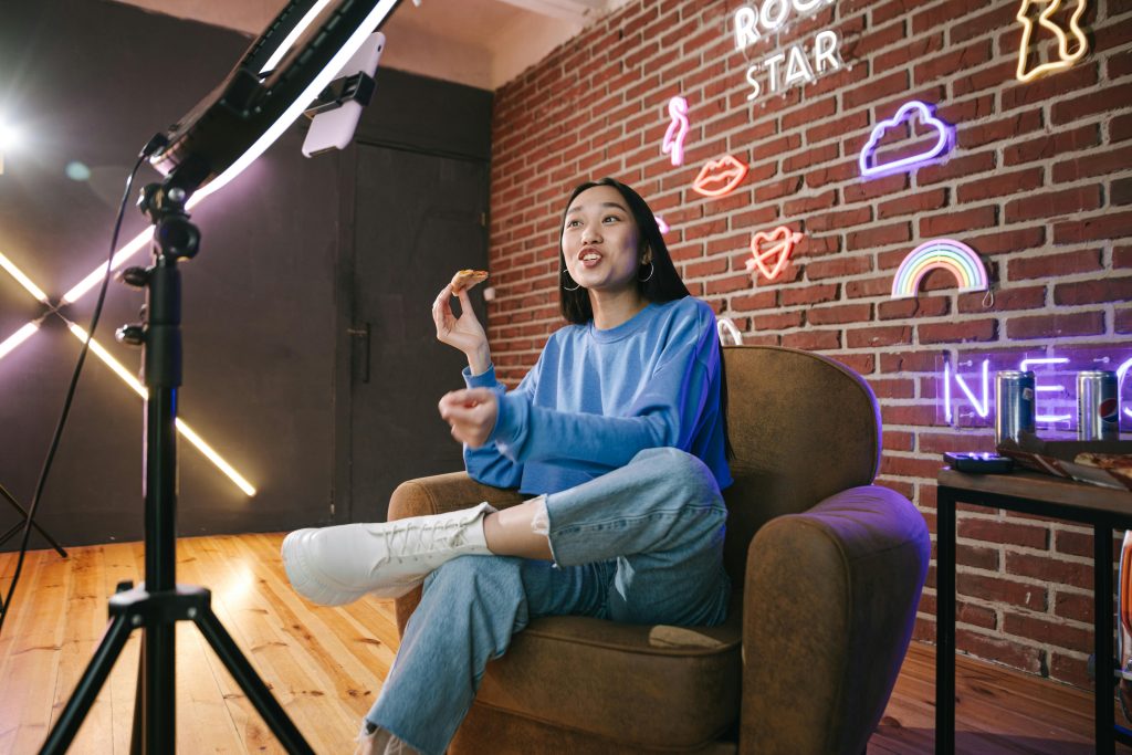
Neon as Atmosphere, Not Decor
Neon has come a long way from flashing shop windows and late-night bars. These days, it’s showing up in cafés, offices, gyms, studios, retail spaces, and even homes. And the best examples aren’t just decorative. They’re intentional.
When used properly, neon signs become part of the atmosphere of a space. It influences how people move, how long they stay, and how they feel while they’re there. That’s a very different role from simply “filling a wall”.
This article looks at how to use neon lighting to shape interior ambience — not as an afterthought, but as a design tool.
Atmosphere Is Felt Before It’s Understood
Walk into any space and you’ll feel something before you consciously notice details. Calm. Energy. Intimacy. Tension. Comfort. That feeling is atmosphere.
Lighting plays a huge role in this, often more than furniture or colour. And neon, with its soft glow and visual clarity, has a unique ability to influence mood without overwhelming it.
Unlike overhead lighting, neon sits within the space. It’s closer to eye level. It lives where people look, not just above them. That alone changes how a room feels.
Moving Beyond “Statement Piece” Thinking
A common mistake is treating neon like wall art. One sign, one wall, one job: look cool.
That approach can work, but it barely scratches the surface of what neon can do.
When neon is only decorative:
- It’s easy to ignore
- It doesn’t affect how the space is used
- It doesn’t guide behaviour
- It rarely changes how long people stay
When neon is used atmospherically, it starts influencing flow, energy, and perception. It becomes functional in a subtle way.
Defining Zones Without Physical Barriers
One of the most effective uses of neon is zone definition.
Open-plan spaces are popular, but they come with a challenge: everything can blur together. Neon can help separate areas without walls or signage.
Examples:
- A soft glow behind a seating area to signal “stay and relax”
- A brighter neon accent near a counter or bar to draw attention
- A subtle sign near a waiting area to create calm
- A directional phrase guiding people toward a feature or space
The brain responds to light instinctively. People move toward it. They linger where it feels comfortable. Neon can quietly suggest what each area of a space is for.
Guiding Movement Through Light
Interior design isn’t just about how a space looks — it’s about how people move through it.
Neon can be used to:
- Draw people deeper into a space
- Highlight pathways
- Pull attention toward focal points
- Reduce awkward dead zones
This is especially useful in:
- Retail stores
- Event spaces
- Gyms or studios
- Hospitality venues
Instead of signs telling people where to go, light shows them. It feels natural, not instructional.
Setting the Emotional Tone of a Room
Different lighting creates different emotional responses. Neon is particularly good at this because it sits somewhere between ambient and accent lighting.
Soft, warm neon tones can make a space feel:
- Relaxed
- Welcoming
- Intimate
- Safe
Brighter or more saturated colours can introduce:
- Energy
- Playfulness
- Creativity
- Momentum
This makes neon especially useful for businesses that want to influence how people feel without saying it outright. A space can feel calm without being boring. Energetic without being chaotic.
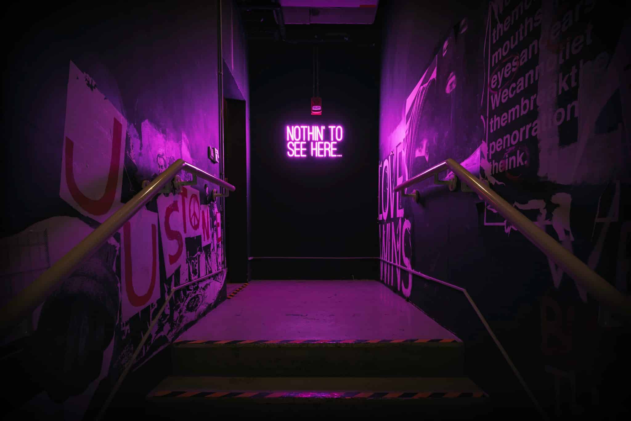
Neon as a Background, Not the Star
The best atmospheric neon doesn’t demand attention. It supports the space rather than dominating it.
Often, this means:
- Mounting neon slightly out of direct focus
- Using indirect reflection off walls or surfaces
- Choosing shorter phrases or symbols
- Letting the glow do more work than the text
When neon becomes part of the background, it subtly shapes the experience. People might not consciously notice it — but they’ll feel its absence if it’s removed.
Layering Light for Depth
Good interiors rarely rely on a single light source. Neon works best when layered with other lighting elements.
Think:
- Overhead lighting for general visibility
- Task lighting where function matters
- Neon for mood and visual rhythm
This layering creates depth. It prevents spaces from feeling flat or harsh. Neon softens edges and adds visual interest without clutter.
In many interiors, it’s the difference between “nicely lit” and “feels right”.
Matching Neon to the Space’s Purpose
Not every neon sign suits every space. And that’s okay.
Atmospheric use depends on alignment with purpose:
- A yoga studio might use gentle, minimal neon to support calm
- A creative agency might use bold neon to reflect energy and ideas
- A café might use warm tones to encourage people to stay longer
- A retail store might use neon to highlight hero products or areas
The goal isn’t to copy what others are doing. It’s to reinforce what your space is meant to feel like.
Subtle Branding Without Visual Noise
Neon can also support branding in a way that doesn’t feel like advertising.
Instead of large logos everywhere, a single well-placed neon element can:
- Reinforce brand tone
- Create recognition
- Appear naturally in photos and videos
- Become part of the space’s identity
Because neon is light, not print, it feels lighter (literally and visually). Branding blends into the environment instead of sitting on top of it.
Creating Rhythm and Flow
In longer or larger spaces, neon can be used rhythmically.
Rather than one sign, think:
- Repeating light elements
- Subtle glows at intervals
- A visual trail that leads the eye
This works particularly well in:
- Corridors
- Large retail floors
- Event venues
- Co-working spaces
It keeps people engaged and oriented without overwhelming them.
Neon and Time Perception
Here’s an interesting effect: lighting can change how long people feel they’ve been somewhere.
Harsh, bright lighting tends to speed people up. Softer, ambient lighting encourages lingering.
Neon, especially when used warmly and indirectly, often increases dwell time. People feel comfortable. They relax. They slow down.
For businesses, that matters:
- Longer stays can mean more spending
- Better experiences lead to stronger memories
- Comfortable spaces invite return visits
This isn’t accidental. It’s design psychology at work.
Avoiding the “Too Much” Trap
One thing neon does not forgive is excess.
Too many signs. Too many colours. Too many messages. Suddenly the space feels noisy, not atmospheric.
Good rules of thumb:
- One strong neon feature per zone
- Keep messages short
- Avoid competing colours
- Let negative space exist
Restraint is what turns neon from novelty into design.
When Neon Replaces Traditional Decor
In some interiors, neon can actually replace other decorative elements.
Instead of:
- Wall art
- Quotes in frames
- Feature paint colours
Neon can serve the same role, but with added depth and warmth. And because it emits light, it changes the space dynamically throughout the day.
Daytime glow feels different from evening glow. The space evolves without changing anything else.
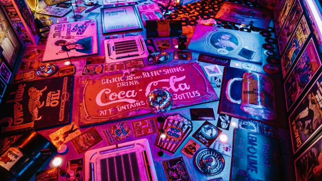
Neon as a Living Design Element
Unlike static decor, neon interacts with:
- Natural light
- Camera exposure
- Movement
- Shadows
That interaction keeps a space feeling alive. It’s part of why neon shows up so often in photos and videos — it reacts.
This makes it especially valuable in spaces where ambience matters more than perfection.
Choosing Meaning Over Message
Atmospheric neon doesn’t need to explain itself.
Sometimes it’s a word.
Sometimes it’s a symbol.
Sometimes it’s just a shape or line.
Meaning comes from placement and context, not length. Over-explaining with neon text usually weakens its effect.
Let the light speak first. People will interpret it emotionally before they read it literally.
A Tool, Not a Trend
Neon is popular right now, yes. But its usefulness isn’t tied to trends.
When integrated thoughtfully, neon becomes part of the architecture of a space. It works quietly, consistently, and over time.
It doesn’t need to be replaced every season. It doesn’t rely on gimmicks. It just… works.
Final Thoughts
Using neon signs to create atmosphere means thinking beyond decoration. It’s about how light shapes movement, emotion, and experience.
When neon is treated as a design tool rather than a novelty, it can:
- Define zones
- Guide flow
- Set tone
- Increase comfort
- Strengthen identity
The most effective neon isn’t always the loudest or the brightest. It’s the one that feels like it belongs — woven into the space so naturally that removing it would change everything.
That’s when neon stops being something you notice… and starts being something you feel.