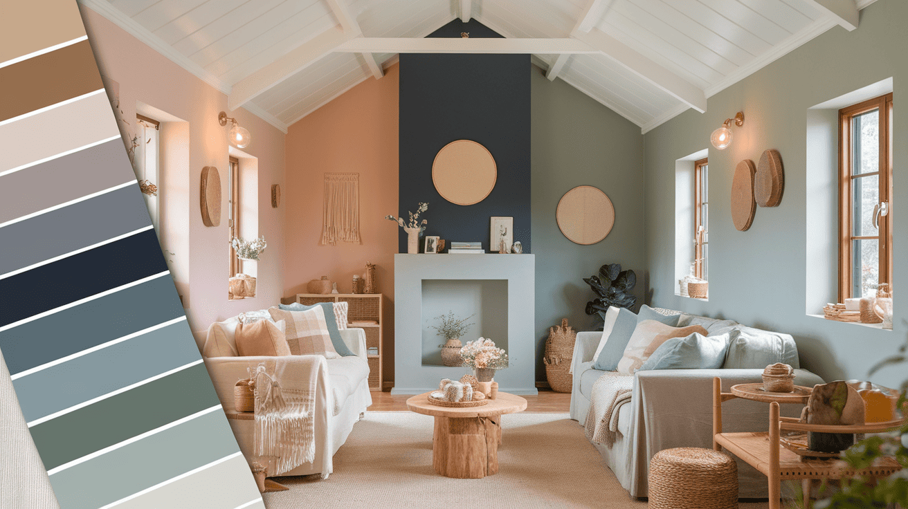
15 Colors for Your Cozy Cottage Interior
Small cottages need the right paint colors to feel warm and open. Most homeowners struggle with picking colors that keep their cottage rooms feeling spacious yet cozy.
When walls are too dark, rooms shrink visually, but when too light, they lose that snug cottage feel we all want.
Good paint colors can help resolve this issue. Choosing the right shades helps small spaces appear larger while maintaining a warm, lived-in cottage charm.
The proper colors create the perfect mood in each room while connecting spaces throughout your home.
This article shares the most effective paint colors for small cottages, along with practical tips for incorporating light, pastel, and rich tones to create a perfect blend of cozy and spacious feel in every room.
15 Perfect Paint Shades to Convert Your Small Cottage Interior
Small cottage spaces require colors that serve double duty, making rooms feel larger while maintaining that warm, inviting cottage charm. These carefully selected paint colors will help you achieve both goals in every room of your home.
Soft Neutrals Shades for Cottage Interior
Warm whites, creams, light grays, and beiges form the backbone of cottage color schemes. These soft tones work well in small cottages because they reflect more light around the room, making tight spaces feel open and breezy.
In small cottage rooms, neutral walls create a blank canvas that lets your furniture and decor stand out. Light colors bounce natural light from windows, making rooms appear larger than they are.
Suggested Colors
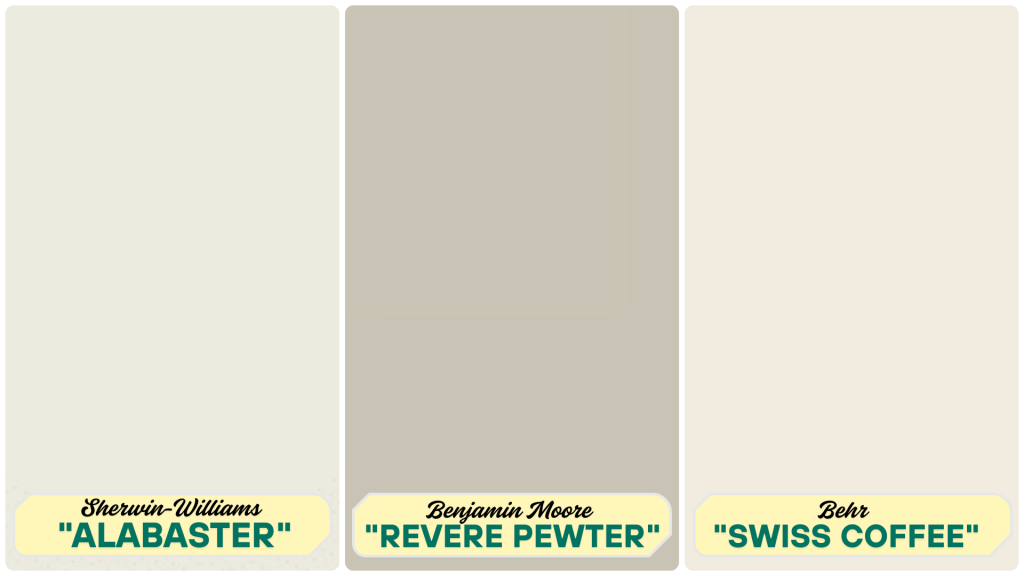
1.Sherwin-Williams “Alabaster” gives a warm white that feels cozy without being stark. This shade works well in living rooms and bedrooms, creating a soft glow when sunlight hits the walls.
2. Benjamin Moore “Revere Pewter”offers a light gray with warm hints that shift with the light. This color sits beautifully in kitchens and hallways, adding subtle depth while keeping spaces feeling open.
3. Behr’s “Swiss Coffee” presents a creamy, off-white shade that feels like fresh-baked goods. It works well in dining areas or smaller bedrooms, providing a clean yet not cold atmosphere.
Warm Earth Tones for a Natural Touch
Earth tones bring the outdoors inside your small cottage, creating a warm, grounded feeling. These colors work well in spaces where you want comfort and a link to nature, even in modest-sized rooms.
Suggested Colors
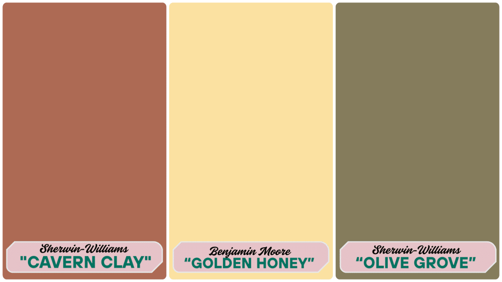
4. Sherwin-Williams “Cavern Clay” offers a soft terracotta that feels like sun-baked clay. This warm tone works well in small dining rooms or kitchens, adding richness without darkness.
5.Benjamin Moore’s “Golden Honey”provides a muted, mustard-yellow hue that glows in small spaces. This tone works as a happy accent wall or in nooks where you want to add warmth.
6.Sherwin-Williams “Olive Grove”brings a muted olive green that connects to the natural world. This shade pairs well with wood tones in small living rooms or studies.
Light Greens and Blues: Nature-Inspired Palette
Light green and blue tones bring the feeling of the outdoors inside your small cottage. These nature-based colors create a sense of calm and space, making them perfect for smaller rooms that need to feel open.
Suggested Colors
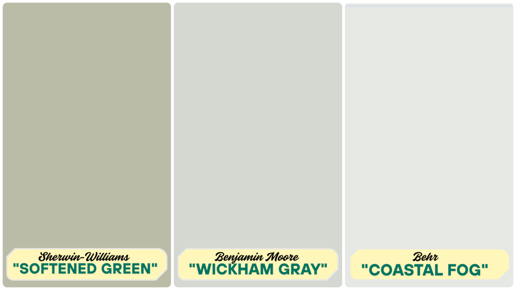
7. Sherwin-Williams’ “Softened Green” offers a light mint shade that evokes the feel of spring leaves. This color brightens small bathrooms and kitchens with its fresh, clean feeling.
8. Benjamin Moore “Wickham Gray”blends subtle blue with gray for a color that shifts with the light. This versatile tone works well in bedrooms and living areas where a soft color palette is desired.
9. Behr “Coastal Fog”mixes seafoam and gray tones for a misty, beach-glass look. This color suits small cottages near water or those wanting a coastal feel.
Rich Accent Small Cottage Interior Colors
While small cottages often need light colors to feel spacious, rich accent colors add character and warmth. These deeper tones can bring focus to special areas without making your whole cottage feel small.
Suggested Colors
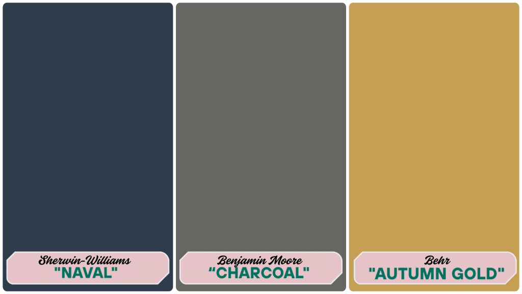
10. Sherwin-Williams “Naval” provides a deep navy blue that feels both classic and modern. This color works well on a single wall, inside bookcases, or in smaller rooms where you want to create a cozy atmosphere.
11. Benjamin Moore’s “Kendall Charcoal” offers a soft, charcoal gray with warm undertones. This shade adds depth to small spaces without the harshness of black, creating subtle drama.
12. Benjamin Moore’s “Autumn Gold” brings a deep, mustard-yellow hue that glows like fall leaves. This warm tone adds life to north-facing rooms or spaces that need extra warmth.
Soft Pastels Cottage Interior Paints
Soft pastel colors bring a gentle, lived-in feeling to small cottage interiors. These light tints add personality without making rooms feel closed in, creating spaces that feel both fresh and familiar.
Pastels work well in cottages because they nod to the old-world charm while feeling new and clean. They add subtle color without the weight of darker shades, which can crowd small rooms.
Suggested Colors
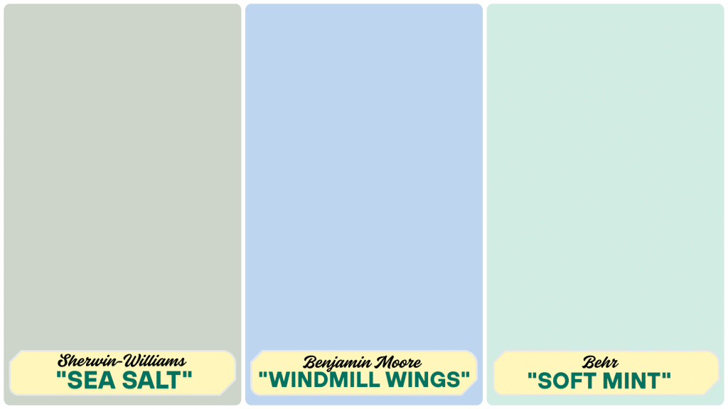
13. Sherwin-Williams “Sea Salt” blends blue and green tones into a soft, misty shade that feels like morning fog near the ocean. This color works wonderfully in bathrooms and bedrooms, creating a restful mood.
14. Benjamin Moore “Windmill Wings” offers a blush pink that warms up north-facing rooms. This gentle tone adds sweetness to guest rooms or reading nooks without feeling too young or bright.
15.Behr “Soft Mint”brings a fresh, clean feel to kitchens and sunrooms. This light green has just enough color to evoke happiness while still functioning as a neutral in small spaces.
Final Tips for Painting Small Cottage Interiors
Picking the right paint colors is just the first step for your small cottage. Here’s how to apply them effectively to create spaces that feel both roomy and cozy.
Maximizing Space with Light Colors
Quick Tips:
- Paint trim and walls the same color to create an unbroken visual space
- Extend the wall color 2-3 inches onto the ceiling to make it appear higher
- Choose satin or eggshell finishes that reflect more light than flat paint
- Keep color consistent in connected spaces to make them feel larger
- Use warm whites in north-facing rooms to counter cold light
- Paint doors the same color as walls in very tight spaces
Why It Works: Light colors reflect natural light, making dark corners brighter and creating the feeling of more space rather than tight walls.
Using Accent Walls for Visual Interest
Best places for accent walls include behind the bed, surrounding fireplaces or TVs, inside built-in bookcases, on walls with interesting architectural details, and at the ends of rectangular rooms. These strategic locations create focal points without overwhelming small cottage spaces.
Smart Accent Tips:
- Use rich colors sparingly in tiny rooms
- Try a “mini accent” by painting just a section of one wall
- Balance dark accents with lighter colors elsewhere
- Choose colors from your decor for a cohesive look
Testing Paint Colors in Different Lighting Conditions
- Paint 2′ x 2′ sample patches on multiple walls
- Check colors at different times of day (morning, afternoon, evening)
- View samples on both sunny and cloudy days
- Turn on the lamps to see how artificial light affects the color
- Live with samples for at least 3 days before deciding
Remember: Small spaces amplify color intensity. When in doubt, choose a slightly lighter version of the color you’re considering.
Conclusion
Choosing the right paint colors for your cottage home isn’t just about aesthetics—it’s about creating a space that feels like home. The colors on your walls set the tone for your entire home.
Whether you choose soft whites, gentle blues, warm neutrals, or tiny touches of bold colors, let the colors speak to your heart. Test samples, consider your furniture, and think about how each room will be used.
Remember that quality paint is worth the investment. The right colors and finishes will make your cottage feel special for years to come.
What paint colors have you used in your cottage? Share your experiences in the comments below! And if you need more cottage-style tips, check out my complete guide to cottage decorating.