Have you ever walked into a room that felt oddly bigger than its size? I will show you how to create that feeling with a simple paint trick: matching your trim and wall colors.
This color-pairing method can turn small spaces into roomy havens and large rooms into statement-making showcases.
I’ve used this exact approach in updating my son’s tiny bedroom, transforming what once felt cramped into a much more open, flowing space that looks professionally designed.
Looking around my home now, I can count five rooms where I’ve used this color-matching technique, each with fantastic results that visitors regularly comment on.
The biggest win? My powder room, where dark walls and trim are in the same shade, created the perfect backdrop for artwork and fixtures to stand out.
Let’s also explore how this paint method can work in your home.
Why Matching Trim and Wall Colors Works?
Painting trim and walls the same color might seem like a small change, but it greatly impacts how a room feels. This approach turns your space into something more intentional and carefully designed.
When I first tried this in my home office, the change was noticeable. The room felt calmer, less busy, and somehow bigger. Now, I use this technique for most of my home updates.
Creates a Unified and Expansive Look
Using the same color for walls and trim removes harsh visual breaks, allowing the eye to move smoothly across the space.
In my living room, painting both surfaces in soft beige made the modest 12×14 area feel more open. Without contrasting trim dividing the walls, the room had a natural flow that felt effortless.
This method works well in open floor plans and homes with unique architectural features, such as angled ceilings and alcoves. When I used this method in my breakfast nook, the slanted ceiling blended seamlessly into the space rather than feeling disjointed.
Enhances Architectural Features Subtly
Matching colors subtly highlight architectural details rather than overpowering them. Crown molding, baseboards, and door frames create depth and dimension without sharp contrast.
The crown molding casts gentle shadows in my dining room, making the craftsmanship more noticeable. This approach also benefits built-in shelves and cabinets, making them appear more custom and polished.
My office bookcases looked like high-end built-ins once they matched the wall color.
How to Use This Paint Technique in Different Rooms
This painting technique works throughout the home, but each room has specific considerations. Here’s how I’ve used matching trim and wall colors in various spaces and what I’ve learned along the way.
1. Living Room: Warm and Inviting Spaces
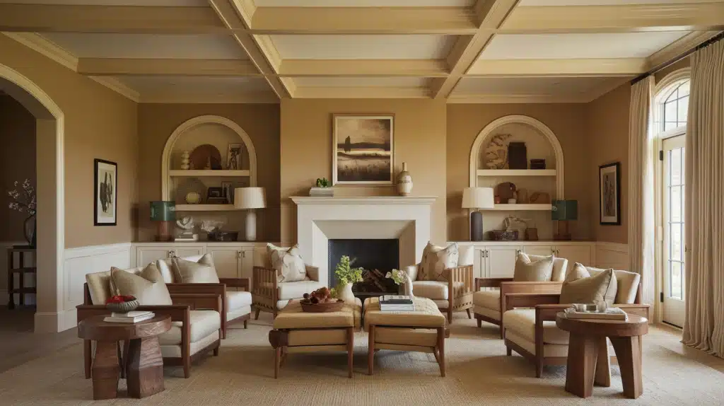
The living room is often the heart of the home, making it perfect for this cohesive painting approach. When I painted my living room walls and trim in a warm, neutral beige, the space immediately felt more relaxed and put together.
For best results, I chose a color with subtle warmth rather than a stark white or gray. The soft tone created a welcoming backdrop that complemented my wood furniture and textiles. My guests often comment on how “peaceful” the room feels.
The subtle distinction between my eggshell walls and satin trim creates enough variation to maintain interest while keeping the unified look. This difference becomes more noticeable as daylight shifts, adding a natural dimension throughout the day.
2. Bedroom: A Serene Retreat
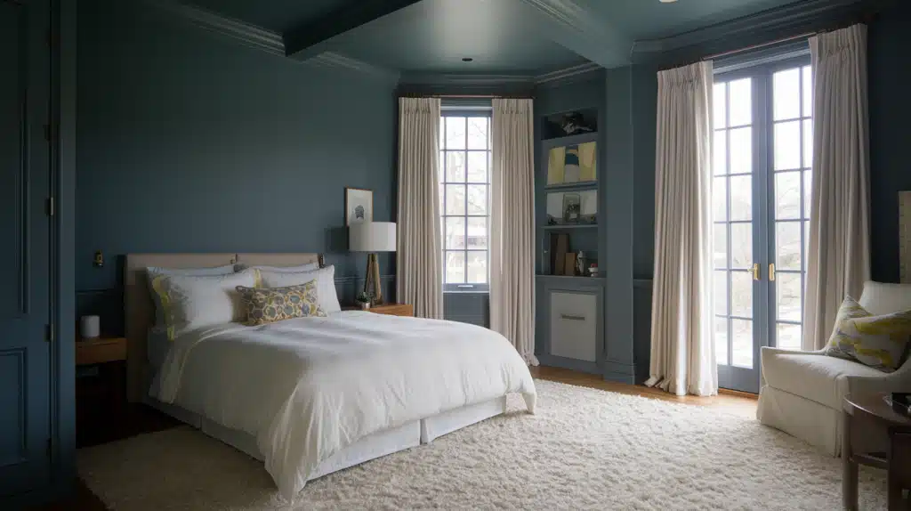
Matching trim and wall colors can have a tremendously calming effect in bedrooms. In my main bedroom, I used a deep blue-gray color on the walls and trim to create a perfect cocoon-like atmosphere for unwinding.
The room’s continuous color eliminated visual breaks, making the modest-sized space feel more generous. I also used the same color for the window frames to minimize the contrast with the view outside.
I chose a matte finish for the walls to reduce light reflection and create a softer feel. For the trim, a satin finish provides subtle contrast and practical durability. The combination feels luxurious without being showy.
3. Bathroom: Creating a Spa-Like Feel
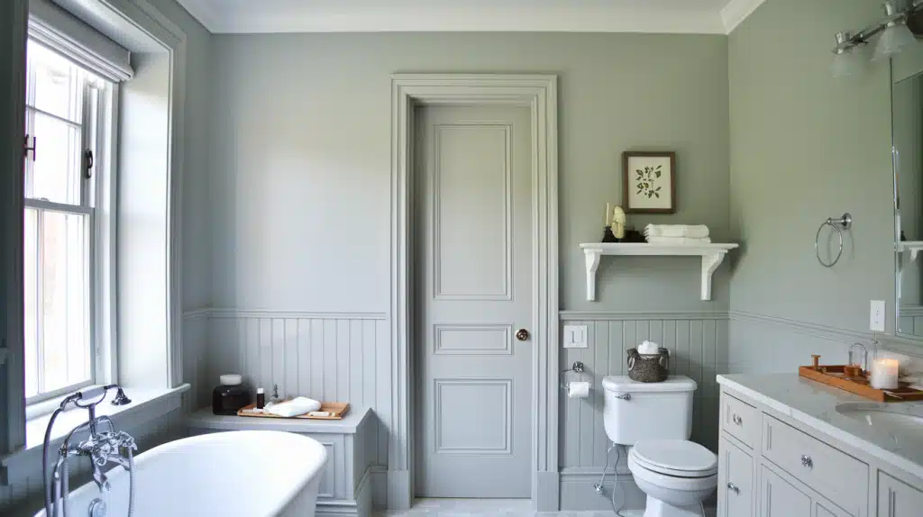
Bathrooms often have many transitions between walls, trim, and fixtures, making them ideal candidates for this painting technique. My guest bathroom felt choppy and small until I painted the walls, trim, and even the vanity in the same soft gray.
The unified approach makes the room feel like a high-end spa retreat. Without harsh transitions between surfaces, the eye moves smoothly around the space, making it feel larger and more cohesive.
To resist moisture, I used semi-gloss on all the trim, doors, and window frames. The walls received an eggshell finish in a paint specifically formulated for bathrooms. This combination stands up well to humidity while maintaining the monochromatic look.
4. Kitchen: Blending Functionality with Style
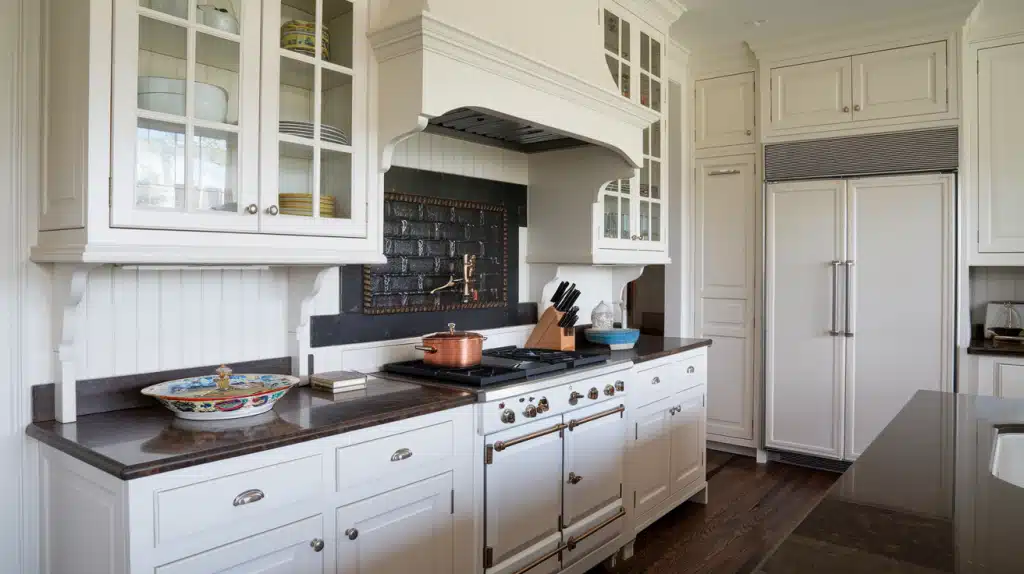
Kitchens benefit especially from matching trim and cabinet colors. When I updated my kitchen, painting the cabinets, trim, and walls in a soft cream created a custom, built-in feel that made the standard cabinets look much more expensive.
This approach simplified the visual elements in a busy space with many functional items. The consistent color created a clean backdrop that allowed my copper cookware and colorful dishes to stand out as focal points.
I installed a slightly darker backsplash to add some contrast and prevent the space from feeling one-dimensional. This subtle difference provides just enough visual interest without breaking the cohesive feel.
5. Hallways and Entryways: Making an Impact
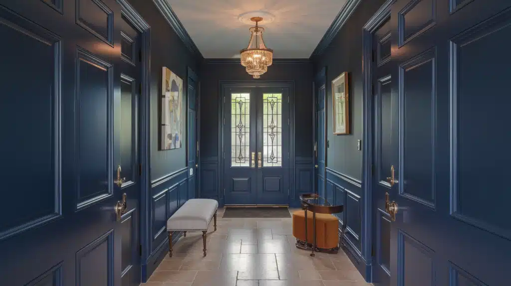
Transitional spaces like hallways and entryways make perfect testing grounds for bolder versions of this technique. My narrow entrance hall went from forgettable to striking when I painted walls, trim, and doors in a rich navy blue.
These smaller spaces can handle deeper, more saturated colors that might feel overwhelming in larger rooms. The enveloping effect creates a memorable impression for visitors and sets the tone for the rest of the home.
In my hallway, applying high-gloss paint to the trim while keeping the walls in eggshell finish creates beautiful light play as you move through the space. The glossier trim’s reflective quality subtly highlights architectural details without color contrast.
Pros and Cons of Matching Trim and Wall Colors
Before discussing this painting method, I want to present both sides. Like any design approach, painting trim and walls the same color has advantages and potential drawbacks. Having tried this in multiple rooms over several years, I’ve experienced both.
| Pros | Cons |
|---|---|
| Reduces Need for Masking: Simplifies the painting process with less taping and edge work. I saved hours of edging work in my dining room. | Can Minimize Architectural Details: Ornate trim may lose its impact, as seen in my cousin’s Victorian home. |
| Provides a Polished Look: This creates a cohesive appearance on a designer’s level. Guests often assume my living room was professionally designed. | Requires Strategic Paint Selection: Choosing the wrong sheen can result in a flat or mismatched finish, as I learned when I had to repaint my office trim. |
| Hides Imperfections: Unifies surfaces and conceals flaws like uneven walls or damaged trim. My den’s old paneling blended seamlessly. | Limited Design Flexibility: Future changes may require repainting walls and trim, making updates more time-consuming. |
| Makes Art and Decor Stand Out: Acts as a clean backdrop, allowing furniture, artwork, and accessories to shine. My vintage print collection looks more gallery-like. | Can Feel Too Simple: Some spaces benefit from the definition of contrasting trim. My formal living room felt plain until I incorporated more textural elements. |
Final Thoughts
Painting walls and trim the same color is more than just a passing trend. It’s a timeless design creates a clean, sophisticated look in any home.
This technique creates visual continuity, making spaces feel larger, highlighting beautiful architecture, and creating a perfect backdrop for furniture and decor.
This monochromatic approach offers a fresh alternative to traditional contrasting trim, whether for bright white, a warm neutral, or a bold, saturated hue.
It’s a simple change that can completely transform your space’s feelings and functions.
So, consider this designer-approved technique the next time you plan a painting project.
You might be surprised by how much you love the cohesive, polished result of walls and trim working together in perfect harmony.