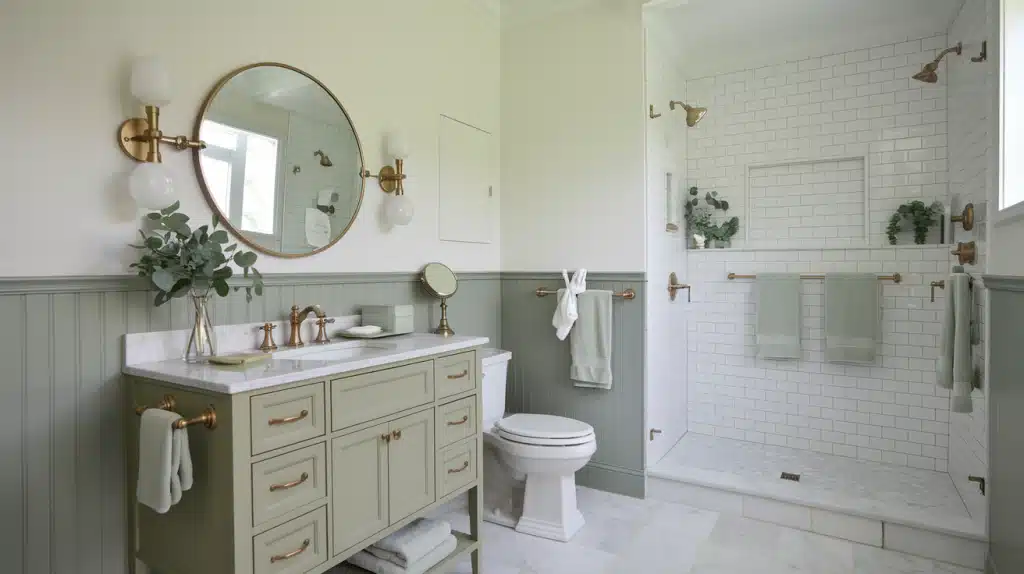
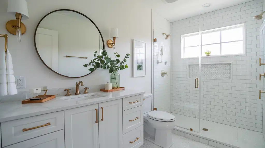
“Is white paint really just… white?”
Trust me, I’ve learned this the hard way. When I first picked white paint for my walls, I thought all whites were the same. But after a bad experience with a white that looked too stark and cold, I realized how wrong I was.
Here’s the good news: Benjamin Moore’s Oxford White (CC-30) might be exactly what you’re looking for.
I’ve used this shade in several rooms, and I’m sharing my real experience to help you understand if this crisp, clean white is right for your space.
Let’s look at everything from how it changes with light to where it works best.
What Color Is Oxford White?
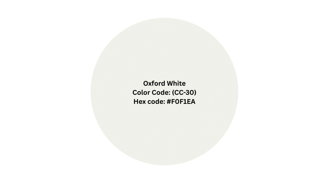
Let me tell you about Oxford White(CC-30 or OC-57) from Benjamin Moore’s Classic Collection. It’s a bright white that has just the tiniest hint of coolness to it – and I mean tiny!
With an LRV (Light Reflective Value) of 86.69, this paint really knows how to make a room feel open and bright.
I like to think of Oxford White as that friendly neighbor who gets along with everyone. It’s not too pushy like some stark whites can be, but it’s not shy either. The color stays true and clear while adding a gentle touch of freshness to your walls.
You’ll find this shade particularly helpful when you want a polished-looking space that doesn’t feel cold or clinical. It’s the kind of white that makes both modern furniture and traditional decor feel right at home.
My Personal Favourite Best Pairings
From my experience, I have seen how well using a color like Benjamin Moore’s Oxford White in several homes goes well with other colors.
From warm colors like red, orange, and yellow to cooler shades like green and blue, even pastel colors suit Oxford White and this is precisely why I prefer working with white shades.
I’ve listed my favorite pairings that look great with Oxford White.
1. Horizon OC-53
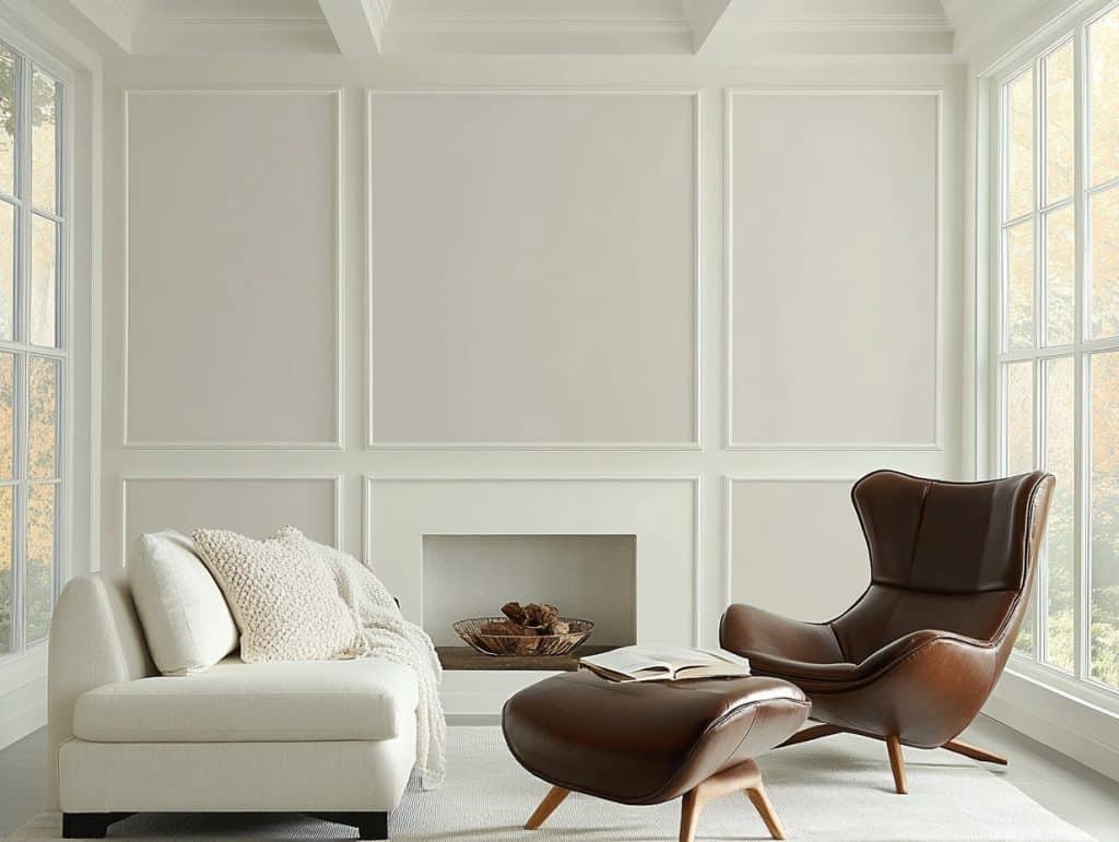
When looking at the official pairings, Horizon (OC-53) brings a soft, gentle look that I’ve seen work wonders in living rooms.
It creates a cozy atmosphere for you to sit back and relax after a long day.
2. Sage Tint 458
If you’re feeling a bit more adventurous, Sage Tint (458) adds a very natural and calming feel to any space, without feeling too loud.
I like using it in bathrooms, as it creates a very fine and soft contrast with whites.
3. Wickham Gray HC-171
I’ve noticed Wickham Gray (HC-171) creates a beautiful balance when used with Oxford White – they’re like old friends who just get each other!
Grey and white, being from the same color group, goes well together.
4. Chantilly Lace OC-65
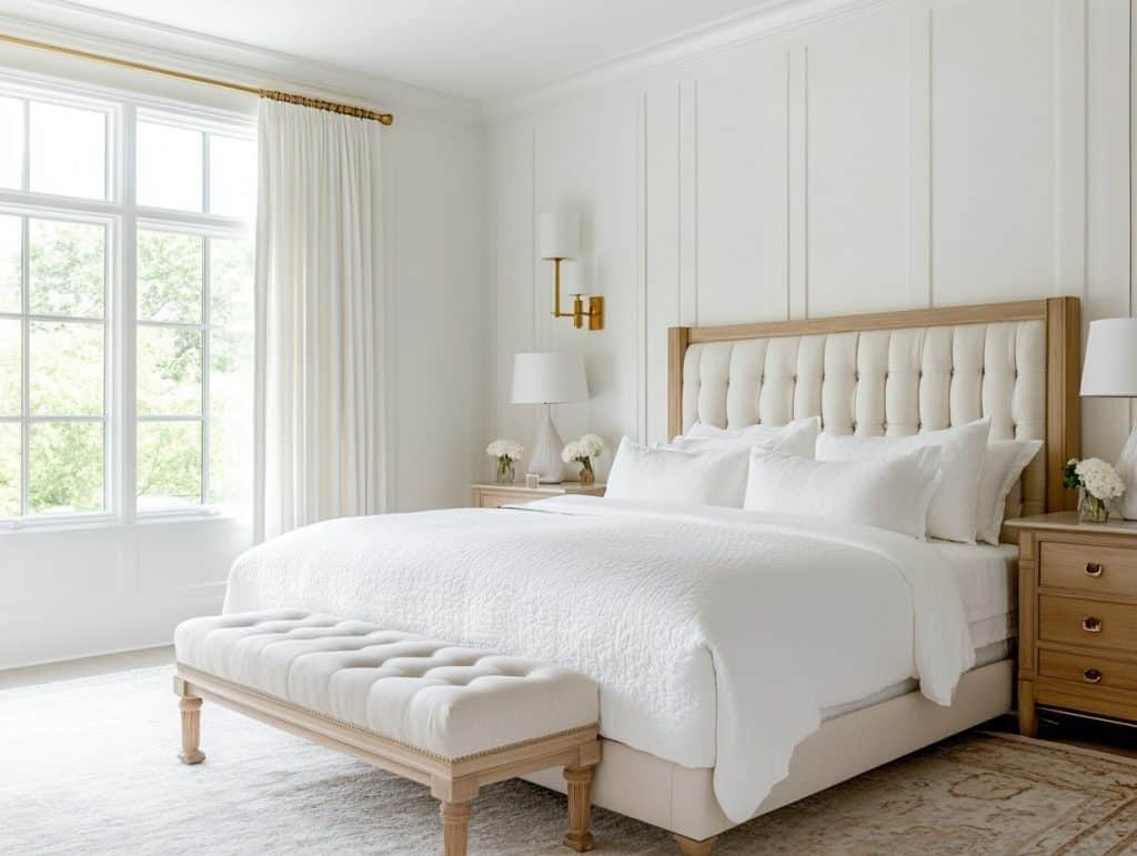
If you want something pure and bright, Chantilly Lace (OC-65) makes for a perfect companion in spaces where you want to layer different whites.
Those who love green tones have some great options, too.
5. Mountain Lane (488)
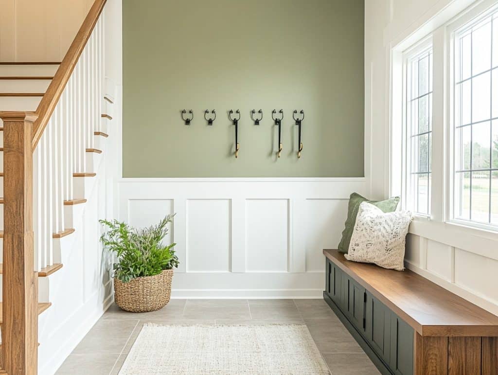
Mountain Lane 488 is a warm green color that goes well with Oxford White. This muted color feels very inviting.
This combination of muted green and white works wonderfully together.
6. Soft Fern (2144-40)

Soft Fern by Benjamin Moore offers a gentle green tone that pairs well with neutrals. This shade provides a fresh balance to white and beige walls.
Yes, I love green, but does that mean I’m biased? Not at all!
Oxford White Vs. Similar Shades to Try Out
Let me explain how Oxford White compares to other popular white shades I’ve worked with.
Here’s how Oxford White (CC-30) stands out:
| Comparison | Oxford White | Other Shades |
|---|---|---|
| Oxford White vs Chantilly Lace (2121-70) | Cool hints | Brighter and more pure white |
| It feels softer on the walls | Neutral look | |
| Oxford White vs White Dove (I-06) | Maintains a cooler presence | It carries more warmth in its base |
| Fresh nature | Slightly creamier | |
| Oxford White vs Snowfall White (2144-70) | Holds more brightness | Leans toward a softer appearance |
| Brighter and clean | Gentler touch to walls | |
| Oxford White vs Frostine (AF-5) | Higher brightness levels | More gray undertones |
| Crisp and pale | Slightly more muted |
Interior Application Performance
Let me show you how Oxford White acts in real homes – both inside and out. I’ve used this paint countless times, and it behaves quite differently depending on where you put it.
This will show you how this white color works its magic indoors. Notice how it changes based on your lighting and room setup.
1. Living Room
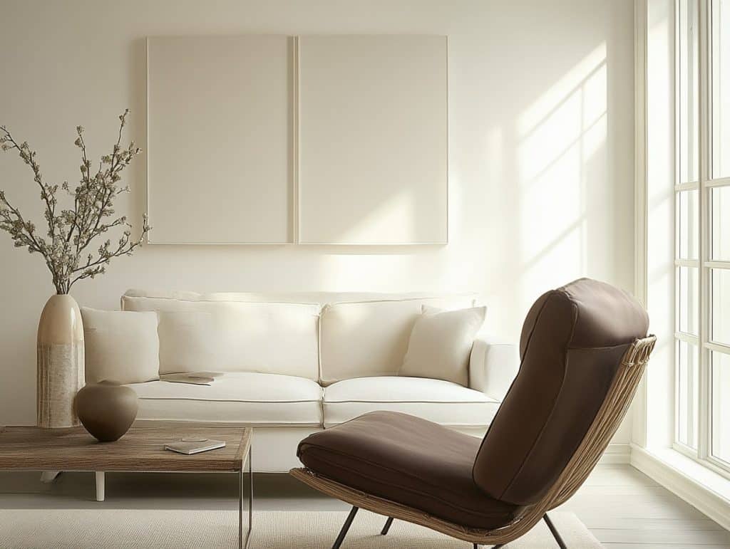
My living room gets different kinds of light throughout the day, and Oxford White responds so nicely to these changes.
In the morning, it feels bright, while evening light brings out its softer side.
2. Kitchen Brightness
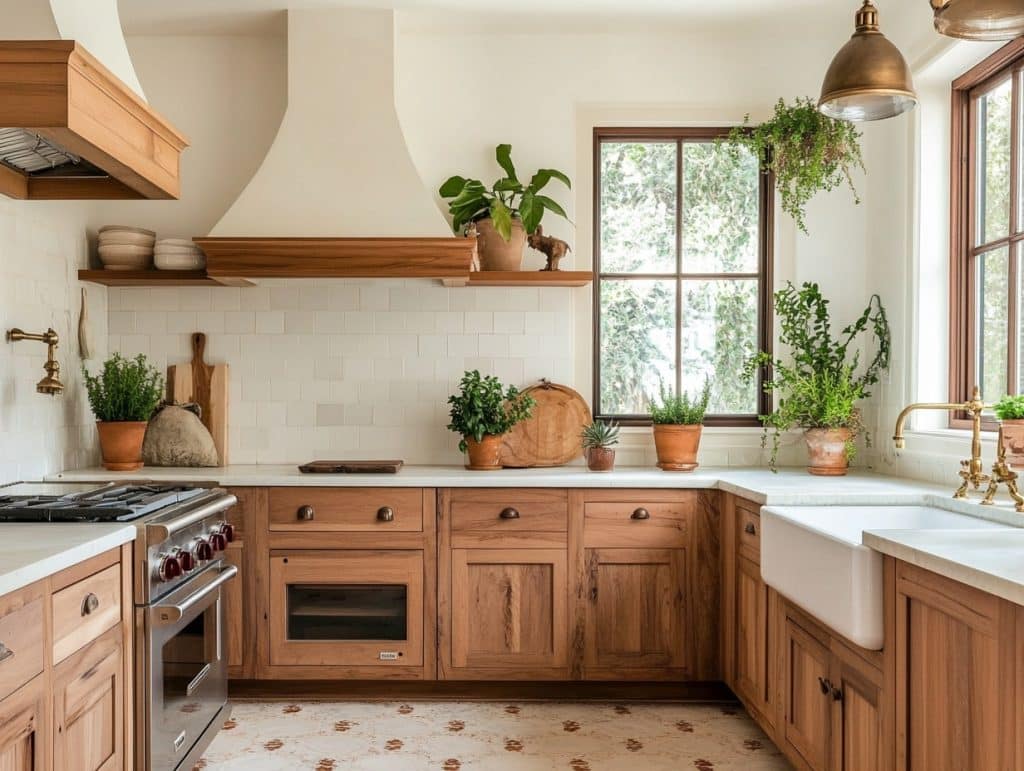
The kitchen is where Oxford White really shows its practical side. I’ve noticed how it makes the space feel spacious without being too stark.
It works especially well with natural wood cabinets and marble countertops.
3. Bedroom Comfort

Oxford White is bright enough to make the room feel open but not so bright that it feels like a hospital room.
Personal touches like blankets, rugs, and so on enhance the softness of Oxford White.
Exterior Applications Performance
Oxford White on house exteriors shows its true strength in different light conditions. On sunny days, it maintains its appearance without looking too stark.
During cloudy weather, it keeps its warmth while still standing out. Let me show you how it handles sunshine and shade and still stands tough.
4. Front Facade

On house exteriors, Oxford White takes on a slightly different personality. The natural daylight brings out Oxford White’s cooler side.
The house looks fresh without looking too pale.
5. Trim and Details

When used for exterior trim, Oxford White creates nice, clean lines against darker siding or brick. It creates a lovely contrast with gray and black.
I’ve seen it look particularly good during different times of day.
6. Structural Details
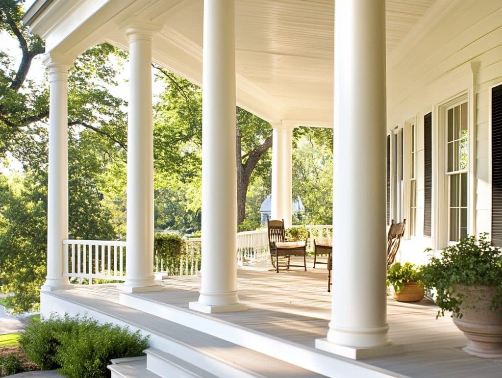
Throughout the day, you’ll notice Oxford White’s appearance shift naturally from bright mornings to muted afternoons.
On features like columns and porches, it outlines each detail with contrast.
My Own Application Tips
Listen, I’ve painted quite a few rooms with Oxford White, and I’ve learned some useful tricks along the way.
Here are some simple tips that’ll help you get it right the first time – no trial and error needed!
- Test the paint in your actual room – morning, afternoon, and evening light show different sides of this color.
- Remove dust from your walls well and fix any holes or marks first
- Pick eggshell finish for walls and semi-gloss for trim
- Plan for two coats of paint
- Paint your samples on different walls – the color acts differently on north vs south-facing walls.
- Let each coat dry completely before adding the next one
- Use good quality brushes and rollers – they help the paint go on more smoothly
- Keep a wet edge while painting to avoid lap marks
Conclusion
Remember our initial question – “Is white paint just… white?”
Well, after looking closely at Oxford White (CC-30), we can see it’s much more than just another white paint.
With its clean, bright character, Oxford White proves to be a flexible choice that works in many settings. I feel it’s one of those reliable whites that feels shining without being harsh, making it a solid pick for both walls and trim.
Ready to try Oxford White in your home? Start with a sample test in your space. Have questions about using Oxford White? Drop a comment below – I’d love to help you make the right choice for your space.
Frequently Asked Questions
What Color is Oxford White?
Oxford white is an off-white shade with soft, cool undertones.
What is the Difference Between Simply White and Oxford White?
Simply White shows yellower undertones and feels brighter, while Oxford White has more grey undertones that make it a bit cooler.
What is the Difference Between Oxford White and Chantilly Lace?
Chantilly Lace has warm cream undertones, while Oxford White is a pure, clean white with no blue undertones.

