What Colors Go With Burnt Orange: 7 Best Pairings

You have a burnt orange cushion, sofa, or paint swatch in hand. Now what? People often freeze here. They love the color but have no idea what to pair with it.
The answer is simpler than it looks. Burnt orange contains red, orange, and brown pigments. That brown base does most of the pairing work on its own.
The best colors for burnt orange are cream, navy blue, sage green, teal, chocolate brown, black, and mustard yellow.
This post covers all seven pairings. You get proportion tips, room-specific ideas, and outfit combinations for each one.
Why Burnt Orange Is Easy to Pair
Burnt orange is a warm color. It contains orange, red, and brown pigments. All three sit on the warm side of the color wheel.
The brown base is the key. It stops the color from looking too bright. It also lets burnt orange sit naturally next to both warm and cool shades.
Burnt orange runs around hex #CC5500. Unlike pure orange, it feels earthy and grounded. That makes it a good fit for boho, rustic, and mid-century modern styles.
Pairing it with cooler shades like navy or teal creates contrast. Using only warm shades throughout can make a space feel heavy. The sweet spot is one warm partner, one neutral, and the right balance between them.
What Colors Go With Burnt Orange?
Burnt orange is a versatile shade that works beautifully with both warm and cool tones. Here are the best color pairings to help you create balanced combinations for your home and wardrobe.
1. Burnt Orange and Navy Blue
Navy and burnt orange sit opposite each other on the color wheel. This produces the sharpest contrast of any pairing on this list.
Bright blue creates a clash. Navy works because its depth matches the brown base in burnt orange. The result is bold but clean, not jarring.
Proportion rule: 60% neutral (cream or warm white), 30% navy, 10% burnt orange. That balance keeps both colors readable without either taking over the room.
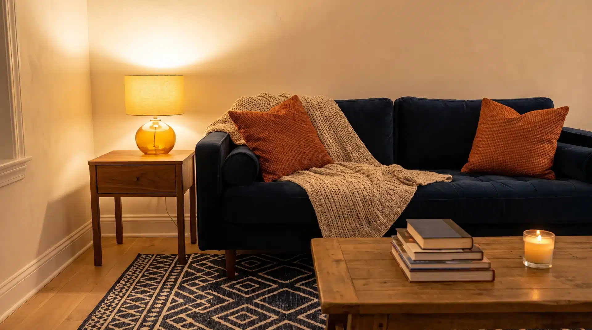
For living rooms, a navy sofa with burnt orange cushions on cream walls is clean and sharp. For a study, navy walls with a burnt orange leather chair and warm wood shelving add real depth. Farmhouse blue interiors often use this pairing alongside natural wood for a warm, relaxed result.
For outfits, navy trousers or a navy blazer with a burnt orange top is the wardrobe version of this pairing. No other combination on this list produces results this sharp with this little effort.
2. Burnt Orange and Cream
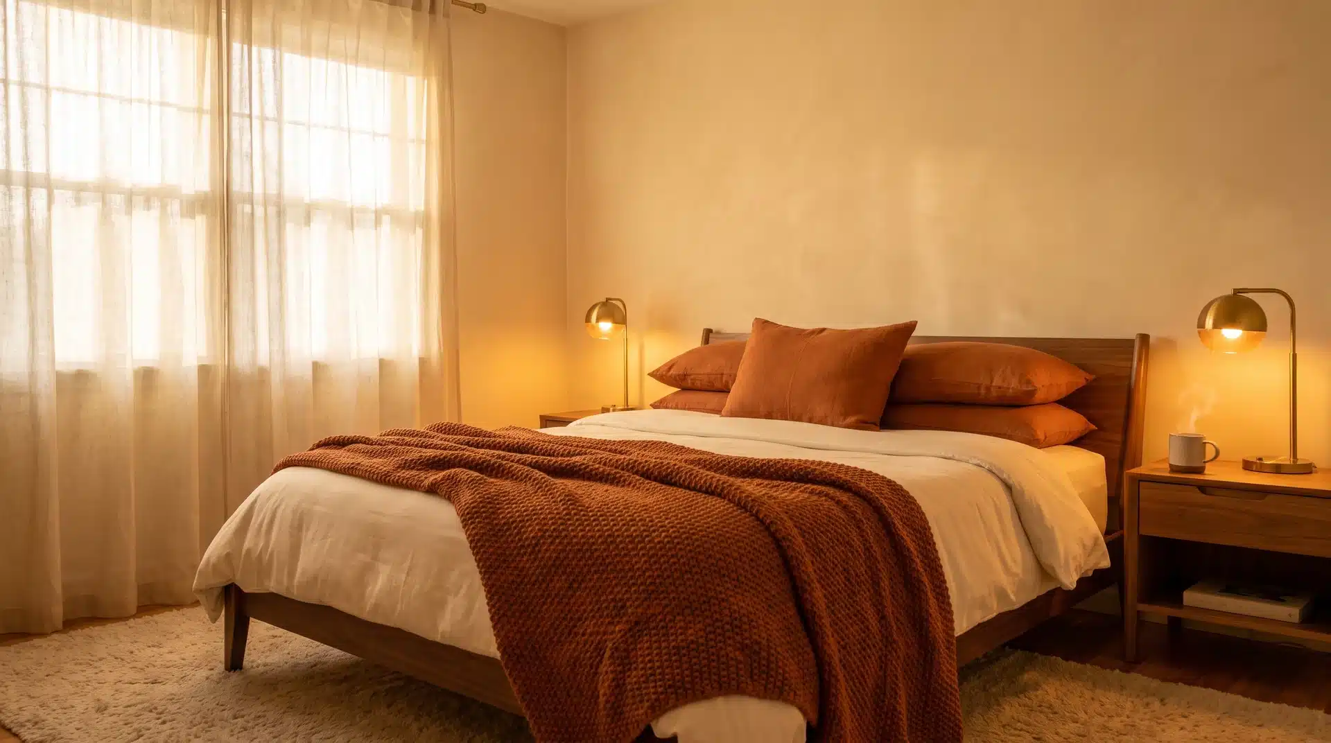
Cream is the best neutral to pair with burnt orange.
Both colors carry warm pigment. They work together naturally. Put a burnt orange swatch next to stark white, and the orange looks slightly off. Put it next to cream, and the combination settles into something warm and easy on the eye.
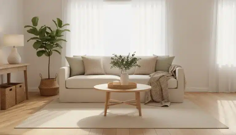
For living rooms, a cream sofa with burnt orange cushions and a throw blanket works well. A patterned rug that carries both colors ties the space together without adding more to manage.
For bedrooms, cream walls with burnt orange bedding in linen or bouclé read as warm and well-considered. The material matters. Linen carries burnt orange well. Polyester in the same shade reads flat.
For outfits, a cream shirt under a burnt orange jacket works across every season. So does a cream trouser with a burnt orange knit.
3. Burnt Orange and Sage Green
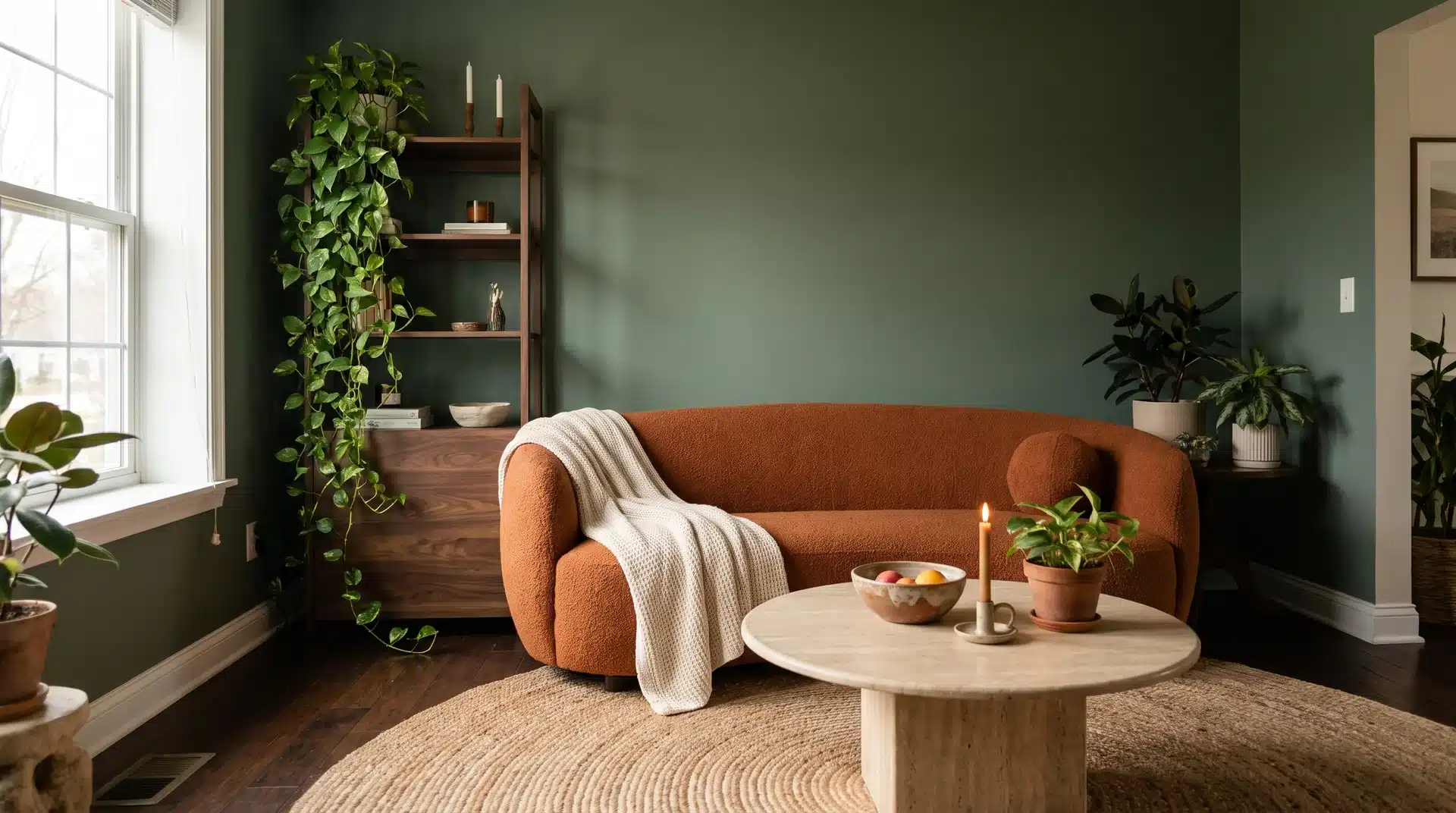
Sage green and burnt orange are both earthy, muted versions of their base colors. Neither one fights for attention.
They share the same warm, slightly desaturated quality found in nature-inspired palettes. That is what makes them naturally compatible.
Sage green walls with burnt orange soft furnishings create a room that feels organic and layered. A burnt orange sofa against sage green cabinetry produces the same result, with the furniture doing the pairing work.
This combination suits living rooms, kitchens, and bedrooms with warm wood floors. Benjamin Moore Sage Wisdom is one paint option that reads warm and earthy without going too yellow. It pairs well with burnt orange accents in a living room or bedroom.
For outfits, sage green trousers with a burnt orange knit are a strong fall combination. A sage utility jacket over a burnt orange base layer works just as well. Most color guides skip this pairing, which means using it puts your space ahead of what most people are doing.
4. Burnt Orange and Chocolate Brown
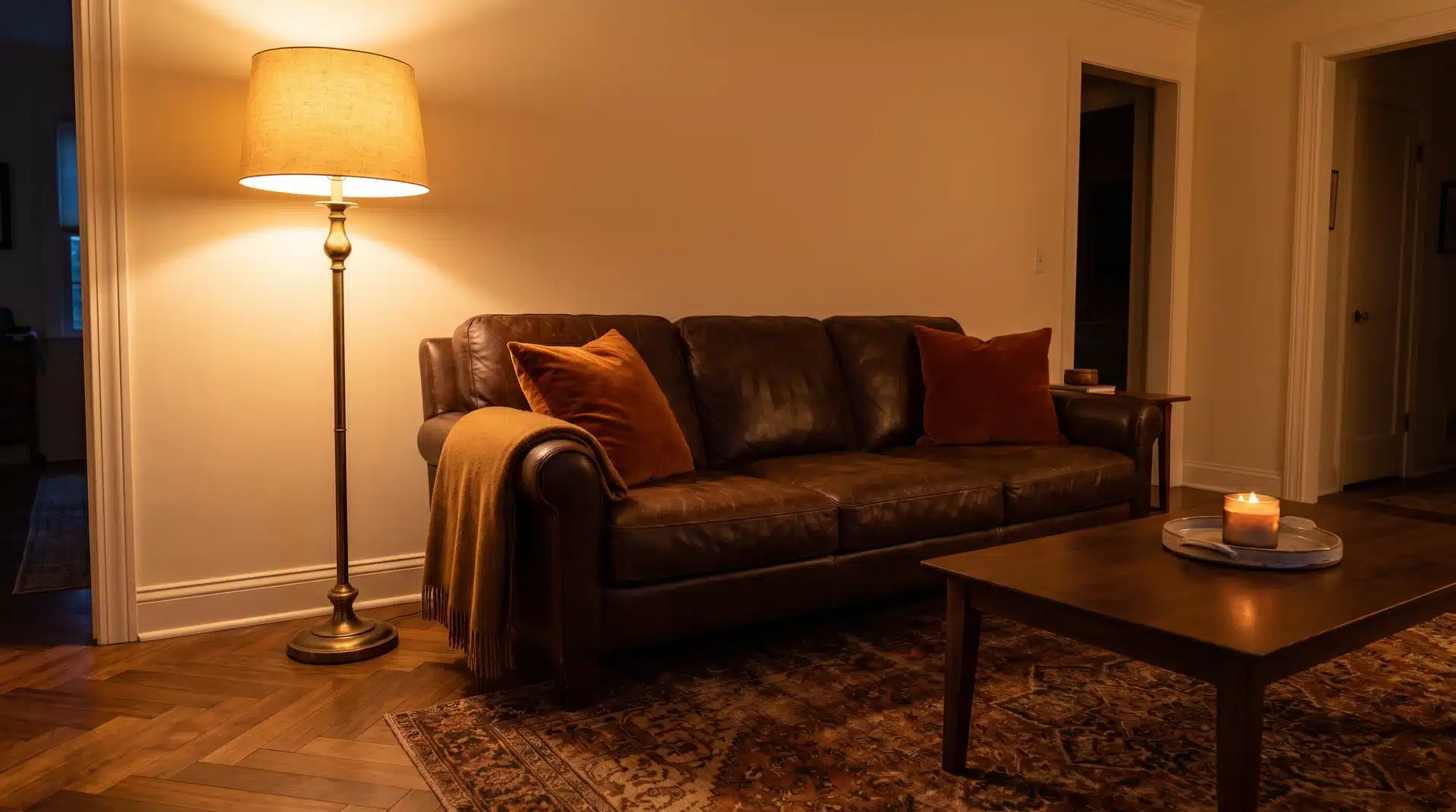
Chocolate brown and burnt orange share red and brown pigments. They are tonal relatives, not contrasting partners.
The combination does not produce the sharp graphic punch of navy. It produces depth and warmth instead. That richness reads as considered when the materials are good.
Use chocolate brown as the dominant tone and burnt orange as the accent. Reversing that in an interior makes a room feel heavy.
A chocolate brown leather sofa with burnt orange cushions works in almost any US living room. Add warm wood floors and a cream wall, and the combination reads as rich without much effort.
For outfits, chocolate brown boots or a brown leather bag with a burnt orange dress or coat grounds the look. The brown holds the outfit down. The burnt orange adds lift.
5. Burnt Orange and Mustard Yellow
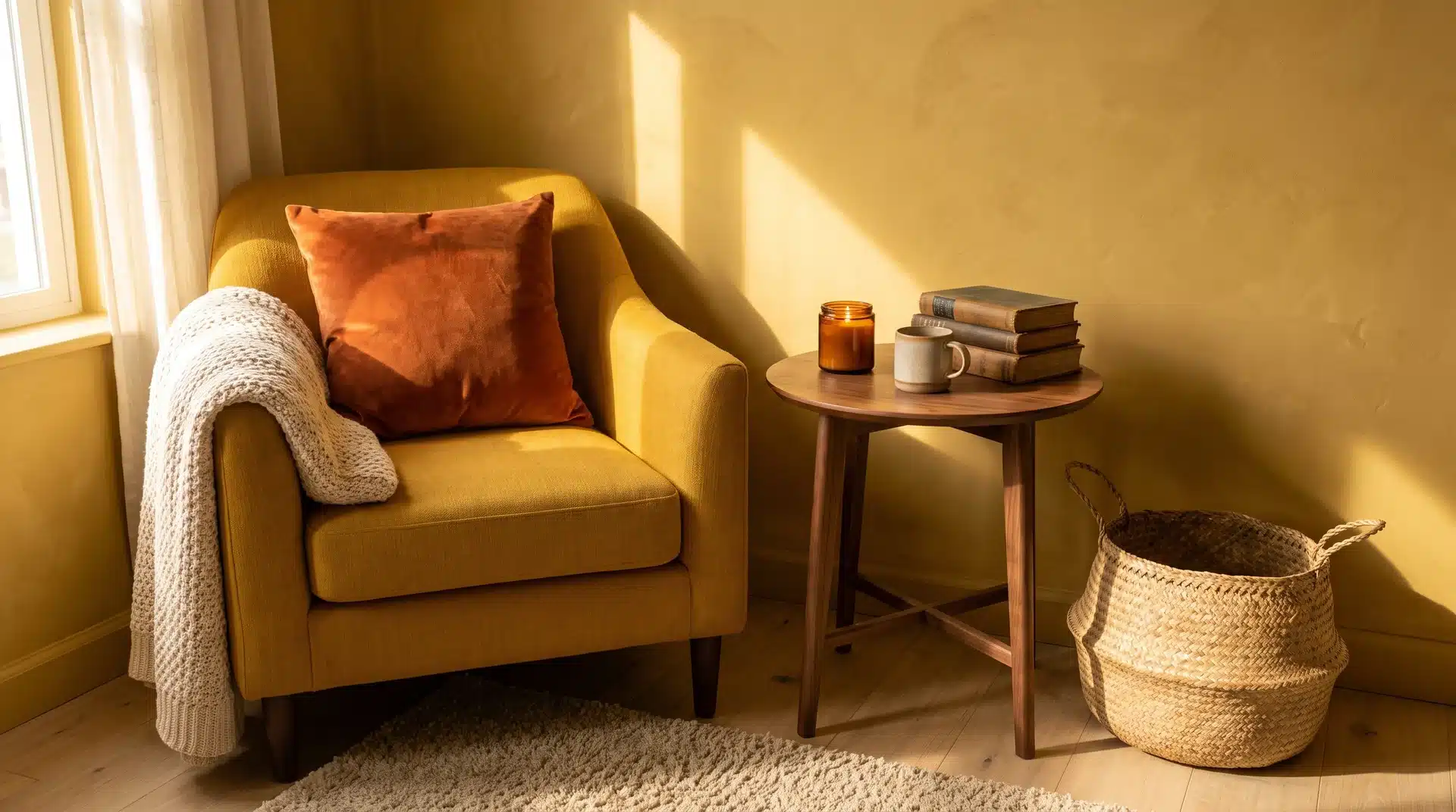
Mustard and burnt orange sit next to each other on the color wheel. They share overlapping warm pigments, so the combination is cohesive from the start.
The risk is using too much of both in one space. Equal proportions create visual noise rather than visual interest. One color needs to lead. The other should play a supporting role.
Mustard walls with burnt orange cushions and throws keep the balance right. In an outfit, separate the two with a cream or warm white base layer. That stops the combination from reading as too saturated.
6. Burnt Orange and Teal
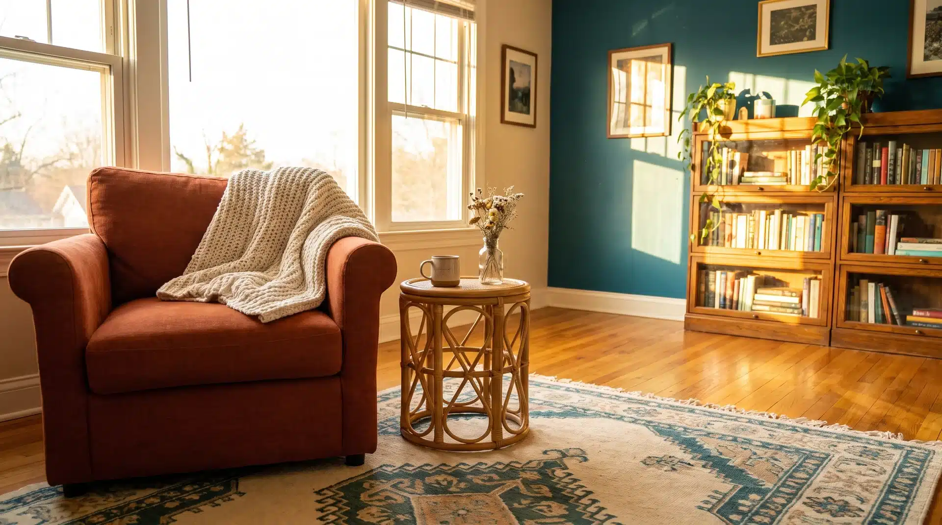
Teal is the bolder contrast option. The blue in teal creates contrast against burnt orange. The green in teal adds warmth the pairing would otherwise lack.
The result is more energetic than the navy combination. It suits spaces where you want visual interest rather than quiet sophistication.
Both colors need strong natural light to show at their best. In a dim room, teal goes flat and burnt orange turns muddy. Use this pairing in a south-facing room or one with strong overhead lighting.
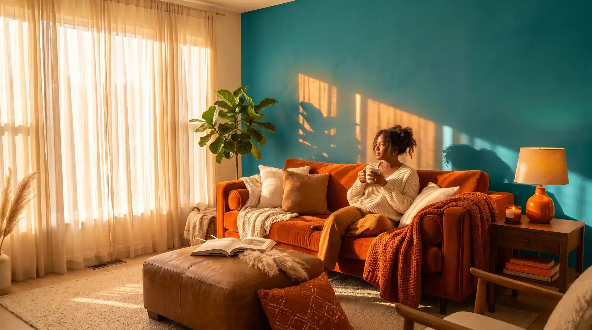
For interiors, a teal accent wall with soft burnt orange furnishings creates a room with real character. For outfits, a teal bag or scarf with a burnt orange ensemble is the lower-commitment version of the same pairing.
7. Burnt Orange and Black
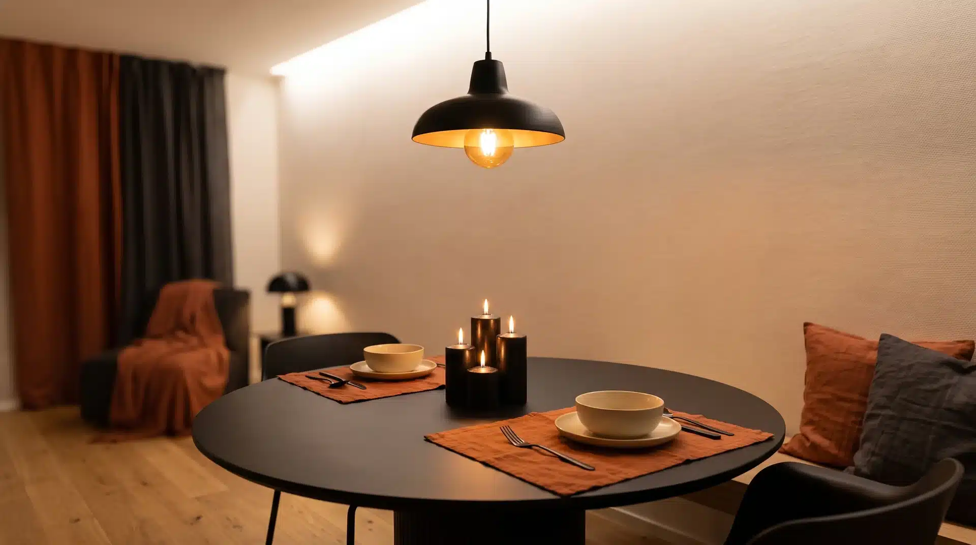
Black is a neutral, but it behaves differently next to burnt orange. The orange anchors the combination. It stops black from feeling cold or heavy.
The result is contemporary and sharp. It also works across more settings than most other burnt orange pairings.
In a room, black matte fixtures, frames, and furniture legs alongside burnt orange textiles create a clean result. A black dining table with burnt orange cushions and cream walls is the simplest version of this pairing.
For outfits, black trousers or jeans with a burnt orange top cross the most dress codes. It works for a smart-casual office, a weekend look, and an evening setting. Add a gold earring or a tan leather belt to bring warmth and complete the combination.
Burnt Orange Color Combos for Bedrooms and Living Rooms
Burnt orange in an interior asks for more thought about proportion and material than the same color does in a wardrobe. A color that makes a bold statement on a sweater becomes the entire atmosphere when it covers a wall. The pairings below include notes on proportion and material.
1. Burnt Orange Accent Wall in a Neutral Bedroom
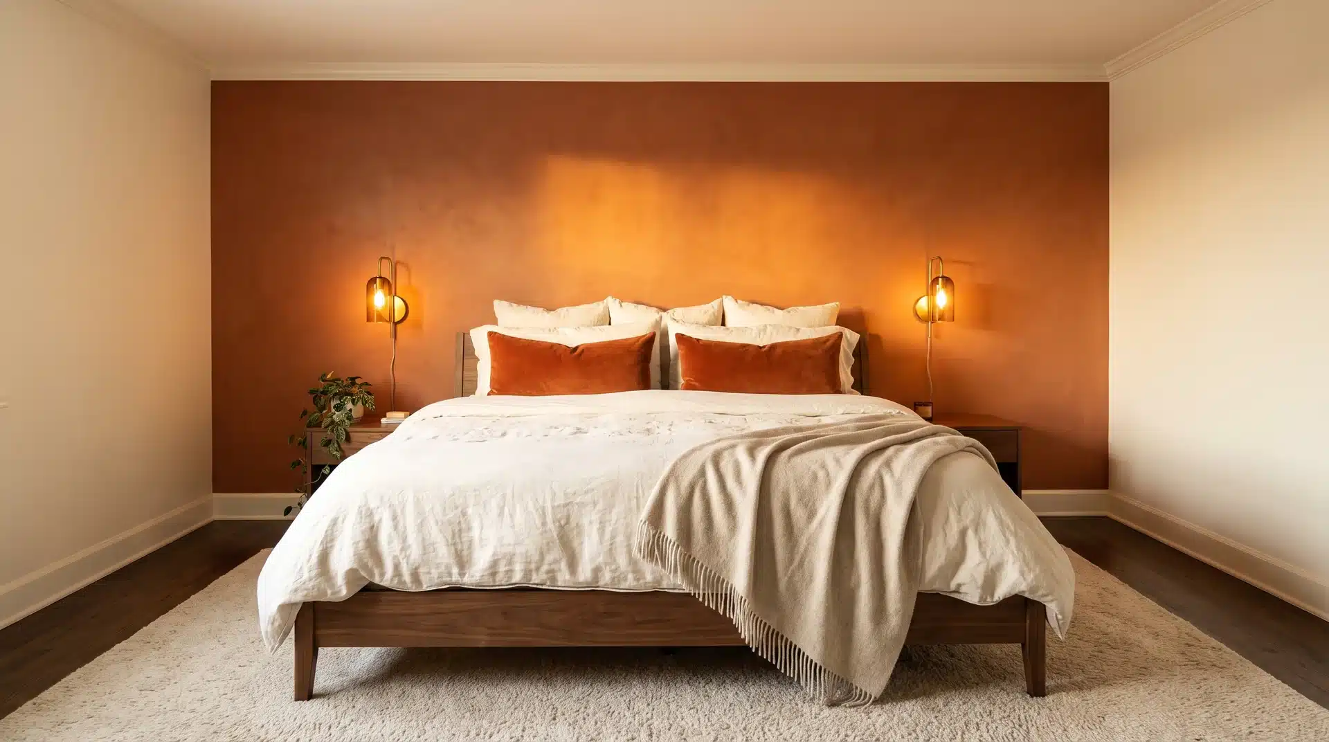
A single burnt orange accent wall behind the bed is the most practical way to bring this color into a bedroom. It creates warmth and personality without committing all four walls.
The remaining walls should stay warm cream or warm white, not cool white. Cool white creates an undertone conflict that is hard to name but easy to see.
Good materials to use alongside this include warm walnut furniture, white oak pieces, linen bedding in ivory or oat, and brushed brass hardware. Avoid chrome or brushed silver next to a burnt orange wall. The cool metallic tone pulls against the warmth of the color.
2. Cream and Burnt Orange Living Room
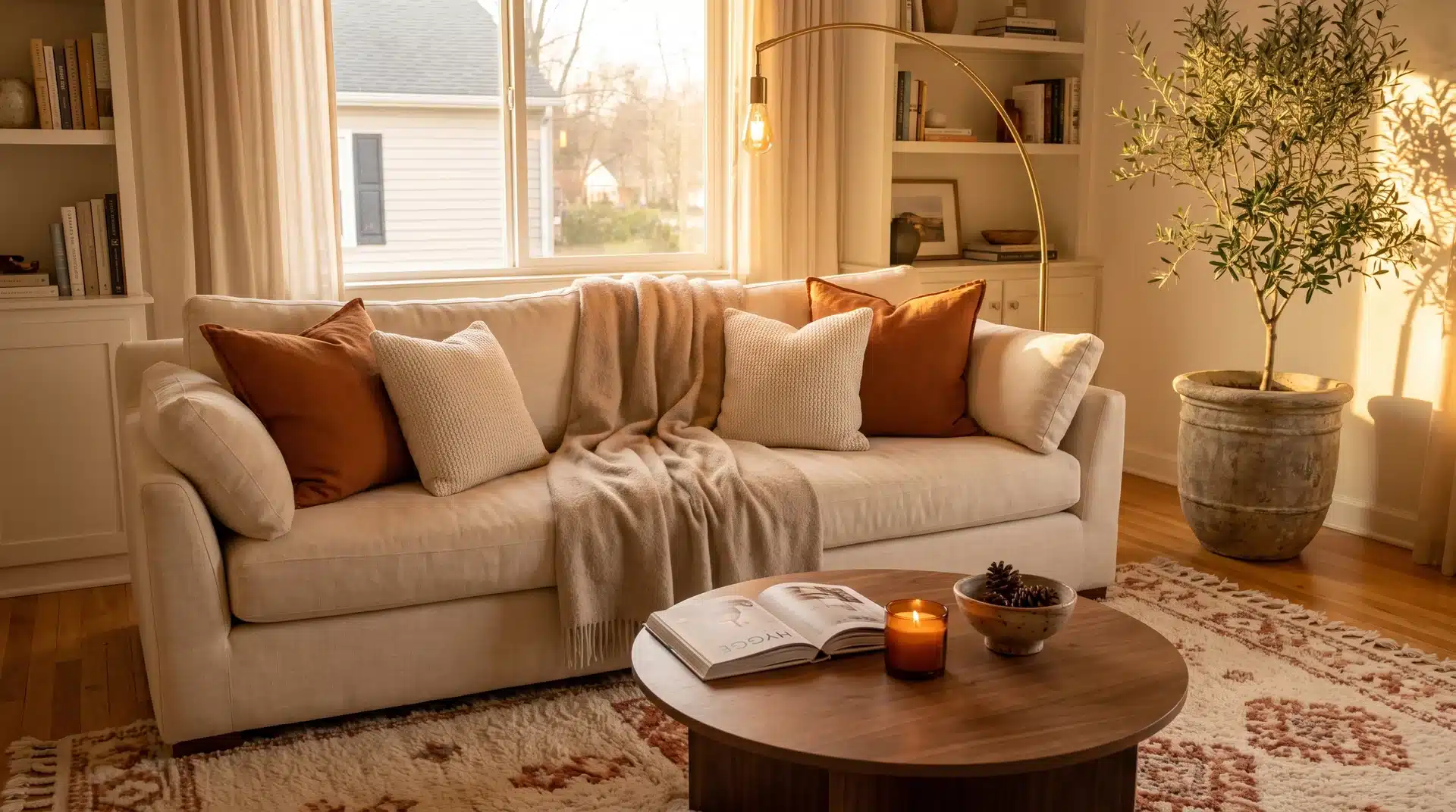
A cream sofa with burnt orange cushions and throws works well as a starting point. Place it on a patterned rug that carries both colors. That ties the space together without adding more to manage.
Cream handles the bulk of the room as the dominant color. Burnt orange adds warmth and definition without taking over.
Warm wood side tables bridge the two colors well. Brushed brass or matte black finishes on lighting and hardware suit this palette. Cool-toned metals like chrome pull against both surfaces rather than letting either read cleanly.
A large plant in a stone vessel completes the earthy quality of the combination. A fiddle leaf fig or olive tree both work well here. A warm taupe paint on surrounding walls can soften a burnt orange accent. It also helps keep the overall light level balanced.
3. Burnt Orange Bedding With Warm Wood Tones
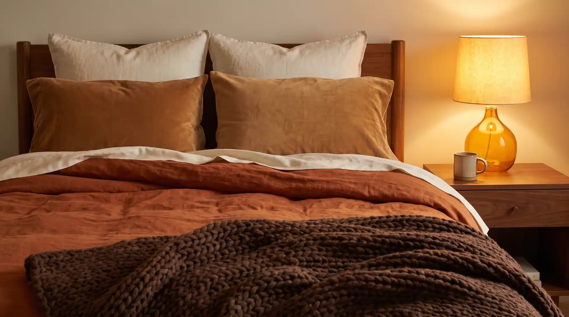
Burnt orange bedding works well with warm wood floors, walnut furniture, and cream or oat walls. All four elements share the same warm undertone family. That is why they work together without deliberate effort.
Fabric choice matters more than most people expect. Linen and bouclé carry burnt orange well. Their texture adds visual interest. It also stops the color from reading flat on a bed.
Layer burnt orange bedding with ivory and chocolate brown throws. That creates a tonal, warm bed that reads as considered rather than coordinated.
Does Lighting Change How Burnt Orange Looks?
Yes. Lighting changes how burnt orange reads in a space. This step is easy to skip. It leads to choices that look different on the wall than they did in the store.
Here is how different light sources affect the color:
- Warm incandescent bulbs make burnt orange richer and deeper.
- Cool daylight bulbs reveal full saturation and can push the tone toward red-orange.
- Dim rooms can make burnt orange appear muddy, especially next to teal or navy.
- Bright, south-facing rooms let burnt orange and its partner colors show at their best.
Always test paint samples and fabric swatches in your actual space. Check them at morning, noon, and evening before making a final call.
Start With Two Colors and One Neutral
Burnt orange does not need much help. The brown base does most of the pairing work. That happens before you even pick up a cushion or open your wardrobe.
Start with cream or navy in whatever setting you are working in. Get those proportions right and see what the combination does before adding anything else.
The best burnt orange rooms tend to use two colors and one neutral, not five. Pick your partner, trust the warm undertone to hold the combination together, and stop there.
Lighting and material choice will do more for the final result than adding a third or fourth color ever will.
Which pairing are you trying first?
Frequently Asked Questions
Does Burnt Orange Go With Gray?
Yes. Charcoal gray adds drama alongside burnt orange, while lighter grays keep things airy. Warm-toned grays pair best. Avoid cool blue-gray shades, which pull against burnt orange’s warm undertone.
What Is The Difference Between Burnt Orange And Rust?
Rust leans more toward red and reads darker and more muted than burnt orange. Burnt orange carries more yellow in its base, making it brighter overall. Both are earthy, but rust is heavier.
What Is The Difference Between Burnt Orange And Terracotta?
Terracotta is earthier and more clay-like, with a dusty pink-brown tone. Burnt orange is brighter and more orange-forward. Terracotta reads as quieter in a room. Burnt orange carries more visible warmth.
Can Burnt Orange Work in A Modern Home?
Yes. Pair it with black, cream, and matte metal finishes for a modern result. Use burnt orange as an accent in cushions, throws, or a single chair rather than a full wall.
What Metal Finishes Work Best with Burnt Orange?
Brushed brass, gold, and warm copper work best. Silver and chrome create an undertone conflict. When choosing a metal to pair with burnt orange, the warm option wins every time.
Does Burnt Orange Work in A Small Room?
Yes, when used as an accent rather than the dominant color. One burnt orange cushion, throw, or rug adds warmth without making a small space feel heavy. Pair with cream walls and warm wood to keep the room open.