Before and After: A Highlands Ranch Kitchen Transformation

The best remodels are rarely the flashiest. They are the ones that quietly fix a home’s daily friction, the collisions, the dead corners, the room everyone crowds into during a party.
A recent Highlands Ranch kitchen is a clear example of how a thoughtful redesign can change an entire floor without moving the footprint much at all. Here is what changed, why, and what other homeowners can borrow from it.
Each section below stands alone, so you can jump straight to the part of the story you care about.
What did the Highlands Ranch kitchen look like before?
The starting point was familiar for homes of its era: a closed-off kitchen, dark cabinets, a peninsula that blocked traffic, and a layout that funneled everyone into one corner during gatherings.
It functioned, but it fought the family every day. The finishes were structurally sound yet visually stuck in the decade the home was built, and the room felt smaller and darker than its actual square footage suggested. It was a kitchen in need of a rethink, not just a repaint.
Why did the old layout not work?
The core problem was flow. A peninsula jutted into the main path, forcing two cooks to take turns and pushing guests out of the room. The single overhead light left the counters in shadow, and a wall cut the kitchen off from the living space.
None of these are finish problems, which is why a cosmetic update would not have solved them. Layout issues touch how a room feels every hour of every day, and they can only be fixed by moving the pieces, not by changing their color.
What were the three biggest changes?
The redesign focused on three moves. First, opening the sightline between the kitchen and the living space so the cook was no longer isolated. Second, replacing the awkward peninsula with a properly sized island. Third, layering the lighting so the room stayed usable from morning to night.
Everything else, the cabinetry, the counters, the backsplash, followed from those three decisions. Getting the structure right first meant the finishes could be chosen for looks rather than forced to compensate for a layout that did not work.
How was the island redesigned?
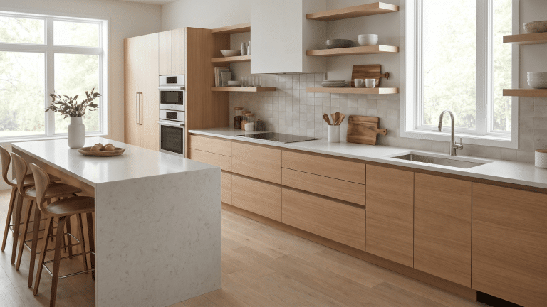
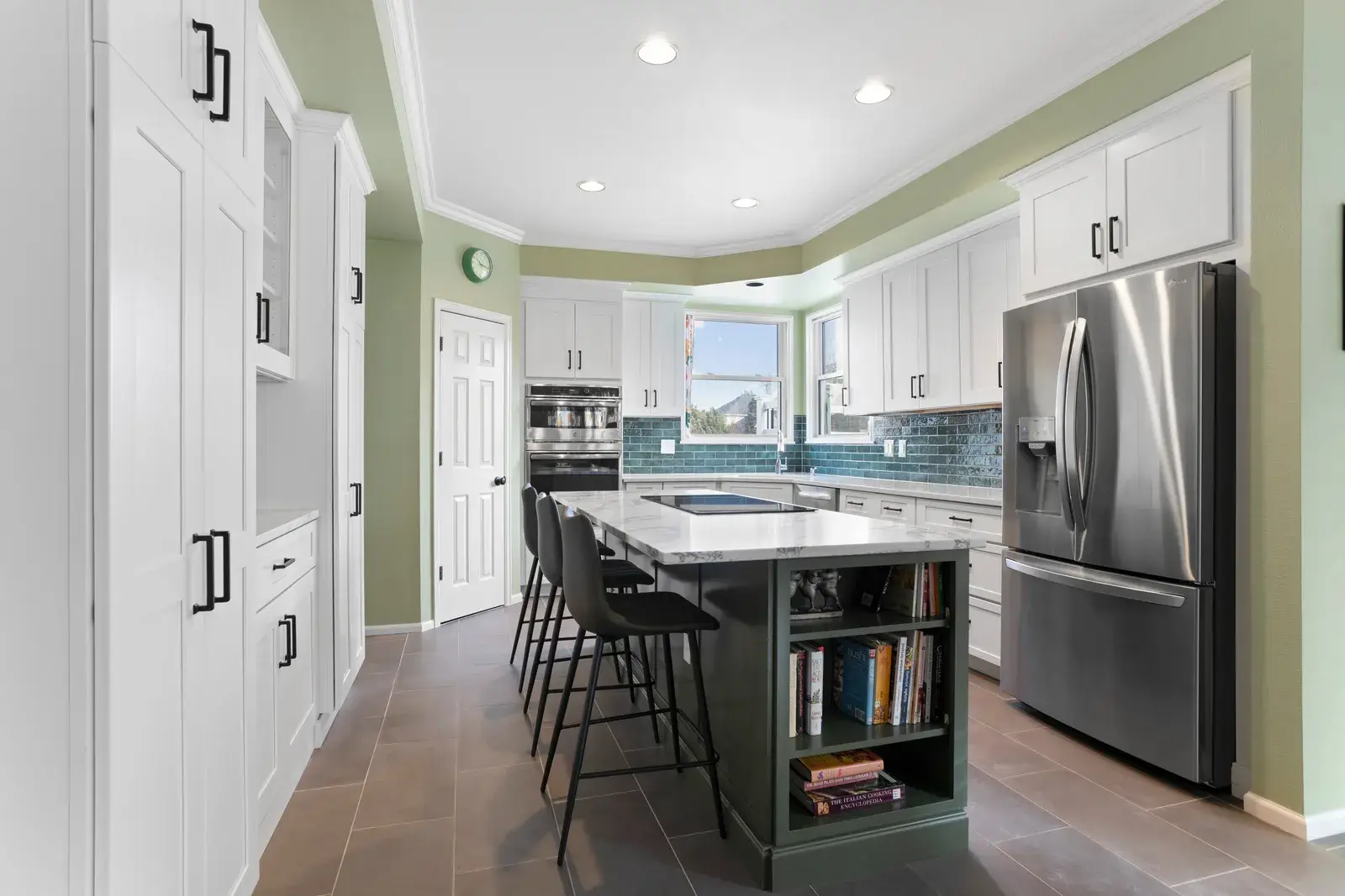
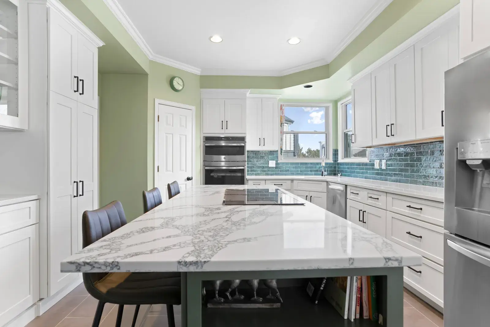
The old peninsula was replaced with an island sized for both prep and seating, positioned to open the natural work triangle instead of blocking it. It quickly became the most-used surface in the house.
An island earns its space only when it improves flow and adds function; an oversized one that crowds the walkways does the opposite. Here the dimensions were set around real clearances, so two people can work and others can gather without anyone feeling boxed in.
What finishes were chosen and why?
Finishes were chosen to last, not to date. Warm neutral cabinetry, durable stone, and hardware simple enough to still look right in ten years replaced the dark, heavy look of the original.
The goal was a kitchen that reads current without chasing a trend that expires. Timeless bones with changeable accents is a formula that ages gracefully: the paint, hardware, and fixtures can evolve over the years while the expensive core stays relevant.
How was the lighting improved?
The single central fixture gave way to three layers: task lighting over the work zones and island, ambient light across the room, and a touch of accent light for warmth in the evening.
The effect was dramatic and disproportionate to the cost. A room that had felt dim and flat became bright and inviting, usable for early coffee and late cleanup alike. Lighting is often the cheapest change in a remodel with the largest daily payoff.
Did the footprint change?
Barely. The transformation was achieved almost entirely within the existing walls, with the main structural move being the opening to the living area. The room occupies nearly the same square footage it always did.
That is the lesson worth stealing: you rarely need more space, you need the space you have to work correctly. Reorganizing the existing footprint is usually far cheaper than adding on, and often delivers a bigger improvement in how the home actually lives.
What was the project like at a glance?
The table below summarizes the scope, so you can compare it against your own kitchen and get a realistic sense of what a redesign of this depth involves.
|
Element |
Detail |
|
Scope |
Full kitchen remodel with wall opening to living area |
|
Footprint |
Unchanged, same square footage |
|
Key structural change |
Removed wall / peninsula, added properly sized island |
|
Cabinetry |
New, warm neutral, timeless door style |
|
Countertops |
Durable quartz |
|
Lighting |
Three-layer scheme (task, ambient, accent) |
|
Typical timeline for this scope |
8 – 12 weeks |
What surprised the homeowners most?
The most common reaction to a project like this is not about a single finish, it is about how much bigger the whole floor feels. Opening one wall changed the experience of the kitchen, the dining area, and the living room all at once.
Homeowners also tend to be surprised by how central the island becomes. What starts as a prep surface turns into the place the family eats breakfast, does homework, and gathers, quietly becoming the heart of the home.
What can other Highlands Ranch homeowners learn?
Most Highlands Ranch homes share the same DNA: solid construction, generous size, and layouts or finishes from the era they were built. That makes them ideal candidates for exactly this kind of flow-first redesign.
The takeaway is to diagnose flow before finishes. If your kitchen feels dark, cramped, or cut off despite being a decent size, the fix is almost certainly structural, not cosmetic. You can see the full kitchen remodel in Highlands Ranch and how each decision played out from demolition to the finished island.
Is opening the kitchen always the answer?
Not always. Opening a kitchen works beautifully when a wall is isolating the space and the structure allows it, but some homes benefit more from keeping a defined kitchen and improving it in place.
The right move depends on how the household lives and what the framing permits. A good remodeler evaluates whether the wall is load-bearing, how the change affects adjoining rooms, and whether the openness actually suits the family, rather than opening everything by default.
Redesign or Refresh: How Do You Tell?
If your complaints are about looks, dated cabinets, tired counters, an old backsplash, a refresh may be enough. If your complaints are about how the room works, collisions, poor flow, isolation, darkness, you need a redesign.
The Highlands Ranch kitchen needed a redesign because its problems were structural, and a refresh would have left the family fighting the same layout in prettier clothes. Being honest about which category your frustration falls into saves both money and disappointment.
How Do You Plan a Kitchen Redesign Around Real Clearances?
Good kitchen design starts with clearances, not cabinets: at least 42 inches of walkway around an island, room for appliance doors to open, and a work triangle that keeps the sink, stove, and refrigerator within easy reach.
The Highlands Ranch redesign sized the island and pathways around these real dimensions, which is why the finished room feels effortless. Skipping this step is how kitchens end up beautiful but frustrating, with islands that block traffic and doors that collide.
What Role Did Storage Play in the Redesign?
Storage was designed around how the family actually cooks, deep drawers for pots, dedicated space for small appliances, and a pantry solution that cleared the counters. Clear counters are a large part of why the kitchen feels calm.
Thoughtful storage is invisible but transformative. A kitchen with a place for everything stays tidy with less effort, which keeps the design looking as good in daily life as it does on the day it is finished.
How Was the Backsplash and Palette Chosen?
The backsplash and surfaces were kept in a warm, natural palette that complements the cabinetry without competing with it. The aim was cohesion, a room that reads as one calm, intentional space rather than a collection of statements.
Restraint is what makes the palette timeless. By letting the layout and the island be the stars and keeping the surfaces quiet, the design avoids the trend-chasing that dates a kitchen within a few years.
Did the Redesign Add Resale Value?
A flow-first kitchen redesign in a strong neighborhood like Highlands Ranch reliably supports resale value, because an open, updated, well-executed kitchen is exactly what local buyers expect and reward.
Even for owners staying long term, the daily improvement is the real return, but the resale benefit is a genuine bonus. Quality workmanship and timeless finishes ensure the value holds rather than fading with a passing trend.
How Do You Avoid Common Kitchen Redesign Mistakes?
The frequent mistakes are choosing finishes before fixing the layout, sizing an island too large for the room, under-lighting the space, and committing bold, of-the-moment choices to permanent surfaces.
This redesign avoided each by leading with flow, sizing the island to real clearances, layering the lighting, and keeping the palette timeless. Learning from these common errors is often what separates a kitchen you love from one you tolerate.
How Do You Choose Cabinetry That Lasts?
Choose solid construction, a timeless door style, and a finish you will still like in a decade. The cabinetry is the largest visual element and the biggest slice of the budget, so it rewards durability over fashion.
The Highlands Ranch kitchen used warm neutral cabinetry precisely because it reads as current without chasing a trend. Well-built cabinets in a classic style are the foundation that lets the rest of the kitchen evolve around them over the years.
What made the island the heart of the home?
Sized for both prep and seating and positioned to open the work triangle, the island became the surface the family gathers around for meals, homework, and conversation, not just a place to chop vegetables.
An island earns that central role only when its dimensions and placement serve real life. Here it was planned around genuine clearances and daily habits, which is why it quietly became the busiest and most-loved spot in the house.
How Do You Balance Trends and Timelessness?
Commit the permanent, expensive elements, cabinetry, counters, layout, to timeless choices, and reserve any trend-driven personality for paint, hardware, and accessories that are cheap and easy to swap later.
This balance is what keeps a kitchen feeling current for years rather than dating quickly. The Highlands Ranch redesign followed it closely, which is why the room reads as fresh and intentional rather than tied to the moment it was built.
Is Your Kitchen a Candidate for This Kind of Redesign?
If your kitchen feels dark, cramped, or cut off despite being a reasonable size, it is a strong candidate for a flow-first redesign like this one. Those symptoms point to a layout problem, not a finish problem.
Homes with closed kitchens, blocking peninsulas, and single-source lighting almost always benefit from opening up and reorganizing the space. If that describes your kitchen, the Highlands Ranch project is a useful blueprint for what a thoughtful redesign can achieve.
How Do You Size an Island Correctly?
Size an island to leave at least 42 inches of clearance on all sides, enough for people to pass and appliance doors to open, and keep its proportions in scale with the room. An island that is too large crowds the kitchen it is meant to serve.
In the Highlands Ranch project, the island was dimensioned around these real clearances, which is why it improves flow instead of blocking it. Getting the size right is what lets an island become the functional, well-used centerpiece rather than an obstacle.
The Bottom Line
A room that feels twice its previous size while occupying nearly the same footprint is the payoff of designing for flow first and finishes second. The Highlands Ranch kitchen did not gain square footage; it gained function, light, and connection.
If your kitchen fights you every day, resist the urge to start with tile samples. Fix the flow, size the island to the space, and layer the light, and the finishes will finally have a layout worthy of them.