Beyond White: A Room-by-Room Guide to Choosing Your Door Color
We paint walls, hang art, and arrange furniture with deliberate care, yet the vertical planes we physically open and close each day often remain an afterthought. Treating every door like a white rectangular ghost is a missed opportunity for depth, rhythm, and narrative within your home. Color, applied to these moving canvases, is not mere decoration. It is a powerful, low-commitment tool for shaping a room’s atmosphere, guiding movement, and expressing a layered design intelligence that transcends the safety of monochrome.
Moving Beyond the Default White
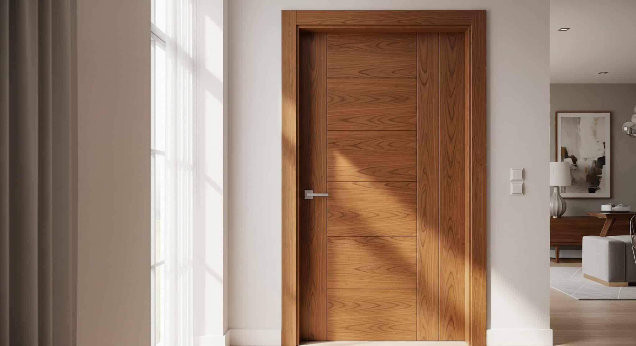
Why does defaulting to bright white feel so instinctive? Its promise of neutrality often delivers visual sterility, creating a flat and disjointed landscape. A door possesses incredible power as a transitional element. Its hue can either anchor a space, create a surprising focal point, or subtly direct the flow from one area to the next. Even the most beautiful natural wood grains, like those found on classic walnut panel doors, can feel lost or overly muted against vibrant wall colors, sometimes begging for a protective, tinted stain to enhance their richness and integration.
Establishing Your Color Strategy
Before selecting a single swatch, decide on your home’s overarching chromatic philosophy. Will you pursue a cohesive flow, using the same family of colors throughout to create a serene, unified envelope? Alternatively, will you grant each room its own distinct personality, letting the door announce a shift in mood and function? A third, more daring approach treats the door as an independent art piece, using its color to create a deliberate, energetic clash that becomes a conversation starter rather than a bridge.
Room-by-Room Color Psychology
Different spaces ask for different emotional responses from their portals.
- Entryways deserve a confident, welcoming hand. A deep charcoal, a saturated navy, or a warm, earthy terracotta sets a sophisticated tone upon arrival.
- Kitchens and Dining Rooms benefit from colors that stimulate appetite and sociability. Consider creamy yellows, herbaceous greens, or cheerful, muted blues.
- Bedrooms call for retreat. Soothing sage, tranquil lavender, or soft, grayed-out blues promote rest and calm, turning the doorway into a gentle promise of repose.
- Home Offices require focus and clarity. Energizing yet stable colors like a mossy green, a deep teal, or a stately burgundy can help define the workspace mentally.
Harmonizing with Walls and Trim
Your door’s relationship with its surrounding surfaces is critical. Will it blend, stand apart, or create a new dialogue? A popular tactic involves painting the door the same color as the walls but in a high-gloss sheen, creating a subtle, reflective variation. Another method paints the trim and door the same crisp white for a classic, tailored look. For maximum drama, let the door’s color clash beautifully with the wall, using the trim as a neutral frame to contain the vibrant interaction.
The Impact of Light and Space
Never forget the transformative effect of illumination. A north-facing room with cool, dim light can be warmed instantly by a door painted in a rich cream or a pale ochre. Conversely, a south-facing space flooded with warm sun can handle, and even cool down, a door in a refreshing slate gray or pale green. In tight corridors, a light-colored door can help the space feel less confined, while a dark, moody hue in a large room can make it feel more intimate and grounded.
Practical Considerations and Finishes
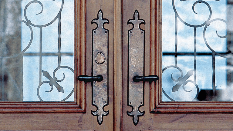
Durability and finish are as important as the color itself. High-traffic areas like kitchens and children’s rooms demand a scrubbable, durable paint. A satin or semi-gloss finish is far more practical for cleaning than a flat matte. For a truly custom feel, don’t neglect the hardware. A bold color paired with black ironmongery creates a modern, sharp contrast, while brass or nickel offers a more traditional, refined complement.
Your Home’s New Rhythm
Choosing a door color is an exercise in intentionality. It asks you to see these functional objects as integral components of your home’s visual rhythm. Stepping away from uniform white is not an act of rebellion, but one of curation. It demonstrates a considered approach to design, where every element, even the moving parts, contributes to a holistic and personally resonant environment. By granting your doors a voice, you choreograph a more dynamic, expressive, and truly personalized journey through the place you call home.


