Stonington Gray ( HC-170): A Review
Tired of white walls that feel too stark, yet worried gray paint might make your space feel cold and uninviting? You’re not alone in this paint color dilemma.
Most homeowners struggle to find that perfect gray that feels both urbane and welcoming, one that won’t clash with their existing furniture or look completely different in various lighting conditions.
Here’s the good news: Benjamin Moore’s Stonington Gray offers the ideal solution. This versatile cool gray creates a refined backdrop that works with any decor style while maintaining its character throughout the day.
In this complete guide, you’ll learn everything about the color from its unique characteristics and best room applications to expert color pairings and sampling tips. Get ready to change your space with confidence using this timeless, refined gray that interior designers trust.
What is Stonington Gray?
It is a gray paint color that isn’t warm but also isn’t as icy cold as some gray paint colors. It’s a ‘slightly stormy gray.’ HC-170 Gray,
Thanks to its cool blue undertones, is a cool-leaning, mid-toned gray. It’s not overly cool (usually reads neutral) but instead offers that touch of coolness that can balance out warm lighting.
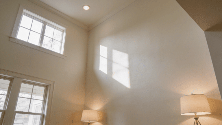
This gray can change significantly under different lighting conditions. This quality is part of what makes it such a versatile color. But it can also make it a bit tricky to work with.
This urbane gray is known for its chameleon-like quality, making it both versatile and requiring careful consideration of your room’s natural light exposure.
Benjamin Moore (HC-170) Characteristics
| Characteristic | Details |
|---|---|
| Brand & Code | Benjamin Moore HC-170 |
| Hex Code | #CACBC5 |
| RGB Values | 202, 203, 197 |
| Light Reflectance Value (LRV) | 59-59.36 |
| Color Family | Cool Gray |
Best Use Cases for Stonington Gray HC-170
The Gray’s versatile cool undertones and medium-light depth make it perfect for creating refined, timeless spaces throughout your home.
This Benjamin Moore favorite works beautifully in any room where you want a calming yet refined atmosphere.
1. Living Rooms

Living rooms need a color that works with everything you own.the HC-170 Gray paint works really well for a living room paint color.
It can be used in a large space without feeling overwhelming and is less harsh than white walls. Because this color is so versatile, it can work well as the main foundation color in an open-concept living space.
This cool gray creates a urbane backdrop that feels timeless without being boring.
- Works with any furniture style – The neutral gray also pairs well with just about any furniture or home decor you might have in your living room because of its versatile blue undertones
- Creates balanced atmosphere – Medium-toned LRV ensures it won’t make rooms too bright or dark
- Perfect for open floor plans – serves as an ideal foundation color that flows between spaces
- Adapts to changing light – you’ll see the paint change as the sunlight shifts throughout the day
Keep in mind: Be sure to test your paint in every room and all kinds of lighting before you commit to buying gallons of this color.It can look more blue in northern light and show subtle green hints in southern exposure.
2. Kitchen

Kitchen cabinets need a color that feels fresh but not stark, it would be a lovely alternative to a white kitchen.
The color is light enough to make the kitchen feel bright and fresh without being as stark as traditional white cabinets. This creates a kitchen that feels both timeless and current.
- Brightens without being harsh: It maintains kitchen brightness while adding refinement.
- Works in tuxedo style: the HC-170 Gray could also be used for the lowers in a tuxedo kitchen cabinet palette.
- Pairs with any countertop: It complements marble, quartz, and granite surfaces.
- Timeless appeal: It won’t go out of style like trendy colored cabinets.
Keep in mind: This color works particularly well in kitchens with good natural light where the subtle blue undertones can shift throughout the day. Consider pairing with brass or black hardware for contrast.
3. Bedroom

Bedrooms need a color that promotes rest and relaxation. As a bedroom color it is beautiful , the soft gray hue is really calming bedroom paint color.
If you want the bedroom to be your little sanctuary, this gracefulneutral Gray can have an incredibly relaxing feel thanks to the blue undertones.
- Creates serene atmosphere – blue undertones promote relaxation and rest
- Works for all ages – especially popular for boys’ bedrooms with masculine color schemes
- Adapts to different lighting – performs differently in various lighting conditions, which adds to its charm in bedroom settings
- Flexible styling options – works with both neutral and colorful accent pieces
Keep in mind: The perfect sheen for bedrooms is either satin or eggshell paint, depending on your lighting. You can add pops of color through accent walls, patterned bedding, or vibrant rugs.
4. Bathroom

Bathrooms need a color that feels clean and cohesive. In my son’s bathroom, we used it on the walls and the ceiling.
I love to paint bathroom walls and ceilings the same color when I’m working with light neutrals it adds a really nice unified touch.
- Creates cohesive look: Painting walls and ceiling the same color makes small bathrooms feel larger.
- Pairs with dark vanities: The Gray paint also pairs really well with the deep charcoal black vanity.
- Works with white fixtures: It complements standard bathroom elements
- Adds Refinement: It the space beyond basic white walls
Keep in mind: With an LRV of almost 60, it works well in a room with average or even above-average natural light. However, if your room has low-light, you might find it a bit harsh and lacking in undertones. Test thoroughly in your specific bathroom lighting conditions.
Color Pairing Ideas with Stonington Gray
These three Benjamin Moore colors create a complete palette that enhances its cool undertones while offering versatility for any room style.

1. Puritan Gray HC-164
These two soft grays work beautifully together to create a calm, layered look in any room. Puritan Gray brings slightly warmer undertones that complement it’d cool blue base.
Use HC-164 on accent walls or trim while keeping it on main surfaces. This pairing adds depth without overwhelming the space. The subtle contrast helps define different areas while maintaining a cohesive feel throughout your home.
- Best for: Modern farmhouse styles, transitional decor, and spaces needing subtle contrast.
- Room applications: Master bedrooms, home offices, and hallways where gentle color variation creates visual interest.
2. Lychee AF-40
The warm pink-red tones of Lychee create a striking contrast against its cool undertones. This bold pairing brings energy and personality to neutral spaces without feeling too dramatic.
Lychee works perfectly as an accent color through pillows, artwork, or a single feature wall. The combination feels both sophisticated and playful, making rooms feel more inviting and alive while maintaining a balanced and refined overall palette.
- Best for: Contemporary homes, eclectic styles, and spaces needing a pop of warm color.
- Room applications: Living rooms, dining areas, and powder rooms where bold accents make a statement.
3. Decorator’s White OC-149
Clean, crisp Decorator’s White brightens Stonington Gray’s subtle blue undertones perfectly. This classic combination feels fresh and timeless in any setting.
The white helps reflect light and makes rooms feel larger, while the gray adds refinement. Use Decorator’s White on trim, ceilings, or cabinets with Stonington Gray on walls. This pairing never goes out of style and works with both traditional and modern furniture pieces seamlessly.
- Best for: Traditional homes, coastal styles, and spaces needing brightness and contrast.
- Room applications: Kitchens, bathrooms, and nurseries where clean, fresh looks are essential.
Stonington Gray Similar Colors

These carefully curated gray tones share Stonington Gray’s worldly cool undertones and versatile appeal, offering complementary options that range from icy Arctic hues to lustrous metallic finishes for cohesive color schemes.
1. Arctic Gray
Arctic Gray is a cool-toned, muted gray color that evokes the subtle hues of ice and snow in polar regions. It typically features blue or silver undertones that create a crisp, clean appearance reminiscent of overcast Arctic skies and weathered ice formations.
2. Nimbus
Nimbus is a soft, cloudy gray color that captures the essence of rain-bearing clouds before a storm. It typically features a medium-toned gray with subtle blue or purple undertones, creating a moody yet sophisticated appearance reminiscent of overcast skies.
3. Silver Chain
Silver Chain is a bright, metallic gray color that mimics the lustrous appearance of polished silver jewelry or chains. It features cool undertones with a reflective quality that creates a sleek, modern aesthetic reminiscent of brushed metal surfaces.
4. Sleigh Bells
Sleigh Bells is a bright, shimmery silver-white color that captures the gleaming metallic shine of traditional holiday bells. It features cool undertones with a luminous, almost iridescent quality that evokes the festive sparkle and crisp winter atmosphere of the holiday season.
Pro Tips for Testing and Applying This Versatile Gray
- Test in Multiple Lighting Conditions: Be sure to test your paint in every room and all kinds of lighting before you commit to buying gallons of this color. View your samples in morning, afternoon, and evening light to see how the undertones shift throughout the day.
- Use Large Sample Sizes: Don’t rely on tiny paint chips from the store. Paint large poster boards or use peel-and-stick samples that are at least 12×12 inches. Larger samples help you see these undertone changes more clearly in your specific space.
- Test Against Your Fixed Elements: Paint samples on walls next to your existing flooring, countertops, and furniture. This helps you see how the color will interact with your current elements before committing to full coverage.
- Consider Your Room’s Natural Light: With an LRV of almost 60, this color works well in a room with average or even above-average natural light. North-facing rooms will emphasize the blue undertones, while south-facing rooms may bring out subtle green hints.
- Choose the Right Paint Finish: Select your paint sheen based on the room’s function and lighting. For bedrooms, the perfect sheen is either satin or eggshell paint, depending on your lighting.
- Prime Properly for True Color: Use a high-quality primer, especially if you’re painting over darker colors or switching from warm to cool tones. This ensures the true color comes through without being influenced by the previous paint color.
Conclusion
Stonington Gray proves why it remains one of Benjamin Moore’s most trusted paint colors. This versatile, cool gray offers the perfect solution for homeowners seeking a refined yet welcoming backdrop that works with any decor style.
From creating serene bedrooms to brightening kitchens without the starkness of white, Stonington Gray adapts beautifully to different spaces and lighting conditions.
Remember the key to success: always test samples in your specific lighting conditions and pair them thoughtfully with complementary colors, such as decorative white or puritan gray. With its medium-light LRV and subtle blue undertones, this timeless gray will create the refined atmosphere you’ve been searching for.
Ready to convert your home? Start by ordering large paint samples and testing them in your space to ensure a perfect fit.