Kitchen cabinets take up more visual space than any other element in your kitchen. The color you choose sets the entire mood and style of your home’s heart.
But with hundreds of color options available, how do you pick the perfect shade?
They worry about making expensive mistakes or choosing trendy colors that look dated in a few years.
The wrong color can make your kitchen feel cramped, outdated, or clash with your home’s style.
This guide solves those problems. You’ll find expert-approved cabinet colors that work in real homes, along with practical tips for selecting the right finish and considering key factors such as lighting and maintenance.
By the end, you’ll have the confidence to select cabinet colors that you’ll love for years to come.
How to Choose the Right Cabinet Color?
Choosing the perfect cabinet color starts with understanding your kitchen’s unique needs. Look at your kitchen’s size, natural light, and current style first.
Small kitchens work best with lighter shades that reflect light, making the space feel larger. Large kitchens can handle darker, bolder colors without feeling cramped.
Modern homes often pair well with clean whites and grays, while traditional spaces look great with warm wood tones or soft, creamy colors. Think about daily use as well.
Light colors show dirt and fingerprints more easily, while darker shades hide everyday wear better. Test paint samples on your actual cabinets in different lighting throughout the day.
Morning light, afternoon sun, and evening fixtures all change how colors look. Match your cabinets to your countertops, backsplash, and flooring for a cohesive look that feels intentional rather than random.
For neutral shades that are both stylish and market‑friendly, check our deep insights onBest Neutral Cabinet Colors to Upgrade Your Kitchen.
Factors to Consider When Choosing Cabinet Colors
- Visual alignment with home style (modern, rustic, coastal, etc.): Match your cabinet color to your home’s overall style – clean whites and grays for contemporary homes, warm woods and creams for rustic spaces, and soft blues for coastal themes.
- Lighting conditions (natural vs. artificial): Test cabinet colors in your actual kitchen lighting throughout the day, as natural light reveals true colors, while artificial light can make them appear warmer or cooler.
- Kitchen size and layout: Choose light colors for small kitchens to make them feel larger, while spacious kitchens can handle darker, bolder colors without feeling cramped.
- Maintenance and durability: Light colors tend to show dirt and fingerprints more easily, while darker shades hide everyday wear better but may reveal dust and water spots.
- Resale value and timelessness: Stick with classic colors like white, gray, or natural wood tones that appeal to most buyers and won’t look dated in five years.
19 Best Kitchen Cabinet Colors Ideas
Finding the perfect cabinet color can change your kitchen from ordinary to outstanding. These 19 colors offer proven combinations that work in real homes.
1. Classic White
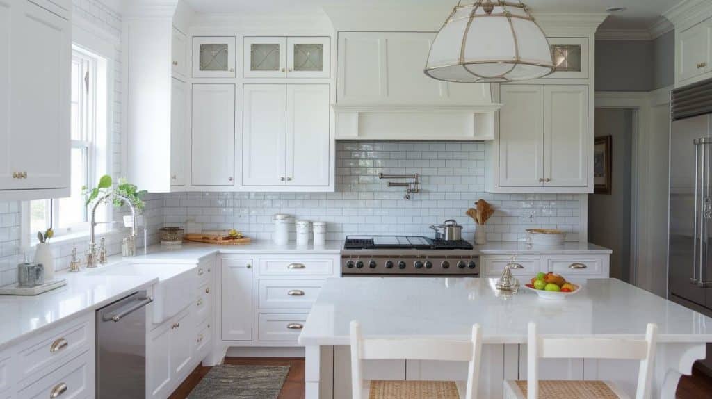
Pure white cabinets remain the most popular choice for good reason. They make small kitchens feel larger and work with any decor style. White reflects natural light beautifully, creating a bright, clean atmosphere that never goes out of style.
Best pairings: Marble countertops, subway tile backsplash, stainless steel appliances, and brushed nickel hardware.
2. Sage Green
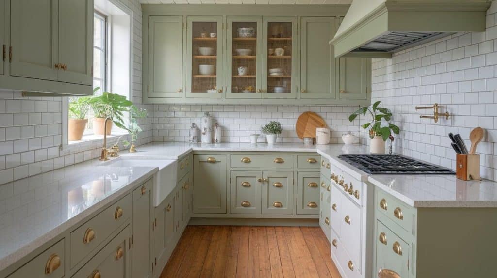
Sage green brings nature indoors with its soft, muted tone. This color creates a peaceful kitchen environment while staying current with 2025 trends. It works exceptionally well in farmhouse and transitional kitchen styles.
Best pairings: White quartz countertops, natural wood floors, cream subway tiles, and brass or black hardware. Add plants for an organic feel.
3. Navy Blue
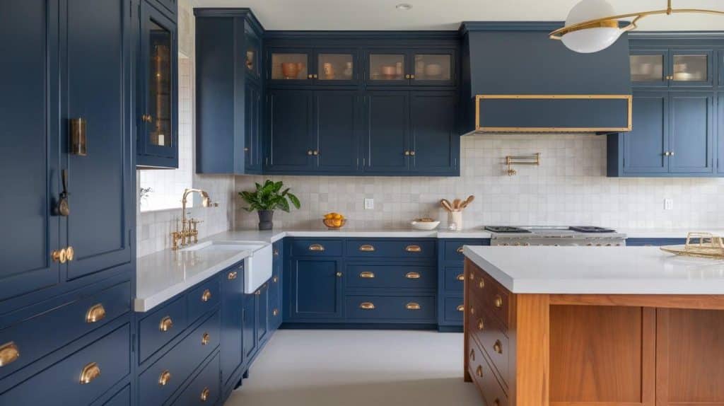
Navy blue cabinets add complexity and depth to any kitchen. This classic color strikes a balance between tradition and modernity, making it perfect for homeowners who seek a timeless style with a distinct personality.
Best pairings: White or light gray countertops, white backsplash tiles, gold or brass hardware, and warm wood accents for contrast.
4. Charcoal Gray
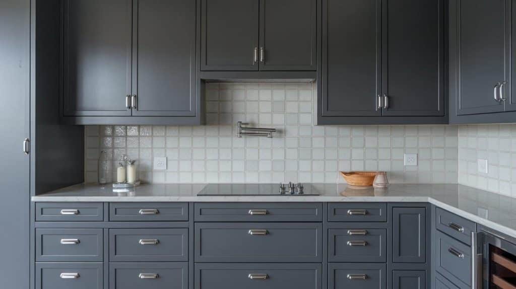
Charcoal gray offers a contemporary alternative to black cabinets. This color adds drama without being too bold, making it ideal for modern and industrial kitchen designs.
Best pairings: White marble countertops, stainless steel appliances, glass tile backsplash, and chrome or brushed steel hardware for a cohesive look.
5. Greige
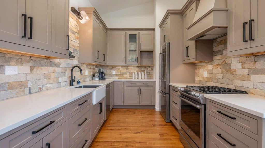
Greige combines the best of gray and beige, creating a versatile neutral that works with any color scheme. This adaptable shade suits both modern and traditional kitchens perfectly.
Best pairings: White or cream-colored countertops, a natural stone backsplash, warm wood floors, and brushed gold or black hardware, depending on your style preference.
6. Matte Black
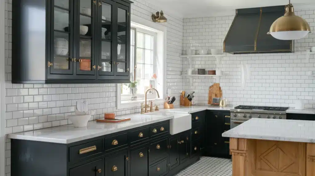
Matte black cabinets make a strong statement while maintaining a refined look. This dramatic color works best in larger kitchens with plenty of natural light to prevent the space from feeling closed in.
Best pairings: White marble or quartz countertops, white subway tiles, brass or gold hardware, and plenty of under-cabinet lighting for balance.
7. Creamy Off-White
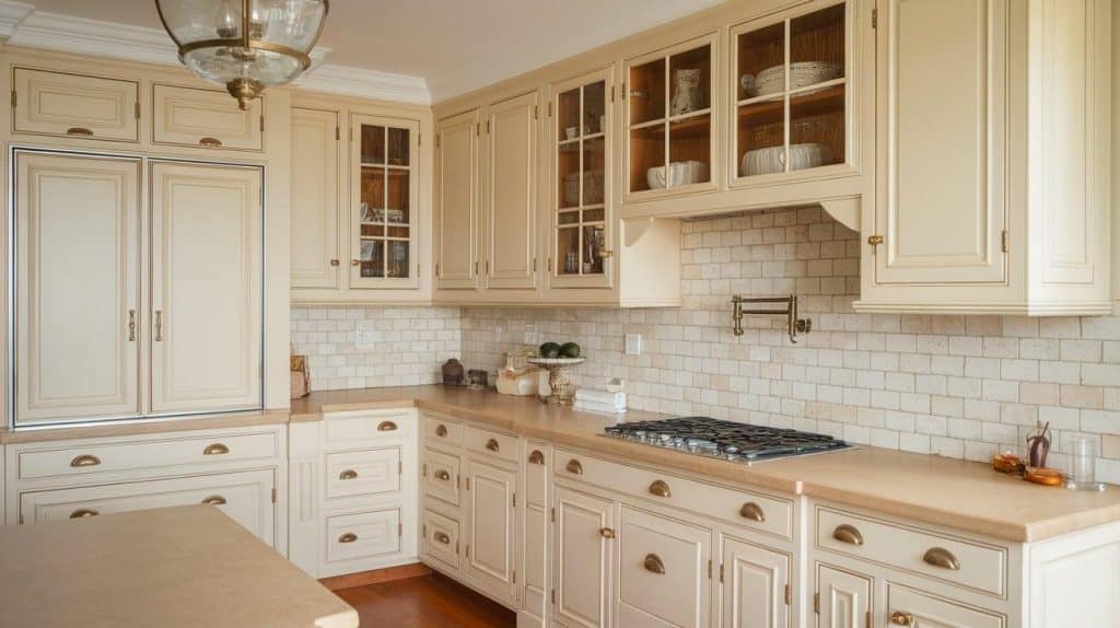
Creamy off-white offers warmth that pure white can’t match. This soft shade works beautifully in traditional and transitional kitchens, creating a cozy yet refined atmosphere.
Best pairings: Natural stone countertops, warm wood floors, beige or cream backsplash tiles, and antique brass or oil-rubbed bronze hardware.
8. Dusty Rose
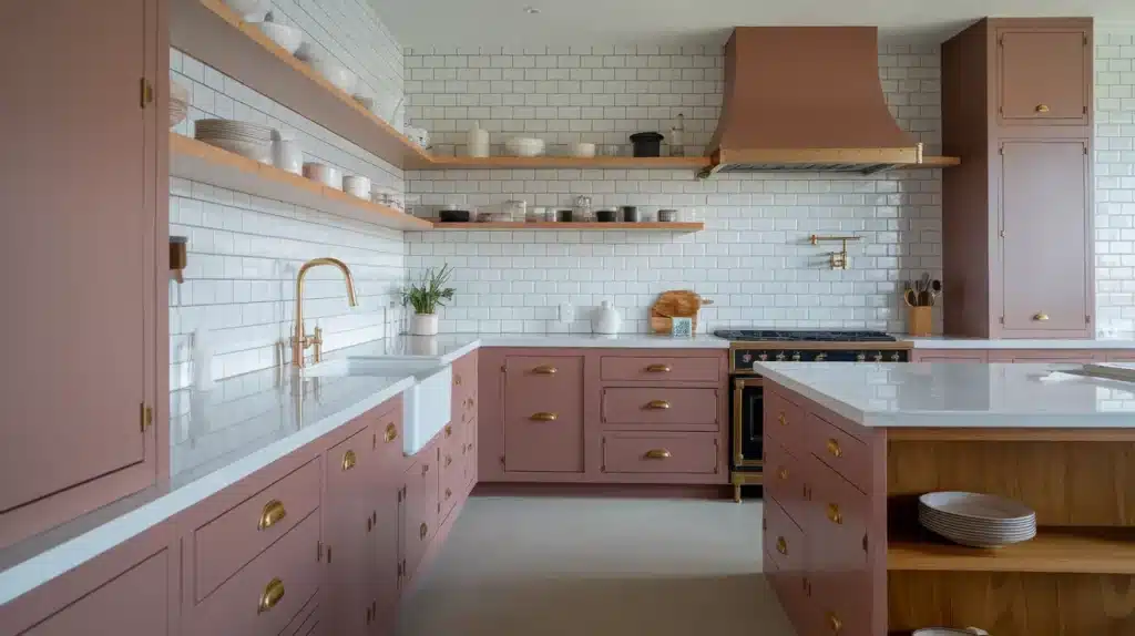
Dusty Rose adds a touch of romance without being overly feminine. This muted pink works surprisingly well in modern kitchens, especially when paired with the right materials and finishes.
Best pairings: White or gray countertops, white subway tiles, brass hardware, and natural wood accents to ground the soft color.
9. Deep Forest Green
Deep forest green creates a rich, luxurious atmosphere in your kitchen. This bold color works especially well in traditional and transitional styles, bringing natural beauty indoors.
Best pairings: White or cream countertops, natural stone backsplash, brass hardware, and warm wood accents for a balanced, organic feel.
10. Sky Blue
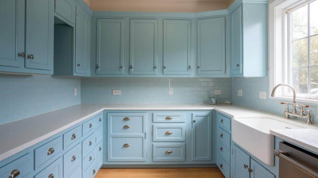
Sky blue cabinets bring a fresh, airy feel to your kitchen. This light shade works perfectly in coastal and cottage-style kitchens, creating a relaxed, vacation-like atmosphere.
Best pairings: White countertops, white or light blue backsplash tiles, brushed nickel hardware, and natural wood accents for coastal charm.
11. Natural Wood Finish
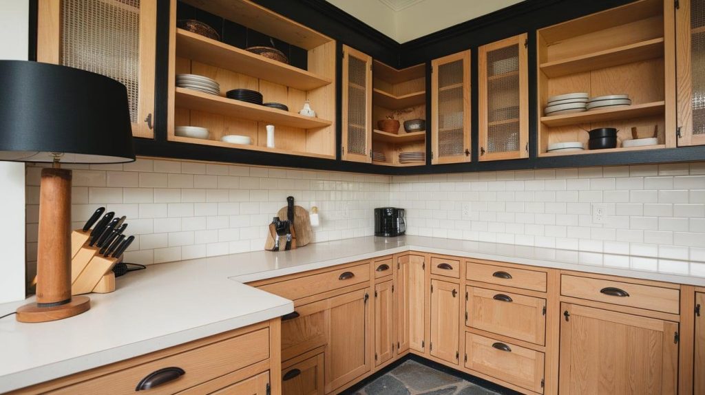
Natural wood cabinets offer warmth and texture that painted finishes can’t match. This timeless choice works in any kitchen style and adds organic beauty to your space.
Best pairings: White or black countertops, subway tile backsplash, black or brass hardware, and stone or tile floors for natural contrast.
12. Terracotta
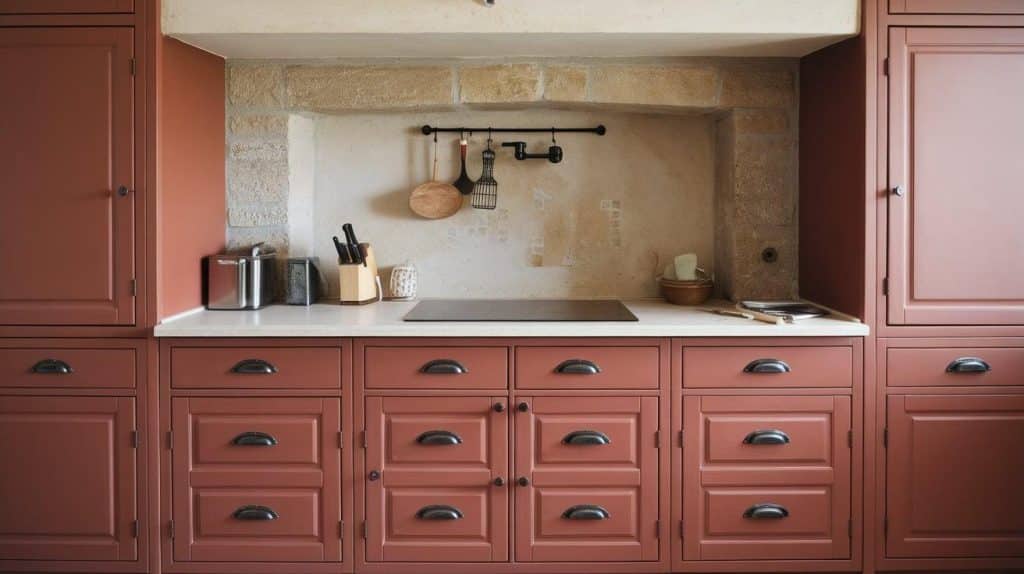
Terracotta cabinets bring Mediterranean warmth and personality to your kitchen. This earthy orange-red shade works beautifully in rustic, farmhouse, and southwestern kitchen styles.
Best pairings: Cream or white countertops, natural stone backsplash, brass or black hardware, and warm wood accents for cohesive earthiness.
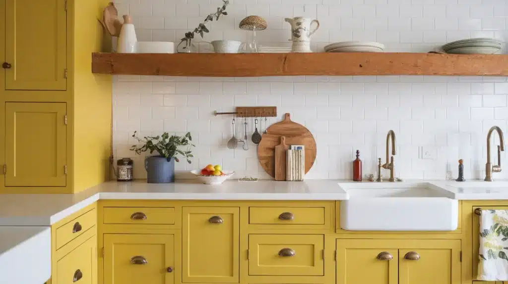
13. Muted Mustard
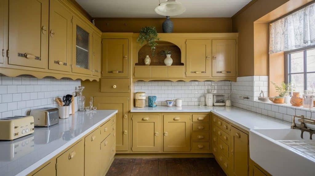
Muted mustard yellow brings vintage charm and cheerful warmth to your kitchen. This retro-inspired color works especially well in farmhouse and eclectic kitchen designs.
Best pairings: White or cream countertops, white subway tiles, brass or black hardware, and natural wood accents for vintage appeal.
14. Pale Mint
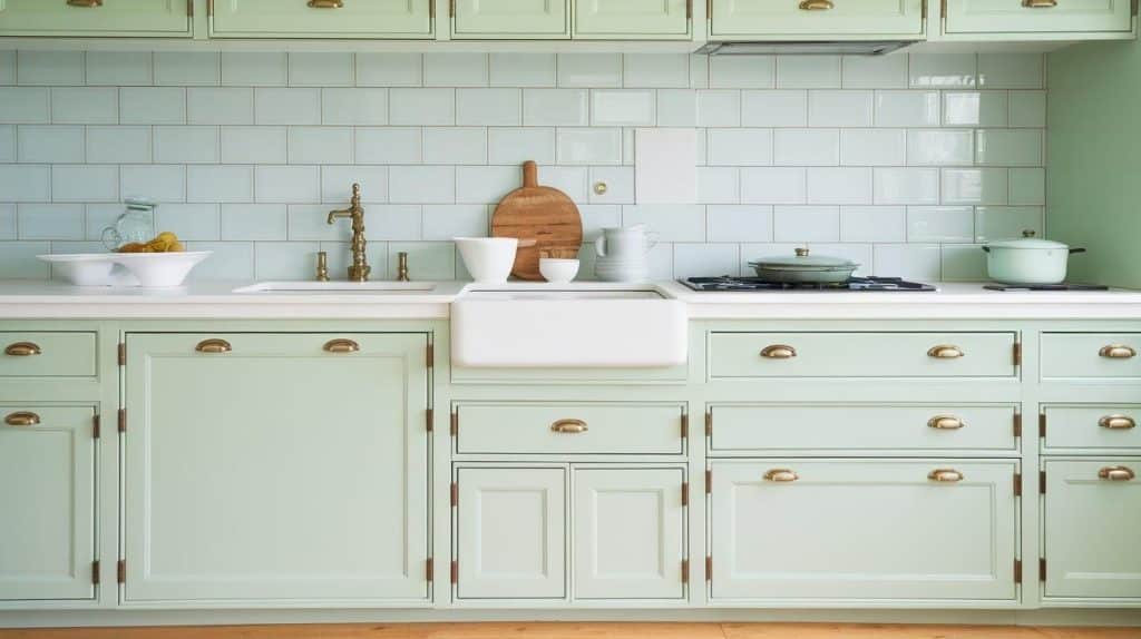
Pale mint green offers a fresh, playful alternative to traditional cabinet colors. This soft shade works well in vintage-inspired and eclectic kitchens, adding personality without overwhelming.
Best pairings: White countertops, white or mint backsplash tiles, brass or chrome hardware, and white or natural wood floors.
15. Stone Gray
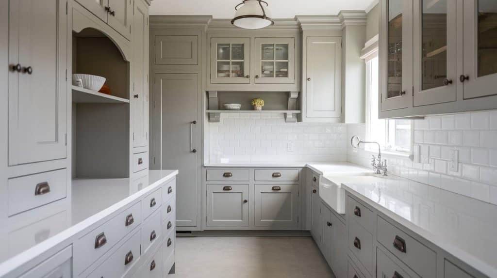
Stone gray provides a neutral foundation that works with any color scheme. This versatile shade suits both modern and traditional kitchens, offering flexibility in your design choices.
Best pairings: White or black countertops, any backsplash color, any hardware finish, and works with both warm and cool accent colors.
16. Warm Taupe
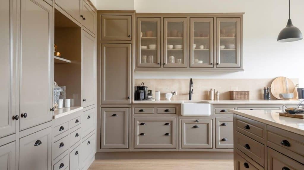
Warm taupe cabinets offer refined neutrality with subtle warmth. This refined color works beautifully in transitional and contemporary kitchens, creating a calm, cultured atmosphere.
Best pairings: White or cream countertops, neutral backsplash tiles, brushed gold or black hardware, and warm wood or stone floors.
17. Sunflower Yellow
Sunflower yellow cabinets bring sunshine and energy to your kitchen. This cheerful color works best in farmhouse and cottage-style kitchens, creating a happy, welcoming atmosphere.
Best pairings: White countertops, white subway tiles, brass or black hardware, and natural wood accents to balance the bright color.
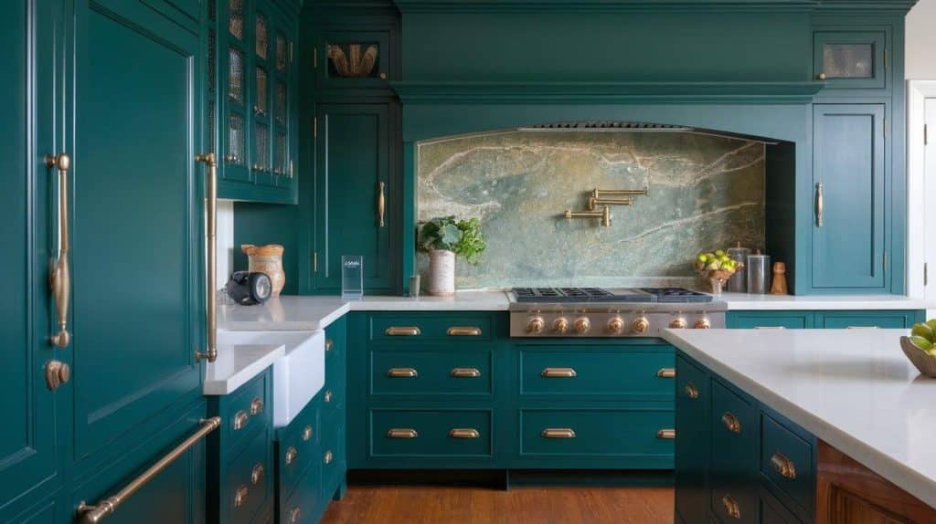
18. Peacock Blue
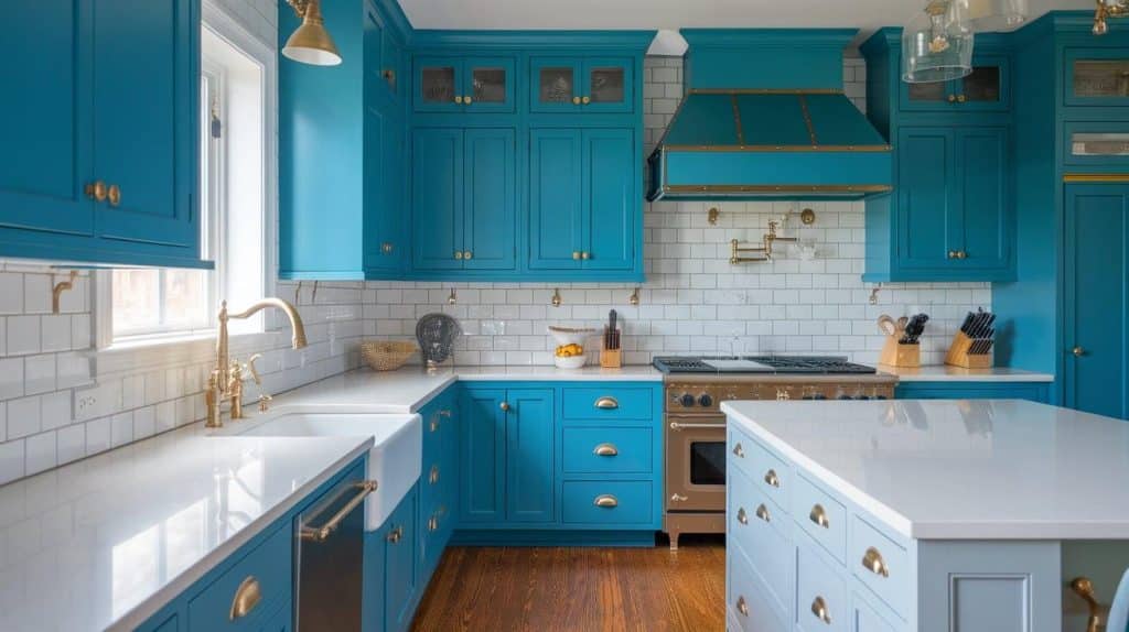
Peacock blue makes a stunning statement in any kitchen. This rich, jewel-toned hue works beautifully in both traditional and modern kitchens, adding luxury and personality.
Best pairings: White or gold-veined countertops, white backsplash tiles, brass or gold hardware, and warm wood accents for balance.
19. Blush Beige
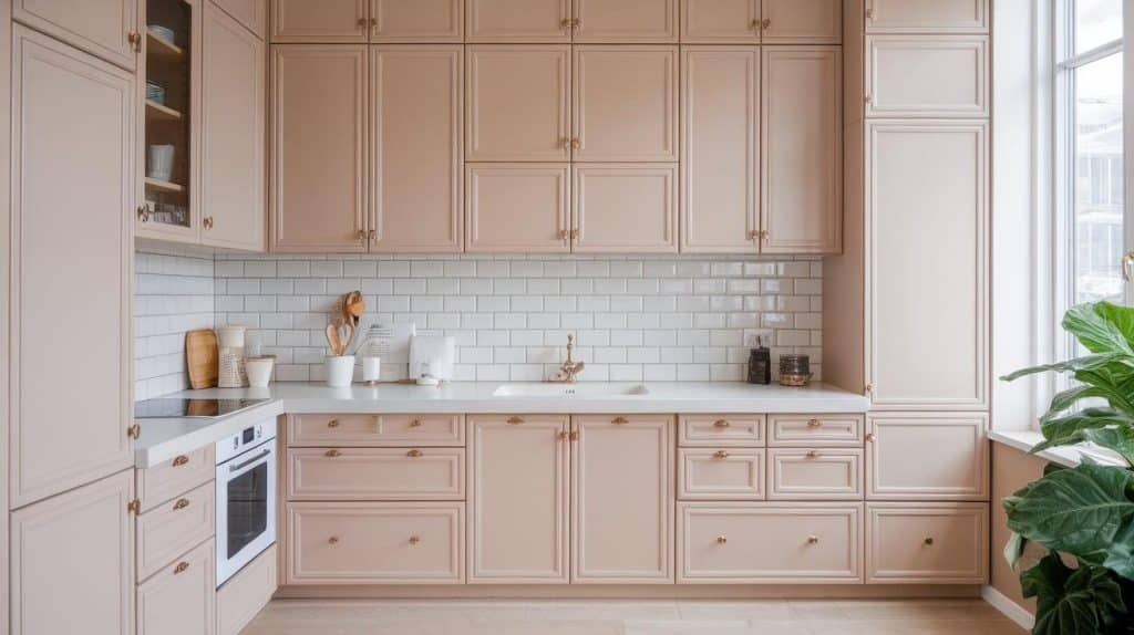
Blush beige offers subtle warmth, perfect for minimalist and Scandinavian-style kitchens. This soft neutral creates a calm, serene atmosphere while staying current with neutral trends.
Best pairings: White countertops, white or beige backsplash tiles, brushed gold or black hardware, and light wood or white floors.
Best Cabinet Finish: Matte vs Satin vs Gloss
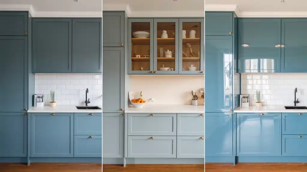
The right cabinet finish can make or break your kitchen’s look and functionality. Here’s how to choose between matte, satin, and gloss finishes for your home.
1. Matte Finish
Matte finishes absorb light rather than reflect it, creating a soft, refined look. Colors appear deeper and richer with matte because there’s no shine to compete with the pigment. This finish hides fingerprints and minor scratches better than glossy options.
Cleaning: Requires gentle cleaning with soft cloths. Avoid harsh scrubbing as it can damage the surface. Use mild soap and water for daily maintenance.
Light effect: Reduces glare and creates a calm atmosphere. Perfect for kitchens with lots of natural light or bright fixtures.
2. Satin Finish
Satin offers the perfect middle ground between matte and gloss. It has a subtle sheen that reflects some light while still hiding imperfections. Colors stay true while getting a slight boost in vibrancy.
Cleaning: Easy to wipe clean with standard kitchen cleaners. More durable than matte but not as hardy as gloss finishes.
Light effect: Provides gentle light reflection without harsh glare. Works well in most lighting conditions.
3. Gloss Finish
Gloss finishes reflect maximum light, making colors appear brighter and more vibrant. They create a polished, high-end look but show every fingerprint, scratch, and imperfection clearly.
Cleaning: Easiest to clean and most resistant to moisture and stains. Can handle regular scrubbing and strong cleaners.
Light effect: Maximizes light reflection, making small kitchens appear larger and brighter.
Cabinet Color Mistakes to Avoid
| Mistake | Why It’s a Problem |
|---|---|
| Ignoring natural light | Lighting changes how colors appear. Your favorite shade may look dull or too intense. |
| Do not sample paint in your actual kitchen. | Paint looks different on screens, in stores, and under your kitchen’s lighting. |
| Choosing trendy over timeless without context | Trends fade; without balancing timelessness, resale value and long-term appeal drop. |
| Forgetting to test colors at different times | Daylight vs evening lighting can drastically alter perception. |
| Using too many bold colors in one space | It can overwhelm the eye and make the kitchen feel chaotic or cramped. |
| Mismatching cabinet color with countertop/backsplash | Disconnected color palettes disrupt flow and reduce aesthetic cohesion. |
Final Thoughts
Choosing the right cabinet color doesn’t have to be overwhelming.
With expert-approved colors and clear guidance on finishes and key factors, you now have everything needed to make a confident decision.
Remember the most essential points: match your cabinet color to your home’s style, test colors in your actual lighting, and consider your family’s lifestyle needs.
The perfect cabinet color is out there waiting for you. Whether you choose timeless white, bold navy blue, or trendy sage green, the right color will change your kitchen into a space you love spending time in.
Ready to start your kitchen conversion? Save this guide and share it with your family to get everyone on board with your cabinet color choice.
Frequently Asked Questions
What Is the Most Popular Color for Cabinets?
White remains the most popular cabinet color, chosen by over 50% of homeowners for its timeless appeal and ability to make kitchens look larger and brighter.
What Kitchen Cabinet Color Is Outdated?
Honey oak and golden wood finishes from the 1990s look most outdated, along with stark white paired with brass hardware from the 2000s.
What Cabinet Color Is Timeless?
Classic white, soft gray, and natural wood tones are among the most timeless cabinet colors, as they never go out of style and appeal to future buyers.