Are you looking for a paint color that brings calm to your home? BM Water’s Edge (1635) might be the perfect fit for your space.
This soft, blue-gray shade offers a balance of warmth and coolness, making it suitable for many rooms in your home.
I’ve found that this color works well in both small and large spaces. It makes rooms feel bigger without feeling cold. The subtle blue hints give it depth while the gray undertones keep it neutral enough to match with many decor styles.
Water’s Edge sits in the sweet spot between too bold and too bland. It works well as a main wall color or as an accent, providing you with plenty of options.
Water’s Edge (1635): An Overview
Water’s Edge is a gentle, blue-gray hue that appears differently depending on the light. In the morning sun, it shows more blue tones. Under evening light, the gray comes forward more strongly.
This shade falls into the cool neutral group but has enough warmth to feel cozy. It’s soft but not washed out, making it suitable for year-round use in most homes.
The color has just enough depth to create interest on walls without taking over a room’s feel. It’s a middle tone that works well as a full room color or accent.
| Property | Details |
|---|---|
| Color Family | Blue-Gray |
| Light Reflectance Value | 31.48 |
| HEX Code | #BEC6C9 |
What Makes Water’s Edge Special?
- It balances both warm and cool tones, working in many lighting situations
- The color changes subtly throughout the day, adding interest to your walls
- It has enough gray to be neutral but enough blue to be interesting
- Works well with many other colors, making it easy to update your decor
- Offers a fresh feel without being too trendy or time-specific
- Creates a calm mood that works in both active and restful spaces
Perfect Color Pairings for Water’s Edge
Neutral companions bring out the best in Water’s Edge by providing balance and contrast.

White Dove (OC-17)
A soft white that perfectly complements Water’s Edge. This warm-leaning shade works well on trim and ceilings, creating a cohesive look throughout your home.
Revere Pewter (HC-172)
Neutral beige that adds subtle warmth to balance the cool undertones of Water’s Edge. Ideal for adjacent walls or furnishings.
Providence Blue (1636)
A tonal blue-green from the same collection, offering harmonious layering for a cohesive, serene aesthetic.
Simply White (OC-117)
Crisp and neutral, this hue highlights Water’s Edge’s depth without competing. Perfect for modern kitchens or bathrooms.
Antique Jade (465)
Muted green accent that pairs organically with Water’s Edge’s maritime essence, adding earthy contrast.
Want to discover even more beautiful paint colour combinations? Explore our full range of colour guides and find the perfect hues to enhance every room in your home.
Benjamin Moore Shades Similar to Water’s Edge
If you like Water’s Edge but want to explore options, these similar shades offer subtle variations:

Quiet Moments (1563)
Leans slightly more green than Water’s Edge, creating a spa-like feel while maintaining the same calming effect. Works beautifully in bathrooms and bedrooms.
Silver Lake (1598)
Has a slightly more pronounced blue undertone, offering a cooler overall appearance. Ideal for spaces with warm, southern light.
Gray Wisp (1570)
Offers a warmer take with subtle green undertones. This softer option works well in living areas, creating a cozy yet fresh atmosphere.
Wickham Gray (HC-171)
Slightly lighter than Water’s Edge with a similar blue-gray balance. Perfect for smaller spaces requiring brightness.
Brittany Blue (1633)
Lighter, airier blue from the same collection. Maintains coastal charm while brightening compact rooms.
Best Spaces to Use Water’s Edge
Water’s Edge adapts beautifully to various rooms in your home. Here’s how this versatile blue-gray shade can transform different spaces with its balanced tone and calming presence.
1. Living Room
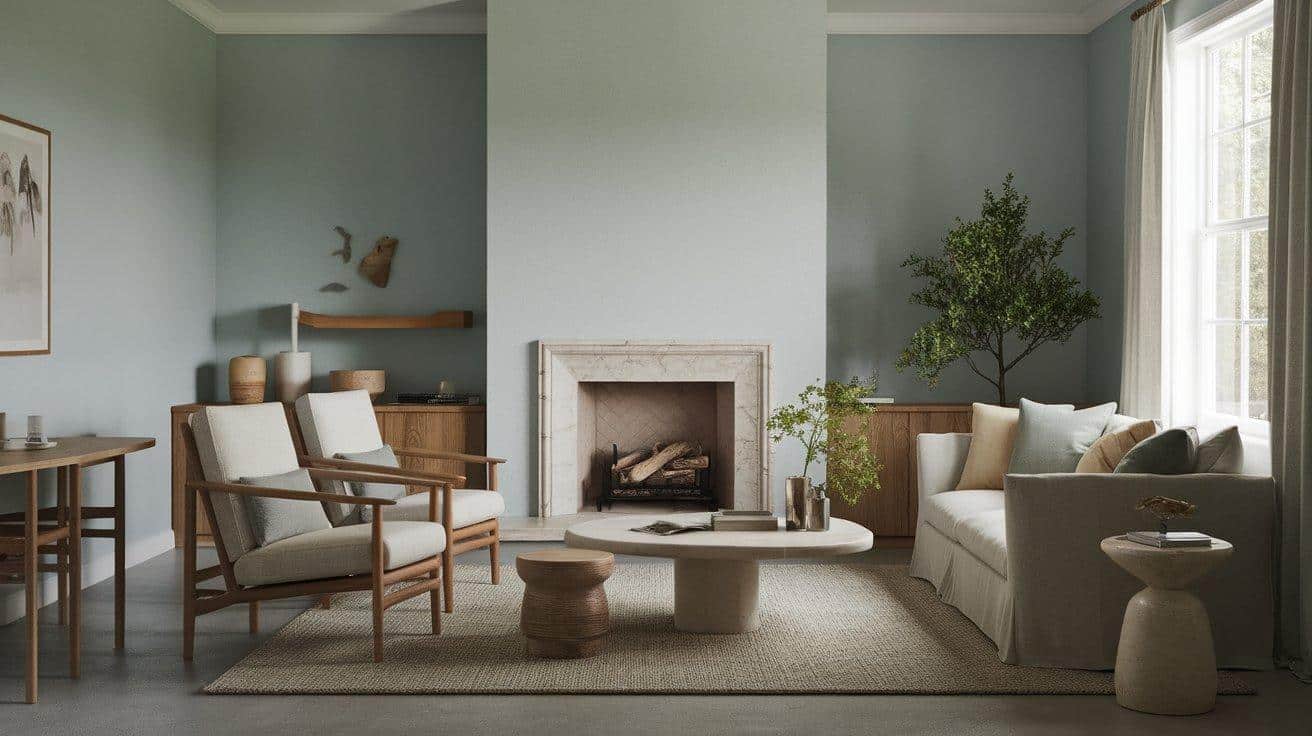
Water’s Edge creates a calm, inviting atmosphere in living rooms without feeling too cold. The blue-gray tones offer enough color to be interesting while remaining neutral enough for daily living.
- Pair with cream or off-white trim for a clean look
- Add natural wood accents to warm up the space
- Use brass or gold fixtures to create a pleasing contrast
2. Bedroom

This gentle shade promotes sleep and relaxation in bedrooms, making it an ideal choice for your most personal space. The color shifts with lighting to create different moods throughout the day.
- Match with soft white bedding for a hotel-like feel
- Incorporate textured fabrics to add depth
- Consider painting just the wall behind your bed for a focal point
3. Bathroom

Water’s Edge brings a spa-like quality to bathrooms that feels both clean and soothing. The hint of blue works well with water themes without being too literal.
- Use with white subway tiles for a timeless look
- Add plants to enhance the fresh feeling
- Choose warm-toned towels to balance the cool wall color
4. Kitchen

On kitchen cabinets or walls, Water’s Edge offers a fresh twist on neutral that works with many countertop materials. It feels clean without being stark or clinical.
- Try it on lower cabinets with white uppers for a modern look
- Pairs beautifully with marble or quartz countertops
- Add wood elements through cutting boards or stools
5. Exterior

As an exterior shade, Water’s Edge provides subtle color that changes with the daylight. It’s understated yet more interesting than plain gray or beige.
- Use for a whole-house color that stands out gently
- Try shutters against a white or cream house
- Perfect for front doors when you want something beyond basic
How to Choose the Right Shade?
Finding the perfect blue-gray can be challenging, as these colors change dramatically with varying lighting conditions. Follow these tips to ensure Water’s Edge is the right fit for your home before you make a commitment.
Test in Multiple Locations: Apply paint sample patches to different walls in your room, including corners and areas near windows. Colors appear differently depending on their placement.
Check in Changing Light: View your samples at different times of day – morning, midday, evening, and with artificial lighting. Water’s Edge may show more blue in morning light and more gray in the evening.
Use Large Sample Areas: Paint at least a 2×2-foot area rather than tiny swatches. Small samples won’t give you an accurate feel for how the color will look across a full wall.
Consider your fixed elements: Hold your paint sample next to flooring, countertops, and major furniture pieces that won’t be changing. The color should complement these permanent features.
Think about connecting rooms: If your home has an open floor plan, consider how Water’s Edge will flow with colors in adjoining spaces. Look for undertones that work together.
Test with your decorative items: Place some of your art, pillows, or other decor items near your test patch to see how they’ll look with the new wall color.
Impact of Lighting on Water’s Edge
Water’s Edge changes its look based on the light in your room, which is why testing it in your space is so important. This blue-gray paint shifts throughout the day and appears different depending on the direction your windows face.
In north-facing rooms, the color shows more gray and feels cooler. South-facing spaces bring out the blue tones, making the color appear brighter and slightly warmer.
East-facing rooms highlight the fresh qualities of Water’s Edge during morning hours, while west-facing rooms show it as more muted gray in mornings but warmer in evenings.
Light Direction Effects
- North-facing: More gray, cooler look
- South-facing: Blue tones pop, appear brighter
- East-facing: Fresh in mornings, more neutral later
- West-facing: Gray in mornings, warmer blue in evenings
The type of bulbs you use also matters. LED lights display true colors, while incandescent bulbs add warmth.
Fluorescent lighting can make colors appear cooler than they really are. The color temperature of your bulbs (warm vs. cool) will also change how Water’s Edge looks on your walls.
Conclusion
Water’s Edge (1635) offers a flexible option for many home spaces. Its blue-gray mix hits the sweet spot between too bold and too plain, working in many rooms and with many styles.
As we’ve seen, this color shifts throughout the day, which adds depth to your walls. It pairs with whites, blues, greens, and more, giving you room to grow and change your style over time.
When picking paint, remember to test it in your actual space. Light changes everything, and what works in one home might look different in yours.
Would you try Water’s Edge in your home? Think about which room might benefit most from this calm, balanced shade.
Frequently Asked Questions
Is Water’s Edge Suitable for North-Facing Rooms?
Yes, Water’s Edge works well in north-facing rooms. Its warm undertones help balance the cooler natural light while maintaining its calming blue-gray appearance.
Does Water’s Edge Work Well with Wood Trim?
Yes, Water’s Edge pairs nicely with wood trim, especially medium to light tones. The warmth of wood balances the cool blue-gray for a welcoming look.
How Many Coats of Water’s Edge Are Typically Needed?
Most walls require two coats for even coverage. Using a quality primer first can help achieve the true color, especially when covering darker shades.