Have you ever noticed how colors change our mood? Spring brings life back after winter’s cold grip. The soft pinks, gentle yellows, and fresh greens speak to us.
Colors from spring flowers offer more than pretty looks. They connect with how we feel inside and remind us of growth and new starts.
Many designers miss this chance to use these colors well. They stick to what they know.
But what if the right mix of flower colors could make your work stand out? What if these shades could say things words cannot?
Spring flower colors work because they feel true. They come from nature itself.
This guide will show you how to use spring flower colors in your designs. You’ll learn which colors work together and why they matter so much this season.
Why Choose a Spring Floral Color Palette for Your Designs?
Colors from spring flowers bring warmth to designs when used well. These shades add depth and feeling that other color sets might lack. Spring colors often include soft pinks, bright yellows, and calm blues.
Spring flower colors make spaces feel alive. They add a sense of new growth to any project. The mix of soft and bright tones helps create balance in the design work.
Spring colors bring light where it’s needed. They can make small spaces seem bigger and help dark corners feel lighter. Spring floral colors work in many places. They fit well in:
- Wedding themes and party plans
- Website designs and apps
- Home rooms and office spaces
- Print materials and signs
- Clothes and fabric patterns
These colors mix well with other styles, too. They can be toned down for formal looks or made brighter for fun projects. Flower colors from spring work all year round. They add calm to summer themes.
Key Elements of a Spring Floral Color Palette
A great spring floral color palette isn’t just a random collection of pretty colors – it requires careful thought and planning. These key elements will help you create combinations that feel natural, balanced, and truly representative of the season.
1. Balance of Colors: Spring flower palettes need both light and dark shades. The mix of bright and soft colors creates depth in your work. Too many bright colors can feel too strong.
2. Complementary and Neutral Tones: To make flower colors pop, add gray, tan, or white backgrounds. These quiet colors help the eyes rest between bright spots, and good designs need this rest.
3. Consider the Season: Spring calls for soft pinks, light blues, and pale yellows. Summer needs brighter tones. Fall works with deeper reds and oranges. Winter goes with cool blues and purples.
4. Color Transition: Create smooth shifts between colors in your palette. Sharp changes can seem harsh to viewers. Good spring palettes flow from one shade to the next like real garden views.
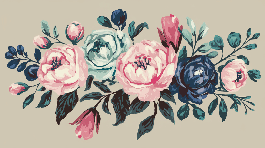
5. Inspiration from Nature: Look at real spring flowers for true color ideas. Take photos of gardens or parks. Nature already knows which colors work well together.
Top Spring Floral Color Palettes to Inspire Your Designs
Looking for the perfect spring-inspired color palette? These carefully selected combinations capture the feeling of the season while offering practical options for various design needs.
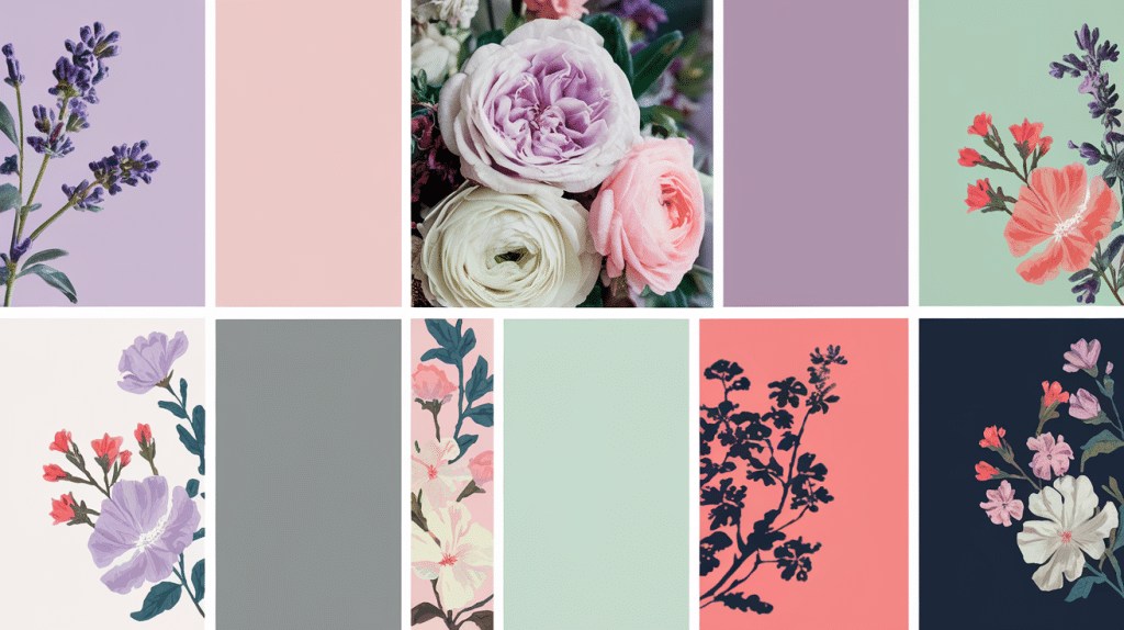
1. Spring Blossom

This palette recalls the first cherry blossoms and apple blossoms of the season. Soft pinks form the base, while warm oranges add a touch of sunrise glow. Teal and deep blue provide contrast and depth.
- Works well for: Spring wedding themes, greeting cards, and website headers
- Main colors: Blush pink, peach, teal, navy blue
- Why it works: The mix of soft and strong colors creates balance and interest
- Best used with: White space to let the colors breathe
2. Lavender Dream

Built around the soothing tones of lavender fields, this palette uses various purple shades for a calm but rich effect. The soft purples create a sense of peace and luxury.
- Works well for: Wellness brands, spa products, and high-end packaging
- Main colors: Light lavender, mid-purple, lilac, soft white
- Why it works: Purple has long been linked to calm and quality
- Best used with: Silver or gold accents for an added luxury feel
3. Meadow Breeze

This palette captures a spring meadow filled with wildflowers. Light greens form a natural base, while soft cream adds warmth. Vibrant pinks and corals pop against these backgrounds.
- Works well for: Casual clothing lines, home items, and outdoor brands
- Main colors: Sage green, cream, coral pink, mint
- Why it works: It feels both fresh and grounded, like a walk in nature
- Best used with: Natural textures like linen or cotton
4. Citrus Burst
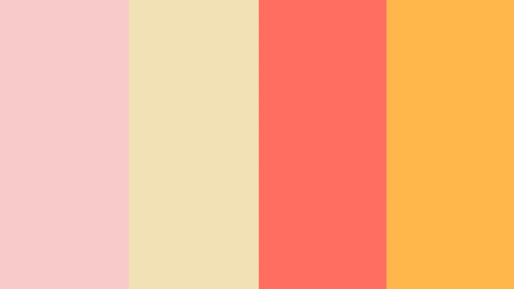
This palette is bright and full of life, drawing from spring’s most vibrant flowers. Orange and coral tones create energy, while soft pinks and yellows add warmth without being too strong.
- Works well for: Season sales, food packaging, and fun social media posts
- Main colors: Bright orange, coral, lemon yellow, soft pink
- Why it works: It creates feelings of joy and energy
- Best used with: White or light gray backgrounds to keep from feeling too busy
Best Practices for Using Floral Color Palettes
These best practices will help you avoid common mistakes and get the most from your spring floral palette selections.
1. Test Your Palette
Colors can look very different depending on where and how they’re used.
- Try your colors on both white and dark backgrounds before finalizing them.
- Check how your colors look on screens and in print if your project needs both.
- View your colors in different lighting to make sure they still work well.
- Get feedback from others – sometimes fresh eyes spot issues you might miss.
- Remember that colors may appear different on phones versus computers.
2. Consistency is Key
Using colors the same way throughout your work makes it feel more put-together.
- Create clear rules for when each color in your palette will be used.
- Note the exact color codes (RGB, HEX, or CMYK) to use the same shades each time.
- Don’t add new colors halfway through a project unless really needed.
- Use the same color for the same meaning or purpose across your design.
- Consider making a simple style guide for yourself or your team.
3. Layering for Depth
Flat designs can feel boring. Using colors in layers adds interest.
- Pair light spring colors with darker ones to create contrast.
- Use color overlays to add richness to photos or backgrounds.
- Try placing semi-clear colored shapes over each other for blended effects.
- Think about which colors come forward and which ones should stay in the background.
- Make important elements stand out with brighter spring colors from your palette.
Conclusion
Spring flower colors can add life to any project. They speak to us in ways that other colors sometimes miss.
We’ve examined why these colors work, which ones go well together, and where to use them. Now, it’s your turn to try them out.
Remember to balance bright with soft, test on different backgrounds, and stay true to your color choices throughout your work.
Spring colors aren’t just for spring – they can bring a touch of life to projects all year round.
What spring color combo will you try first? Maybe the soft pinks of Spring Blossom or the happy yellows of Citrus Burst?
The best way to learn is by doing. Pick a small project and play with these spring tones. Your work will feel fresher for it.
Frequently Asked Questions
1. What are the Spring Colors for Flowers?
Spring flower colors include soft pinks, light purples, fresh greens, gentle blues, sunny yellows, and warm corals. These colors reflect nature’s renewal during springtime.
2. How Do You Know if You’re a Spring Color Palette?
If bright, clear colors look good on you, you’re a spring color palette. Your skin has warm undertones, and you shine in light pinks, yellows, and fresh greens.
3. What is the Romantic Spring Color Palette?
A romantic spring color palette includes soft pinks, light lavenders, blush tones, gentle peach, and creamy whites. These colors create a tender, loving mood, perfect for weddings and date settings.