Choosing colors that work with Sea Salt feels like solving a puzzle with pieces that keep changing shape.
I’ve spent countless hours testing paint combinations, watching how Sea Salt shifts from green to gray to blue throughout the day. The truth is, most homeowners pick coordinating colors without understanding how lighting affects their choices.
But what if I told you there’s a simple system to select colors that enhance Sea Salt’s natural beauty? I’m going to share the exact coordinating colors that work in every room, plus a quick selection method that takes the guesswork out of your decisions.
Let me show you how to create color combinations that make Sea Salt look perfect in any space, regardless of the lighting conditions you’re working with.
Sherwin-Williams Sea Salt Overview
Sea Salt (SW 6204) is a soft green-gray paint color with blue undertones that changes appearance like a chameleon.
This versatile shade appeals to small-space dwellers, coastal decor enthusiasts, and DIY homeowners who want flexibility in their color choices.
Sherwin-Williams Sea Salt Color Characteristics:
| Feature | Details |
|---|---|
| Paint Code | SW 6204 |
| Color Type | Cool, muted green with blue undertones |
| Undertones | Blue undertones |
| LRV | 63 |
| RGB | 205 / 210 / 202 |
| Hex Value | #CDD2CA |
What Makes Sea Salt Unique?
Understanding what makes Sea Salt special helps explain its popularity in modern home design. Here’s why this shade has become a favorite among homeowners and designers.
1. Color-Changing Properties: Sea Salt shifts between green, gray, and blue tones. The color’s appearance changes with different lighting. It adapts throughout the day naturally.
2. Light Benefits: The LRV of 63-64 reflects good light. This makes rooms feel brighter. It works well in small spaces.
3. Room Effects: South-facing rooms show more green tones. North-facing rooms appear more blue-gray. East and west rooms vary by time of day.
4. Practical Advantages: One color works in multiple rooms effectively. It fits both warm and cool decor styles. This reduces the stress of paint selection for homeowners.
5. Lighting Flexibility: The color works with natural and artificial light. LED bulbs show cooler tones. Warm bulbs bring out green undertones instead.
Coordinating Colors: Sherwin-Williams Sea Salt
These complementary colors work perfectly with Sea Salt to create cohesive room designs.
Each option offers different undertones and intensities while maintaining visual harmony with Sea Salt’s changeable nature.
1. Spare White (SW 6203)

This bright white paint features cool, subtle green undertones. The color adds playful tranquility to any room. It works wonderfully in bedrooms and bathrooms. The soft green hint creates a calming atmosphere.
| Detail | Value |
|---|---|
| Color Code | SW 6203 |
| RGB | 228 / 228 / 221 |
| Hex Value | #E4E4DD |
Uses and Benefits:
- Perfect for trim work with Sea Salt walls.
- Works well in small spaces to maintain brightness.
- Ideal for ceilings to keep rooms feeling open.
- Complements both modern and traditional decor styles.
- Creates a fresh, clean look in kitchens.
2. Fleur de Sel (SW 7666)

This white has a hint of green that feels coastal. It creates bright and dreamy spaces in homes. The green undertone is very light and subtle. This color brings seaside vibes to any room. It complements Sea Salt’s coastal character perfectly.
| Detail | Value |
|---|---|
| Color Code | SW 7666 |
| RGB | 220 / 221 / 216 |
| Hex Value | #DCDDD8 |
Uses and Benefits:
- Excellent for accent walls alongside Sea Salt.
- Works beautifully for cabinets in kitchen spaces.
- Perfect for creating layered neutral schemes.
- Helps establish a calming atmosphere in living areas.
- Pairs well with natural wood finishes.
3. Summit Gray (SW 7669)

This dark gray has slight purple undertones. It creates warm and welcoming spaces. The color works well in dining rooms and bathrooms.
It balances Sea Salt’s cool tones with warmth. This neutral provides good contrast with lighter colors.
| Detail | Value |
|---|---|
| Color Code | SW 7669 |
| RGB | 149 / 148 / 145 |
| Hex Value | #959491 |
Uses and Benefits:
- Creates dramatic focal points in open floor plans.
- Perfect for exterior shutters and doors.
- Adds depth when used in powder rooms.
- Works well for furniture paint projects.
- Helps ground lighter color schemes.
Sea Salt Room Placement Guide
Here’s how Sea Salt performs in various spaces and which rooms best utilize its unique qualities.
| Room | Sea Salt Use | Coordinating Colors | Intended Style |
|---|---|---|---|
| Living Room | Main walls | Spare White trim, Fleur de Sel accents | Airy, calm coastal atmosphere |
| Bathroom | Full walls | Spare White trim, Summit Gray accents | Spa-like serenity |
| Kitchen | Island or backsplash | Summit Gray cabinets, Spare White trim | Earthy, modern contrast |
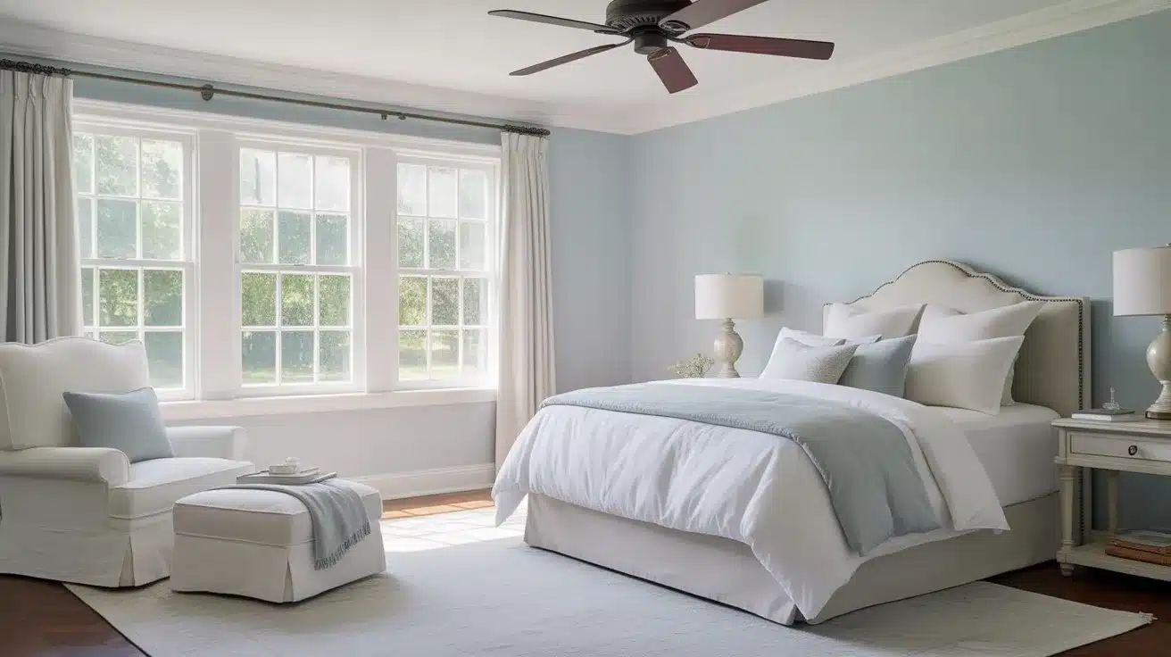
| Bedroom | Accent wall | Fleur de Sel bedding, Spare White accessories | Calm, restful retreat |
| Home Office | Walls or built-ins | Summit Gray furniture, Fleur de Sel decor | Focused, elegant workspace |
Sea Salt adapts to any room’s lighting and purpose, making it a versatile choice for homeowners who want consistency throughout their space.
The key is choosing the right coordinating colors to match each room’s function and mood.
How to Choose Colors That Coordinate with Sea Salt
Selecting colors that complement Sea Salt depends on your room’s lighting, size, and desired mood. Here are the key factors to consider when building your color palette.
Consider Your Room’s Natural Light: Natural light affects how Sea Salt appears throughout the day. Rooms with lots of sunlight bring out the green undertones, while darker spaces show more gray and blue tones. Test your coordinating colors in the same lighting conditions where you’ll use them.
Consider Room Size and Function: Smaller rooms benefit from lighter, coordinating colors like Spare White and Fleur de Sel. Larger spaces can accommodate darker accents like Summit Gray. Consider the room’s purpose – bedrooms typically require calming colors, while home offices can use more contrasting shades.
Balance Warm and Cool Tones: Sea Salt has cool undertones, so you can either complement this with other cool colors or create contrast with warm neutrals. Cool combinations feel fresh and coastal, while warm accents add coziness and depth.
Test Colors Together: Always test your color combinations on actual wall samples. Paint large swatches next to each other and observe them at different times of day. This helps you see how the colors interact in your specific lighting conditions.
Conclusion
Sea Salt’s magic lies in its ability to work with multiple coordinating colors rather than against them.
I’ve provided you with the three most reliable options, Spare White, Fleur de Sel, and Summit Gray, plus a simple system to choose between them based on your room’s specific needs.
Remember, lighting changes everything with Sea Salt. What looks green in morning sun might appear blue-gray by evening. That’s not a problem, it’s Sea Salt’s greatest strength.
Start small with one room and see how these color combinations transform your space. Once you experience how effortlessly they work together, you’ll want to use this system throughout your home.
Which room will you tackle first? I’d love to hear about your Sea Salt color combinations in the comments below.