
In today’s post, I will show you why Sherwin Williams Porpoise should be on your radar for your next paint project.
This mid-range, complex neutral brings a unique mix of warmth and character to any space.
I’ve used this versatile shade in numerous homes, watching it transform plain walls into rich, welcoming backdrops.
With its low LRV of 13, Porpoise creates depth while maintaining balance – perfect for modern, craftsman, or even rustic-style homes.
Let’s look at what makes Porpoise so special and how you can use it to bring your home to life, inside and out
What is Sherwin Williams Porpoise?

Sherwin Williams Porpoise (SW 7047) is a rich mid-tone neutral that blends gray and brown hues. This greige shade carries a low Light Reflectance Value (LRV) of 13, making it a deeper option that absorbs more light than it reflects.
The color shifts subtly based on lighting conditions, sometimes leaning more toward its gray side and other times highlighting its warm brown notes.
The depth of Porpoise creates a solid backdrop that feels grounded and refined. Unlike lighter neutrals that can feel flat, this shade has enough substance to make a statement without overwhelming a space.
Its brown undertones bring a natural warmth that pure grays often lack, making rooms feel more lived-in and comfortable.
The Technical Side of Porpoise
Understanding the technical aspects of Porpoise helps explain its visual impact. With RGB values of 107 (Red), 100 (Green), and 91 (Blue), the color maintains balance, while the slightly higher red value contributes to its warmth.
This careful balance allows Porpoise to function as a true neutral that works with many different color schemes.
Porpoise in Different Lighting Conditions
| Lighting Condition | Effect on Porpoise | Best Complementary Adjustments |
|---|---|---|
| North-Facing Rooms | Appears cooler, with more gray undertones. | Use warm lighting or pair with warm neutrals like SW Shoji White. |
| South-Facing Rooms | It warms up significantly, revealing brown undertones. | Balance with cooler accents like SW Gibraltar. |
| Morning Light | Lighter and warmer, creating a soft ambiance. | Works well with soft whites and natural wood tones. |
| Evening Light | Darkens, adding depth and coziness. | Enhance with warm lighting or contrast with lighter trims. |
Practical Tips for Using Porpoise
Before committing to Porpoise, test the color in your specific space. Paint samples on different walls to see how light affects the color throughout the day.
Consider the fixed elements in your room – flooring, cabinetry, furniture – and how Porpoise interacts with these items.
Porpoises can create continuity between rooms for large open spaces, making each area feel distinct. Consider using it on an accent wall or in well-lit areas in smaller rooms to prevent the space from feeling closed in.
When using Porpoise on exteriors, factor in the surrounding landscape and how seasonal changes might affect its appearance.
Applying Sherwin Williams Porpoise in Your Home
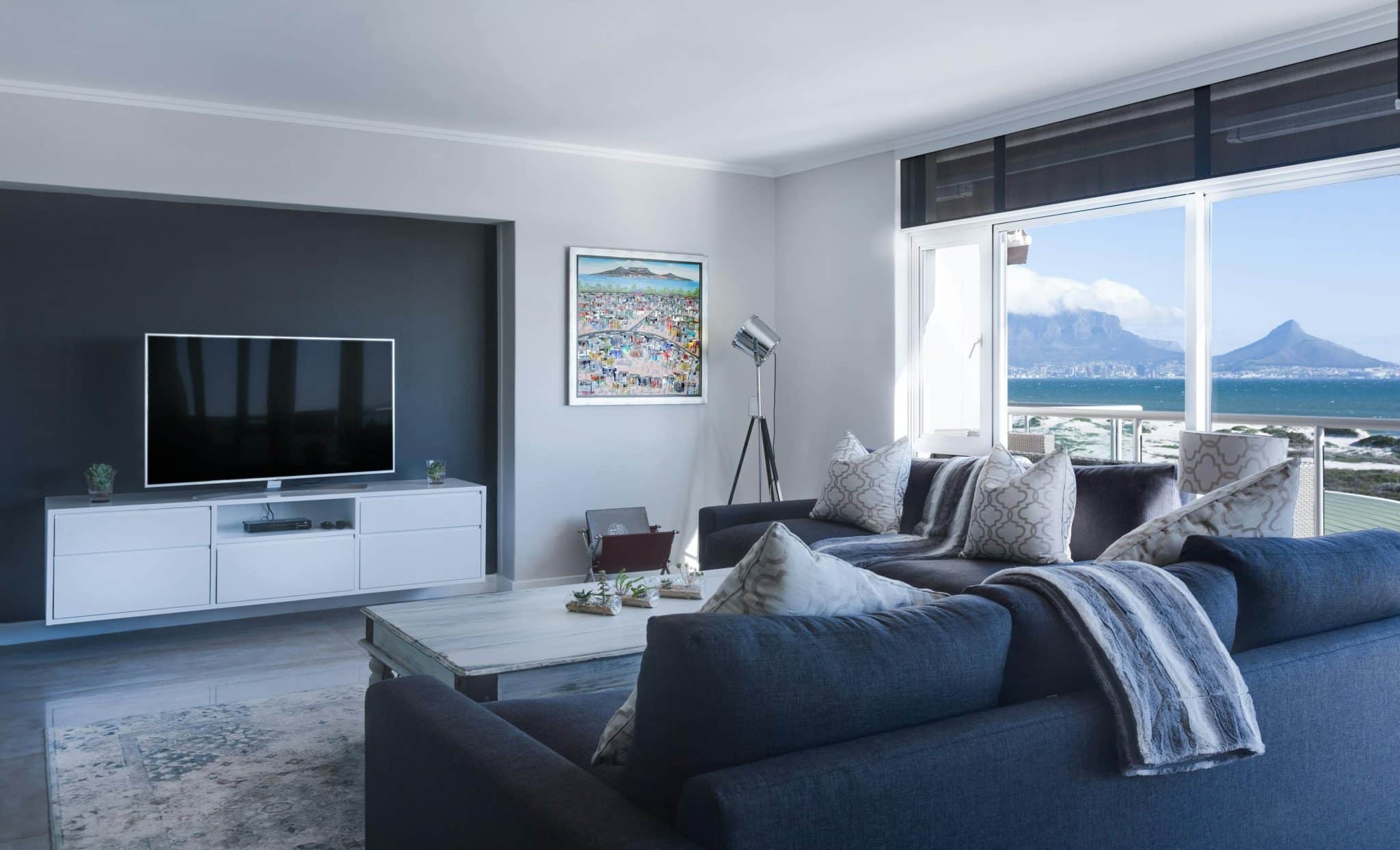
Sherwin Williams Porpoise brings character to any space. This mid-tone neutral creates depth while maintaining warmth, making it suitable for various applications throughout your home.
Bedroom Applications

Bedrooms painted in Porpoise transform into restful retreats. The color absorbs light rather than reflects it, creating a cocoon-like atmosphere perfect for relaxation.
Balance the depth with lighter bedding and window treatments to maintain airiness.
Kitchen Applications

In kitchens, Porpoise makes a statement on cabinetry. Lower cabinets in this shade, grounded by white upper cabinets, create a balanced, current, and timeless look.
The color hides marks and scuffs better than lighter options, making it practical for busy households.
Main Exterior Color Applications

Porpoise pairs wonderfully with crisp white trim when used as a main color. The contrast highlights window frames and architectural features.
Add wooden elements like porch posts or garage doors to enhance the warmth in Porpoise’s undertones.
Accent Color Applications
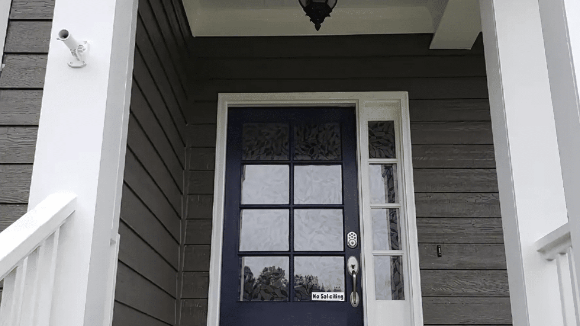
Porpoise makes an outstanding accent color for shutters, doors, and trim for those wanting a subtler approach. Against lighter siding, it creates a definition without appearing too stark or harsh.
This approach works particularly well on traditional homes seeking a fresh update.
Statement Features and Accent Walls
Fireplace Features
A fireplace surround painted in Porpoise instantly becomes a focal point. The color frames the fireplace beautifully and creates a natural gathering spot. This approach works in both traditional and contemporary settings.
Interior Doors and Transitions
Interior doors painted in Porpoise add architectural interest without requiring major renovations. This small change creates a significant visual impact, particularly against lighter wall colors.
The contrast highlights transitions between spaces in a subtle yet effective way.
Conclusion
Sherwin Williams Porpoise offers that perfect balance between character and versatility that so many paint colors promise, but few deliver. Its rich blend of gray and brown creates depth without limiting your design options.
If you’re considering this shade for your home, remember to test it in your specific space. The way it shifts in different lighting is part of its charm, but it’s best to see these changes firsthand before making your final decision.
Whether you use it for your home’s exterior, a cozy living room, or to add interest to interior doors, Porpoise brings warmth and sophistication to any surface it touches.
Ready to try Porpoise in your home? Grab a sample and watch this color appear in your unique space.