Cherry wood furniture represents the pinnacle of timeless grace and natural beauty in interior design, with its rich, warm tones and distinctive grain patterns creating lovely focal points in any room.
However, the secret to truly showcasing cherry wood’s luxurious character lies in selecting the perfect paint colors that complement rather than compete with its natural warmth and depth.
In this guide, you’ll find the best paint colors that make cherry wood furniture look more expensive and refined and master professional techniques for testing colors with your existing pieces.
By the end, you’ll have the confidence to choose colors that make your cherry wood furniture the gorgeous focal point it deserves to be.
What is Cherry Wood?
Cherry wood is a prized hardwood renowned for its exceptional warmth and rich character, making it a favorite choice for high-quality furniture, cabinetry, and decorative elements.
This luxurious wood showcases gorgeous natural color variations that range from light golden brown to deep, lustrous reddish tones, often featuring subtle grain patterns that add depth and visual interest.
What makes cherry wood particularly appealing is its ability to deepen and mature over time, developing more pronounced reddish hues when exposed to light.
This creates furniture pieces that become more beautiful with age, adding timeless grace to any interior space.
Types of Cherry Wood
| Types | Color | Characteristics |
|---|---|---|
| American Cherry | Light reddish-brown | Darkens with age, rich warmth. |
| Brazilian Cherry | Deep red | Dense, darkens over time. |
| Black Cherry | Dark reddish-brown | Pronounced red tones. |
| Cherry Veneer | Lighter reddish-brown | Thin layer, often lighter tone. |
| Eastern Cherry | Yellowish-brown | Lighter, subtle hue. |
Considerations for Paint Colors with Cherry Wood
- Lighting Matters: Natural light enhances the warm tones of cherry wood, while artificial lighting can either amplify or cool down the wood’s appearance. Therefore, always test paint colors under both conditions before making your final decision.
- Room Function: Living rooms benefit from warm, inviting colors like cream or sage green, bedrooms work well with soft blues or lavender for tranquility, while offices pair beautifully with refined grays or navy for a professional atmosphere.
- Complementary vs. Contrasting: Complementary colors, such as soft greens, naturally harmonize with the red undertones of cherry wood, while contrasting colors, like cool blues, create dynamic visual interest by opposing the warmth of the wood.
- Balance of Warmth: Choose warm neutrals like beige or taupe to echo the cozy nature of cherry wood, or select cooler tones like light gray or pale blue to provide a refreshing counterbalance to the wood’s inherent richness.
14 Best Paint Colors That Match Cherry Wood
Find the 14 best paint colors that beautifully complement cherry wood furniture, creating harmonious and stylish interiors for every room in your home.
Neutral Paint Colors
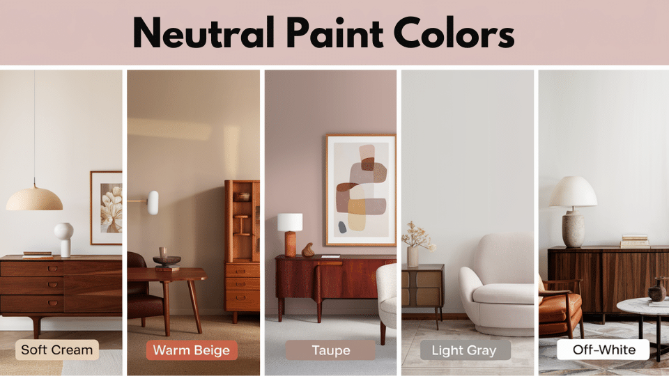
1. Soft Cream
This gentle, warm neutral creates a soothing backdrop that allows the natural beauty of cherry wood to shine without competition.
The creamy undertones complement the wood’s golden hues while providing enough contrast to prevent the space from feeling monotonous. This timeless choice works particularly well in traditional and transitional interiors.
2. Warm Beige
A refined neutral that echoes cherry wood’s earthy warmth, creating a cohesive and inviting atmosphere throughout the room.
This versatile shade strikes the perfect balance between light and dark, making spaces feel larger while maintaining a cozy ambiance. Warm beige pairs beautifully with the natural grain patterns and deepening tones of cherry wood.
3. Taupe
This complex, earthy neutral offers subtle gray and brown undertones that create refined depth alongside cherry wood furniture.
Taupe’s muted quality prevents overwhelming the wood’s rich character while adding contemporary polish to any space.
It works exceptionally well in modern and minimalist settings where cherry wood serves as a warm accent.
4. Light Gray
A superb, refined choice that provides striking contrast to cherry wood’s inherent warmth, creating visual interest and balance.
This refined neutral prevents spaces from feeling too heavy while allowing the wood’s reddish tones to pop dramatically.
Light gray works beautifully in contemporary settings, helping cherry wood furniture become the room’s focal point.
5. Off-White
This classic, fresh neutral creates a clean, airy backdrop that makes cherry wood’s rich tones appear more vibrant and pronounced.
The crisp contrast highlights the wood’s natural grain and color variations while maintaining a timeless, luxury visual. Off-white works seamlessly across all design styles, from traditional to modern farmhouse.
Bold & Deep Colors
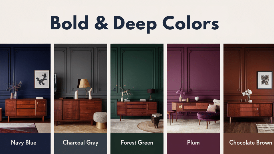
6. Navy Blue
This rich, dramatic color creates a lovely contrast with the warm, reddish hues of cherry wood, resulting in a refined and timeless combination.
Navy’s depth complements the wood’s natural richness without competing, while the cool undertones provide perfect balance. This pairing works exceptionally well in libraries, dining rooms, and formal living spaces.
7. Charcoal Gray
A sleek, modern choice that adds contemporary culture while allowing cherry wood’s warmth to shine through beautifully.
This deep neutral provides enough contrast to create visual interest without overwhelming the space or competing with the wood’s natural character. Charcoal gray works perfectly in minimalist and industrial-inspired interiors.
8. Forest Green
This natural, earthy tone enhances the organic beauty of cherry wood while creating a harmonious connection to nature.
The deep green complements the wood’s reddish undertones through classic color theory, creating a rich and cozy atmosphere. This combination works wonderfully in traditional settings, studies, and spaces designed for relaxation.
9. Plum
A refined, deep purple that provides bold contrast while maintaining harmony with cherry wood’s warm undertones.
This rich color adds drama and grace to any space, allowing the wood’s natural beauty to remain the focal point.
Plum works beautifully in bedrooms, dining rooms, and spaces where you want to create an intimate, luxurious ambiance.
10. Chocolate Brown
This warm, rich brown creates a cohesive, monochromatic look that emphasizes the natural warmth and depth of cherry wood.
The similar tonal qualities create a cozy, enveloping atmosphere while different textures and finishes add visual interest. This combination works perfectly in traditional settings, creating incredibly inviting and comfortable spaces.
Soft & Subtle Colors
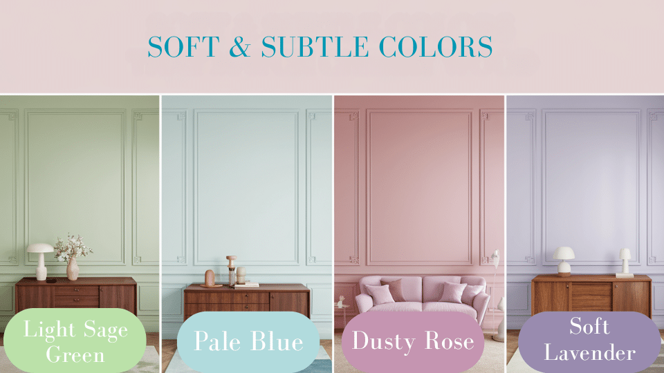
11. Light Sage Green
This gentle, muted green offers subtle contrast to cherry wood, maintaining a natural, organic feel throughout the space. The soft tone complements the warmth of the wood without overwhelming it, creating a serene and balanced environment. Light sage works beautifully in bedrooms, bathrooms, and spaces designed for relaxation and tranquility.
12. Pale Blue
This tranquil, airy color creates a refreshing contrast to the deep, warm tones of cherry wood, while maintaining an agile and refined appearance.
The cool undertones provide perfect balance, making spaces feel larger and more open while highlighting the wood’s natural richness. Pale blue works wonderfully in bedrooms, bathrooms, and coastal-inspired interiors.
13. Dusty Rose
This soft, warm pink brings out the natural reddish undertones of cherry wood, adding feminine grace and romantic charm.
The muted quality prevents the color from overwhelming the space while creating a cohesive and harmonious palette.
Dusty rose works beautifully in bedrooms, powder rooms, and spaces where you want to make a cozy, intimate atmosphere.
14. Soft Lavender
This subtle, pastel purple adds gentle dignity while complementing the warm tones of cherry wood through its underlying red undertones.
The delicate hue creates a refined, calming environment that feels both modern and timeless. Soft lavender works perfectly in bedrooms, reading nooks, and spaces designed for rest and reflection.
Avoid These Cherry Wood Matching Mistakes
| Common Mistake | Why It’s Wrong | Better Approach |
|---|---|---|
| Using small paint samples | Tiny chips don’t show actual color interaction | Test 12″x12″ swatches next to furniture |
| Ignoring lighting changes | Colors look different throughout the day | Observe samples for one whole week |
| Choosing stark white paint | Makes cherry wood appear orange | Use warm whites or cream instead |
| Testing in-store lighting | Artificial lights distort colors | Always test in your actual room |
| Going too bold too quickly | Can overwhelm wood’s natural beauty | Start with medium tones first |
| Forgetting about undertones | Hidden tones in paint can clash | Study colors for warm/cool undertones |
Conclusion
Choosing the right paint color for your cherry wood furniture becomes simple when you follow these proven color combinations.
Whether you prefer timeless creams and warm beiges or bold navy blues and forest greens, these colors enhance the natural beauty of cherry wood while creating the perfect atmosphere.
Remember to test paint samples in different lighting conditions throughout the day, as lighting significantly impacts how colors appear with cherry wood.
Ready to change your space? Start by selecting two colors from our recommendations and paint small test patches on your walls.
Have you tried any of these paint colors with your cherry wood furniture? Share your results in the comments below.
Choosing the perfect shade? Explore more paint color ideas and inspiration.