
Looking for that perfect off-white that sits just between cream and greige?
I’m sharing everything you need to know about Sherwin Williams Shoji White and the best colors to pair it with in your home.
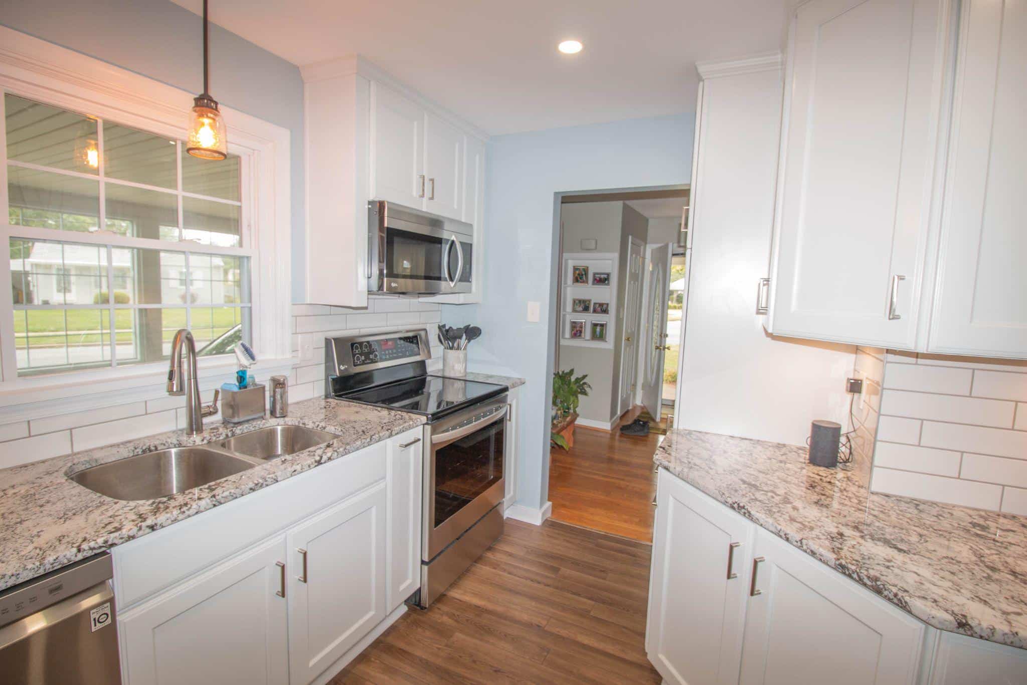
I’ve spent years testing paint colors in hundreds of homes, and Shoji White SW 7042 is a top choice for clients who want something warmer than stark white but not as heavy as beige.
With an LRV of 74, this versatile neutral adapts beautifully to different lighting situations while maintaining its cozy feel.
Let’s look at the most flattering trim colors, accent walls, and coordinating shades that make Shoji White shine in any space – from kitchens and living rooms to exteriors that make your neighbors stop and stare.
Why is Shoji White the Perfect Neutral?
Shoji White (SW 7042) is a warm, off-white with greige undertones. It is ideal for creating a soft and inviting space.
Unlike stark whites, which can feel cold or clinical, Shoji White offers a hint of warmth without fully committing to beige.
With an LRV of 74, it sits right on the edge between white and light color, making it incredibly versatile.
I love how this color changes throughout the day. You might notice more of the morning light’s creamy qualities, while evening light can bring out its subtle greige base.
This chameleon-like quality makes it perfect for spaces where you want a neutral that isn’t boring.
Why Color Coordination Matters?
The right coordinating colors enhance Shoji White’s versatility in different lighting conditions. Since It has both cream and greige undertones, pairing it with colors that complement rather than fight these undertones makes all the difference.
I’ve found that poor color combinations can make Shoji White appear dull or muddy, while good matches highlight its soft, lived-in quality.
This is especially important in open floor plans where colors flow from one space to another.
Thoughtful color coordination ensures your home feels cohesive and intentional rather than disjointed.
Best White and Neutral Trim Colors for Shoji White
When helping clients select the perfect trim color to pair with Shoji White walls, I focus on options that enhance rather than compete with the warmth of the white. The right trim choice can significantly affect the entire space’s feel.
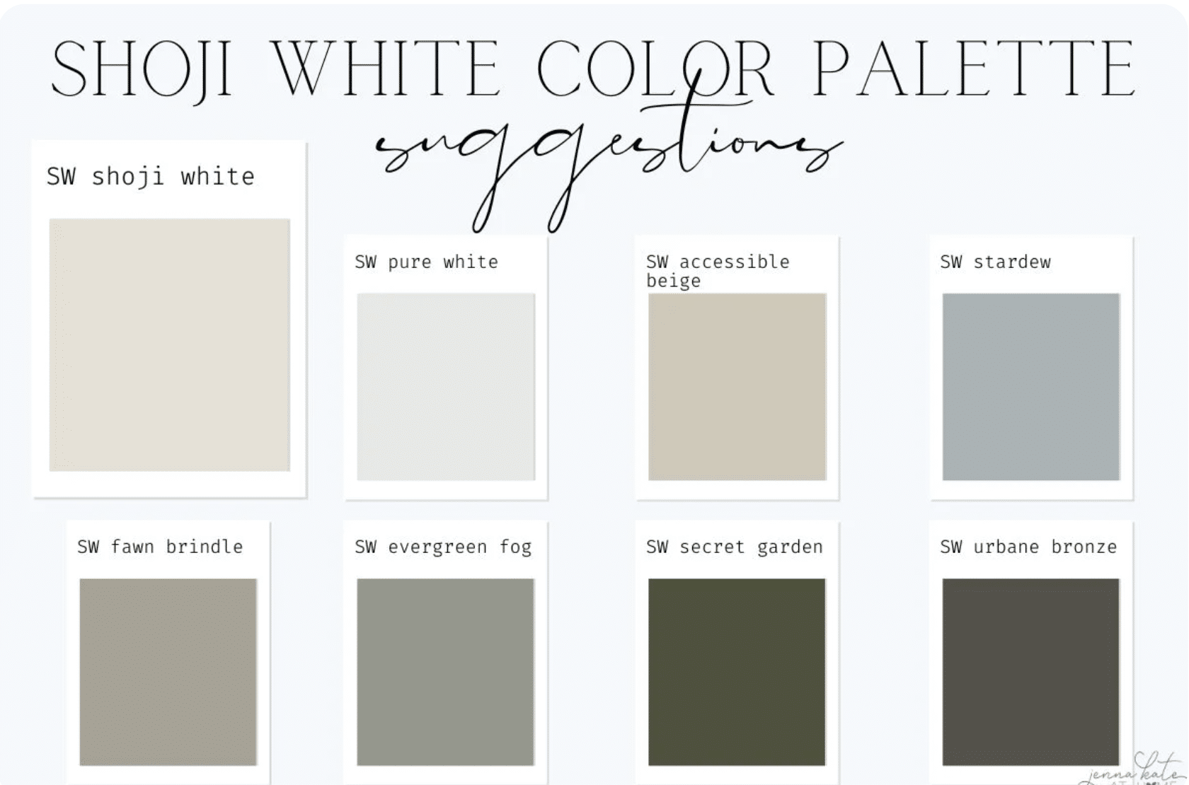
1. Pure White (SW 7005)

Pure White is my go-to trim color with Shoji White. It’s a crisp, clean white that offers just enough contrast without looking stark. With an LRV of 84, it’s noticeably brighter than Shoji White but still has a hint of warmth that keeps the pairing harmonious.
This combination is particularly effective in brightening spaces where stark white walls would feel too clinical. The contrast is subtle enough to feel intentional without creating harsh transitions.
2. Greek Villa (SW 7551)

Greek Villa is a soft, warm white that blends subtly with Shoji White, creating a more unified look. This pairing creates a gentle, layered effect from the same color strip.
I recommend this combo for clients who want a more seamless transition between walls and trim. The result feels cohesive and thoughtfully designed, especially in traditional homes or spaces with ornate trim work.
3. Snowbound (SW 7004)

Snowbound offers a slightly cool white to balance Shoji White’s warmth. This pairing creates a subtle tension that works particularly well in rooms with both cool and warm elements.
I’ve used this combination in spaces with cool-toned flooring or fixtures where a warm white trim would feel disconnected. The result is balanced and clean without feeling sterile.
Warm and Earthy Coordinating Colors
Pairing Shoji White with warm and earthy tones creates a comfortable, grounded feeling in any space. These combinations work especially well in homes with natural wood, stone, or clay elements.
Accessible Beige (SW 7036)

Accessible Beige is slightly deeper with warm undertones that pair beautifully with Shoji White. An LRV of 58 creates a noticeable but not dramatic contrast when used alongside Shoji White.
I often recommend this combination for open floor plans where you want connected spaces to feel distinct yet related.
Shoji White in main living areas and Accessible Beige in dining rooms or hallways create a pleasant flow without stark transitions.
Loggia (SW 7506)

Loggia is a balanced, taupe-inspired neutral that brings a touch of sophistication when paired with Shoji White. This medium-depth neutral has subtle brown undertones that complement the creamy aspect of Shoji White.
This combination is especially effective in spaces with leather furniture, woven textiles, or wooden elements. The depth of Loggia grounds the airiness of Shoji White, creating a space that feels both refined and relaxed.
High-Contrast Pairings for a Bold Look
When I want to create more visual impact with Shoji White, I turn to high-contrast pairings. These combinations make a statement while maintaining the warm, welcoming quality that makes Shoji White popular.
Deep Charcoals and Grays
Urbane Bronze (SW 7048)
Urbane Bronze is a rich, dark brown-gray that creates dramatic contrast against Shoji White. With an LRV of just 8, it’s a bold choice that feels both contemporary and timeless.
I love using this combination for accent walls, exterior trim, or statement furniture against Shoji White backgrounds. This pairing brings warmth and depth to homes with modern farmhouses or industrial touches without feeling heavy or dark.
The earthiness of Urbane Bronze pulls out the subtle greige undertones in Shoji White, creating a grounded, cohesive look despite the strong contrast.
Gauntlet Gray (SW 7019)

Gauntlet Gray is a modern, warm gray that offers substantial contrast without the intensity of darker shades like Urbane Bronze. An LRV of 17 clearly distinguishes from Shoji White while maintaining a soft, approachable feel.
I find this pairing works wonderfully in kitchens (with Gauntlet Gray on lower cabinets and Shoji White on uppers), home offices, or any space where you want some contrast without going too bold.
Blues and Navy Tones
Naval (SW 6244)

Naval is a striking navy blue that pairs beautifully with Shoji White. This classic blue brings a timeless quality to any space, allowing Shoji White to shine.
I’ve used this combination countless times in dining rooms, bedrooms, and exteriors. The coolness of Naval balances the subtle warmth of Shoji White, creating a balanced, refined atmosphere.
This pairing offers the perfect solution for clients who want a touch of traditional style with modern freshness – it feels current yet enduring.
Smoky Blue (SW7604)

Smoky Blue is a dusty blue-gray with a cozy feel that complements Shoji White’s soft quality. Less intense than Naval, this blue brings a subtle, lived-in quality to spaces.
I recommend this pairing for bedrooms, reading nooks, or bathrooms where you want a hint of color without overwhelming the senses. Smoky blue’s gray undertones connect beautifully with Shoji white’s greige aspects, creating a naturally cohesive look.
Muted Greens
Evergreen Fog (SW 9130)

Evergreen Fog is a soft, nature-inspired sage that creates a fresh yet calming combination with Shoji White. This pairing brings the outdoors in without overwhelming the space.
I’ve used this combination in bedrooms, studies, and living rooms where clients want a hint of color without committing to something bold. The gray undertones in both colors create a natural harmony that feels current but not trendy.
Pewter Green (SW 6208)

Pewter Green is a moody, gray-green that grounds Shoji White beautifully. This deeper, more saturated color creates a striking contrast that feels natural and cohesive.
I recommend this pairing for accent walls, kitchen islands, or built-in cabinets to create visual interest against Shoji White walls. The combination feels timeless and fresh – modern yet connected to classic color schemes.
Final Thoughts
Now you know why Shoji White continues to be one of Sherwin Williams’ most popular colors. This versatile off-white creates warm and inviting spaces without leaning too beige or stark.
When choosing colors to pair with Shoji White, consider how lighting affects its appearance in your specific space.
North-facing rooms bring out greige undertones, while south-facing spaces highlight its creamy warmth.
Shoji White provides a flexible foundation for countless color schemes, whether you prefer subtle coordination with Pure White trim or bold contrast with Urbane Bronze accents.
Remember to test your combinations in your actual space before committing.
The perfect pairing will create a fresh, timeless home, with the right balance of warmth and brightness to make your space truly shine.