Honey oak cabinets and trim driving you up the wall? You’re not alone.
Many homeowners struggle to find paint colors that work with honey oak’s warm, golden-orange tones without making their space feel dated or overwhelming.
Here’s the good news: you don’t need to rip out your honey oak to create a fresh, modern look. The right paint color can change your space and make that wood shine in all the right ways.
This guide showcases carefully selected Sherwin-Williams paint colors that beautifully complement honey oak.
From soft neutrals to bold accent shades, these colors will help you create a balanced, stylish home that feels both current and timeless.
What Makes Honey Oak Unique?
Honey oak wood brings rich, golden-orange undertones that create warmth in any space.
This popular wood choice dominated homes during the 80s and 90s, and it can still look fresh and stylish today when paired with the right paint colors.
The key lies in understanding these warm undertones; they pull orange and yellow hues from nearby colors, which means your paint choice can either clash with or complement this natural warmth.
When you choose colors that complement the golden base of honey oak, you create a balanced, cohesive look that feels both timeless and contemporary.
How to Choose Colors for Honey Oak
- Contrasting vs. Blending: Choose cool grays and blues to contrast honey oak’s warmth, or select warm beiges and creams to blend smoothly with its golden tones.
- Lighting Assessment: Test paint samples in both natural daylight and evening artificial light, since honey oak can appear more orange under warm bulbs and more golden in bright sunlight.
- Color Strategy: Neutral tones like greiges and soft whites are your safest bet, but adding strategic pops of green or blue can give honey oak a fresh, modern update.
- Room Size Considerations: Lighter paint colors help small spaces with honey oak feel more open, while darker shades can make large rooms with honey oak woodwork feel cozy and grounded.
- Existing Decor Balance: Consider your furniture, flooring, and accessories when selecting a paint color. If you have many warm elements, cooler paint tones will create a more visually balanced look.
12 Sherwin-Williams Colors to Pair with Honey Oak
Find 12 beautiful Sherwin-Williams paint colors that perfectly complement the warm tones of honey oak wood, from soft neutrals to cool contrasts.
1. Canvas Tan (SW 7531)

This soft, neutral color complements the honey oak’s golden warmth without competing for attention.
The creamy base prevents the orange tones from becoming too intense while maintaining the cozy feel that makes honey oak so appealing. It acts like a gentle bridge between your wood and other room elements.
Undertones: Warm, creamy beige with subtle yellow hints
Best for: Living rooms, bedrooms, and hallways where you want a cozy feel
Design styles: Traditional, farmhouse, and transitional spaces
Mood: Creates a welcoming, cohesive atmosphere that feels like a warm hug
2. Agreeable Gray (SW 7029)
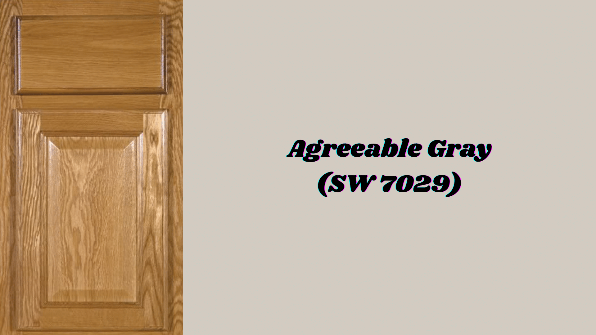
Neutralizes honey oak’s orange tones while adding modern refinement.
This popular shade has enough warmth to avoid looking cold against wood, but enough gray to tone down any overly golden effects. It’s the perfect middle ground that works in almost any lighting condition.
Undertones: Perfect greige blend with balanced gray and beige notes
Best for: Open-concept spaces, kitchens, and well-lit rooms
Design styles: Contemporary, transitional, and modern farmhouse
Mood: Brings calm, balanced energy that feels current and fresh
3. Westhighland White (SW 7566)
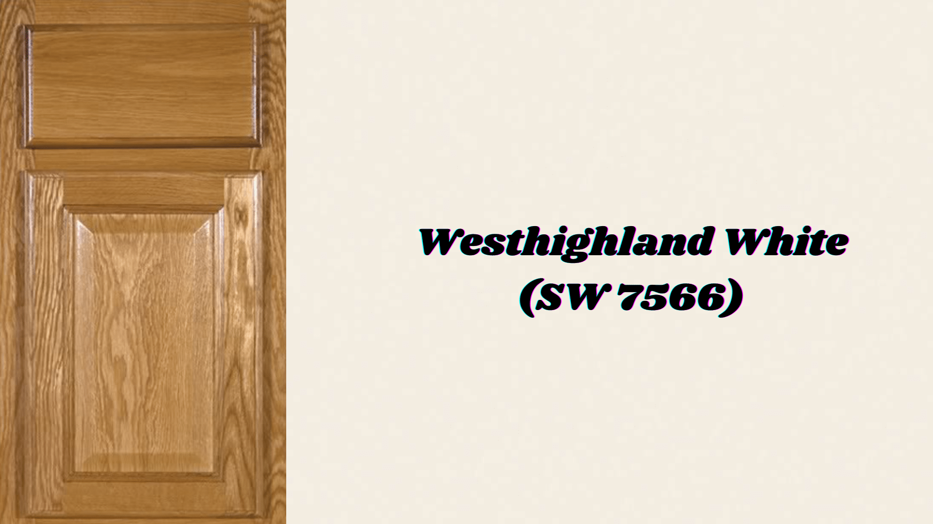
Provides a crisp contrast that highlights the natural beauty of honey oak without creating harsh lines.
Unlike stark whites that can make honey oak look outdated, this warmer white works with the wood’s golden tones. It brightens spaces while maintaining an inviting and comfortable overall feel.
Undertones: Clean white with subtle warm undertones
Best for: Trim, ceilings, and smaller spaces that need brightening
Design styles: Modern, coastal, and updated traditional
Mood: Creates an airy, fresh atmosphere without feeling cold
4. Rainwashed (SW 6211)
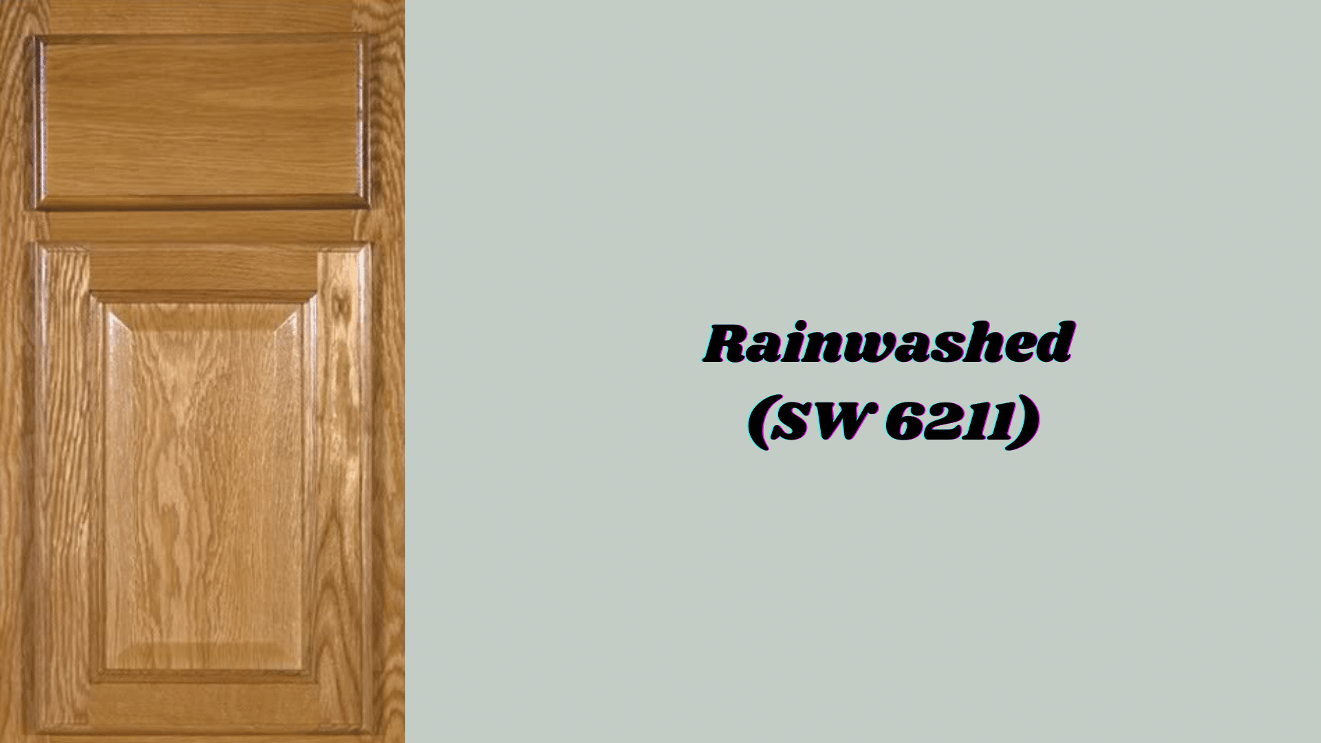
Cools down the intensity of honey oak while adding a tranquil contrast that feels natural and soothing.
The blue-green tones are opposite orange on the color wheel, creating a pleasing contrast without being jarring. This combination evokes a sense of nature, warm wood, and cool water.
Undertones: Gentle blue-green with soft, muted qualities
Best for: Bathrooms, bedrooms, and powder rooms
Design styles: Coastal, spa-like, and relaxed traditional
Mood: Brings peaceful, calming vibes that soothe the senses
5. Evergreen Fog (SW 9130)

This earthy shade complements honey oak’s natural warmth perfectly while adding modern refinement.
The green connects to nature themes that work well with wood, while the gray undertones keep it from being too bold. It’s rich enough to create interest but soft enough to live with daily.
Undertones: Muted green with subtle gray undertones
Best for: Dining rooms, living spaces, and accent walls
Design styles: Modern, transitional, and nature-inspired spaces
Mood: Creates refined, grounded energy that feels organic
6. Sea Salt (SW 6204)
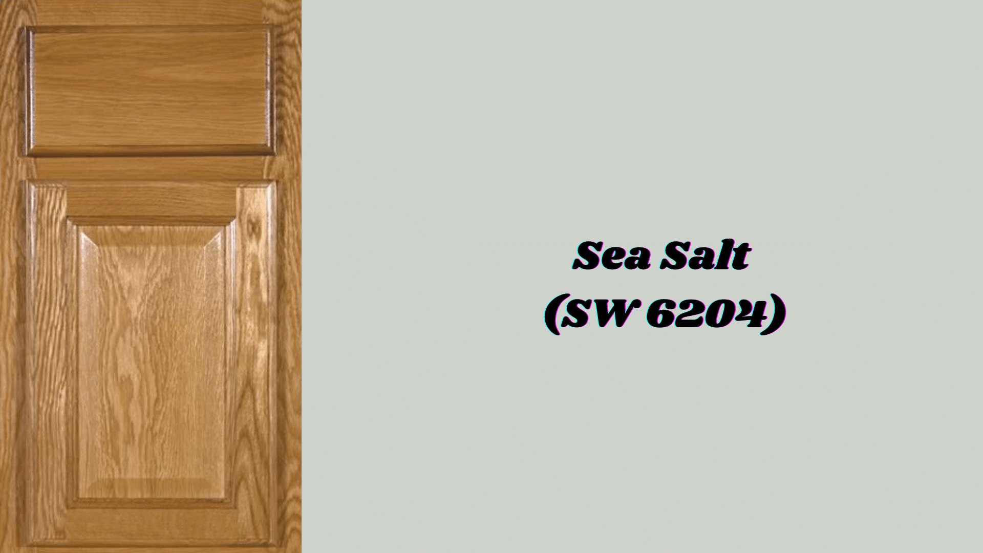
Softens honey oak’s orange tones while adding coastal freshness that feels timeless.
This chameleon-like color shifts between blue, gray, and green, depending on the lighting, which means it always complements honey oak’s changing appearance throughout the day. It’s like having the ocean nearby.
Undertones: Blue-gray-green blend with spa-like qualities
Best for: Bathrooms, laundry rooms, and bedrooms
Design styles: Coastal, contemporary, and relaxed farmhouse
Mood: Brings timeless, refreshing vibes that feel like a beach retreat
7. Dirty Martini (SW 9119)

Adds character without overwhelming the natural warmth of honey oak, creating a refined pairing that feels both bold and balanced.
The yellow undertones echo the golden tones in the wood, while the green adds just enough contrast to keep things interesting. It’s confident without being loud.
Undertones: Soft green-yellow with rich depth
Best for: Dining rooms, home offices, and statement walls
Design styles: Eclectic, modern, and bold traditional
Mood: Creates personality-filled spaces that spark conversation
8. Rice Grain (SW 6155)

Blends smoothly with honey oak for a monochromatic, harmonious look that feels intentional and polished.
Instead of fighting the warmth of the wood, this color embraces it, creating a layered neutral scheme that’s rich and comfortable. It’s like wrapping your room in soft cashmere.
Undertones: Warm beige with creamy, neutral qualities
Best for: Living rooms, bedrooms, and cozy family spaces
Design styles: Traditional, farmhouse, and comfortable casual
Mood: Brings comfort and subtle style that feels like home
9. Oyster White (SW 7637)
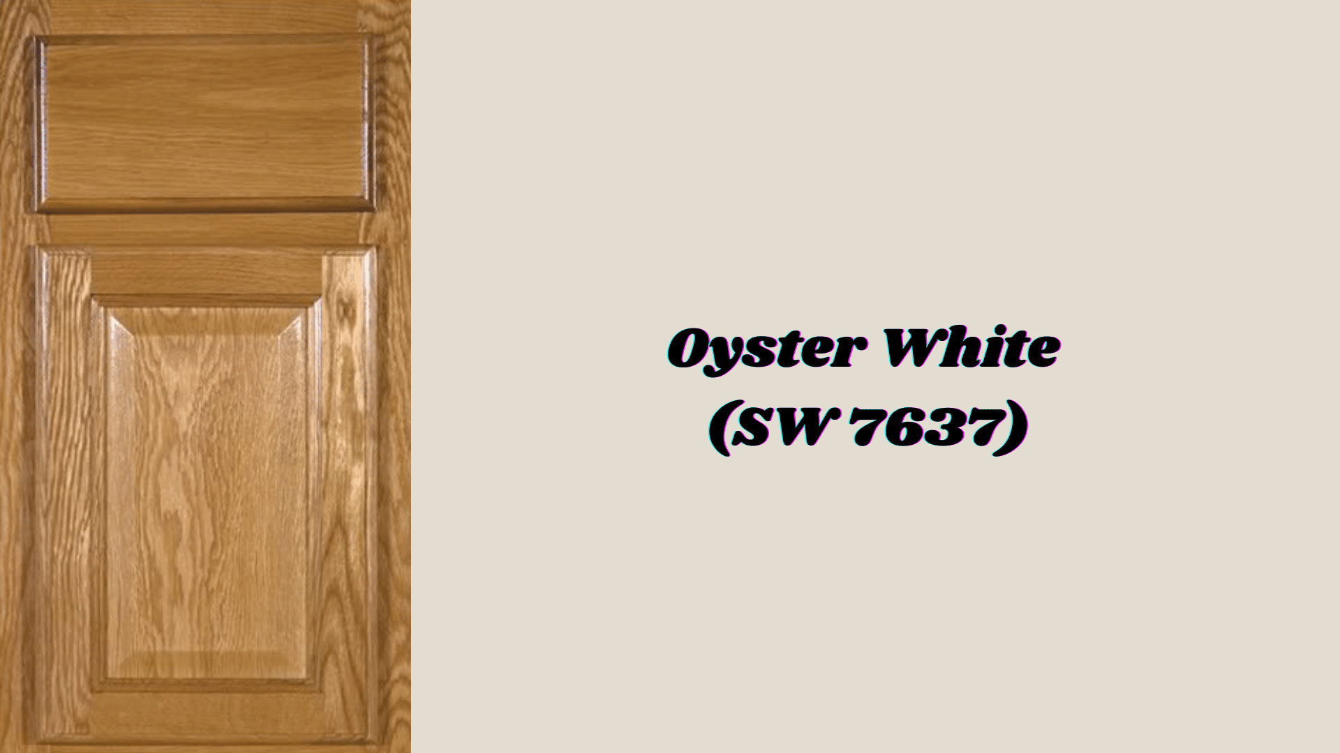
Provides brightness without the stark contrast of pure white, creating a fresh backdrop that makes honey oak look more refined.
The gray undertones prevent it from looking yellow next to the wood, while the warmth keeps it from feeling cold. It’s the perfect compromise between clean and cozy.
Undertones: Warm off-white with gentle gray hints
Best for: Kitchens, bathrooms, and spaces needing more light
Design styles: Transitional, updated traditional, and modern farmhouse
Mood: Creates fresh, inviting spaces that still feel warm
10. Alabaster (SW 7008)
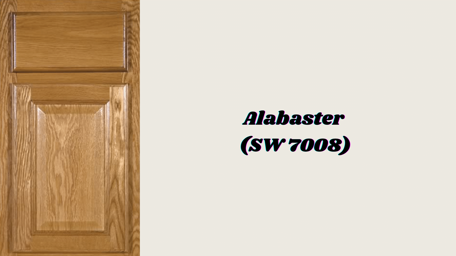
Offers a gentle contrast that modernizes honey oak without overwhelming it, creating a classic pairing that works in any era.
This is the white that plays well with wood; it’s clean enough to feel current but warm enough to complement golden tones. It’s like the perfect neutral friend who gets along with everyone.
Undertones: Soft white with subtle warm qualities
Best for: Walls, trim, kitchens, and living areas
Design styles: Modern farmhouse, contemporary, and transitional
Mood: Brings timeless freshness that feels both current and classic
11. Accessible Beige (SW 7036)

Creates balance alongside honey oak without clashing or competing, offering a neutral foundation that lets the wood be the star.
The greige quality means it’s not too warm or too cool, making it work in various lighting conditions. It’s the diplomatic color that brings peace to your palette.
Undertones: Versatile beige with greige undertones
Best for: Open-concept homes, hallways, and multi-purpose spaces
Design styles: Modern, transitional, and updated traditional
Mood: Supports a cozy yet contemporary feel throughout the home
12. Mindful Gray (SW 7016)

Grounds honey oak’s warmth while keeping the palette modern, creating a refined contrast that feels both current and timeless.
This deeper shade adds weight and drama to balance the lightness of honey oak, while the warm undertones keep it from feeling cold. It’s like adding a cashmere throw to your space.
Undertones: Rich, deeper neutral with warm gray qualities
Best for: Living rooms, home offices, and larger spaces
Design styles: Contemporary, transitional, and cultivated traditional
Mood: Creates grounded, refined energy that feels both warm and current
Paint & Honey Oak: What Not to Do
| Mistake | Why It’s a Problem | Better Solution |
|---|---|---|
| Overly yellow or orange walls | Amplifies honey oak’s warmth | Choose cool grays or soft whites |
| Ignoring undertones | Colors clash with wood | Test samples in different lighting |
| Using stark white paint | Creates a harsh contrast | Pick warm whites like Alabaster |
| Matching everything too closely | Creates a monotonous look | Mix warm and cool tones |
| Forgetting about lighting | Colors look different in various lights | Test in daylight and evening light |
| Choosing trendy colors only | Results in a dated look | Use timeless neutrals as a base |
| Overwhelming with bold colors | Competes with honey oak | Use bold colors sparingly |
Tips for Coordinating with Honey Oak
- Trim Colors: Opt for soft whites, such as Alabaster (SW 7008) or Oyster White (SW 7637), for trim to create clean lines that brighten the space without harsh contrast.
- Hardware Updates: Switch to black, matte black, or brushed gold cabinet pulls and light fixtures to instantly modernize honey oak cabinets and give them a contemporary edge.
- Natural Elements: Incorporate fresh greenery, such as potted plants or eucalyptus branches, along with textured textiles like linen curtains or jute rugs to balance the warmth of the wood with organic freshness.
Conclusion
Honey oak doesn’t have to be a design challenge. With the right paint colors, your warm wood tones can become the foundation of a beautiful, modern home.
The Sherwin-Williams colors we’ve covered offer options for every style, from soft neutrals like Agreeable Gray to bold choices like Dirty Martini.
Remember to test your paint samples in different lighting conditions. Don’t rush the process; take time to live with your samples for a few days.
Your honey oak has character and warmth that many homeowners pay extra to achieve. Instead of fighting it, work with it.
Choose colors that balance those golden tones, update your hardware, and add fresh elements.
Which color caught your eye? Let us know in the comments below!
Frequently Asked Questions
What Paint Colors Complement Honey Oak?
Cool grays, such as Agreeable Gray, soft whites like Alabaster, and muted greens like Sea Salt, work best to balance the warm golden tones of honey oak.
How to Complement Honey Oak?
Choose paint colors with cool undertones, update hardware to black or brushed gold, and add fresh greenery to create modern contrast with the warm wood.
Does Agreeable Grey Go with Honey Oak?
Yes, Agreeable Gray is one of the most popular choices because its greige undertones neutralize honey oak’s orange tones while adding contemporary style.
How to Tone Down Honey Oak Floors?
Use cool-toned paint colors like Rainwashed or Sea Salt on the walls, add area rugs in blue or gray tones, and incorporate plenty of white trim to balance the warmth of the floor.