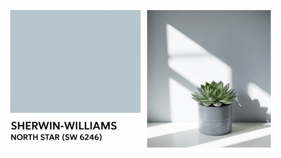
Is Sherwin-Williams North Star blue or gray? Here’s the definitive answer.
Sherwin-Williams North Star (SW 6246) is a light blue with cool, slate-gray undertones that shift between blue and gray depending on the lighting.
This color confusion happens because it acts like a chameleon, appearing more blue in bright, south-facing rooms and more gray in dimmer, north-facing spaces.
This flexible, calming shade has become ideal for bedrooms, bathrooms, and beyond. It’s great for anyone seeking a soft, breezy look without losing neutrality. The color works beautifully in both modern and traditional homes.
In this guide, I’ll walk you through where to use this calm and peaceful colour.
Compare it to similar colors and expert pairings, which will help you decide if it’s the right choice for your space.
What Color Is Sherwin-Williams North Star?
This paint color is a light blue with strong slate-gray undertones. This soft, muted shade creates a calm and soothing atmosphere in any room.
The color has gained popularity because it offers an excellent balance between adding enough color to create interest while remaining neutral enough to work with various decor styles.
Key characteristics of this paint:
- Color family: Light blue with gray undertones that can appear more blue or gray depending on room lighting
- Finish versatility: Works well in both traditional and contemporary home styles
- Room compatibility: Especially popular for bedrooms and bathrooms, where a relaxing vibe is desired
- Neutral appeal: Soft enough to act as a backdrop for brighter accent colors while adding subtle color interest
The beauty of this shade lies in its ability to shift appearance based on your room’s lighting conditions. In spaces with abundant natural light, this paint color tends to showcase its blue qualities more prominently.
In darker rooms or those with limited natural light, the gray undertones become more obvious, creating a softer, more neutral appearance.
Sherwin-Williams North Star Paint Details
Understanding the technical specifications helps you make informed decisions about this popular paint color. These numbers tell you exactly how the color will behave in your space and how it interacts with light.
The technical details also help paint professionals match colors accurately and predict how they will look in different room conditions.
| Specification | Value | What This Means |
|---|---|---|
| Light Reflectance Value (LRV) | 62 | Mid-range brightness that balances light reflection without being too bright or too dark |
| RGB Values |
R: 202, G: 208, B: 210 |
Digital color formula showing the red, green, and blue components that create this shade |
| Hex Code |
#CADOD2 |
Web-safe color code used for digital matching and online visualization |
| Temperature Classification | Cool | Leans toward cooler tones due to gray undertones, creating a calming effect |
How is North Star compared to Different Colors?
Comparing this paint color to similar shades helps you understand its qualities and choose the right option for your space.
Each of these colors has subtle differences in tone, depth, and undertones that can significantly impact the final appearance of your room.
Understanding these comparisons ensures you select the shade that matches your vision and lighting conditions.
- vs Krypton 6247: Krypton appears darker and leans more toward contemporary styling, while this shade remains lighter and easier to use for various room types
- vs Misty 6232: Misty appears grayer and cooler in most lighting conditions, whereas this color shows more blue warmth and richness throughout the day
- vs Upward 6239: Upward offers deeper, more intense blue tones that can feel bold, making this shade the lighter, softer alternative with warmer gray undertones
- vs Benjamin Moore options: Benjamin Moore Early Frost and Silver Lining provide similar qualities, but this Sherwin-Williams option offers better consistency and easier color matching
Sherwin-Williams North Star in Real Spaces
This shade works beautifully throughout your home, creating a cohesive flow while serving different functional needs in each space.
The color’s ability to shift between blue and gray makes it adaptable to various room purposes and lighting conditions.
1. Bedrooms
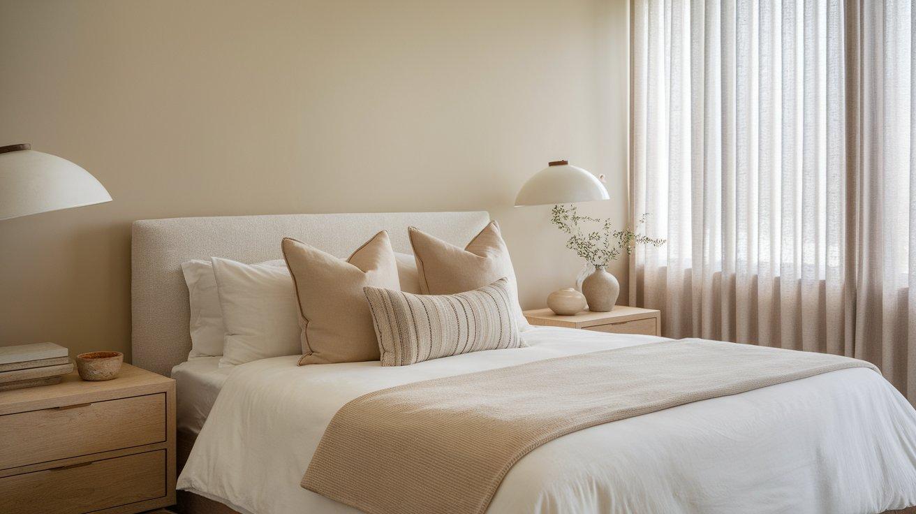
Blue colors naturally promote better sleep quality and relaxation. This soft shade creates a tranquil environment that helps your mind unwind after long days.
The gray undertones prevent the color from feeling too stimulating while maintaining visual interest.
Many homeowners choose this paint for master bedrooms and guest rooms because it appeals to both masculine and feminine preferences.
- Creates a calming backdrop that promotes restful sleep
- Works well with both warm and cool bedding colors
- Provides gender-neutral appeal for shared spaces
- Pairs beautifully with white trim and natural wood furniture
Styling Tip: Use this color on an accent wall behind your headboard, then keep other walls neutral white to create a focal point without overwhelming the space.
2. Bathrooms
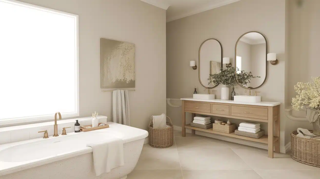
The qualities of this paint make bathrooms feel more peaceful and serene. The color complements white fixtures and vanities while adding clean color interest.
This shade works particularly well in bathrooms with good natural light, where it maintains its blue qualities throughout the day.
- Creates an atmosphere for relaxation
- Complements white cabinets and fixtures
- Handles bathroom humidity well when properly primed
- Makes small bathrooms feel more spacious
Styling Tip: Paint bathroom vanities in this color while keeping walls white, or use it on all walls with bright white trim for a fresh, clean look.
3. Living Rooms
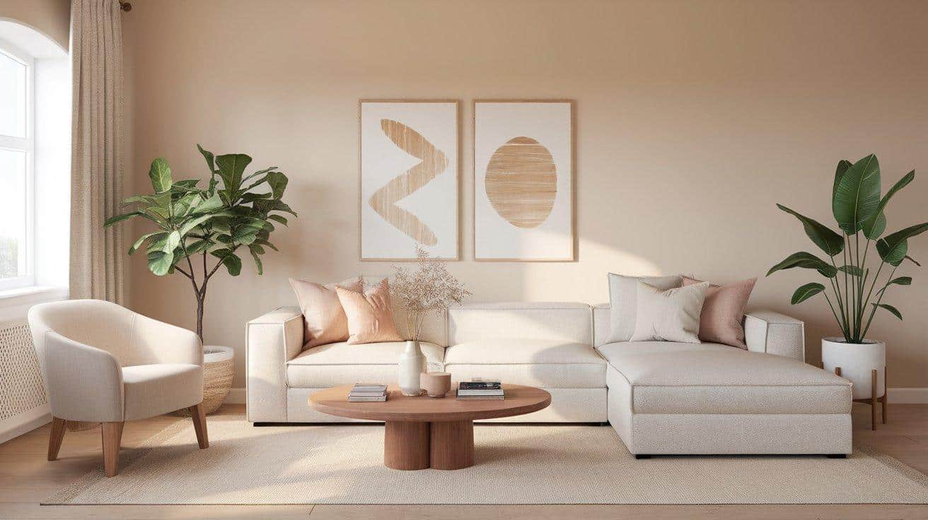
This paint color establishes a calm atmosphere for family gatherings and quiet evenings. The neutral qualities allow it to work with various furniture styles and colors.
It provides enough color to create visual interest without competing with artwork, furniture, or decorative accessories.
- Serves as a neutral backdrop for colorful furniture and art
- Creates a clean, wide range look
- Works with both modern and traditional furniture styles
- Helps balance warmer wood tones in the space
Styling Tip: Use this color on the main walls and pair with creamy white on the ceiling and trim, then add navy blue and coral accents through pillows and artwork.
4. Kitchens
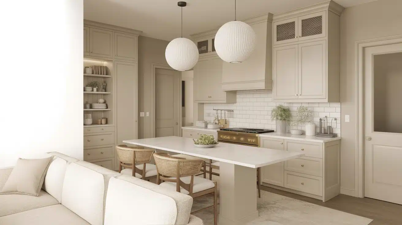
The classic appeal of this shade makes it an ideal choice for kitchen spaces that need to feel both functional and welcoming. It pairs beautifully with white cabinets and stainless steel appliances.
The color adds sophistication without dating your kitchen design, making it a smart long-term choice.
- Complements white kitchen cabinets and marble countertops
- Creates a classic look that won’t feel outdated
- Works well with both warm and cool kitchen lighting
- Provides a refined alternative to plain white walls
Styling Tip: Paint kitchen islands or lower cabinets in this color while keeping upper cabinets white, or use it on walls with white shiplap wainscoting for a coastal feel.
Coordinating Colors for a Balanced Look
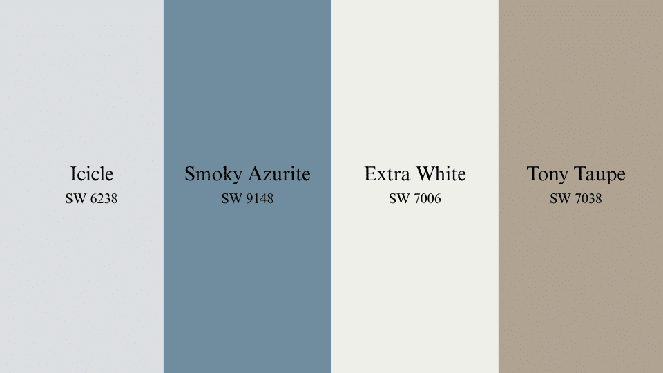
These shades work well alongside cooler tones, helping to round out the space with contrast, softness, or added warmth. Each one supports the room’s flow without visually taking over.
1. Icicle (SW 6238)
Light and quiet, Icicle gives just a trace of blue to ceilings, bathrooms, or small entryways. It works well where plain white might feel too stark, especially under soft, warm bulbs.
The color softens reflective surfaces while keeping the space light and cool. It fits easily with brushed nickel fixtures, pale flooring, and off-white cabinetry.
2. Smoky Azurite (SW 9148)
This rich blue brings contrast without feeling heavy, especially in mid-sized living rooms or dining spaces. It’s a solid choice for built-ins, accent walls, or lower kitchen cabinets.
In natural light, it shows depth without overpowering nearby colors. Pair it with light-stained flooring, black metal accents, or matte ceramic tile for a grounded but open look.
3. Extra White (SW 7006)
Extra White is a bright, clean white that adds strong contrast to cool-toned colors. It’s ideal for trim, doors, and ceilings, helping the main color stand out without overpowering the space.
In smaller rooms, it keeps things feeling open and clear. Its consistent appearance across different lighting makes it reliable for both day and evening use.
4. Tony Taupe (SW 7038)
Tony Taupe is a warm, balanced shade that mixes beige and gray. It suits living rooms, entryways, and dining spaces, staying consistent in different lighting.
This color pairs well with natural textures like wood and stone, adding a calm, steady feel to the room.
Similar Colors That Share a Common Tone
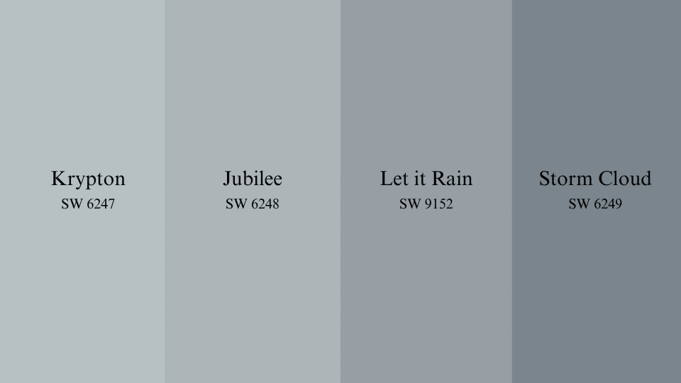
1. Krypton (SW 6247)
The shade feels calm without being too soft. It’s often used on walls to support neutral or metal finishes.
Jubilee leans toward a steely blue with more substantial gray influence. It fits well in modern rooms or spaces with cool flooring and clean lines. The color holds steady in most lighting, making it dependable.
It pairs nicely with off-whites, light grays, and brushed finishes.
3. Let it Rain (SW 9152)
Let it Rain is a medium blue with a soft, grounded tone that adds quiet presence to a room. It works in both small and large spaces without feeling too bold.
The color complements natural wood and muted fabrics. It’s a steady pick for accent walls or cabinets.
4. Storm Cloud (SW 6249)
Storm Cloud is a deeper shade that brings strength to any room. It’s often used to highlight focal points or add contrast in neutral spaces.
The color pairs well with soft textures and light wood tones. It performs best in rooms with steady daylight.
Conclusion
This soft paint color has become a go-to choice for those seeking a calm yet polished look. It works well in bedrooms that promote better sleep and bathrooms that require a peaceful, clean ambiance.
The shade adjusts easily to different spaces while keeping a steady, relaxed tone.
Its color details make it a good fit for smaller rooms without feeling too plain. You can pair it with white for a light look or with navy for more contrast.
Just make sure to test it out in your lighting first, as it can look different depending on the time of day.
Want to see how it fits your space? Try a peel-and-stick sample first to check the color before you paint.