Sherwin William’s Light French Gray Vs. Repose Gray (Choose)
Looking for the perfect gray paint color? I spent weeks testing different Sherwin-Williams grays in my home, and I want to share what I learned about Light French Gray and Repose Gray.
Like many homeowners, I found it hard to distinguish these popular shades at first glance. However, I noticed key differences that can make or break your space after using both colors in different rooms and lighting conditions.
In this post, I’ll compare Light French Gray and Repose Gray side by side, looking at their undertones, light reflection values, and how they look in various settings.
By the end, you’ll know exactly which gray suits your home best.
An Overview of Gray Paint Color
Choosing gray paint can be trickier than it seems. Gray mixes black and white with undertones that can make it look warm, cool, or neutral.
Warm grays have hints of brown, beige, or purple, while cool grays lean towards blue, green, or blue-green.
Finally, consider your furniture and decor. The right gray should complement existing elements like flooring and trim to create a cohesive look.
Brief About Sherwin William’s Light French Gray
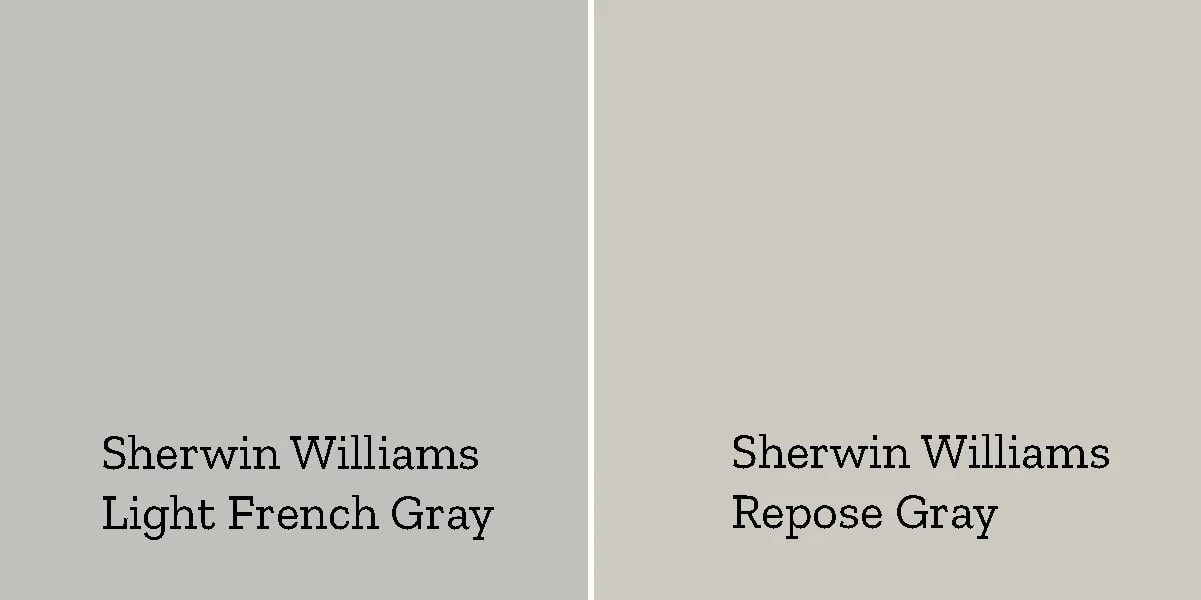
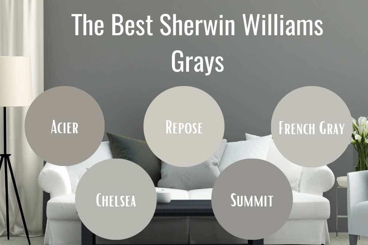
Light French Gray is a balanced neutral color I’ve used often in my home projects. With an LRV of 53, it sits perfectly in the mid-tone range, making it suitable for most rooms.
I love that this paint shows a clean, true gray base with subtle blue undertones. It stays steady throughout the day and works well with both warm and cool decor.
The color looks brighter in sunny rooms but keeps its charm in darker spaces, too. I’ve found it pairs nicely with white trim and can handle different lighting conditions without looking too stark or dull.
What makes Light French Gray special is its ability to blend with any style – from modern to classic homes. It creates a perfect backdrop without drawing too much attention.
Brief About Sherwin William’s Repose Gray
Repose Gray has become my go-to color when helping clients choose a versatile gray. With an LRV of 58, it’s slightly lighter than Light French Gray, making rooms open and bright.
I noticed this paint has warm undertones showing beige hints, keeping spaces feeling cozy. During my testing, I saw how it shifts from a soft gray in the morning light to a warmer tone in the afternoon sun.
The color stays light enough to work in small spaces but has enough depth to add interest to larger rooms. From my design work, I’ve seen it match well with both cool and warm color schemes.
One thing that sets Repose Gray apart is its ability to look good in any lighting. It doesn’t turn too cool in north-facing rooms or too warm in sunny spaces, making it a reliable choice for whole-home color schemes.
Light French Gray Vs. Repose Gray – Which One to Choose
| Feature | Light French Gray | Repose Gray |
|---|---|---|
| LRV | 53 | 58 |
| Base | True gray | Soft gray |
| Undertones | Slight blue hints | Warm beige notes |
| Depth | Medium tone | Light to medium-tone |
| Best Use Cases | – Modern homes need clean lines | – Open floor plans |
| – Spaces with lots of natural light | – North-facing rooms | |
| – Rooms with cool-toned furniture | – Family living spaces | |
| – Office spaces and formal living rooms | – Kitchens and dining areas | |
| – Bedrooms needing a calm feel | – Rooms with wooden elements | |
| Pros | – Stays true to color all-day | – Brightens up dark spaces |
| – Makes a strong neutral base | – Feels welcoming and warm | |
| – Works with modern decor | – Matches most decor styles | |
| – Handles bright light well | – Great for whole-home use | |
| Cons | – Can feel cold in dark rooms | – May look beige in warm light |
| – Might look too formal in casual spaces | – Can feel too light in bright rooms | |
| – Needs good lighting to show true color | – Might need darker accents | |
| – Can clash with warm wood tones | – Sometimes lacks depth for formal spaces |
Some Factors to Consider When Choosing
1. Room Lighting Type
I always test paint colors under your room’s actual lighting. Natural light affects these grays differently. Light French Gray stays cooler in north-facing rooms.
Repose Gray adds warmth to spaces with limited sunlight. Check how each color looks during morning, afternoon, and evening hours.
2. Room Size and Height
Your room’s size matters when choosing between these grays. Due to its higher LRV, Repose Gray can make small rooms feel more open.
Light French Gray adds more depth to large spaces. Consider your ceiling height, too – lighter grays can make low ceilings appear higher.
3. Existing Decor and Furnishings
Look at your current furniture and fixtures. I recommend using paint samples to test against your flooring, cabinets, and major furniture pieces.
Light French Gray matches well with silver and chrome finishes. Repose Gray complements wooden elements and brass fixtures.
4. Room Function
Think about how you use the space. I find Light French Gray creates a focused atmosphere for home offices.
Repose Gray brings a comfortable feel to living rooms and bedrooms. Consider whether you want the room to feel formal or casual.
5. Connected Spaces
If your rooms flow into each other, consider how the colors transition. Both grays can work in open floor plans, but consistency matters. I suggest using one color throughout connected spaces to create a unified look.
Best Alternative Grey Shades to Consider
- Benjamin Moore Stonington Gray: This gray has an LRV of 59, making it brighter than both Light French Gray and Repose Gray. I find it works well in rooms with limited light. It shows a crisp, clean appearance with slight blue-green hints. From my experience, it’s perfect for modern spaces.
- Sherwin Williams Mindful Gray: With an LRV of 48, this shade offers more depth. During testing, I noticed warm undertones that create a cozy feel. The color stays stable throughout the day. It pairs well with natural textures and creates a balanced look in large spaces.
- Benjamin Moore Gray Owl: This versatile option has an LRV of 65. I love how it brightens up any room while maintaining true gray characteristics. Depending on the lighting, the color shows different personalities—sometimes cool, sometimes warm. It works beautifully in bathrooms and kitchens.
- Sherwin Williams Passive Gray: Here’s a middle-ground option with an LRV of 60. From my projects, I’ve seen it create a soft, welcoming atmosphere. It carries subtle warm undertones without looking beige. The color maintains its gray base even in bright sunlight.
- Benjamin Moore Coventry Gray: This deeper option has an LRV of 48. I recommend it for spaces needing more character. It shows true gray properties with minimal undertones. The color creates excellent contrast with white trim and looks refined in formal areas.
- Sherwin Williams Agreeable Gray: With an LRV of 60, this color is a perfect “greige.” During my design work, I’ve noticed it beautifully bridges the gap between gray and beige. It creates a welcoming atmosphere in any room and matches most decor styles.
Conclusion
Choosing between Light French Gray and Repose Gray comes down to your space and style needs.
I’ve used both colors in different homes, and each has its own charm. Light French Gray offers a cooler, cleaner look that works well in modern spaces, while Repose Gray provides a warmer, more versatile option that suits most home styles.
Remember to test your chosen color in your space before deciding. Paint large sample patches and watch how they change throughout the day. Consider your room’s lighting, size, and existing decor.
If neither color feels quite right, try the alternatives I suggested above. They might better match your vision. Ready to start painting?
Head to your local Sherwin-Williams store with these insights in mind!
Feel free to share your experience in the comments below.
Frequently Asked Questions
Which Color is Better for Rooms with Low/high Natural Light?
I recommend Repose Gray in low-light rooms since it brightens spaces. Light French Gray performs better in high-light rooms, keeping its true color without washing out.
What Trim Colors Pair Well with Each Shade?
Light French Gray looks great with Pure White or Extra White trim. Repose Gray pairs nicely with Alabaster or White Dove trim for a softer look.
What is the Lighter Version of Repose Gray?
Eider White is the lighter version of Repose Gray. It has an LRV of 73 and shows similar warm undertones but appears much softer on walls.

