Are you struggling to find the perfect white paint that truly maximizes light in your space?
Most homeowners settle for standard whites that promise brightness but deliver disappointing results.
Finding a paint that reflects maximum light while maintaining a clean appearance feels impossible with countless options available.
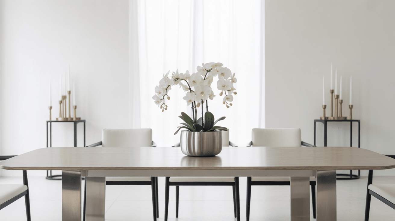
Sherwin-Williams High Reflective White offers the solution you need. This specialty paint delivers exceptional light reflection, outperforming typical white paints.
High Reflective White changes dark spaces and enhances natural light throughout your home or office.
This blog covers everything about Sherwin-Williams High Reflective White, from technical specifications to lighting effects and furniture coordination.
You will learn how to choose and use this specialty paint to achieve the bright, clean finish your space deserves.
High Reflective White (SW 7757) Basics
High Reflective White (HRW) is a specialty paint color designed to reflect maximum light. This paint belongs to Sherwin-Williams’ extended color collection and offers superior brightness compared to standard white paints.
| Color Detail | Description |
|---|---|
| Color Code | SW 7757 |
| Light Reflectance Value (LRV) | 93 |
| Hue Family | Neutral |
| Chroma | Minimal |
| Value | High |
| Undertones | Minimal cool |
| Position | Cooler side of neutral-white spectrum |
What These Terms Mean
- Light Reflectance Value (LRV): A number from 0-100 that measures how much light a color reflects. Higher numbers mean brighter colors that reflect more light.
- Hue Family: The basic color category a paint belongs to. Neutral means it has very little color bias toward warm or cool tones.
- Chroma: The intensity or purity of color. Minimal chroma means the paint has very little color saturation and appears almost pure white.
- Value: How light or dark a color appears on a scale from black to white. High value means the color is very light.
- Undertones: Subtle color hints that show through paint. Cool undertones include hints of blue, green, or gray.
Why Choose High Reflective White?
High-Reflective White offers distinct advantages for specific applications where maximum brightness is most important.
The paint’s exceptional light-reflecting properties help reduce lighting costs by maximizing natural light throughout the day. This makes it an economical choice for both residential and commercial spaces.
This paint works particularly well in professional environments where a clean appearance matters.
The crisp, modern finish enhances productivity and creates visual clarity in office settings. For residential use, it transforms dark areas like basements or rooms with limited natural light into brighter, more welcoming spaces.
The energy efficiency benefits make High Reflective White valuable for exterior applications as well. It reflects heat effectively, helping reduce cooling costs in warm climates.
This dual benefit of aesthetic appeal and practical performance makes it both a smart design choice and a cost-effective investment for your property.
Ideal Spaces for High Reflective White
High Reflective White works best in specific applications where maximum light reflection is desired. Here are the top uses for this specialty paint.
1. Kitchen Cabinet Finishes
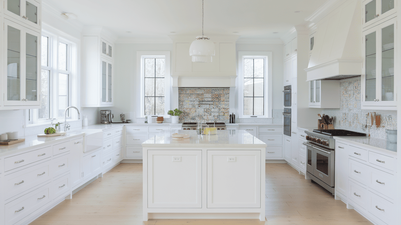
Kitchen cabinets painted in High Reflective White brighten the entire space.
The paint reflects light back into work areas effectively.
It pairs well with colorful backsplashes and works with both traditional and modern hardware.
2. Medical and Dental Offices
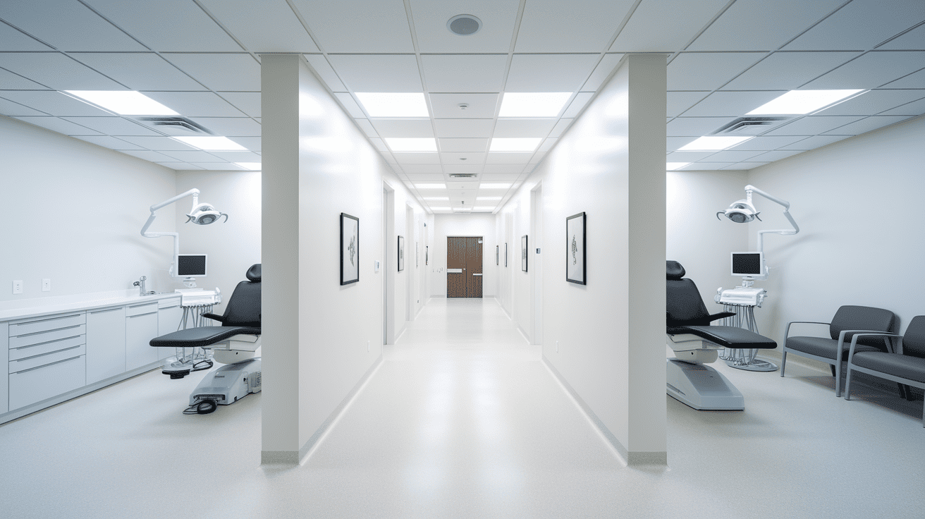
Healthcare facilities choose this paint for its clean, sterile appearance.
The brightness helps with task lighting and creates a hygienic feel.
It meets the professional standards expected in medical environments.
3. Trim and Molding Applications
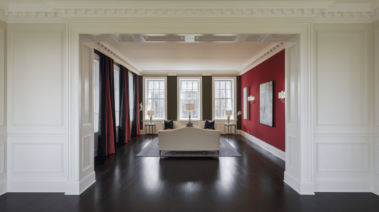
This paint creates sharp, clean lines when used on trim work.
It provides maximum contrast against medium to dark wall colors like SW Agreeable Gray or SW Accessible Beige.
The brightness helps define architectural features clearly while working well with both warm and cool wall tones.
4. Ceiling Applications
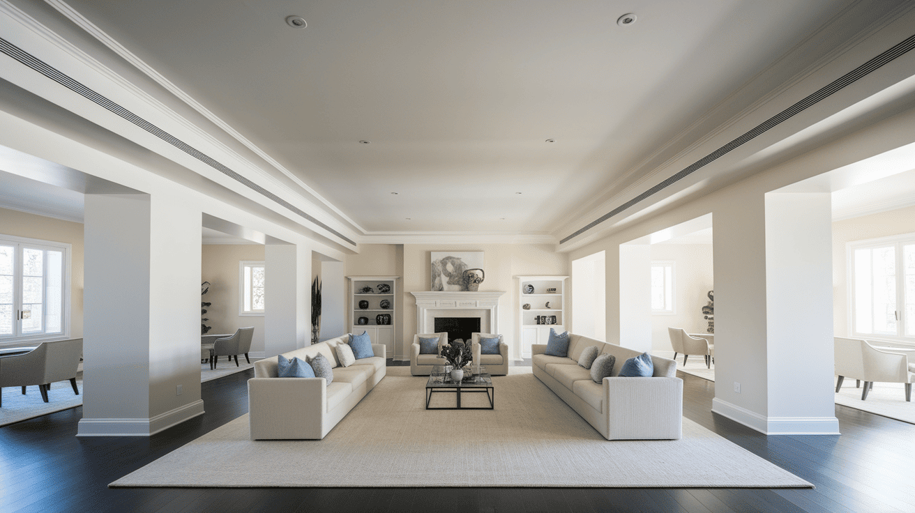
Ceilings painted in High Reflective White reflect light back down into rooms. This creates better overall illumination throughout the space.
It works especially well in rooms with limited natural light and pairs well with soft wall colors like SW Misty or SW Distance.
5. Retail Store Interiors
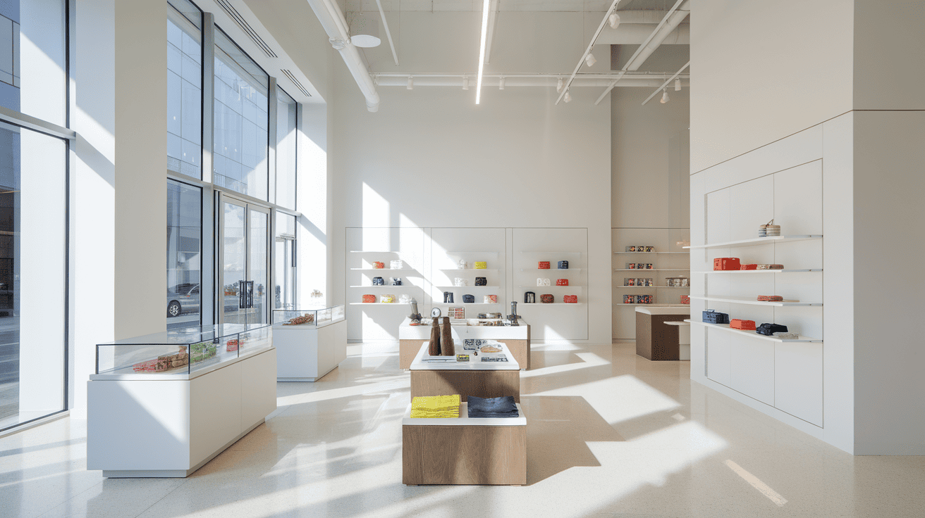
Retail spaces use this paint to showcase products effectively. The high reflectance helps illuminate merchandise naturally.
Store owners report improved product visibility and reduced need for artificial lighting.
How to Sample High Reflective White?
- Order 2-3 sample sizes and apply them to multiple walls in your room
- Test at different times of day to see how natural light affects the color
- Place samples on both north and south-facing walls to compare lighting effects
- View from different angles and distances; larger rooms handle brightness better
- Compare against existing whites to gauge the brightness difference
- Check for clinical or overwhelming feelings; this paint may be too bright for cozy spaces
- Test compatibility with your decor and planned color scheme before committing
Coordinating Furniture with High Reflective White
High Reflective White’s bright, cool-toned nature pairs well with specific furniture styles and finishes that complement its clean appearance.
1. Modern and Contemporary Furniture
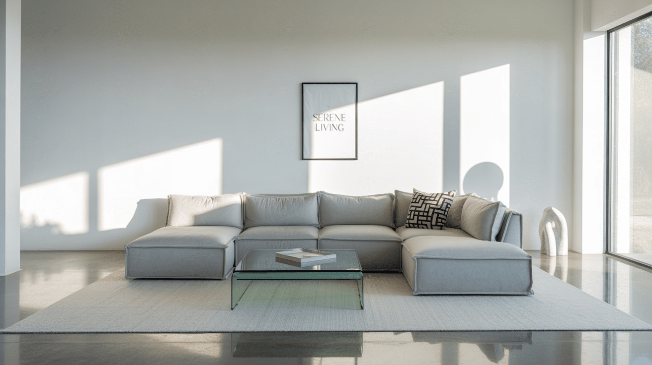
Sleek furniture with clean lines works exceptionally well with HRW’s crisp finish. Black, white, or gray furniture creates a striking contrast against the bright walls.
Glass and metal accents enhance the modern feel while maintaining the clean aesthetic.
2. Natural Wood Finishes
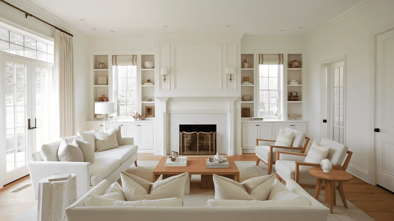
Light wood tones like maple, birch, or light oak provide warmth that balances HRW’s cool undertones.
Medium wood finishes such as walnut or cherry create a beautiful contrast without overwhelming the space.
Avoid very dark woods that might create too much contrast in smaller rooms.
3. Neutral Upholstery Colors
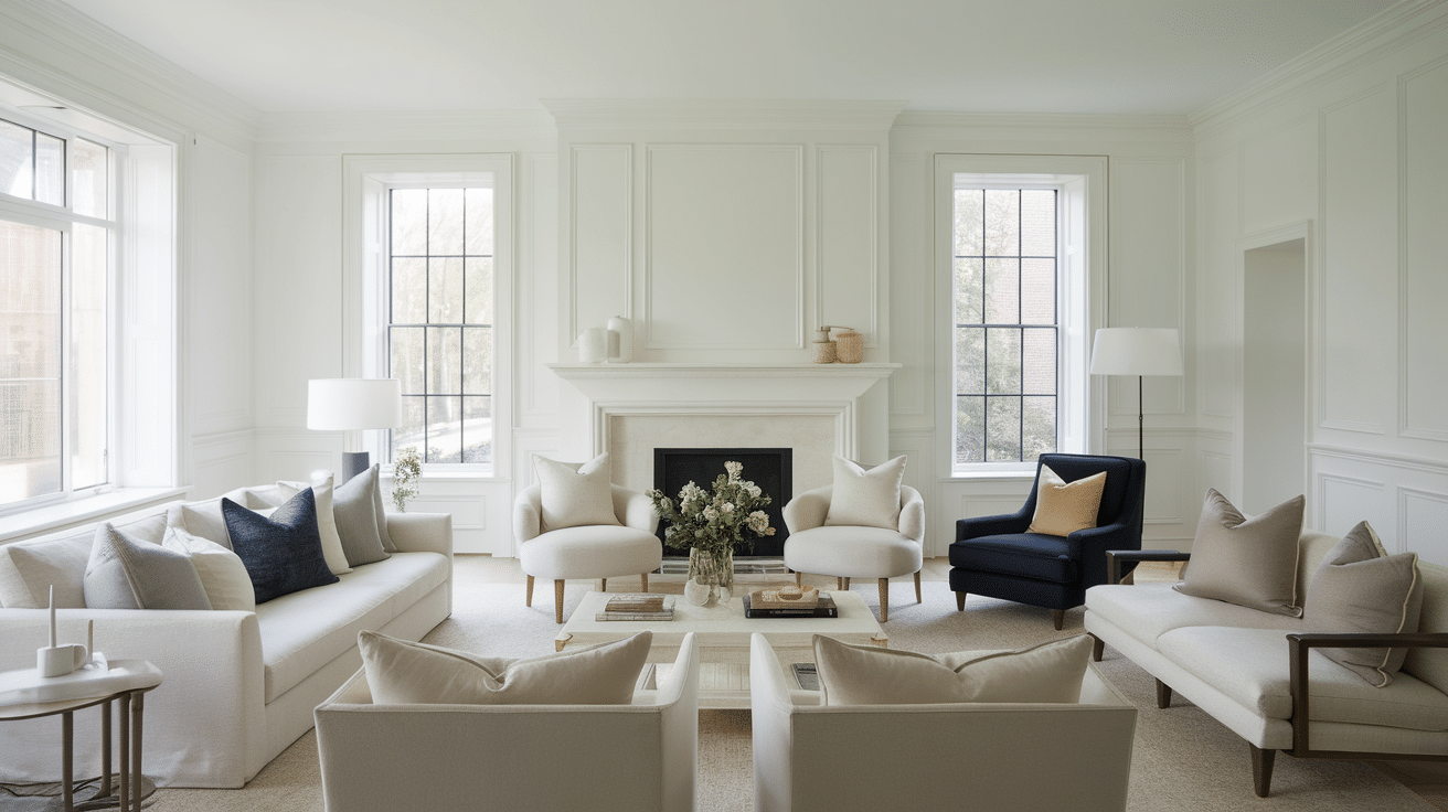
Soft grays, beiges, and cream-colored furniture work harmoniously with HRW’s neutral base.
Navy blue or charcoal upholstery creates a sophisticated contrast while maintaining visual balance.
Avoid bright or warm colors that might clash with the paint’s cool undertones.
4. Metallic Accents and Hardware
Brushed nickel, chrome, or stainless steel hardware complements HRW’s cool nature perfectly.
Brass or gold accents can work, but should be used sparingly to avoid temperature conflicts.
Black metal finishes create a striking contrast and add sophistication to the overall design.
High Reflective White vs Other Whites
Now that you understand the key benefits and applications of High Reflective White, it’s essential to compare it with other popular white paint options.
These direct comparisons will help you determine if High Reflective White is the right choice for your project or if another white might better suit your needs.
High Reflective White vs Extra White
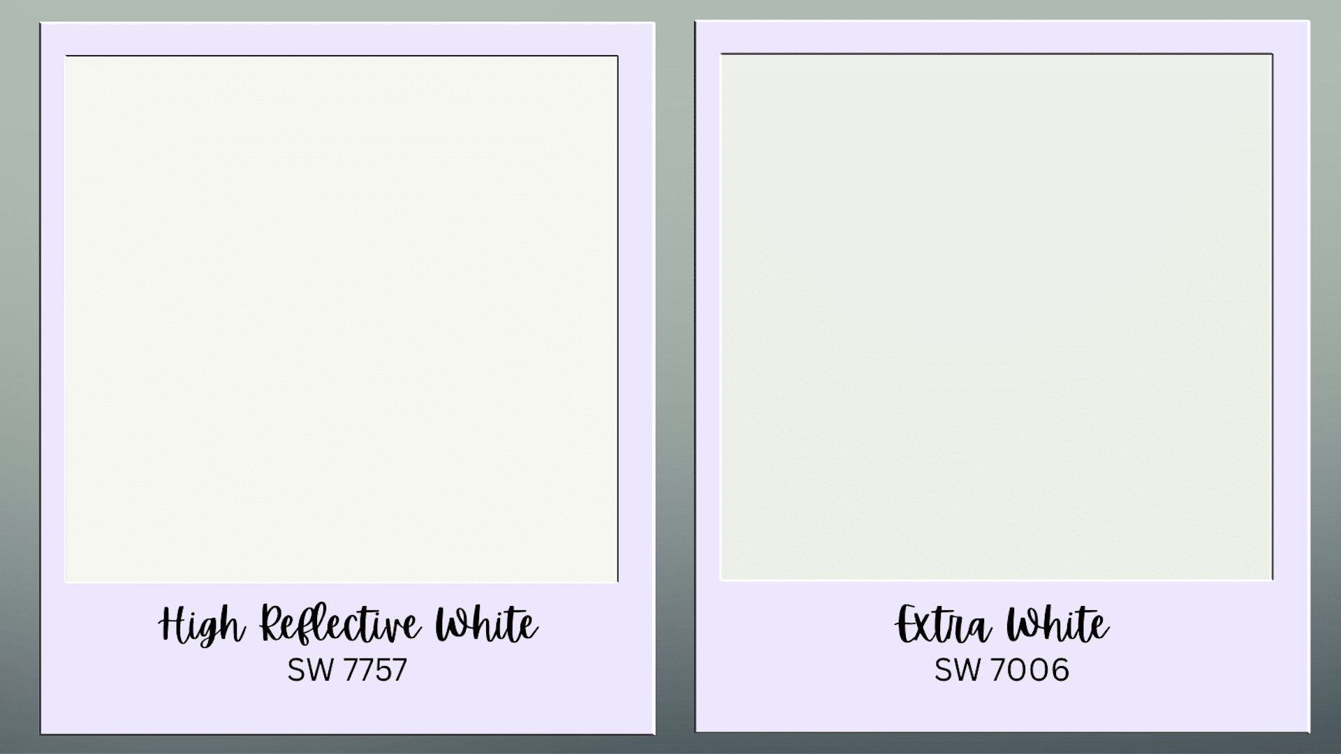
HRW offers significantly higher brightness (93 vs 86 LRV), which is better for maximum light reflection. Extra White is more accessible with wider availability and a warmer feel.
| Feature | High Reflective White (SW 7757) | Extra White (SW 7006) |
|---|---|---|
| LRV | 93 | 86 |
| Undertones | Cool | Slightly warm |
| Availability | Specialty ordering | Widely available |
| Best for | Commercial/specific residential | General residential |
High Reflective White vs Pure White
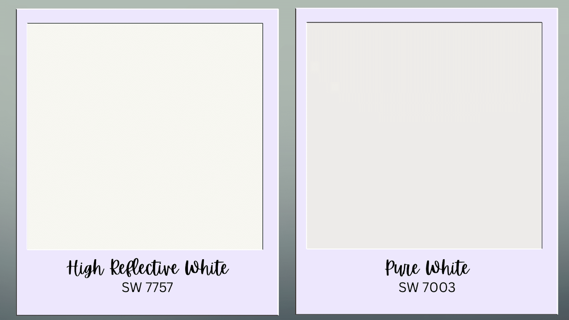
HRW provides maximum light reflection (93 vs 84 LRV). Pure White offers moderate brightness with neutral undertones for versatile residential use.
| Feature | High Reflective White (SW 7757) | Pure White (SW 7005) |
|---|---|---|
| LRV | 93 | 84 |
| Undertones | Minimal cool | Neutral |
| Brightness | Maximum reflectance | Standard brightness |
| Applications | Light-maximizing spaces | Most residential spaces |
High Reflective White vs Chantilly Lace
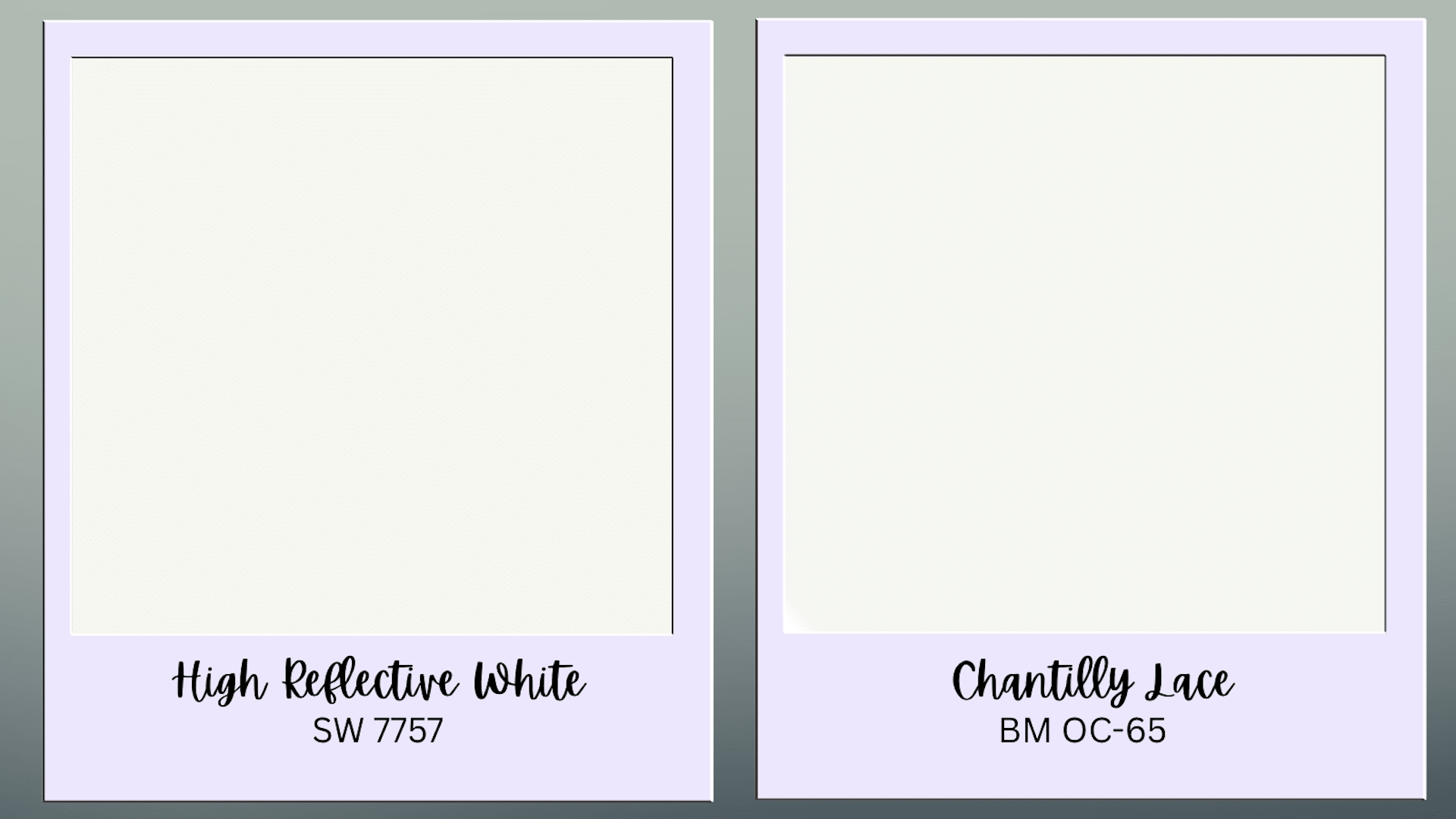
Nearly identical brightness (93 vs 92.2 LRV) with similar cool undertones. Performance is comparable between the two paints.
| Feature | High Reflective White (SW 7757) | Chantilly Lace (BM) |
|---|---|---|
| LRV | 93 | 92.2 |
| Brand | Sherwin Williams | Benjamin Moore |
| Undertones | Minimal cool | Similar cool |
| Availability | Limited specialty | More readily available |
How Different Lightings Affect SW 7757
The appearance of High Reflective White changes significantly based on lighting conditions. Understanding these changes helps you make better decisions for your space.
Morning light (east-facing): The color appears fresh and clean. Cool undertones are minimal during this time.
Midday light (south-facing): This is when High Reflective White looks its best. The color appears true to sample with maximum brightness.
Afternoon light (west-facing): The paint can pick up warm tones from the setting sun. This creates a softer, less clinical appearance.
Evening artificial light: Under warm white LED bulbs, the color maintains its clean appearance. Cool LED bulbs enhance the brightness factor.
Cloudy days: The color may appear slightly cooler or grayer. This is normal for high-LRV whites.
The Bottom Line
High-Reflective White stands out as a specialty paint choice for spaces that require maximum light reflection and a professional appearance.
This paint delivers exceptional brightness that standard whites cannot match, making it ideal for commercial environments, basements, and areas where natural light enhancement is crucial.
While Sherwin-Williams High Reflective White requires special ordering and costs more than typical options, its performance justifies the investment for the right applications.
Remember to always test samples in your specific lighting conditions before committing to any paint choice.
Choose High Reflective White when brightness and light maximization are your primary goals.
This specialty paint excels where maximum light reflection matters most, helping you achieve the optimal results your space deserves.