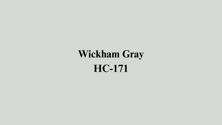
Sherwin Williams Gray with No Undertones: Top Picks
Are you tired of gray paint that looks blue in morning light and beige by evening?
Finding the perfect neutral gray can feel like an impossible task when colors constantly shift throughout the day.
Homeowners often find their chosen gray takes on surprising shifts, turning one shade in daylight and another under artificial bulbs.
This comprehensive guide presents carefully selected Sherwin-Williams gray paints that maintain their true neutral appearance regardless of lighting conditions.
Whether you’re considering popular options like light French gray and Repose gray or seeking lesser-known gems, these picks offer the stability and versatility you need for any space in your home.
Get ready to find your perfect gray match.
Which Sherwin-Williams Gray Is Truly Neutral?
A truly neutral gray contains balanced amounts of all color pigments without favoring any particular undertone.
These shades deliver a steady look, holding true from morning sunshine to evening lamp light.
The key characteristics of genuinely neutral grays include:
- Balanced color composition with equal red, blue, and yellow pigments.
- Consistent appearance across different times of day.
- Versatile pairing ability with both warm and cool accent colors.
- Stable color temperature that doesn’t shift dramatically.
Most paint manufacturers achieve true neutrality by carefully calibrating their color formulas. Sherwin-Williams uses advanced color-matching technology to create grays that resist unwanted color shifts.
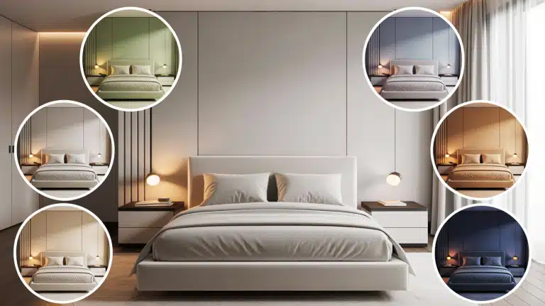
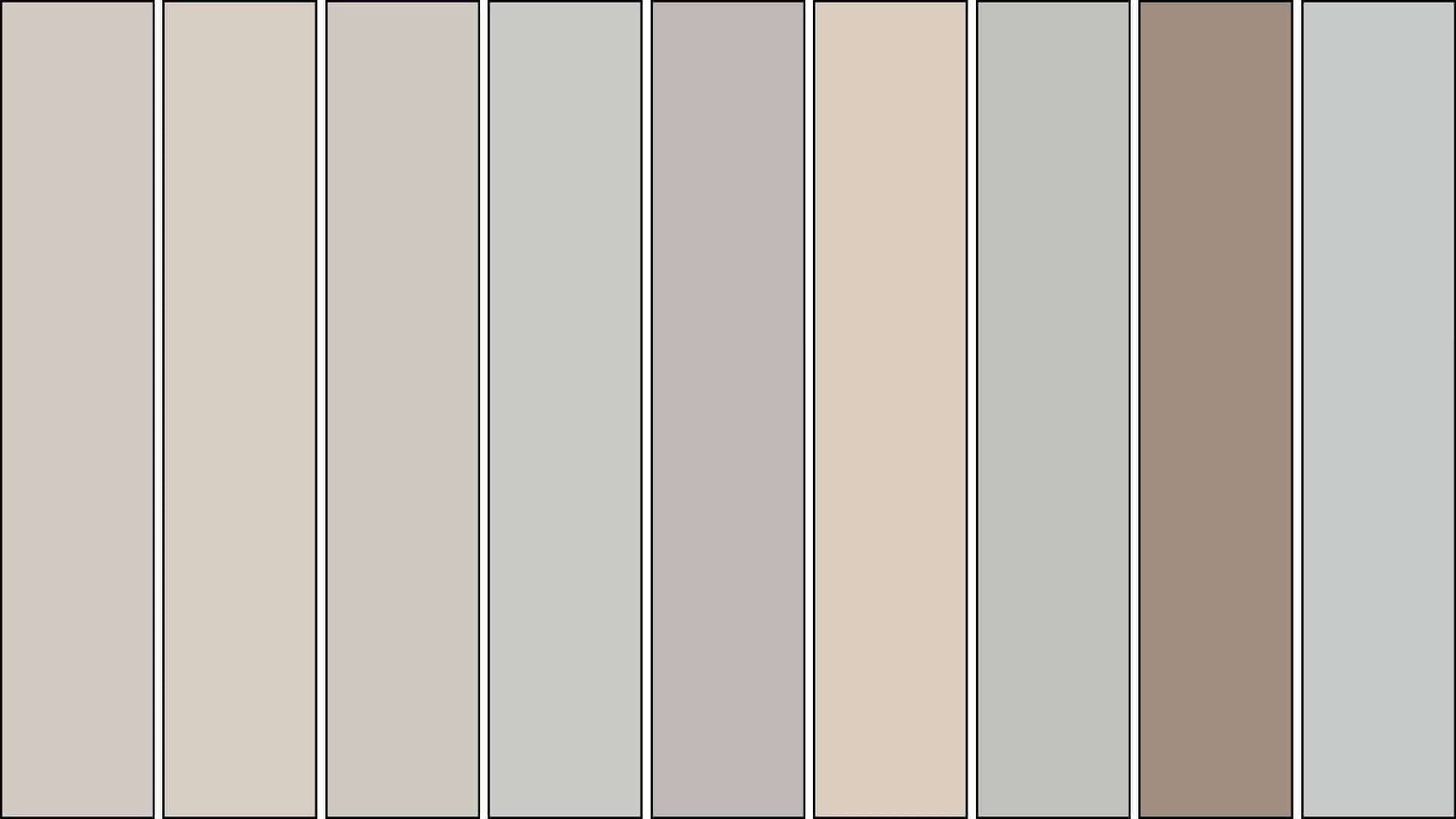
9 Sherwin-Williams Gray Top Picks With Minimal Undertones
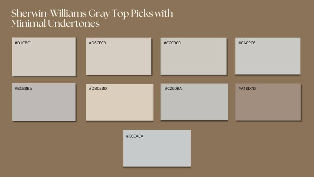
These carefully selected grays offer reliable neutrality across all lighting conditions. Each paint maintains a consistent appearance without unwanted color shifts, perfect for modern homes.
1. Agreeable Gray (SW 7029)
Agreeable Gray ranks among Sherwin-Williams’ top-selling neutral choices. This inviting gray preserves its balanced character, avoiding sudden shifts while staying clear of beige or steel tones.
- Light Reflectance Value: 60
- Undertone Profile: Gentle warmth without dominance.
- Space Compatibility: Excellent for open layouts.
- Trim Pairing: Stunning with crisp white molding.
Perfect For: Family rooms, cooking areas, and central hubs where color stability is essential.
2. Modern Gray (SW 7632)
Modern Gray delivers a fresh, current feel without harsh coldness. This medium-tone shade performs exceptionally well in spaces with abundant daylight.
- Light Reflectance Value: 62
- Temperature Balance: Ideal mix of warm and cool notes.
- Lighting Response: Steady under LED illumination.
- Style Flexibility: Suits both classic and contemporary looks.
Ideal Applications: Sleeping quarters, workspaces, and formal dining areas that require refined neutrality.
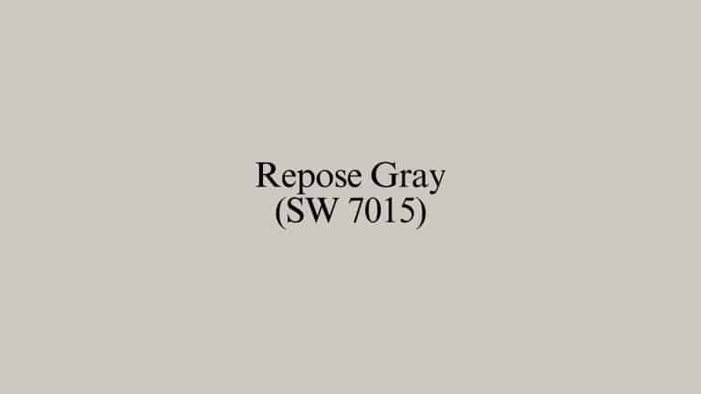
3. Repose Gray (SW 7015)
Repose Gray has earned its reputation as a dependable favorite. Despite concerns about whether “Is Repose Gray Out of Style,” this shade remains timeless through superior balance.
- Light Reflectance Value: 58
- Color Lean: Mildly cool without appearing blue.
- Whole-Home Potential: Perfect for unified schemes.
- Accent Harmony: Pairs effortlessly with both vibrant warm hues and crisp cool shades.
Recommended Spaces: Corridors, washrooms, and transitional areas linking multiple rooms.
4. Zircon (SW 7667)
Zircon showcases refined gray with remarkable richness. This hue holds its personality whether covering entire walls or highlighting specific areas.
- Light Reflectance Value: 59
- Tone Quality: Deep gray without a muddled appearance.
- Light Handling: Adapts well to natural and electric sources.
- Contrast Ability: Creates striking opposition with bright elements.
Prime Uses: Accent walls, custom cabinetry, and architectural highlights.
5. Essential Gray (SW 6002)
Essential Gray supplies fundamental neutrality for any design approach. This trustworthy choice integrates smoothly with diverse decorating methods and color combinations.
- Light Reflectance Value: 48
- Depth Character: Medium-range gray with lasting appeal.
- Stability Factor: Prevents color drift during changes in daylight.
- Coordination Strength: Harmonizes with vibrant accent shades.
Best Applications: Recreation rooms, visitor bedrooms, and flexible-purpose areas.
6. River’s Edge (SW 7517)
River’s Edge embodies the natural qualities of stone in liquid form. This gray preserves its earthy essence while delivering contemporary neutrality.
- Light Reflectance Value: 63
- Natural Inspiration: Stone and mineral influence.
- Temperature Consistency: Maintains steady warmth levels.
- Atmosphere Building: Generates calm, wellness-focused settings.
Optimal Locations: Bathrooms, utility rooms, and spaces prioritizing tranquility.
7. Silverplate (SW 7649)
Silverplate offers metallic-inspired neutrality without actual shimmer. This refined gray works particularly well in contemporary settings.
- Light Reflectance Value: 53
- Cool Classification: Crisp gray avoiding blue shifts.
- Impact: Clean, business-like presence.
- Design Compatibility: Perfect for streamlined concepts.
Strategic Placement: Home offices, updated kitchens, and minimalist rooms.
8. Dry Dock (SW 7502)
Dry Dock introduces weathered charm to indoor environments. This gray captures the essence of aged timber while maintaining the practical advantages of paint.
- Light Reflectance Value: 28
- Style Influence: Rustic gray character.
- Neutral Performance: Dependable color behavior.
- Furnishing Match: Coordinates with antique and modern pieces.
Recommended Zones: Front entries, mud spaces, and informal social areas.
9. Gray Screen (SW 7071)
Gray Screen completes our selection with digital-age influence. This current gray supplies clean neutrality suited for today’s connected living.
- Light Reflectance Value: 59
- Modern Inspiration: Tech-world neutral approach.
- Light Source Stability: Reliable under multiple illumination types.
- Environment Building: Establishes focused, productive atmospheres.
Target Rooms: Home studios, hobby areas, and concentration zones.
Final Thoughts
Choosing the right gray paint becomes straightforward when you focus on genuinely neutral options. These selections eliminate frustrating color shifts and guesswork.
These 9 Sherwin-Williams grays provide dependable performance across various room orientations and design styles. Each offers the reliability needed for successful projects.
The key to achieving success with gray paint lies in understanding the unique characteristics of your space. Consider natural light exposure, existing furnishings, and personal preferences.
Quality neutral grays serve as excellent foundations for any decorating scheme. They work seamlessly with both warm and cool accent colors throughout.
Have you found your ideal neutral gray, or do you need guidance selecting the perfect shade? Share your paint experiences and questions below.