
In today’s post, I will explain exactly why Sherwin Williams Creamy is one of your home’s most versatile off-white paint colors.
This is the same shade I’ve used in my living spaces.
It’s consistently a top recommendation in my color consultations because it strikes the perfect balance of warmth without being too yellow.
Let’s get into all the details about this popular shade and why it might be the perfect choice for your walls, trim, or cabinets.
The Sherwin-Williams Creamy (SW 7012)
Sherwin Williams Creamy (SW 7012) is a soft, warm, off-white paint color that sits comfortably between true white and cream.
With an LRV (Light Reflectance Value) of 81, it reflects quite a bit of light while maintaining enough depth to avoid looking stark or bright.
This color has a hint of yellow undertones, but they’re muted by neutral base notes that keep it from feeling too colorful.
Creamy creates a cozy, inviting atmosphere without overwhelming a space with color; it’s subtle yet has enough character to stand alone.
Why is Sherwin-Williams Creamy a Timeless Choice?
Creamy has stood the test of time because it distinguishes between trendy and basic.
Unlike colors that come and go with design fads, this shade maintains its appeal because:
- It complements both modern and traditional design styles
- It works with various lighting conditions (though it does change somewhat)
- It pairs beautifully with many color schemes
- It brings warmth to a space without feeling dated
I’ve seen homes painted with Creamy ten years ago that still look fresh and current today – that’s the mark of a truly timeless color.
Best Uses for Sherwin Williams Creamy
In living rooms, Creamy creates a welcoming backdrop that makes furniture and art stand out while keeping the space feeling open. I particularly love it in north-facing living rooms, where it counteracts the cooler light with its subtle warmth.
This color delivers a sense of calm and comfort in bedrooms.
It’s not so bright that it energizes the space, nor so dark that it feels heavy. It’s perfect for creating the peaceful sanctuary most people want in their sleep spaces.
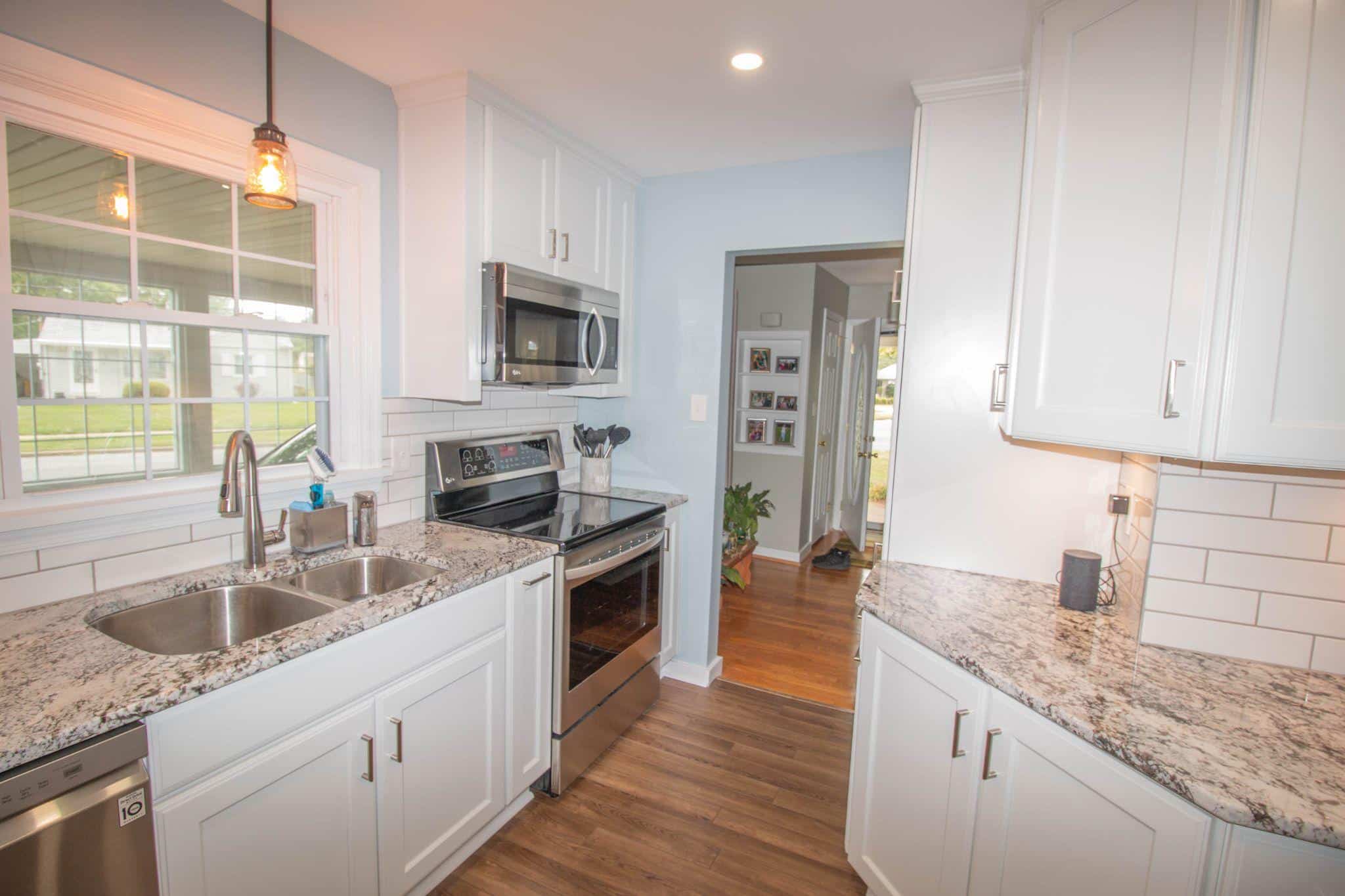
In kitchens, Creamy works wonderfully on walls when paired with white cabinets for a clean but not cold look.
It adds a touch of warmth to the cabinets themselves, which plain white cabinets might lack, especially in kitchens with limited natural light.
Understanding the Color Composition
The magic of Creamy lies in its careful balance of color elements:
- Base family: It belongs to the yellow hue family
- Chroma: With a chroma value of 7.5, it has just enough color to feel warm but not so much that it reads as yellow
- Undertones: The primary undertone is yellow with neutral modifiers that calm it down
I’ve noticed that this composition allows Creamy to change subtly throughout the day.
It might appear more neutral in the morning light, while it might take on a warmer glow in the evening sunlight.
This chameleon quality is part of what makes it so livable long-term.
Sherwin Williams Creamy vs. Other Popular Whites
Creamy vs. Alabaster

Alabaster (SW 7008) is slightly lighter than Creamy, with an LRV of 82. While both have warm undertones, Alabaster has less color saturation (chroma of 5.6 vs. Creamy’s 7.5).
When placed side by side, Alabaster appears more neutral and less yellow. I often recommend Alabaster for trim when using Creamy on walls, as it creates a subtle contrast.
Creamy vs. Dover White

Dover White has stronger yellow undertones than Creamy, with a higher chroma value of 8.2.
This makes Dover White read as more visibly “cream” colored. In my experience, Dover White can sometimes pull too yellow in certain lighting conditions, while Creamy maintains a more balanced look.
Creamy vs. Casa Blanca

Casa Blanca’s muted nature is similar to Creamy’s. With more distinct warm undertones, Casa Blanca feels like a true cream color, while Creamy is more of an off-white color.
I find Casa Blanca works in spaces where you want a more definite cream color, whereas Creamy is the better choice when you want subtle warmth without committing to a more colorful wall.
How Lighting Affects Sherwin Williams Creamy?
1. South-facing Rooms

Natural sunlight tends to be warmer and more intense in south-facing spaces. This amplifies the yellow undertones in Creamy, making them more noticeable throughout the day.
In these rooms, the color appears warmer and slightly more yellow, especially during midday, when sunlight is strongest.
If you’re concerned about too much warmth, I recommend testing a sample on multiple walls before committing. Many clients still love Creamy in south-facing rooms, but they go in knowing it will show its warm side.
2. North-Facing Rooms

North light is naturally cooler and less intense, which balances Creamy’s inherent warmth perfectly.
Creamy loses some yellow quality in these spaces and appears soft, neutral off-white.
This is my favorite placement for Creamy. The color maintains enough warmth to keep the room from feeling cold while appearing more subdued.
The cooler light brings out the neutral base notes in the color rather than emphasizing the yellow tones.
3. East/west-Facing Rooms

These rooms experience the most dramatic color shifts throughout the day.
In east-facing rooms, Creamy looks brightest and most balanced in the morning and becomes more muted as the day progresses.
West-facing rooms have the opposite effect: Creamy appears more neutral in the morning and warms considerably in the afternoon and evening as the golden hour light floods in.
Since the appearance changes so notably from morning to evening, I always suggest checking the color in these spaces at different times.
Best Pairings: Trim, Cabinet, and Accent Colors
1. Best Trim Colors

Benjamin Moore’s Cloud White creates a soft contrast with Creamy while maintaining the warm feel for a subtle, harmonious look.
For a more distinct contrast, Sherwin Williams Pure White offers a cleaner, brighter white that highlights Creamy’s warmth without clashing.
When I want to create a more noticeable definition between wall and trim, Sherwin Williams Extra White provides that crisp contrast many homeowners seek.
2. Wall Color Pairings

Creamy pairs beautifully with many wall colors for trim or cabinetry. For adjoining rooms, consider:
- Soft greiges like Sherwin Williams Agreeable Gray for a current, cohesive flow
- Muted sage greens such as Sherwin Williams Softened Green for a natural, calming combination
- Warm taupes like Benjamin Moore Manchester Tan complement Creamy’s warm undertones
3. Accent Color Suggestions

To create a well-rounded color scheme with Creamy as your main color:
- Navy blues add depth and contrast without harshness
- Muted terracotta or clay tones complement the warmth in Creamy
- Charcoal grays provide contrast while remaining neutral
- Forest greens offer natural balance to the warm undertones
Natural materials like wood, stone, and woven textiles look particularly good against Creamy, enhancing its warm, welcoming quality.
Is Sherwin Williams Creamy Too Yellow?
This is the most common concern I hear from clients considering Creamy.
The answer depends on your expectations, lighting conditions, and personal color sensitivity.
Creamy does contain yellow undertones, which give it warmth and prevent it from looking stark or cold.
However, the yellow in Creamy is quite subdued compared to true cream colors like Sherwin Williams Casa Blanca or Dover White.
In most lighting situations, Creamy reads as a warm off-white rather than a yellow.
The exception is very warm light (like south-facing rooms in the late afternoon), where the yellow undertones become more pronounced.
I find Creamy is rarely “too yellow” for walls, where a bit of warmth is usually welcome.
However, it might show more yellow than desired when used on large surfaces like kitchen cabinets, especially if paired with cool white countertops or backsplashes.
Color perception is also highly personal. Some people are particularly sensitive to yellow tones and might perceive more yellow in Creamy than others.
This is why I always recommend:
- Testing with large paint samples (not just small swatches)
- Viewing the color in your specific lighting conditions
- Examining the color at different times of day
- Placing the sample against existing finishes to check compatibility
If you’re concerned about yellow tones but still want warmth, consider Sherwin Williams Alabaster, which has similar warmth with less yellow influence.
Please remember that no paint color is viewed in isolation. Surrounding elements like flooring, furniture, and neighboring colors all affect how we perceive the yellow in Creamy.
Conclusion
After looking at all aspects of this versatile off-white, it’s clear why Sherwin Williams Creamy remains a top choice for so many homes. Its balanced warmth makes spaces feel inviting without being overly colorful.
While Creamy contains yellow undertones, they’re carefully muted to create a livable, long-lasting color that works in various lighting conditions.
Whether you’re painting walls, trim, or cabinets, testing samples in your specific space is the key to success with any color, including Creamy.
The true beauty of this shade lies in its ability to create a soft, welcoming backdrop that lets your furnishings and décor shine while maintaining a timeless quality that won’t feel dated in a few years.