Are you looking for a paint color that brings warmth without yellowing, offers depth without darkness, and plays nice in every lighting situation?
I completely understand your struggle—finding that perfect neutral can feel impossible.
Ballet White by Benjamin Moore might just be your answer.
This balanced neutral has the rare ability to adapt to different lighting conditions while maintaining its character.
It provides a perfect backdrop that lets your furnishings stand out without competing for attention.
In this review, I’ll walk you through everything you need to know about Ballet White—from its undertones and light reflectance value to how it performs in various rooms.
I’ll share real-world examples and practical tips to help you decide if this popular paint color is right for your space.
What Makes Ballet White Special (#E5DED0) Special?

Ballet White (OC-9) is a light, warm neutral that sits between white and beige.
With an LRV (Light Reflectance Value) of 72, it’s light enough to make spaces feel open but has enough depth to provide contrast with white trim.
This paint color shows its true worth in how it changes throughout the day while maintaining its warm, neutral identity.
Unlike many other light colors, Ballet White has a well-balanced formula.
It starts with a warm base that’s carefully mixed with neutral undertones to create a color that works in nearly any lighting situation.
The Undertones of Ballet White
Understanding undertones helps you predict how a paint color will look in your specific space.
Ballet White has a warm base with very subtle yellow undertones, but thanks to its neutral foundation, these undertones rarely dominate.
You might notice a hint of green undertones in some lights, but they’re so minimal that they rarely become problematic.
This careful balance of warm and neutral makes Ballet White much more versatile than typical cream colors.
How Ballet White Performs in Different Lighting
One of Ballet White’s greatest strengths is how well it performs across various lighting conditions:
North-facing rooms: In cooler northern light, Ballet White maintains its warmth but appears more as a soft tan with slight greige tendencies.
South-facing rooms: In warm southern light, the color shows more of its creamy qualities but never looks yellow or overwhelming.
East/West-facing rooms: These rooms change dramatically throughout the day. Ballet White adapts well, looking warmer during sunset/sunrise hours and more neutral during other times of the day.
Artificial lighting: Under warm bulbs, Ballet White feels cozier, while cooler LED lighting brings out its more neutral side.
Comparing Ballet White to Similar Colors
Ballet White shares its soft, warm undertones with other neutral hues like Ivory and Alabaster, but its subtle yellow or peach tint sets it apart. Compared to pure whites, it offers more warmth and depth, making it a versatile choice for both modern and traditional interiors.
1. Ballet White vs. White Dove

White Dove is notably lighter, with an LRV of 85 compared to Ballet White’s 72.
This higher reflectance makes White Dove appear much brighter, especially in well-lit areas.
While Ballet White offers a soft, warm, neutral presence, White Dove leans more toward a true white with just a hint of warmth.
This difference makes White Dove an excellent trim option when paired with Ballet White walls, creating subtle but noticeable contrast.
2. Ballet White vs. Swiss Coffee

Swiss Coffee brings more yellow to the party.
Its undertones are more prominently cream, which means it can sometimes look more definitively warm and creamy compared to the more balanced Ballet White.
In south-facing rooms, Swiss Coffee might read as slightly too yellow for those wanting a more neutral look.
Ballet White maintains a better balance across different lighting conditions.
3. Ballet White vs. Sherwin Williams White Duck

These two colors share many similarities, making them close alternatives depending on your preferred brand.
White Duck has an LRV of 74, making it slightly lighter than Ballet White.
The most noticeable difference is that White Duck contains slightly less yellow in its base, giving it a touch more greige quality in certain lights.
In north-facing rooms, this subtle difference becomes more apparent, with White Duck appearing slightly cooler.
4. Ballet White vs. Benjamin Moore Classic Gray

Though similar in light reflectance value, these colors have distinctly different undertones.
Classic Gray features cooler purple-gray undertones that create a more contemporary feel, while Ballet White’s warm base gives spaces a softer, more traditional appearance.
Classic Gray can sometimes flash slightly lavender in certain lights, while Ballet White maintains its warm, neutral stance.
These different undertone directions make them suited to different design styles and color schemes.
5. Ballet White vs. Alabaster (Sherwin Williams)
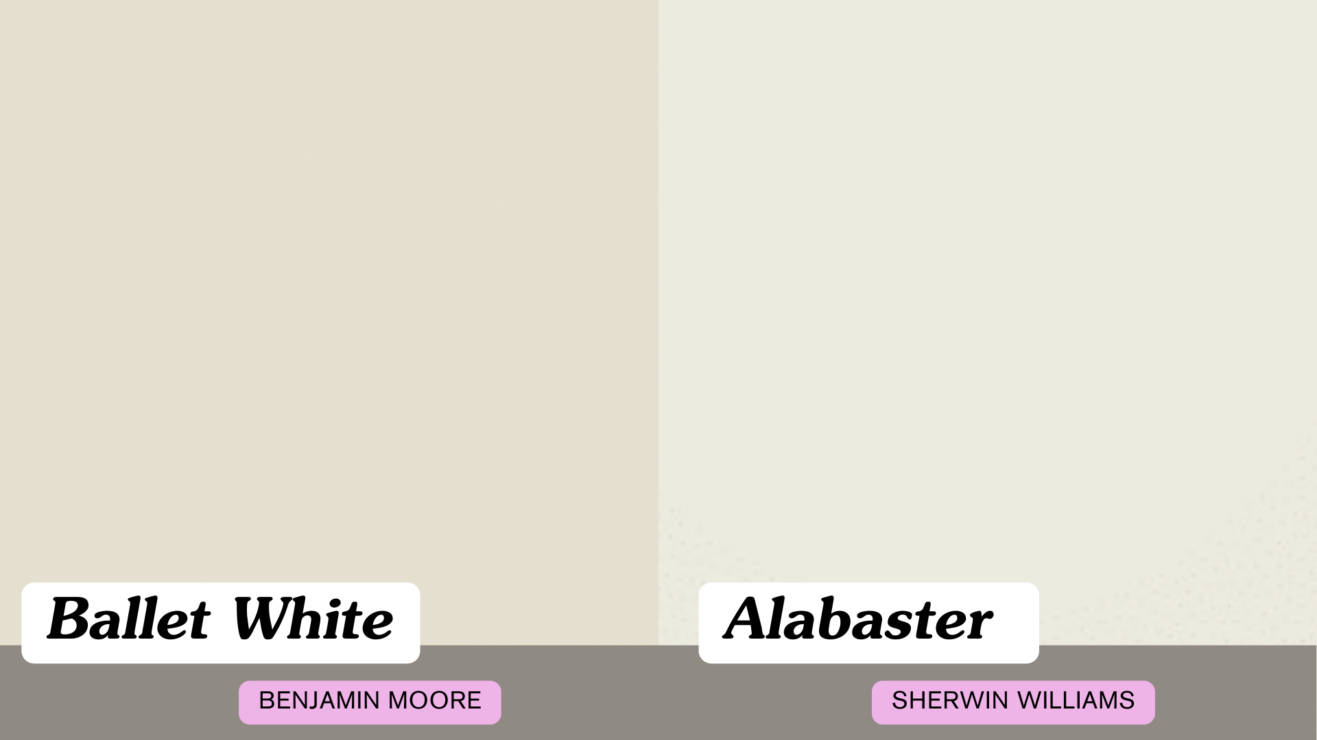
Alabaster has gained popularity as another versatile off-white. With an LRV of 82, it’s significantly lighter than Ballet White.
Alabaster has a creamier base with less gray influence, making it appear cleaner and brighter across most lighting conditions.
Ballet White, with its additional depth and gray undertones, creates more visual interest and shadow play on walls.
Best Uses for Ballet White

Ballet White is remarkably versatile and works well in many areas of your home:
- Whole-house color: Its adaptability makes it perfect for open floor plans
- Living spaces: Creates a warm, welcoming environment
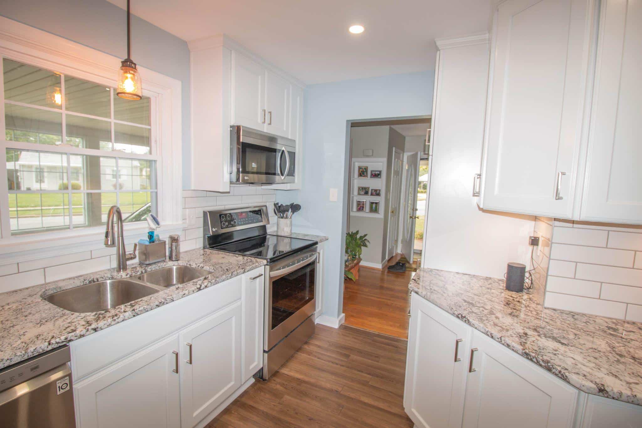
- Kitchens: Pairs well with most cabinet colors and countertop materials
- Bedrooms: Offers a restful, neutral backdrop
- Bathrooms: Light enough to make small spaces feel larger
- Hallways: Brightens darker spaces without feeling stark
Tips for Testing Ballet White
Before committing to any paint color, proper testing is essential:
- Use large paint samples rather than small paint chips
- Place samples on all walls of the room you plan to paint
- Observe how the color looks throughout the day
- Consider using peel-and-stick samples for easy placement
- View the samples against your flooring, furniture, and trim
Final Thoughts
After finding the ins and outs of Ballet White, what’s my final take? This paint color offers that rare combination of warmth and neutrality that works across many homes. If you’re seeking a light, adaptable color that won’t flash yellow or pink, Ballet White deserves your consideration.
Its balanced formula makes it suitable for both sunny rooms and darker spaces alike.
Remember to test this color in your own space before committing. Paint a sample board and move it around to see how it reacts to your specific lighting throughout the day.
Whether for a single room or your entire home, Ballet White creates a soft, welcoming canvas that lets your furniture and personal style take center stage, without competing for attention or fading into the background.
Ready to see Ballet White in action? Head to your local paint store, grab a sample, and start your color transformation today!
Frequently Asked Questions
Is Ballet White Too Yellow?
No, Ballet White has yellow in its base but is well-balanced with neutral undertones that prevent it from reading as yellow on the wall.
Does Ballet White Work with Wood Trim?
Yes, it pairs nicely with both light and dark wood tones.
Can Ballet White Work in a Dark Room?
Yes, its warm properties help it maintain character even in spaces with limited natural light.
Is Ballet White Modern or Traditional?
Ballet White is versatile enough to work in both modern and traditional spaces, depending on your furnishings and decor.