
Finding that perfect gray paint color feels like searching for a needle in a haystack, doesn’t it?
I know the struggle of testing countless samples only to end up with walls that look blue, purple, or even green instead of the beautiful gray I imagined.
Sherwin Williams Dovetail (SW 7018) caught my attention after seeing it transform both my client’s spaces and my own home.
This medium-depth gray brings something special that other grays simply can’t match – genuine versatility without unpredictable undertones.
In this review, I’ll share my personal experience with Dovetail, from how it performs in different lighting conditions to the best ways to use it throughout your home.
You’ll discover if this popular paint color deserves a spot on your walls, cabinets, or exterior.
What Makes Dovetail Special?

When I first encountered Sherwin Williams Dovetail (SW 7018), I noticed its unique ability to bridge the gap between gray and warm neutral.
This medium-depth paint color has an LRV of 26, meaning it sits perfectly in that sweet spot – not too light, not too dark.
I’ve used it on everything from interior walls to kitchen cabinets, and it consistently delivers a sophisticated look.
Breaking Down Dovetail’s Color Profile
This paint color brings something special to the table – it’s a warm gray with subtle depth.
Unlike typical grays that can feel cold or industrial, Dovetail carries a gentle warmth that makes spaces feel more inviting.
In my experience testing it in different homes, I’ve noticed it shifts subtly throughout the day without becoming too brown or purple.
Understanding Dovetail’s Undertones
After testing this color in countless homes, here’s what you should know:
Dovetail has a warm brown-gray base.
Under certain lights, especially in the late afternoon, you might catch a slight purple undertone. But don’t worry – it’s so subtle that most people won’t notice it.
Let’s Talk About LRV (Light Reflectance Value)

With an LRV of 26, Dovetail sits in the medium-dark range.
What does this mean for your space?
| Space Setting | Observation |
|---|---|
| Bright rooms | The color holds its depth without washing out |
| Small spaces | It might feel a bit heavy if used on all walls |
| Large rooms | Creates a perfect backdrop without overwhelming |
| Natural light | Maintains its character while adjusting beautifully to changing daylight |
How Light Affects Dovetail
Here’s something interesting I’ve learned about Dovetail through multiple client projects:
Morning light brings out its warmer side,
while afternoon light shows off its true gray nature.
In north-facing rooms, it maintains its warmth without turning dull, creating a cozy atmosphere even with minimal natural light.
The cooler light in northern spaces makes Dovetail display its true gray nature.
South-facing spaces highlight its adaptable nature, keeping its rich tone while staying perfectly balanced.
Direct sunlight brings out Dovetail’s softer side. The warm southern exposure makes the color appear lighter and more vibrant during the day.
It’s particularly stunning in these spaces as it creates a warm, welcoming feel.
Where Does Dovetail Work Best Inside Your Home?
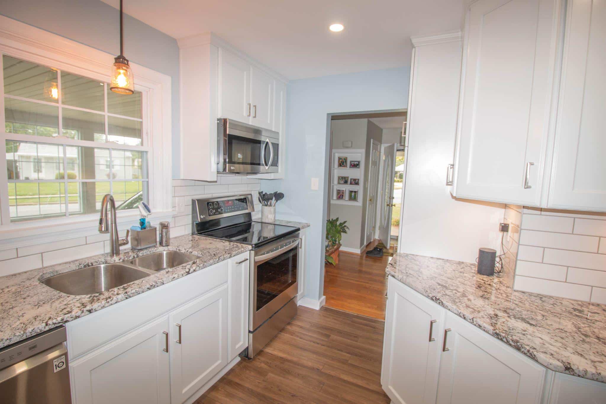
1. Kitchen Cabinets and Islands

I’ve used Dovetail on countless kitchen cabinets – it creates a modern look without feeling heavy. My clients especially love it paired with Pure White walls for contrast. Pro tip: It looks fantastic with both brushed nickel and brass hardware.
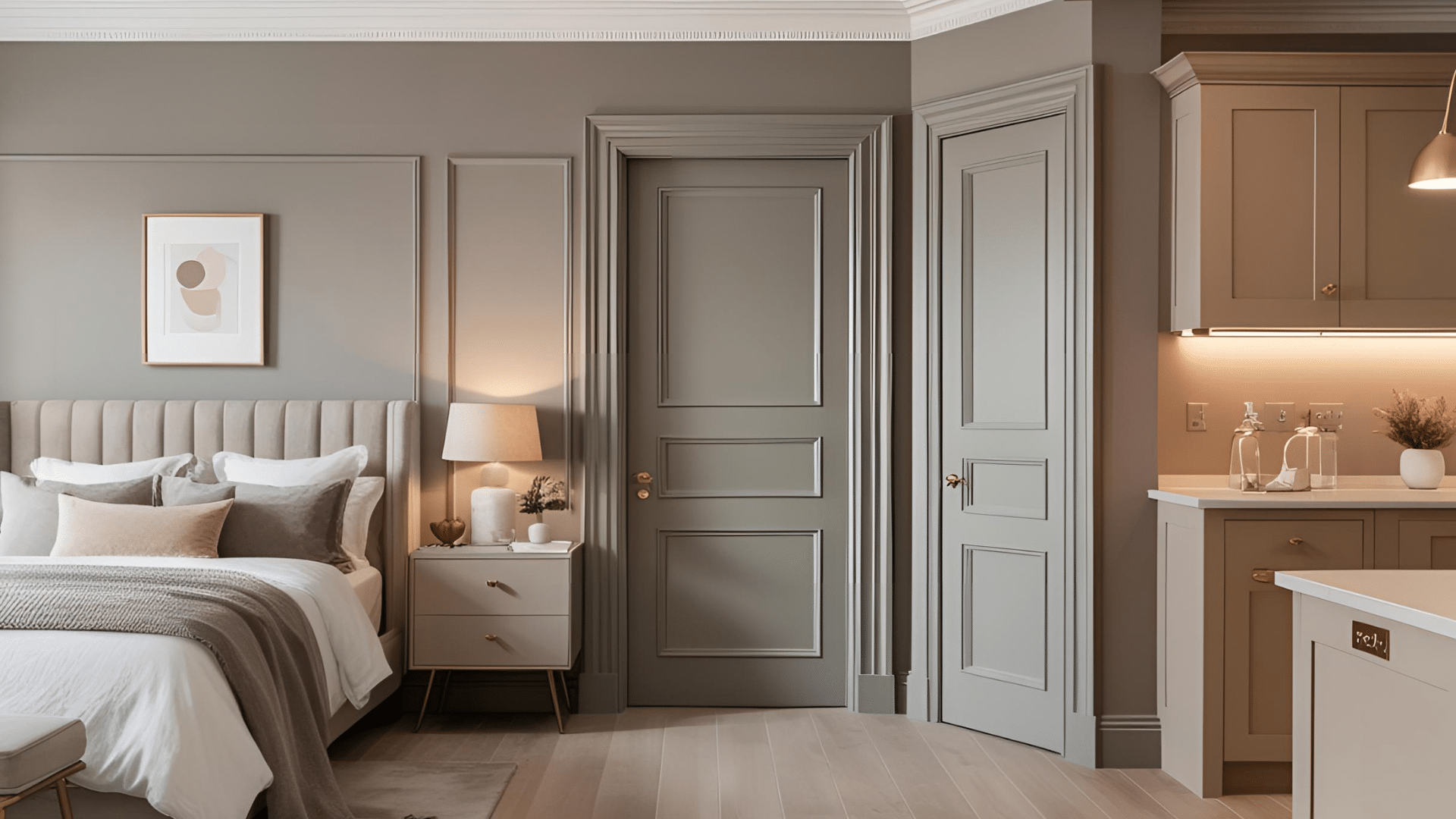
2. Interior Doors and Trim

After painting my own interior doors with Dovetail, I’m convinced it’s a perfect choice for adding subtle drama. It creates a sophisticated look without overwhelming your space, especially against lighter wall colors like Repose Gray.
3. Room and Bedroom Walls

As a wall color, Dovetail offers just enough depth to create interest without dominating your decor. I often suggest using it on an accent wall first if you’re hesitant about going too dark.
Using Dovetail on Your Home’s Exterior
Having seen this color on various home styles, here’s what impresses me most:
1. Main Exterior Color
Holds its color beautifully in direct sunlight without fading
Offers enough depth to make architectural details stand out
Works wonderfully with white trim and dark shutters
2. Natural Material Pairings
The color particularly shines when paired with:
- Red brick (creates a modern update)
- Natural stone (enhances the warm undertones)
- Cedar accents (complement the warmth of the wood)
3. Smart Ways to Use Dovetail in Small Space
Dovetail works wonders in smaller doses!
Try painting your powder room vanity for a touch of sophistication without making the tiny space feel closed in.
Mudroom built-ins look instantly pulled together with this warm gray, hiding scuffs while looking intentional.
Don’t forget fireplace surrounds – Dovetail creates a striking focal point that anchors your living space without the commitment of a full accent wall.
These smaller applications let you enjoy this popular color without overwhelming your home.
Best Paint Colors to Pair with Dovetail
I’ve discovered some perfect color combinations with Dovetail through countless client projects. Here are my tried-and-true pairings:
White Paint Colors

Pure White: Creates clean, crisp contrast
Alabaster: Offers a softer white pairing
White Dove: Adds warmth to the combination
Gray Companions

Repose Gray: Perfect for a layered look
Mindful Gray: Creates subtle depth variation
Alpaca: Offers a lighter alternative that complements beautifully
Dark Accents

Tricorn Black: Makes a bold statement on windows and doors
Iron Ore: Provides a softer alternative to pure black
Urbane Bronze: Adds rich depth to the color scheme
Natural Material Combinations
Learn and try these natural material combinations at your home:
Wood Tones
Light oak: Creates beautiful contrast
Walnut: Enhances the warm undertones
White-washed wood: Offers modern farmhouse appeal
Stone and Brick
Red brick: Updates traditional exteriors
Limestone: Brightens the overall palette
Gray stone: Creates seamless transitions
What to Avoid with Dovetail
From my experience, these combinations can be tricky:
Colors to Use Cautiously:
- Cool blues without proper transition colors
- Bright yellows in direct connection
- Pure whites in large doses (can feel stark)
Design Tips:
- Add transitional elements between contrasting colors.
- Use texture to break up large areas
- Consider lighting when selecting accent colors
Conclusion
After putting Sherwin Williams Dovetail through its paces in countless homes, I can confidently say this paint color delivers on its promises.
This warm gray brings sophistication to any space without the frustrating color shifts many grays exhibit.
Remember to test Dovetail in your specific lighting before committing. What works beautifully in my south-facing living room might appear slightly different in your space.
Ready to try it yourself?
Start small with an accent wall or furniture piece if you’re hesitant about going too dark. Pair it with crisp whites for contrast or wood tones for warmth.