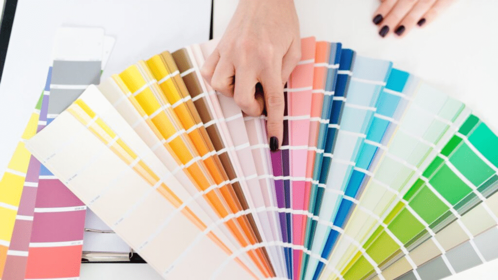
Choosing the right paint color feels hard when staring at hundreds of similar-looking swatches. You pick a color you love in the store, but it looks completely different on your walls at home. This happens because paint colors reflect light differently in various spaces.
Light Reflectance Value (LRV) solves this common problem. This simple number tells you exactly how much light a paint color will reflect in your home. With this knowledge, you can predict how colors will look before painting your walls.
This guide explains LRV in simple terms, shows how it affects your rooms, and provides practical ways to use it when choosing paint.
You’ll learn how to select colors that create the right mood, make spaces feel larger, and even help lower your energy bills.
Light Reflectance Value (LRV): The Basics Explained
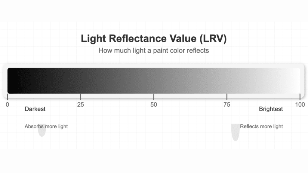
Light Reflectance Value (LRV) tells you how much light a paint color reflects. Think of it as a basic number that shows how bright a color will look on your wall. Paint companies test colors and give them an LRV score from 0 to 100.
A low number like 0 means the paint soaks up all light and looks very dark, like pure black.
A high number close to 100 means the paint bounces almost all light back, like clean white. Most colors fall somewhere in between. For example, mid-tones might have an LRV of 35-65.
When you pick paint, checking this number helps you know how light or dark it will truly look in your home. The higher the LRV, the more light it gives back to the room.
Why is LRV Important in Painting?
LRV affects how bright your room feels throughout the day. Paint with a high LRV makes rooms look sunny and open, even with less actual light, creating a happy, warm feeling in the space. Colors with low LRV create a cozy, intimate mood, but need more lamps to see well.
Your paint choice can also cut down your power bills. Walls with higher LRV need fewer lights on during the day. The paint works like a mirror, sending natural light around the room. This small detail can lower your energy use over time.
LRV also tricks your eyes about the room size. High-LRV paints (lighter colors) push walls outward visually, making small rooms feel bigger and more open. Low-LRV paints do the opposite. They pull walls inward, making large rooms feel smaller and more snug.
This matters most in tight spaces like bathrooms or narrow halls. The LRV number gives you real facts about how a color works—not just how it looks on a tiny sample card. With this info, you can choose colors that help rooms look their best and feel just right.
How to Use LRV When Choosing Paint Colors
1. Matching LRV to Room Size and Natural Light
Look at your room’s size and windows first. Small rooms with few windows need higher LRV paints (60-90) to feel more open. Large rooms can handle lower LRV colors (20-40) without feeling tiny. Check which way your windows face too.
North-facing rooms get cooler light, so pick warmer colors with mid to high LRV (50-70) to balance this effect. South-facing rooms already get lots of warm light, so you have more options.
2. Choosing LRV for Ceilings, Walls, and Trims
For most homes, the ceiling should have the highest LRV (70-90). This makes it feel higher and bounces light down into the room. Walls typically work best with mid-range LRV (35-65), based on the room’s use.
For trim, go 10-20 points higher in LRV than your wall color for a soft look, or use white trim (LRV 80+) for sharp edges. This pattern creates depth without harsh jumps between areas.
3. Balancing Light and Dark Shades with LRV for Design Harmony
To create a balanced look, mix LRV levels with care. Pick one main LRV range for most walls. Then add one shade that’s 20-30 points higher and one that’s 20-30 points lower for accent walls or items. This “60-30-10 rule” keeps rooms from feeling flat or busy.
For open floor plans, keep all main walls within 10 LRV points of each other to help spaces flow from room to room. Always test paint samples on your walls before buying gallons. The same color can look quite different based on a room’s own special light.
The LRV gives you facts to start with, but your eyes make the final call.
Practical Examples of LRV in Paint Choices
Low LRV Colors (0-30): Deep navy blues, forest greens, and charcoal grays fall in this range. These colors absorb most light that hits them. A dark blue with LRV 10 feels rich and bold but makes a room quite dark. These colors work as focal points rather than main room colors.
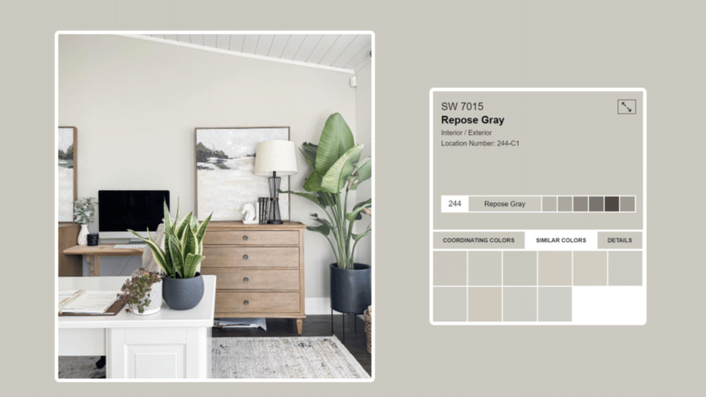
Medium LRV Colors (30-60): Sage greens, warm tans, and soft blues sit in this middle ground. A tan with LRV 45 reflects nearly half the light that hits it. These colors feel solid without being too dark or too washed out. They work well in most rooms with decent light.
High LRV Colors (60-100): Pale yellows, soft grays, and crisp whites have high LRV. A light gray with LRV 75 bounces back most light and feels airy. White ceiling paint often has LRV 85+. These colors make spaces feel open and bright even with less light.
How Different LRV Values Work in Different Rooms
Kitchens: Medium to high LRV (50-80) works best in kitchens. A soft cream with LRV 70 helps the room feel clean and bright for food prep. Task areas need good light, and higher LRV helps with this.
Bedrooms: You have more range here (30-70) based on the mood you want. A medium blue with LRV 45 can create calm without being too dark. Master bedrooms can handle lower LRV than kids’ rooms, which need brighter, higher LRV colors.
Bathrooms: Small bathrooms need higher LRV (60-85) to feel larger and cleaner. A pale gray with LRV 65 makes a small bath feel more open. Large master baths can use medium LRV (40-60) for more drama.
Living Rooms: This depends on when you use the room most. For day use, medium LRV (40-60) balances light and depth. For evening use, lower LRV (30-50) can feel cozy with lamps.
How to Use LRV Wisely: Tips and Common Errors
| Tips and Common Mistakes with LRV | Details |
|---|---|
| Avoiding colors with too low or too high LRV | Prevent overly dark or overly bright colors in inappropriate spaces |
| Considering other factors alongside LRV | Take into account paint finish, undertone, and texture |
| How the lighting type affects the perception of LRV | Different lighting (natural, LED, incandescent) changes how the LRV is seen |
Conclusion
LRV clearly shows you how to pick paint colors that work in your home. The simple 0-100 scale helps you see beyond color chips to how paint will truly look on your walls. By checking the LRV, you can choose colors that fit your space just right.
Remember that high LRV colors bounce more light and make rooms feel open. Low LRV colors soak up light and create cozy, focused spaces. The middle range offers the most balance for everyday living.
When shopping for paint, ask for the LRV or look on the back of color cards. Test samples on your walls in different light before making final choices. Watch how the light changes throughout the day.
LRV isn’t just a number—it’s a tool that helps you create rooms you’ll love to live in. Your home should feel just right morning and at night.
What paint colors with the right LRV will you try in your next room update?
Frequently Asked Questions
Where Can I Find the LRV Number for My Paint Color?
Most paint brands list LRV on color cards, their websites, or fan decks—check the back of the sample or ask a store worker.
Does Paint Finish Affect LRV?
Yes—glossier finishes reflect more light than flat finishes, even with the same color and LRV number.
Can I Mix Paints to Get a Specific LRV?
You can blend two paints to get a middle LRV, but ask your paint store for the exact mix ratio for best results.
Do Online Photos Show True LRV of Colors?
No—screens show colors differently, so always test actual paint samples in your own home lighting.