Creating a calm, balanced home can feel like a challenge when faced with countless color options and design trends. I understand the struggle – finding that perfect palette that feels both warm and minimal isn’t easy.
I’m here to help you discover the Japandi color palette, a thoughtful blend of Japanese minimalism and Scandinavian comfort that creates spaces of true tranquility. In this guide, I’ll walk you through the essential colors that form this soothing design style.
You’ll learn how to select the right neutrals, add depth with natural tones, incorporate subtle contrasts, and apply these colors room by room.
By the end, you’ll have all the tools to bring this peaceful, balanced aesthetic into your own home.
Japandi: A Fusion of Two Design Worlds
Japandi design combines two distinct styles from opposite sides of the world. It merges the clean, simple look of Japanese decor with the cozy feel of Scandinavian homes, resulting in a living space that feels both minimal and warm.
This style has gained attention as more people look for calm, uncluttered spaces in their homes. The blend works because both styles focus on function, clean lines, and a connection to nature.
Japanese design values balance, order, and the beauty found in simple things. It focuses on items that serve a purpose while bringing joy.
Scandinavian design centers on creating bright, homey spaces that feel inviting during long, dark winters.
When combined, these styles create tidy and cozy rooms. They love natural materials, light colors, and spaces free from excess.
Wabi-Sabi and Hygge: The Heart of Japandi

At its core, Japandi combines two key ideas: wabi-sabi and hygge. Wabi-sabi is a Japanese concept that finds beauty in imperfect things. It values small flaws, signs of age, and natural wear as marks of character.
This thinking leads to spaces that feel lived-in and real rather than stiff or staged.
Hygge is the Danish focus on creating moments of comfort and joy. It’s about making spaces where people feel at ease with soft lighting, cozy textiles, and an overall sense of welcome.
Japandi Color Palette Comparison Table
| Color | Hex Code | Description | Room Use |
|---|---|---|---|
| Soft White | #F5F5F5 | A warm, calming white that brightens spaces | Walls, ceilings, furniture |
| Warm Beige | #D9C6A0 | A soft, neutral beige that adds warmth | Walls, upholstery |
| Muted Green | #A8B497 | A calming green representing nature | Cushions, accent walls |
| Sage Green | #B0B99A | A muted, earthy green that promotes tranquility | Bedding, small decor items |
| Warm Taupe | #C7B49E | A soft, earthy color perfect for grounding | Furniture, rugs |
| Soft Gray | #B3B3B3 | A gentle gray that brings depth without overpowering | Accent walls, furniture |
Applying the Japandi Palette to Different Rooms
1. Living Room
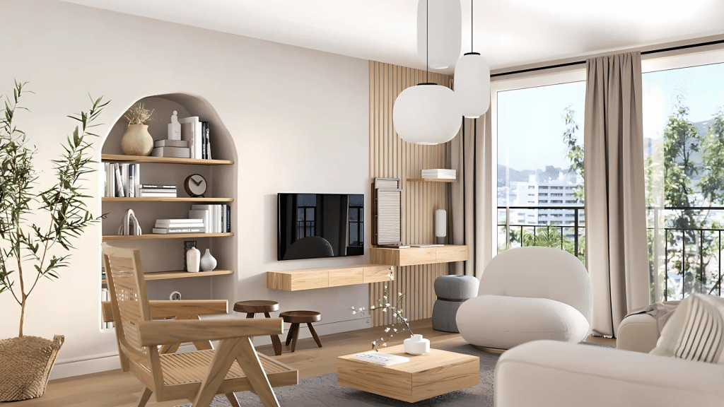
For a calming atmosphere, begin with neutral walls in soft white, beige, or light gray. These tones open up the space and provide a subtle backdrop. Add warmth with natural wood furniture, such as coffee tables or shelving in oak or walnut.
Soft green or muted blue cushions on neutral-toned seating introduce a touch of color, keeping the overall feel relaxed.
2. Bedroom
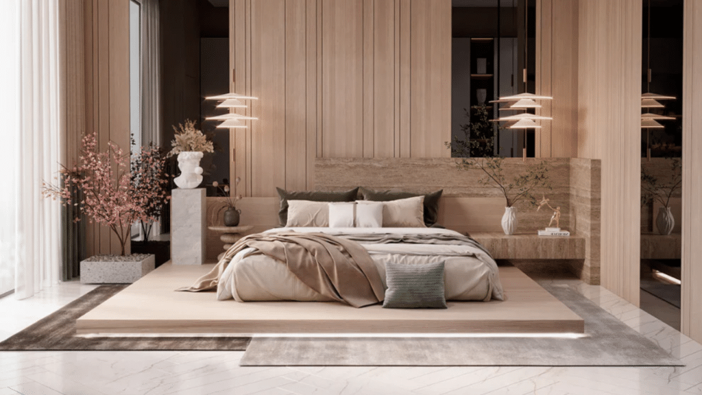
To foster a peaceful environment, choose soft whites, beiges, or pale grays for walls. Stick to neutral bedding in whites, oatmeals, or light taupes, and introduce small touches of color, like sage green or pale terracotta.
Wood elements, like a natural bed frame and nightstands, add warmth without overwhelming the space.
3. Kitchen
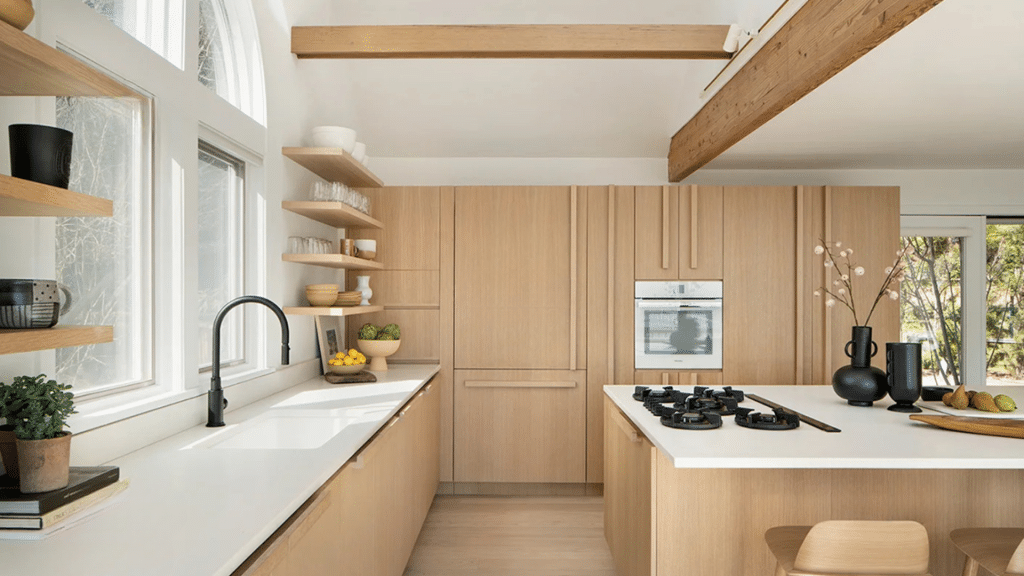
Opt for cabinetry in warm white or light wood, with neutral countertops and backsplashes to maintain a timeless and open feel.
Introduce color sparingly with items like ceramic pots or potted herbs, which add life without creating clutter. Natural stone or wood-look finishes keep the space neat.
4. Bathroom Sanctuary
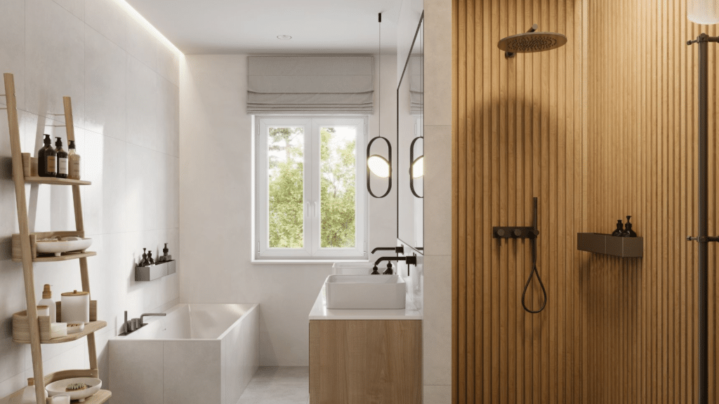
Create a serene bathroom with soft beige or white walls. Add natural wood elements in shelving or vanities for warmth. Use stone features, like vessel sinks or pebble floors, for a calming effect.
Muted green or clay-colored towels and plants will introduce gentle color, enhancing the spa-like vibe.
Materials That Complement the Japandi Color Palette
Japandi design combines materials and colors to create a harmonious, calming atmosphere. Each material adds warmth, texture, and natural beauty, enhancing the muted tones typical of this style.
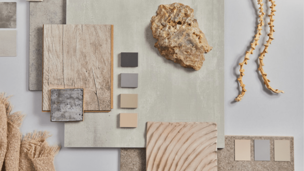
1. Wood- Natural and Minimally Treated
Wood, in various tones, is a central element in Japandi design. Whether light birch or dark oak, it brings warmth and organic texture to the space.
Why it works: It adds depth and complements the minimalist ethos of Japandi.
2. Natural Fibers- Linen, Cotton, Wool, and Jute
Textiles made from linen, cotton, wool, and jute are often neutral in tone and used in upholstery, rugs, and curtains.
Why it works: These fibers provide comfort, texture, and simplicity, aligning with Japandi’s clean lines.
3. Stone and Clay- Subtle Texture
Materials like stone and clay are used in decorative pieces like pottery and tiles, adding texture and natural color variations.
Why it works: They create contrast and depth while reinforcing an organic feel.
4. Paper- Traditional Japanese Craftsmanship
Washi paper is used in light fixtures or screens, offering a delicate and translucent glow that enhances the serene atmosphere.
Why it works: It adds lightness and transparency, complementing the space’s natural elements.
Japandi Design Style vs. Other Minimalist Styles
A table comparing the core features of Japandi design with Scandinavian and Modern Minimalism.
| Design Style | Core Features | Color Palette | Key Materials |
|---|---|---|---|
| Japandi | Minimalist, cozy, connection to nature, balance between function and beauty | Soft neutrals, earthy tones, subtle contrasts | Wood, linen, wool, natural stone, ceramics |
| Scandinavian Minimalism | Clean lines, focus on light, functional | White, soft grays, pops of color | Light wood, leather, steel, glass |
| Modern Minimalism | Focus on simplicity, and form follows function | Monochrome, grayscale, black and white | Glass, concrete, steel, synthetic materials |
Conclusion
The Japandi color palette offers more than just a choice—it creates an environment that promotes mindfulness and tranquility.
In our busy, often chaotic world, surrounding ourselves with these thoughtful, natural colors can help create a sanctuary where we can truly relax and recharge.
By embracing the principles of both Japanese and Scandinavian design, we create spaces that feel both warm and serene, minimal yet cozy. The careful selection of colors plays a vital role in achieving this delicate balance.
Whether you’re redesigning your entire home or simply refreshing a single room, the Japandi color palette provides a timeless approach to creating spaces that feel both beautiful and peaceful.
It reminds us that true luxury lies not in excess but in the thoughtful curation of elements that bring genuine comfort and calm to our daily lives.
Frequently Asked Questions
Is Japandi Just About Neutral Colors?
While neutrals form the foundation, Japandi isn’t about creating bland spaces. The careful addition of earthy tones and natural materials creates depth, warmth, and interest while maintaining a sense of calm.
How Is the Japandi Palette Different from Minimalist White Interiors?
The colors tend to be softer whites rather than bright white, and they’re complemented by warm wood tones and natural materials that create a cozy yet clean feel.
Can I Incorporate Bold Colors Into a Japandi Space?
Traditional Japandi spaces avoid bold colors as they can disrupt the sense of calm. However, you might incorporate a single item with a deeper color if it has special meaning or artistic value.