Is Repose Gray Out Of Style? 2025 Trends and Picks
Is Repose Gray losing its grip on modern homes? This question keeps coming up as design trends shift toward bolder choices and warmer tones.
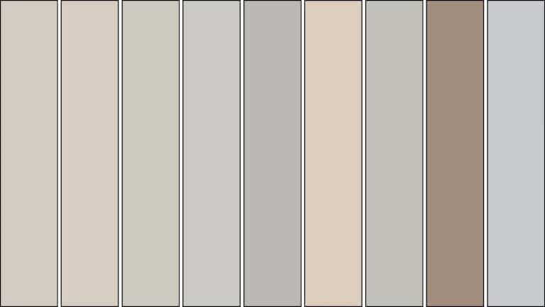
For years, this Sherwin-Williams favorite has dominated walls across America. Homeowners often debate between light French gray and Repose Gray, with many choosing Repose Gray for its reliable warmth and versatility.
However, 2025 brings fresh color movements that challenge the dominance of neutrals. Some designers now refer to traditional grays as “yesterday’s news,” while others defend their timeless appeal.
This blog examines whether Repose Gray still deserves its spot in today’s homes. I’ll share current design shifts, viable alternatives, and help you decide if it’s time for a change.
Why Repose Gray Became a Classic?
In the 2010s, homeowners faced a challenge with color choices. Beige felt stale. White seemed too cold. Most grays looked flat and unwelcoming.
Repose Gray arrived at the perfect moment. It solved the “gray problem” with warm undertones that prevented it from appearing cold.
Key factors in its rise:
- LRV of 58 provided ideal brightness.
- Worked in any lighting condition.
- It pairs well with all decor styles.
- Photographed beautifully for social media.
Real estate agents loved it. Homes with Repose Gray walls sold faster because buyers could picture their own belongings in the space.
The tipping point? Social media exposure helped spread its popularity. Design enthusiasts shared room photos online, and the color gained momentum through word-of-mouth recommendations.
By 2018, it wasn’t just popular, it was the default choice for anyone wanting “safe but stylish.”
Is Repose Gray Still the Right Choice in 2025?
The answer depends on your personal style and home goals. Repose Gray hasn’t become outdated, but it’s no longer the automatic choice it once was.
The color still works well in specific situations. Open floor plans benefit from its unifying quality. In dimly lit spaces, its balanced undertones prevent the walls from feeling dull or heavy.
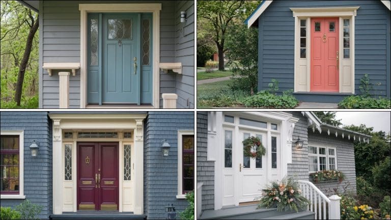
The best cabinet colors for Repose Gray Walls include classic white, deep navy, and natural wood tones. These create contrast without competing for visual attention.
Some designers now prefer Sherwin-Williams Gray colours with no undertones for a cleaner look.
For resale value, Repose Gray stays reliable. Most buyers find it move-in ready and appealing enough to envision their own style additions.
What’s Hot and What’s Not in 2025 Design?
This section covers what paint colors and design approaches are gaining popularity versus those falling out of favor in 2025 interior design trends.
| What’s In | What’s Out |
|
Warm, earthy tones with depth Colors with clear undertones and personality Mixing warm and cool tones in the same space Rich, saturated neutrals Colors that change throughout the day |
Flat, one-note grays without character Playing it too safe with neutral choices Matchy-matchy everything in the same tone Cold grays that lack warmth Generic builder-grade color schemes |
Homeowners now want intentional colors that create specific moods. Matte finishes are replacing eggshell. Regional preferences influence choices. Social media accelerates trend cycles significantly.
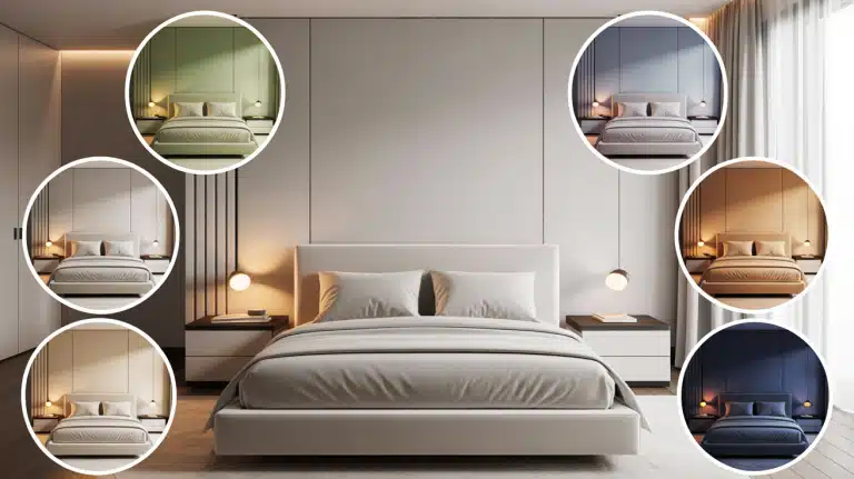
5 Trending Paint Picks Stealing the Show
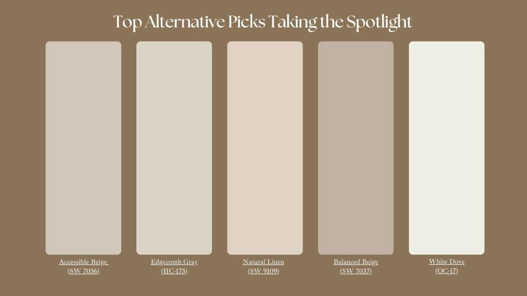
This section presents five popular paint colors that replace Repose Gray in modern homes, including warm beiges, greiges, and whites, each with specific benefits.
Sherwin-Williams Accessible Beige (SW 7036): This warm neutral offers more character than Repose Gray. It has creamy undertones that feel welcoming without being yellow.
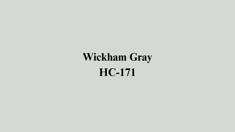
Benjamin Moore Edgecomb Gray (HC-173): A perfect greige that balances gray and beige beautifully. It works well in homes with mixed lighting conditions. The color stays consistent from morning to evening.
Sherwin-Williams Natural Linen (SW 9109): This soft, warm white hue has garnered significant attention. It’s lighter than Repose Gray but offers more warmth than stark whites. Great for small spaces that need brightness.
Sherwin-Williams Balanced Beige (SW 7037): Slightly warmer than Accessible Beige with more depth. This color creates a cozy atmosphere while maintaining a cultivated tone. It pairs beautifully with white trim and dark accents.
Benjamin Moore White Dove (OC-17): A warm white that’s replacing gray in many homes. It offers brightness without feeling cold. This choice works especially well with colorful art and furniture.
Each alternative addresses specific complaints about traditional grays. Some offer more warmth, others provide unique undertones, and a few give completely different color families while maintaining neutral appeal.
Final Thoughts
Repose Gray hasn’t lost its charm, but it’s sharing the spotlight with more diverse, personality-driven options in today’s design landscape.
Current trends favor colors with individual character and regional influences. While Repose Gray remains a solid choice, alternatives might better reflect your personal style.
Your choice should align with your lifestyle, home architecture, and personal taste preferences. Consider your timeline, change tolerance, and what makes you feel comfortable on a daily basis.
The best paint color makes you happy when you come home every day. Always test samples in your actual lighting conditions before making decisions.
What are your thoughts on Repose Gray’s staying power? Have you considered alternatives for your next project? Share your experiences in the comments below.