Choosing white paint can feel frustrating when dozens of nearly identical samples surround you. You want something that isn’t harsh, doesn’t lean yellow, and still brings personality to a room.
That’s where Sherwin-Williams Incredible White SW-7028 steps in. It offers a clean, inviting backdrop that blends the best elements of gray, taupe, and beige without leaning too far in any direction.
This is a refined off-white with just enough warmth to soften a space, plus pink and purple undertones that bring gentle depth.
Whether you’re refreshing a single room or considering a whole-home color, this one adapts with ease.
Here, you’ll learn what makes this color so effective, from its undertones and lighting behavior to coordinating shades and best-use areas.
What Color Is Incredible White?
Sherwin-Williams SW 7028 is a soft greige that leans warm without feeling beige or yellow. It sits in the off-white range but carries more body than a typical white.
The color blends gray, taupe, and subtle pink-purple undertones, which shift slightly based on light direction.
In bright, south-facing spaces, it looks warm and inviting. In cooler lighting, it tends to feel more neutral and muted.
This makes a flexible choice for those who want a wall color that feels clean but not cold.
It works well in bedrooms, living rooms, kitchens, and even small spaces that benefit from extra light reflection.
Below is a quick overview of its key details:
Specification
Details
Color Name
Incredible White
Color Family
Off-White / Greige
LRV
74
RGB Values
R: 227, G: 222, B: 215
HEX Code
#E3DED7
Chroma
Low (soft, muted appearance)
When Undertones Show in Incredible White?
The undertones in this SW 7028 paint don’t always show up the same way. Understanding when these pink and purple undertones appear helps you utilize this paint color more effectively.
Lighting plays the most significant role. South-facing windows bring out pink undertones. North-facing rooms make this off-white look more neutral and gray.
Time of day affects the undertones, too. Morning and afternoon light can make pink and purple hints more visible. Evening artificial lighting can enhance or hide these undertones.
The colors in your room’s existing palette influence how undertones appear. Yellow or warm-toned furniture makes the pink undertones in this paint color more noticeable.
Key factors that make undertones more visible:
South-facing windows – Natural light brings out pink undertones strongly
Yellow or orange decor – These colors make pink undertones pop
Evening hours – Artificial lighting can intensify undertone visibility
Light-colored furniture – Cream or beige pieces emphasize warm undertones
Comparing Incredible White to Other Neutrals
Choosing between similar paint colors can be confusing. This popular SW 7028 paint often gets compared to other popular neutrals.
Here’s how it compares to the most common alternatives.
Paint Color
LRV
Undertones
Best Use
Incredible White SW 7028
74
Pink, Purple
Whole house, warm rooms
Alabaster SW 7008
82
Beige
Darker rooms
Agreeable Gray SW 7029
70
Brown, Violet
Accent walls
Eider White SW 7014
73
Blue-Purple
Cool rooms
Pure White SW 7005
84
None
Trim work
Benjamin Moore Classic Gray OC-23
74.78
Purple
Benjamin Moore alternative
Quick Summary:
This SW 7028 paint sits in the middle range for brightness
It’s warmer than Eider White but cooler than Alabaster
Pure White offers the highest contrast for trim work
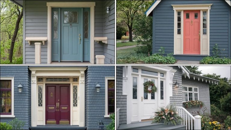
Where Does Incredible White Work Best?
The best rooms to use this paint depend on the lighting and function. This warm off-white performs well in most spaces but shines in certain conditions.
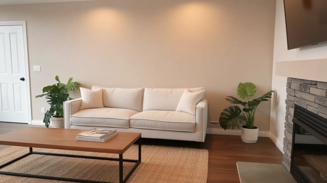
1. Living Rooms
Living rooms are among the best rooms to use this versatile paint color. The color pairs beautifully with black accents, stone fireplaces, and natural textures.
South-facing living rooms show off the pink undertones nicely, while north-facing rooms keep the color more neutral.
Tip: Add navy blue pillows or darker greige accessories to create depth and prevent the space from looking flat.
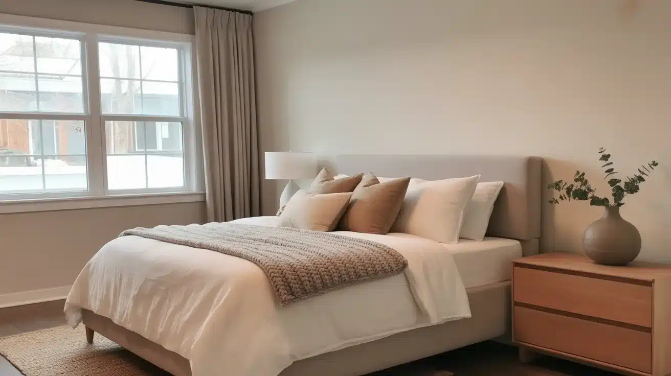
2. Bedrooms
Bedrooms benefit from the cozy warmth that this off-white provides. Unlike stark whites, this color adds gentle warmth without a yellowish tint.
The best rooms to use this paint are bedrooms with east or south-facing windows.
Tip: Pair with white bedding and natural wood furniture for a calming, cohesive look that promotes better sleep.
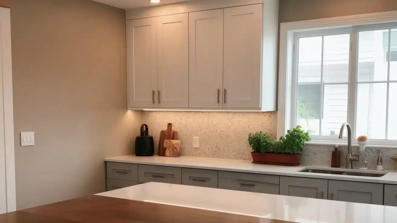
3. Kitchens and Cabinets
Kitchen walls and cabinets are excellent places to use this warm paint color. The color looks clean but not stark, making kitchens feel fresh.
It works beautifully with white countertops, gray cabinets, and granite surfaces.
Tip: Use this color on cabinets with stainless steel appliances and brass fixtures for a timeless kitchen design.
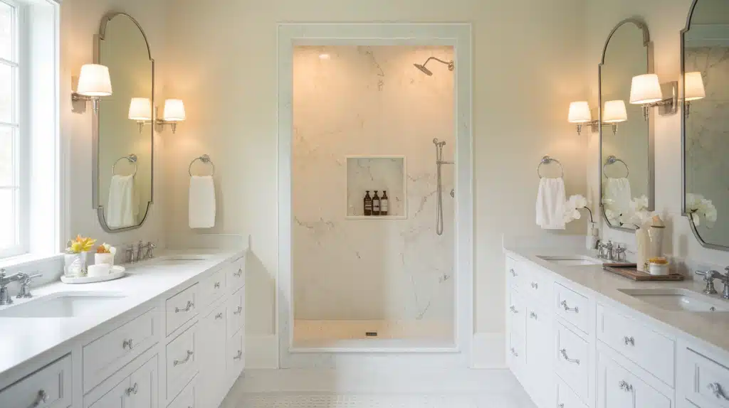
4. Bathrooms
Bathrooms are among the best rooms to use this paint because it creates a serene and bright atmosphere. The color reflects light well with its LRV of 74.
It pairs perfectly with white fixtures and marble surfaces.
Tip: Add navy blue towels or darker accessories for contrast to prevent the bathroom from feeling too monotone.
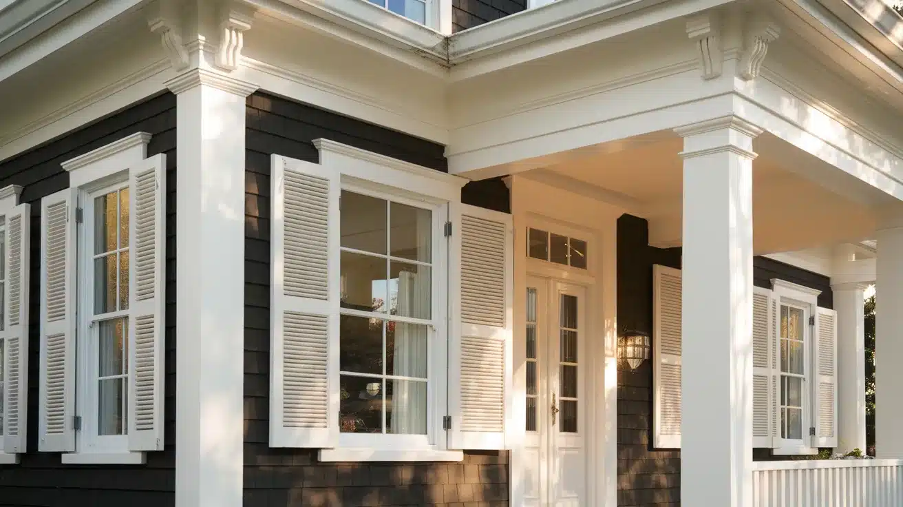
5. Exterior Use
While this SW 7028 paint works on exteriors, it’s not always the best choice. The bright outdoor light can wash out the subtle undertones.
It works better on shutters, trim, or covered porches.
Tip: Test the color in shaded areas first to see if the undertones show through before committing to large exterior surfaces.
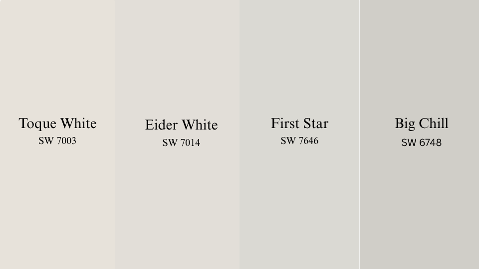
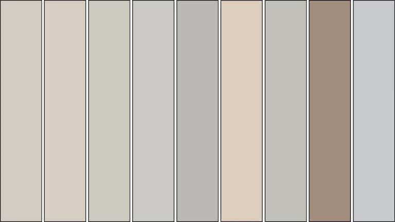
Similar Colors to Incredible White
If you’re searching for shades that resemble this colour, these options offer similar depth, undertones, or light reflectance, each with its own slight variation.
Toque White is a muted off-white with a slight beige cast. It sits close to in brightness but leans warmer overall. This makes it a fitting option if you’re after a touch more softness without shifting to cream.
Eider White has a cool gray base with subtle violet tones that show in certain lights. Compared to this colour, it feels lighter and slightly cooler. It suits spaces where you want a toned-down, light neutral that avoids warmth.
First Star offers a cooler, more silvery backdrop. It works well in contemporary spaces where a crisp, understated wall color is needed. The lack of strong undertones gives it a clean, low-contrast look.
Big Chill is a true gray with a cool base and a balanced feel. It’s noticeably more gray, but it shares the same versatility. Ideal for rooms with a modern palette or where warmth needs to be minimized.
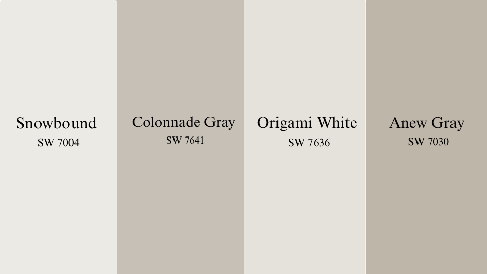
Coordinating Colors for Incredible White
These colors pair well, helping you create contrast, cohesion, or layering in trim, cabinetry, and adjoining walls.
Snowbound is a soft white that holds a clean finish without feeling stark. It complements well by keeping the palette light while offering enough contrast for trim or cabinets. Works especially well in bright rooms.
Colonnade Gray brings a balanced mid-tone that enhances the warmth. With its mix of gray and beige, it’s a reliable option for depth on accent walls or adjacent spaces. It won’t overpower but will create a gentle contrast.
Origami White is a near-white with a soft gray undertone. It’s subtle enough to work alongside Incredible White without clashing. Use it when you want a bit more brightness without stepping outside the warm neutral zone.
Anew Gray is a warm greige that feels grounded and stable. It deepens the color story when paired, adding visual weight in larger rooms. It’s particularly fitting for furniture, lower cabinets, or adjoining walls.
Conclusion
This SW 7028 paint proves that not all white paints are created equal. This off-white brings warmth and character through its subtle pink and purple undertones.
With an LRV of 74, it offers a perfect balance of brightness and depth.
Whether you’re painting living rooms, bedrooms, or kitchens, this versatile color adapts beautifully to different lighting and design styles.
Its ability to pair with navy blues, darker greiges, and bright whites makes decorating easier.
Remember to test samples in your specific lighting before committing. The undertones in this paint can vary throughout the day, so proper sampling ensures you’ll achieve the results you love.
This timeless paint color remains a favorite among homeowners and designers.
Ready to change your space? Start with quality samples and see how this paint color works in your home
Since 2020, Larry Foster, with a background in Graphic Design from the California College of the Arts, has guided our readers in choosing the right Color Schemes. His 15 years of experience as a color consultant for interior designers and paint companies have equipped him with an understanding of color dynamics. His digital and print media expertise adds a contemporary touch and a keen sense of impactful color combinations. He is an amateur photographer and enjoys urban exploration, capturing the vibrancy of cityscapes.