Accessible Beige vs Revere Pewter: Which to Pick?
Paint selection can leave even experienced decorators stuck between choices. Accessible Beige and Revere Pewter stand as two popular neutral options that often cause confusion for homeowners.
Do you find yourself staring at paint swatches, unable to decide which of these two classics fits your space? You’re not alone. These subtle neutrals have key differences in tone, warmth, and light reflection that affect how they work in various rooms.
Picking the right shade matters – it sets the mood for your entire home and works with your existing furniture and decor. The wrong choice might make a room feel cold or clash with your style.
This guide examines both colors in detail, looking at undertones, lighting effects, and pairing options to help you make the perfect choice for your home.
Accessible Beige vs Revere Pewter: A Quick Overview
Small details make a big impact when selecting between Accessible Beige and Revere Pewter. Let’s look at their main features side by side:
| Detail | Accessible Beige (SW 7036) | Revere Pewter (HC-172) |
|---|---|---|
| Color Family | Beige | Greige (Gray-Beige) |
| Light Reflectance Value (LRV) | 58 | 55 |
| Undertones | Warm, slight green undertones | Cool gray undertones with beige base |
| Best for | South-facing rooms, living rooms, bedrooms, and home offices | North-facing rooms, open floor plans, and transitional spaces |
| Overall Look | Soft, warm, and neutral | Balanced, versatile, and slightly cooler |
Where Accessible Beige Looks Best in Your Home?
Accessible Beige is a warm, versatile neutral that effortlessly complements a variety of spaces—let’s explore where it shines best in your home.
1. South-Facing Rooms

Accessible Beige shows its best qualities in rooms filled with natural southern light. The gentle warmth of this shade balances the bright, direct sunlight these spaces receive throughout the day.
- Prevents the washed-out look that can happen with lighter colors in strong sunlight
- Pairs wonderfully with natural wood tones and white trim for a clean, timeless look
NOTE: The subtle depth helps define architectural features while maintaining a soft appearance.
2. Open Concept Living Areas

In open floor plans, Accessible Beige creates visual flow while adding just enough warmth to make spaces feel connected. The color provides a gentle background that unifies different functional areas without feeling flat.
- Works particularly well where kitchen, dining, and living areas share sight lines
- Lets architectural elements and furniture pieces stand out while maintaining cohesion
NOTE: This versatile neutral supports both modern and traditional furnishings equally well.
3. Home Offices and Study Spaces

For productive work environments, Accessible Beige offers the perfect balance of warmth and neutrality. The color creates a focused atmosphere without the starkness of white or the heaviness of darker tones.
- Reduces eye strain during long work sessions by providing gentle contrast
- Pairs well with wood desks, leather chairs, and brass desk accessories
NOTE: The color helps create a space that feels both professional and personal at the same time.
Where Revere Pewter Looks Best in Your Home?
Revere Pewter offers a timeless balance of warmth and elegance—here’s where this classic greige makes the biggest impact in your home.
1. North-Facing Rooms

Revere Pewter shines in spaces with cooler northern light. The balanced gray-beige tone helps warm up rooms that might otherwise feel cold or flat under north-facing windows.
- Counteracts the bluish cast that often appears in north-facing spaces
- Works well with warm light fixtures and reflective surfaces to brighten the room
NOTE: This color maintains its character throughout the day, even as light shifts and changes.
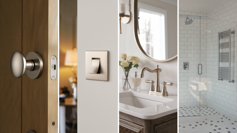
2. Kitchens and Bathrooms

In functional spaces like kitchens and bathrooms, Revere Pewter offers practical beauty. The color works exceptionally well with white cabinets, marble or quartz countertops, and chrome or nickel fixtures.
- Provides enough contrast to highlight white elements without stark divisions
- Hides minor marks and smudges better than lighter colors in high-traffic areas
NOTE: The subtle gray undertones complement stainless steel appliances and cool-toned stone.
3. Modern Farmhouse Interiors

Revere Pewter perfectly captures the modern farmhouse balance between rustic and refined. The color creates a sophisticated backdrop for shiplap, exposed beams, and other textural elements.
- Pairs beautifully with black metal hardware, weathered woods, and natural linens
- Supports the layered, collected look central to farmhouse style while staying fresh
NOTE: This balanced neutral helps blend contemporary furnishings with traditional details.
Which One Should You Choose?

The choice between Accessible Beige and Revere Pewter depends on your space and what you want to create. Each shade brings its own strengths to your walls and can shape how your room feels.
Accessible Beige – For Soft and Welcoming Spaces
Accessible Beige stands out best in rooms where you want gentle warmth without obvious color. The shade works wonders in spaces with harsh sunlight, where its subtle depth helps soften glare.
It makes a perfect match for homes with natural stone and earth-toned furniture. The color stays true throughout the day, providing a steady backdrop for daily life.
This neutral works well in spaces where comfort takes top priority. It helps create rooms that feel lived-in yet put-together. The color brings a soft glow to walls without leaning too yellow, making it ideal for living areas and bedrooms that need a touch of warmth.
Revere Pewter – For Balanced, Versatile Settings
Revere Pewter shows its worth through its perfect balance between warm and cool tones. This shade adapts to changing light conditions, making it work in almost any room.
It keeps spaces feeling current and clean without the coldness of pure gray. The color fits perfectly in updated homes but works just as well with classic design elements.
This beige gives you freedom to mix warm and cool accents in the same space. It won’t clash with metal finishes or compete with wood tones you bring in. The shade creates a solid foundation that supports various design styles while maintaining its own subtle character.
Making Your Choice
Think about what matters most in your space. Accessible Beige makes the better choice if you want rooms that feel naturally warm with subtle depth.
For spaces that need to bridge different design elements, Revere Pewter offers more flexibility. Both neutrals can create beautiful rooms – your choice comes down to matching your home’s light conditions and existing colors.
Conclusion
When choosing between Accessible Beige and Revere Pewter, remember that both offer quality neutral bases for your home. Your final decision should reflect your home’s lighting, existing colors, and the mood you want to create.
Accessible Beige brings gentle warmth that works well in sunny rooms and spaces where comfort is key. Its subtle depth adds character without being too strong.
Revere Pewter offers a balanced mix of warm and cool tones that adapts to changing light and various design styles. Its flexibility makes it ideal for homes with mixed materials.
Consider testing both colors on your walls before making your final choice. Small paint samples in different parts of your room will show how each shade behaves in your specific space throughout the day.
Which neutral would work best in your home? Let us know in the comments below!
Frequently Asked Questions
Is Revere Pewter the Same as Accessible Beige?
No, they’re different. Accessible Beige has warmer undertones, while Revere Pewter has more gray influence and appears slightly cooler.
Is Revere Pewter More Gray or Beige?
Revere Pewter is more gray than beige, though it contains both. It’s a true “greige” with gray as the dominant tone.