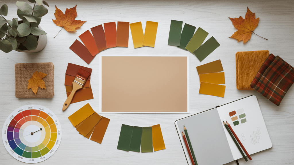
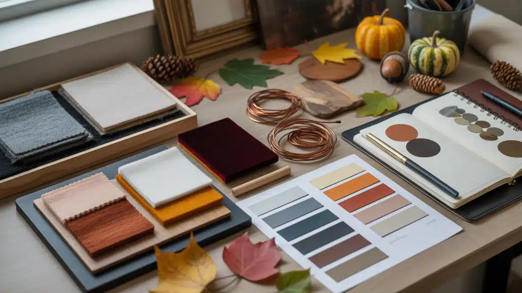
Fall Color Schemes: 9 Palettes + Ideas
Fall brings some of the most beautiful colors of the year.
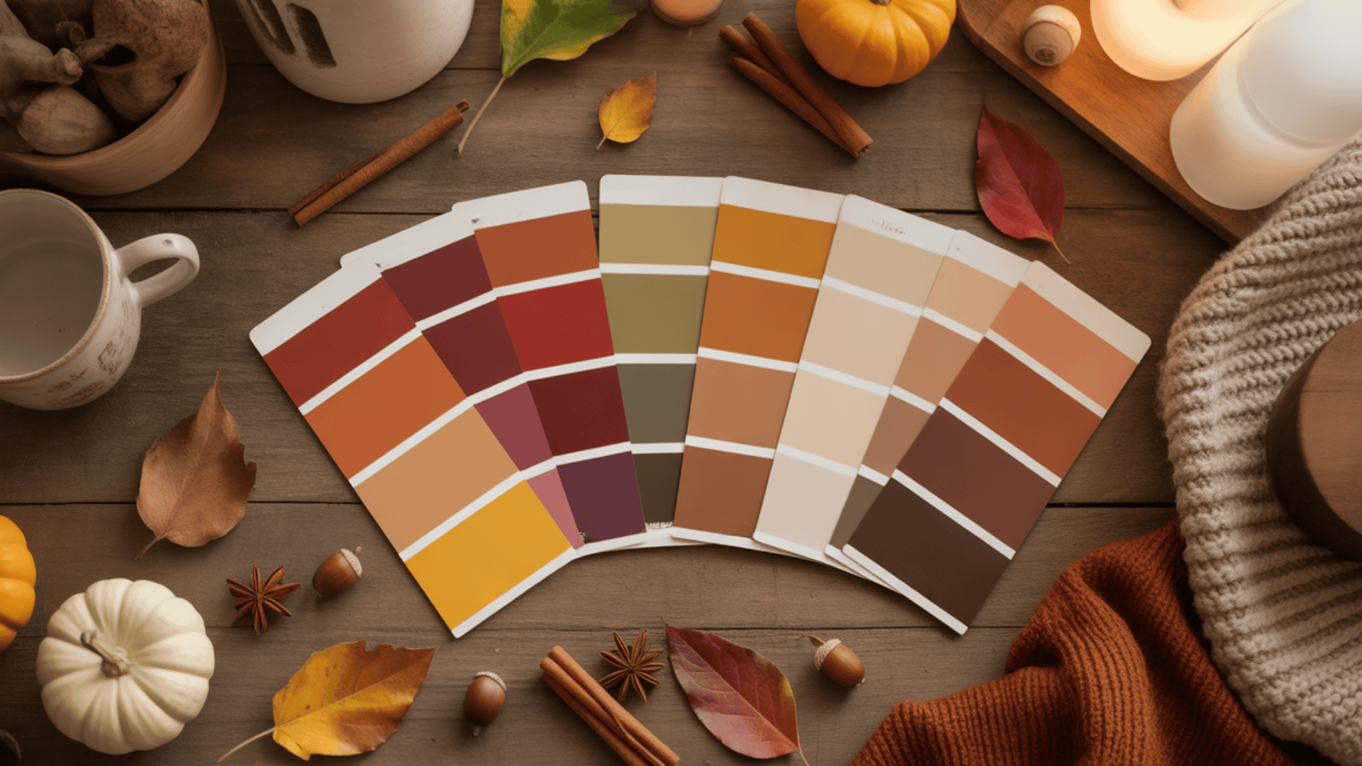
Rust, amber, olive, and burgundy create warmth and comfort wherever you use them. But with so many options, choosing the right fall palette can feel overwhelming.
This guide makes it simple. You’ll find ready-to-use fall color schemes, complete with hex codes and practical ideas for every application.
Whether you’re refreshing your home, designing seasonal graphics, planning a wedding, or updating your wardrobe, these palettes give you a clear starting point.
You’ll also learn how to build your own custom fall palette from scratch. By the end, you’ll know exactly which colors work together and how to use them confidently in any project.
Let’s get started.
What Makes a Fall Color Scheme?
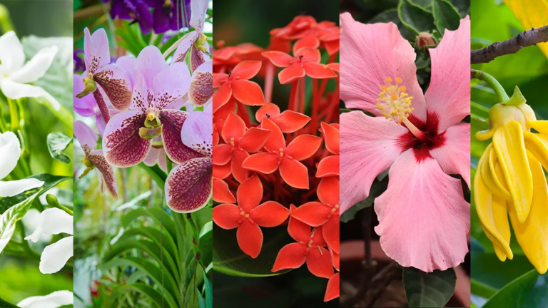
Fall color schemes reflect the season’s shift from bright summer days to cooler, cozy evenings. These palettes draw from nature itself, using rich, earthy, and muted tones that create warmth and comfort.
The best fall colors balance warm shades with grounded neutrals, giving any space or design a welcoming, seasonal feel.
Core Characteristics:
- Warm undertones: Rust, amber, cinnamon, pumpkin, and gold bring instant autumn vibes.
- Natural hues: olive, moss, brown, tan, and burgundy, mirror the colors of falling leaves and bare branches.
- Balanced neutrals: Cream, ivory, taupe, and greige provide harmony and keep the palette from feeling too heavy.
- Deep accents: Plum, forest green, or navy add depth and contrast to round out the scheme.
Pro Tip: Look outside for inspiration. Fallen leaves, tree bark, or autumn sunsets can reveal beautiful color pairings that feel authentic and personal.
11 Popular Fall Color Schemes with Ideas
From traditional autumn shades to modern moody tones, each scheme brings its own character and warmth. Here are 9 popular fall color combinations with practical ways to use them.
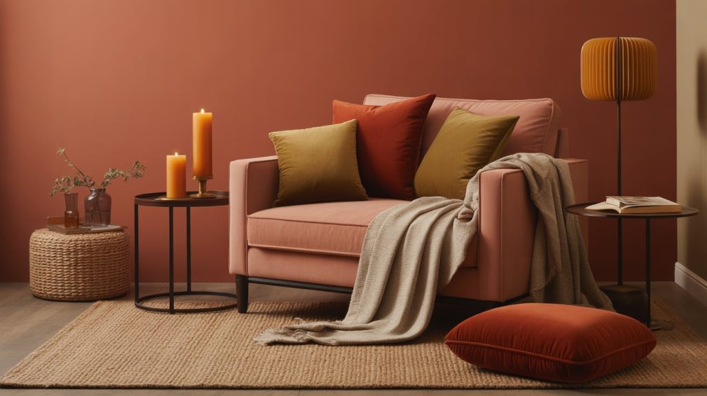
1. Classic Autumn Foliage
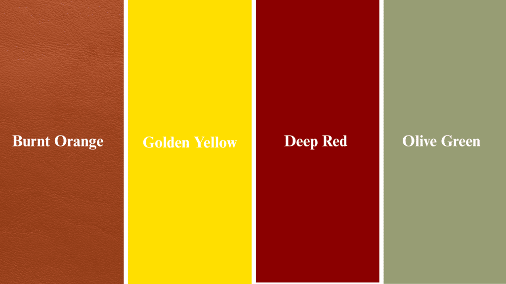
Colors: Burnt orange, golden yellow, deep red, olive green
Mood: Warm, nostalgic, traditional
Ideas:
- Home: Mix rust pillows and mustard blankets on a beige sofa for instant fall coziness.
- Design: Use orange accents and olive borders in social media posts or seasonal graphics.
- Fashion: Pair an olive jacket with a mustard scarf for a timeless autumn look.
This palette is perfect if you love the classic feeling of walking through fallen leaves. It never goes out of style.
2. Rustic Earth Tones
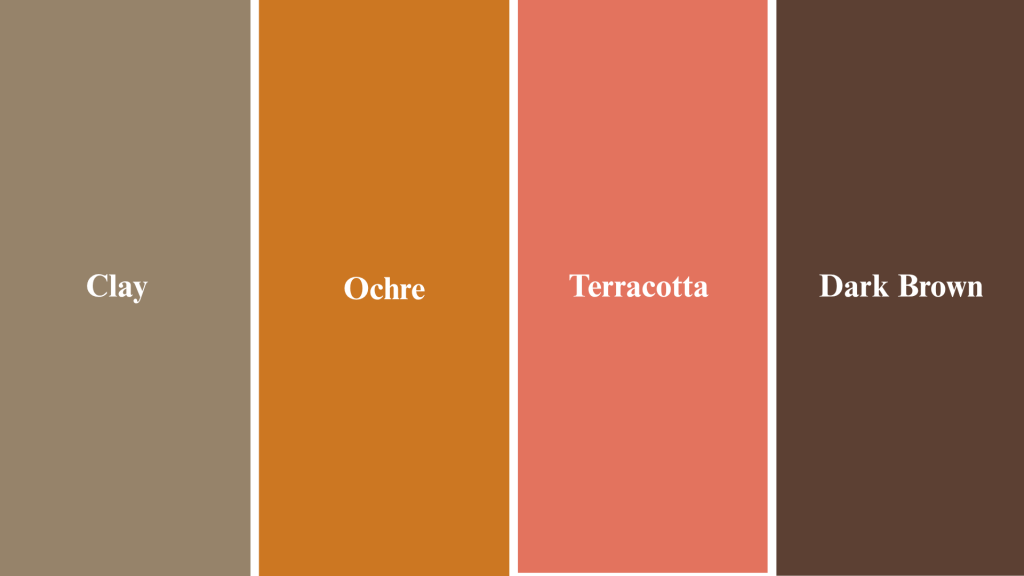
Colors: Clay, ochre, terracotta, and dark brown
Mood: Organic, grounded, natural
Ideas:
- Decorate with wood, rattan, and neutral fabrics to bring earthy textures into your home.
- Craft handmade candles in clay jars for a rustic touch.
- Brand eco-friendly products using earthy packaging that reflects sustainability.
This scheme works beautifully in spaces that celebrate natural materials and simple living.
3. Pumpkin Spice
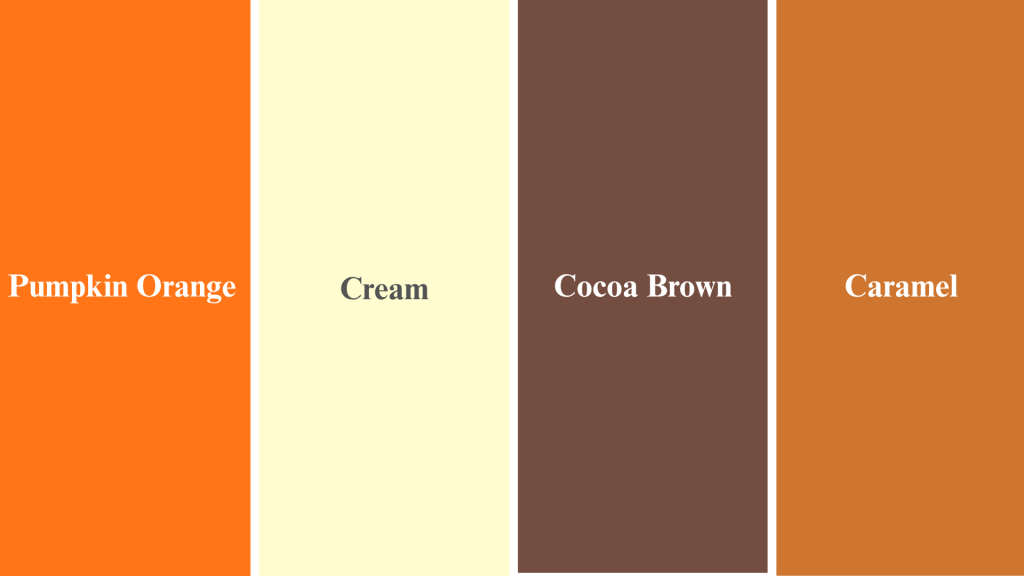
Colors: Pumpkin orange, cream, cocoa brown, and caramel
Mood: Cozy, cheerful, and festive
Ideas:
- Paint pumpkins in a mix of tones for creative centerpieces that stand out.
- Use caramel and cream in kitchen décor, such as dishcloths, mugs, or utensil holders.
- Feature pumpkin orange accents in seasonal ads or social campaigns.
This palette brings the fun and warmth of fall celebrations right into your space.
4. Moody Luxe
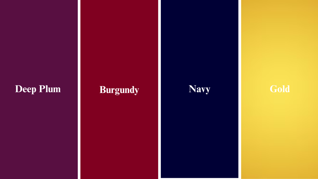
Colors: Deep plum, burgundy, navy, and gold
Mood: Refined, dramatic, polished
Ideas:
- Decorate dinner tables with navy linens and gold flatware for special occasions.
- Create wedding stationery in burgundy and foil gold for a rich, memorable look.
- Use this palette for luxury packaging or boutique branding.
If you want fall colors with a formal twist, this scheme delivers depth and richness.
5. Golden Harvest
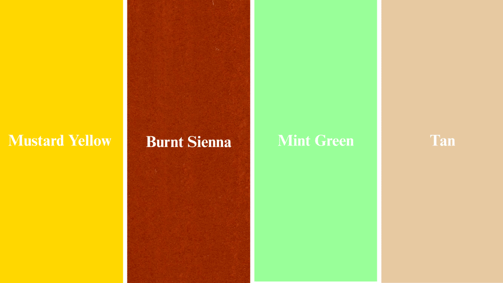
Colors: Mustard yellow, burnt sienna, mint green, tan
Mood: Vibrant yet earthy
Ideas:
- Perfect for farmhouse interiors or autumn parties with a lively feel.
- Use mustard-accent pillows and olive vases to brighten neutral rooms.
- Graphic designers can mix mustard headlines with muted backgrounds for eye-catching layouts.
- This palette strikes a balance between bold color and natural warmth.
6. Forest Escape
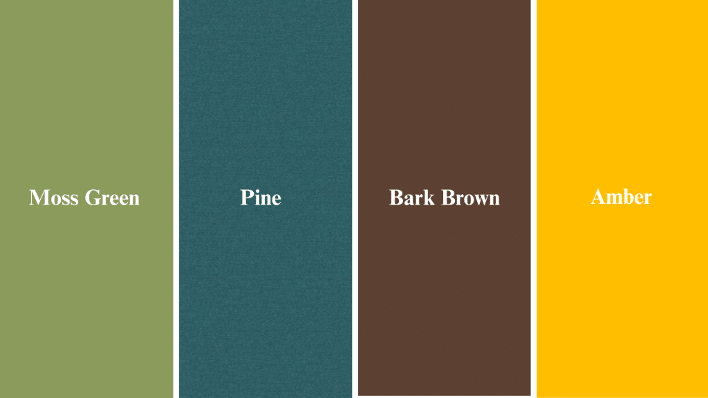
Colors: Moss green, pine, bark brown, amber
Mood: Natural, refreshing, calming
Ideas:
- Incorporate greenery, wooden textures, and amber lighting for a cabin-inspired space.
- Ideal for nature-inspired brands and outdoor lifestyle companies.
- Use pine tones in typography for a grounded visual style.
This scheme brings the outdoors inside, creating a feeling of peace yet vitality.
7. Cozy Neutrals
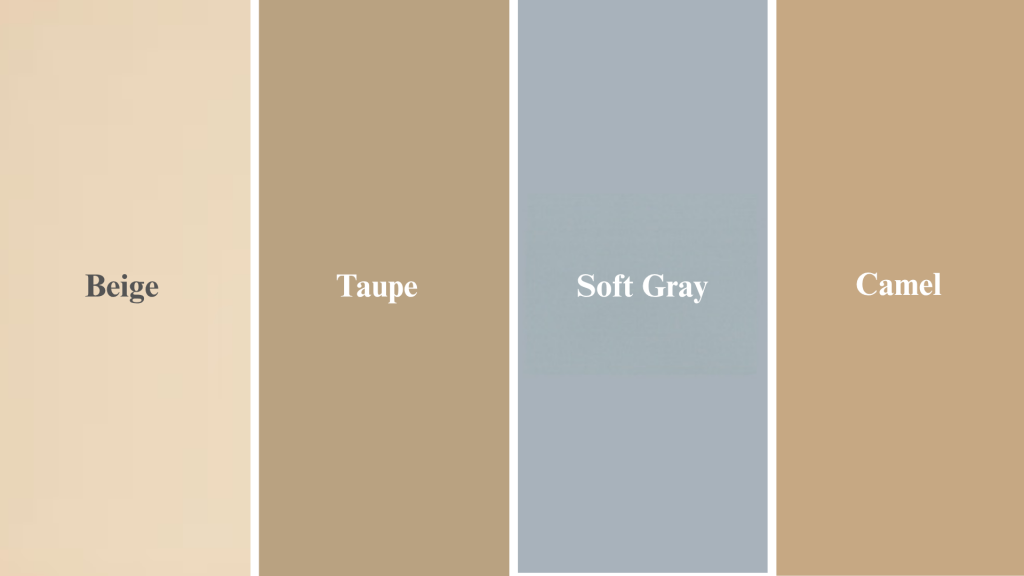
Colors: Beige, taupe, soft gray, camel
Mood: Minimalist, serene, timeless
Ideas:
- Layer neutral fabrics like wool, linen, and cotton for texture without clutter.
- Use camel and ivory tones in modern interiors that feel calm and open.
- Ideal for fall fashion basics and lifestyle branding.
This palette proves that fall doesn’t have to be bold to feel warm.
8. Sunset Glow
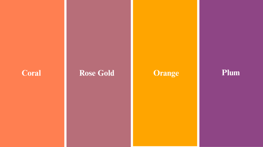
Colors: Coral, rose gold, orange, plum
Mood: Warm, romantic, soft
Ideas:
- Great for event styling and digital design with a gentle, glowing feel.
- Create gradient wall art or photography presets that capture golden hour vibes.
- Use coral and amber in wedding décor for dreamy lighting.
This scheme adds a feminine, sunset-inspired touch to fall palettes.
9. Chestnut & Sage
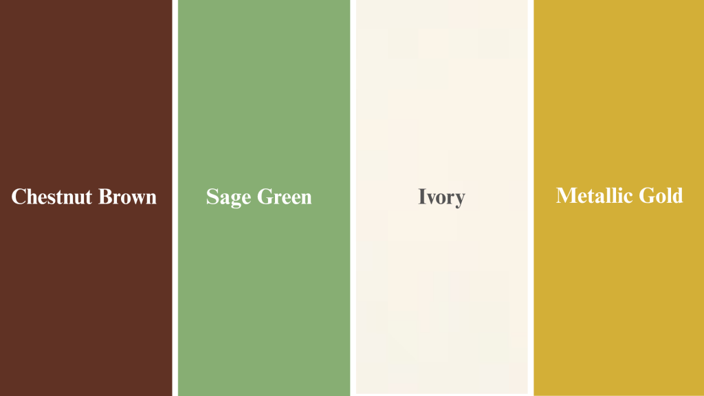
Colors: Chestnut brown, sage green, ivory, metallic gold
Mood: Balanced, modern rustic
Ideas:
- Combine sage walls with golden accents for a fresh take on fall décor.
- Outfit idea: chestnut boots and sage knitwear for a put-together look.
- Ideal for cozy kitchens or fall weddings with a natural, refined feel.
- This palette blends earthy tones with soft greens for a calming effect.
How to Build Your Own Fall Color Scheme
Creating your own fall palette is easier than you think. Follow these simple steps to design a custom color scheme that feels personal and perfectly suited to your style.
1. Pick a Foundation Tone
Start with a warm neutral like taupe or beige. This acts as your base and keeps the palette grounded. Neutrals also make it easier to layer other colors without things feeling too busy.
2. Add Complementary Hues
Combine oranges, greens, or reds that naturally blend together. Think about the colors you see in nature during fall; they already work well together. Choose two or three shades that feel connected and harmonious.
3. Include a Statement Accent
Choose one standout color, such as mustard, burgundy, or copper. This adds personality and draws the eye to key areas. Your accent color should be bold enough to make an impact but still fit the overall mood.
4. Balance with Neutrals
Use ivory or gray to tone things down and give your eyes a place to rest. Too many bold colors can feel overwhelming, so neutrals create breathing room. They also help your statement colors shine even brighter.
5. Test Your Palette
Observe how your colors look in daylight and lamplight before committing. Colors can shift depending on the lighting in your space. Test swatches on walls or fabrics to see how they feel throughout the day.
6. Use the 60–30–10 Rule
Apply 60% of your main color, 30% of a secondary shade, and 10% of your accent for perfect harmony. This formula prevents any one color from taking over. It creates balance and makes your space feel intentional and well-designed.
Pro Tip: Take photos of your test swatches on your phone. This helps you compare options side by side and see what truly works in your space.
Creative Ways to Use Fall Color Schemes
From home décor to fashion and events, these warm palettes bring seasonal charm wherever you apply them. Here are practical ways to use fall color schemes in different settings.
1. Home Décor Ideas
- Paint a terracotta feature wall. This creates a bold focal point without overwhelming your entire room. Pair it with neutral furniture to let the wall shine.
- Mix velvet cushions in rust and olive. Velvet adds richness and texture while the colors bring instant autumn warmth. Layer different sizes for a cozy, lived-in feel.
- Use amber candles and woven rugs for texture. The flickering glow of amber candles creates a warm atmosphere. Woven rugs add natural texture that complements fall tones perfectly.
- Create a cozy reading nook with mustard lighting. A soft mustard lamp or string lights make any corner feel inviting. Add a throw blanket and you have the perfect fall retreat.
2. Graphic Design & Branding

- Use burnt orange buttons and cream backgrounds for seasonal appeal. This combination is easy to read and feels instantly autumnal. It works great for websites, newsletters, or landing pages.
- Create fall-themed email headers or Pinterest templates. Seasonal graphics help your content stand out during the autumn months. Use warm tones with simple typography for clean, professional results.
- Design packaging with kraft paper, gold foil, or textured patterns. These materials add a tactile, premium feel to your products. Fall colors on natural materials create an earthy, authentic look.
3. Fashion & Lifestyle
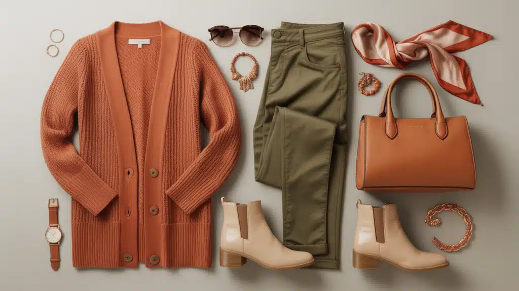
- Style rust cardigans with olive pants and beige boots. This outfit combines three fall staples into one cohesive look. The colors work together without trying too hard.
- Try layered neutrals with pops of mustard or burgundy. Start with cream, tan, or gray basics, then add one bold color. This approach keeps things simple while still feeling seasonal.
- Accessorize with tan handbags and copper jewelry. These pieces add warmth to any outfit without being too loud. Copper especially catches the light beautifully during the fall.
4. DIY & Crafts
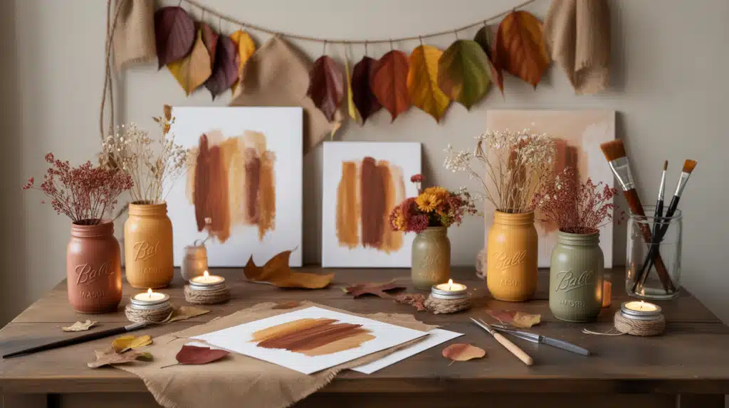
- Paint mason jars in fall tones for rustic centerpieces. Use terracotta, mustard, or sage paint on clean jars. Fill them with dried flowers or candles for instant seasonal décor.
- Make garlands with dried leaves and burlap string. This simple craft brings nature indoors. Hang them over mantels, doorways, or windows for a handmade touch.
- Craft custom wall art using cinnamon and caramel tones. Paint abstract shapes or simple patterns on canvas. These warm colors add personality to blank walls without much effort.
5. Events & Weddings
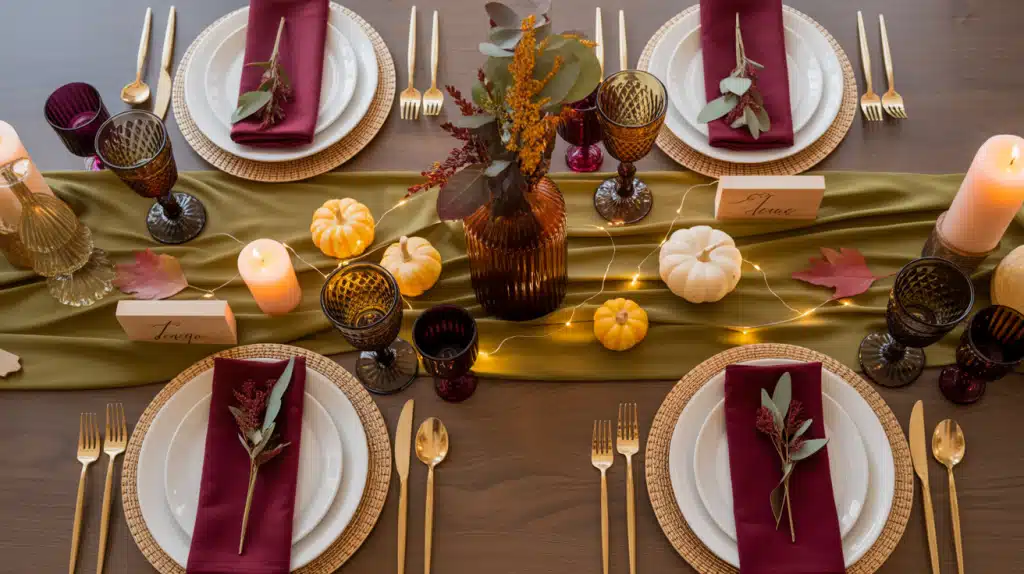
- Pair burgundy dresses with gold accessories. This combination feels formal yet warm for fall ceremonies. Gold jewelry or belts add just enough shine without looking overdone.
- Decorate tables with amber vases and olive napkins. These small touches create a cohesive color story across your event. Layer different textures, such as linen, wood, and glass, for visual interest.
- Use fairy lights and wooden signage for a warm fall ambiance. String lights create a soft glow that makes evening events feel magical. Wooden signs add a rustic element that fits the season perfectly.
Quick Tip: Start small when testing fall colors in any area. Try one or two accent pieces before committing to larger changes. This lets you see what works best for your space or style.
Real-World Palette Inspiration
Ready to put these fall colors into action? Here are five tested palettes with exact hex codes you can use right away. Copy these combinations for your next design project, room makeover, or brand refresh.
| Palette Name | Hex Codes | Use Case |
|---|---|---|
| Pumpkin Harvest | #C76A3D, #F3C677, #8E735B, #593C22 |
Rustic décor & branding |
| Golden Forest | #B49E64, #556B2F, #D1B490, #40342C |
Home décor & nature design |
| Cozy Neutrals | #D9C7B1, #A68B6E, #7B5840, #3F2F25 |
Minimalist interiors |
| Berry Luxe | #5A2749, #9B5E8B, #D4A3C1, #32202C |
Refined weddings |
| Sunset Glow | #E48C70, #F2B8A6, #6D4F4B, #2C1D1A |
Branding & fashion looks |
How to Use These Palettes
Each palette includes four coordinated colors that work together naturally. Use the first color as your main tone, the second and third as supporting shades, and the fourth as a deep accent. You can plug these hex codes directly into design software like Canva, Photoshop, or Figma.
Pro Tip: Save these hex codes in your design tools or phone notes for quick access. This saves time when you need to match colors across different projects or platforms.
Expert Tips for Using Fall Palettes
Working with fall colors is easier when you follow a few tried-and-true principles. These tips help you create cohesive, beautiful results no matter where you apply your palette.
- Keep it balanced: Use darker hues sparingly to prevent heaviness; too much burgundy or chocolate brown can make a space feel closed in.
- Play with textures: Layer wool, wood, and velvet to enhance warmth. Mixing materials adds depth that flat color alone cannot achieve.
- Add metallics: Copper, bronze, and gold amplify fall richness; these finishes catch light beautifully and bring a polished touch to any palette.
- Use nature as a reference: Fallen leaves or seasonal produce often reveal perfect pairings. Look outside for combinations that already work together.
- Stay authentic: Adjust colors to suit your brand or personal taste, not just trends. What works for someone else might not feel right for you.
The best fall palette is one that makes you feel good. Trust your instincts and choose colors that match your mood and space, even if they break the rules a little.
Final Thoughts
Fall color schemes bring warmth, comfort, and seasonal beauty to any project. From classic autumn foliage to moody luxe tones, each palette tells its own story and sets a unique mood.
Whether you’re painting a feature wall, designing seasonal graphics, styling an outfit, or planning an event, these color combinations give you a solid foundation to work from.
Use the provided hex codes, follow the 60-30-10 rule, and trust your instincts when building your palette.
The best part? Fall colors are forgiving. They naturally work together because they come from nature itself.
Now it’s your turn. Which fall color scheme speaks to you? Try one palette this week and see how it changes your space or project.
Share your favorite fall color combination in the comments below. We’d love to see what you create!