
After testing dozens of white paint colors in my design work, I’ve found Benjamin Moore’s Cloud Cover to be the perfect “not-too-warm, not-too-cool” white that adapts beautifully to any space.
When I recently used it in a north-facing living room, the soft gray undertones created the serene backdrop my client hoped for.
Throughout my years as a color consultant, I’ve seen how this versatile shade can transform modern homes and traditional spaces.
Whether brightening up a dark hallway or adding sophistication to kitchen cabinets, Cloud Cover strikes that ideal balance between crisp and cozy.
In this guide, I’ll share my hands-on experience with Cloud Cover and help you decide if it’s the right choice for your home.
What Makes Cloud Cover Paint Special?
Cloud Cover (OC-25) by Benjamin Moore is a compromise between pure white and greige.
With an LRV of 81.8, this paint color creates bright, open spaces without the harsh glare of starker whites. Its gray-blue undertones show up gently in different lighting, making it adaptable to various rooms.
The Science Behind the Shade
The real magic of Cloud Cover lies in its composition. Unlike typical off-whites that lean yellow, this paint carries subtle violet undertones. These undertones help balance the color, preventing it from feeling too warm or cool in your space.
Best Places to Use Cloud Cover Paint for Stunning Results
1. Living Room Success

Nothing sets a relaxed mood quite like Cloud Cover in a living space. The paint’s soft gray undertones create a comfortable backdrop that doesn’t match your furniture or artwork.
I’ve seen it work wonders in small apartments and spacious family rooms, making each feel put together without trying too hard. The color stays true from sunrise to sunset, meaning your space feels good all day.
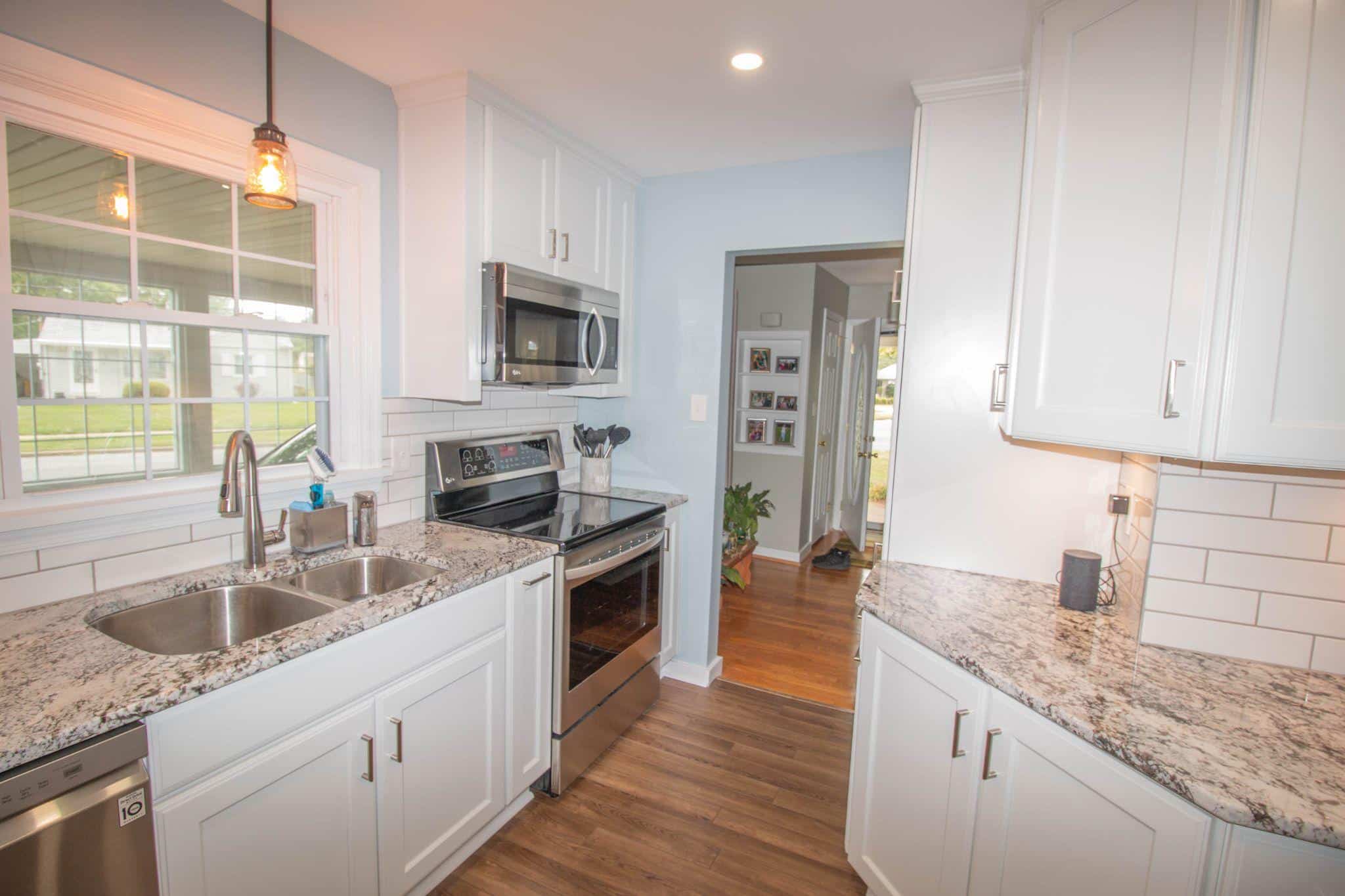
2. Kitchen Harmony

Cloud Cover proves its worth in kitchens. I’ve used it with both white and espresso cabinets, and it fits right in every time.
It is special because it complements white quartz or marble without looking too stark. The subtle blue-gray undertones keep the space feeling clean but lived-in.
It’s particularly good at making smaller kitchens feel more open and bright.
3. Bedroom Serenity

For bedrooms, Cloud Cover creates just the right vibe. It’s light enough to make the room feel spacious but has enough depth to feel cozy.
The color looks great with natural wood furniture and keeps its gentle presence even as shadows shift throughout the day. My clients often tell me their bedrooms feel more peaceful after switching to this shade.
4. Bathroom Balance

In bathrooms, Cloud Cover shows its practical side. It makes white fixtures pop without harsh contrast, and the color holds up well in natural and artificial light.
Small powder rooms feel bigger, and master baths gain a spa-like quality. Plus, it works beautifully with chrome, brass, or black fixtures – making it flexible for any style you choose.
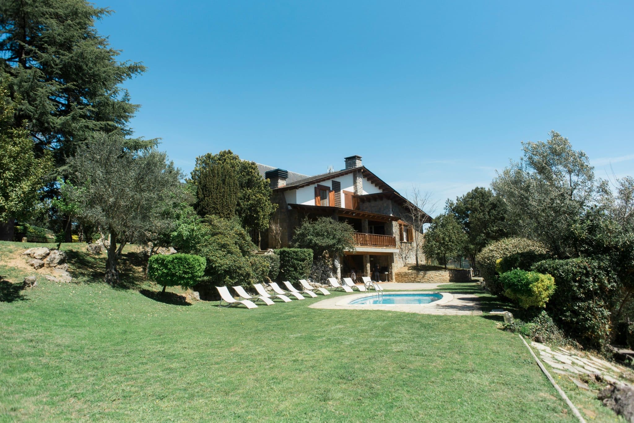
5. On Home Siding

My experience with Cloud Cover on exterior siding has been consistently good. The paint’s subtle depth comes through beautifully in outdoor settings, offering a softer take on white that won’t blind your neighbors.
What I like most is how it shifts with the sun – in the morning light, it appears warm and welcoming, while in the afternoon, it brings out its cooler tones.
This variation adds character to your home’s appearance throughout the day.
6. Trim and Accent Details

For trim work, Cloud Cover brings something special to the table. When paired with darker siding colors like charcoal or navy, it creates a refined contrast that’s not as stark as pure white. I’ve seen it work particularly well on:
- Window frames
- Door casings
- Porch columns
- Fascia boards
- Shutters
A quick tip from my field experience: The color looks about 5-10% brighter outside due to natural light reflection. Testing a sample in your exterior lighting conditions is worth testing before committing to the full project.
Perfect Color Combinations with Cloud Cover
Whites That Work
Based on my hands-on testing, certain whites pair exceptionally well with Cloud Cover.
Benjamin Moore’s Chantilly Lace is a go-to for trim and ceilings – clean and bright without fighting against Cloud Cover’s softness.
Oxford White offers a more subtle approach, creating just enough separation to highlight architectural details without looking too stark.
Cloud White brings something different to the mix. When you need your trim to feel connected to your walls while maintaining some distinction, this warmer white creates a flowing feel that many clients love.
Bold Accent Colors
Are you looking to add some punch to your Cloud Cover walls? Hale Navy is my top pick. This deep blue creates a striking balance – I’ve used it on built-ins and interior doors with fantastic results. It’s rich without being overwhelming.
Soot adds a modern touch to a more dramatic look. I recently used this combo in a home office: Cloud-Covered walls with a Soot accent wall behind the desk. The result was professional yet inviting.
Mountain Lane adds an organic element to the mix. This green shade works particularly well in spaces that connect to the outdoors, helping to bring nature’s influence inside while maintaining a polished look.
Pro tip: Always test these combinations in your specific space. The way these colors interact can shift slightly depending on the lighting conditions in your room and the time of day.
Color Pairing Tips
- Use darker accents sparingly – they’re more impactful that way
- Consider your flooring when selecting accent colors
- Factor in fixed elements like countertops or tile
- Remember that natural light will affect how colors read together
How Does Cloud Cover Compare to Other White Paints?
Cloud Cover vs White Dove
| Feature | Cloud Cover | White Dove |
|---|---|---|
| LRV (Light Reflectance Value) | 81.8 | 85.38 |
| Color Fidelity | Stays true to its color in various lighting conditions | Tends to pull more yellow under artificial light |
| Ambiance | Maintains a clean, modern look | Reads cozier and more traditional |
| Best Use | Ideal for modern living rooms that require a clean appearance | Suitable for spaces where a warm, cozy atmosphere is desired |
Cloud Cover vs Simply White
| Feature | Cloud Cover | Simply White |
|---|---|---|
| LRV (Light Reflectance Value) | 81.8 | 91.7 |
| Behavior in Bright Light | Stays balanced, maintaining composure | Maximizes brightness, can feel intense |
| Depth in Shadows | Offers more depth, enhancing shaded areas | Less depth in shadows might appear flat |
| Clarity in Dark Spaces | Maintains a balanced appearance | It reads cleaner and clearer in less-lit conditions |
Cloud Cover vs Swiss Coffee
| Feature | Cloud Cover | Swiss Coffee |
|---|---|---|
| LRV (Light Reflectance Value) | 81.8 | 83.93 |
| Undertones | Gray-blue, lending a modern and versatile touch | Creamy, providing a soft, warm glow |
| Best for | Modern spaces need a neutral yet distinct background | Homes seeking a cozy, inviting atmosphere |
| Aesthetic Suitability | Ideal for contemporary and minimalist designs | Perfect for traditional and rustic settings |
Tips for Perfect Cloud Cover Application
Testing and Preparation
I always tell my clients that sample testing is non-negotiable with Cloud Cover. Paint a large test patch – at least 2 feet by 2 feet – on every wall you plan to paint.
Watch how it changes from morning to night. This step alone has saved many homeowners from second-guessing their choice later.
Tools and Techniques
The right tools make all the difference with Cloud Cover. Based on my painting experience, these produce the best results:
- Quality 3/8-inch nap roller covers for smooth walls
- 1/2-inch nap for textured surfaces
- Angled sash brush for cutting in
- Paint extender for better flow in warm conditions
Conclusion
After working with Cloud Cover on countless projects, I can confidently say this paint offers something unique in the world of off-whites.
Its ability to shift subtly with light while maintaining its essential character makes it a reliable choice for modern and traditional spaces.
When you’re ready to try Cloud Cover, test your samples thoroughly, choose your finish wisely, and observe how it interacts with your space’s lighting.
Also, please consider how it interacts with your existing finishes and furniture.
The beauty of Cloud Cover lies in its simplicity. It’s not trying to be the brightest white or the warmest greige – it’s found its sweet spot right in between, making it a versatile choice for any home.