Want to make your walls stand out without much effort? Plain walls can feel boring and lifeless, making your room look flat and unfinished.
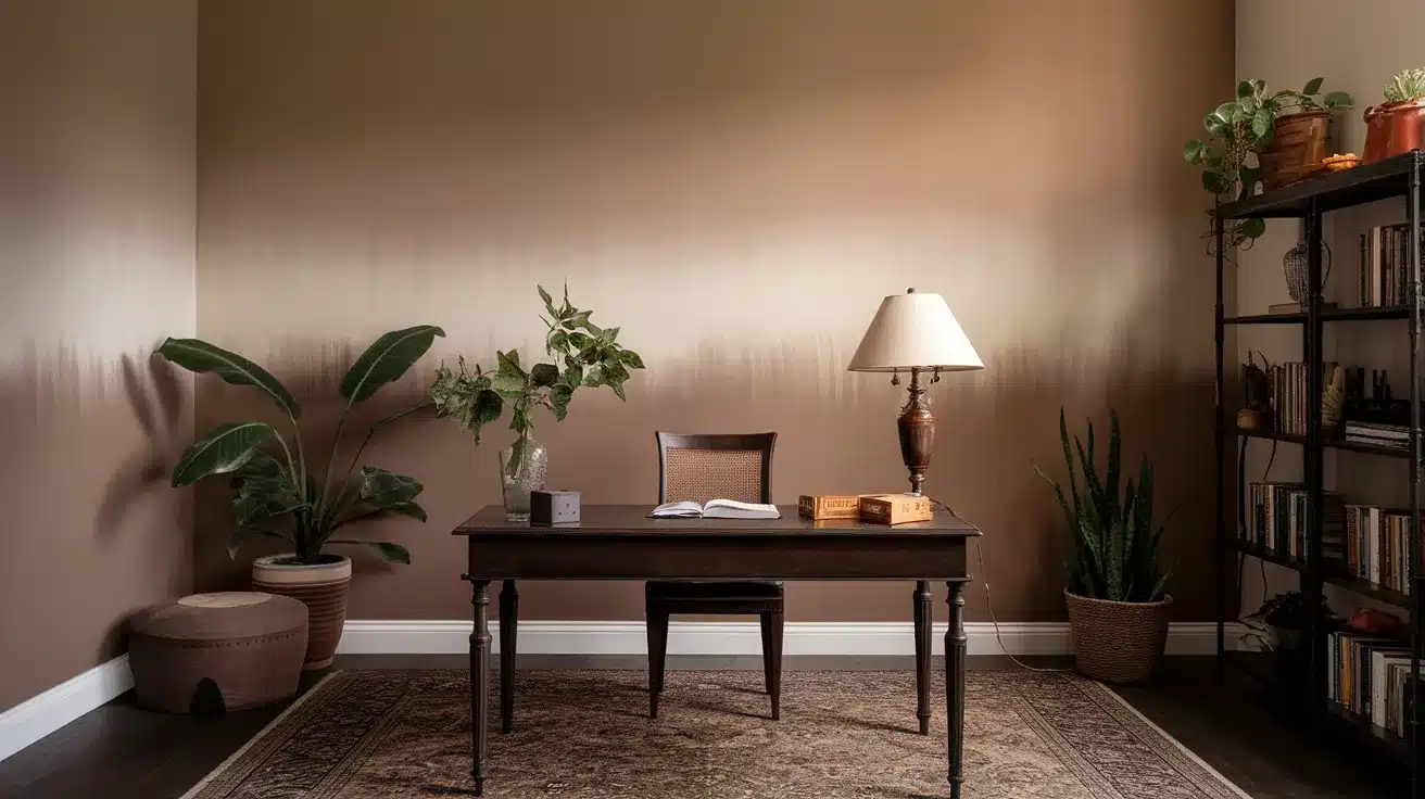
Ombre wall paint offers a fresh way to add depth and style to any room. This painting method creates a smooth color shift from dark to light or between different hues.
The soft, flowing look brings warmth and charm to spaces that single-color walls simply cannot match.
The technique might seem hard at first glance, but with the right tools and steps, anyone can create this effect at home. You don’t need to hire costly professionals or buy fancy equipment.
Keep reading to learn five simple methods for painting ombre walls that will change your home’s look this weekend.
Why Choose an Ombre Wall?
Ombre walls have become increasingly popular in interior design, and for good reason. The gradient effect creates visual interest and dimension that flat paint simply cannot achieve.
This technique works in virtually any room – from bedrooms and living spaces to home offices and even bathrooms. It’s versatile enough to complement both modern and traditional decor styles.
Best of all, while an ombre wall looks like a high-end designer feature, it’s actually an affordable DIY project that can be completed in a weekend.
The results are truly stunning, giving your space that custom, professionally-designed look without the designer price tag.
Five Simple Methods for Painting Ombre Walls
Before descending into the detailed step-by-step process, let’s examine five different approaches to creating stunning ombre walls. Each method offers unique advantages depending on your skill level and desired outcome.
1. The Classic Horizontal Fade
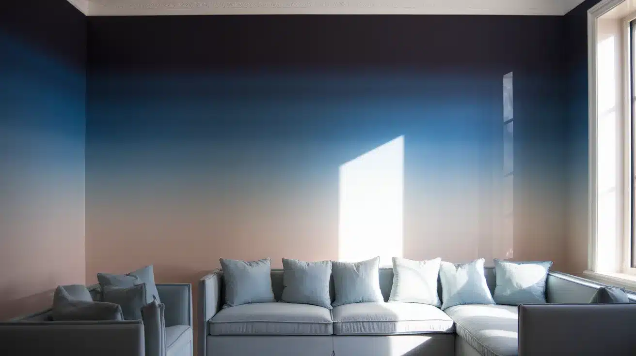
Create a top-to-bottom gradient by dividing your wall into horizontal sections. Apply darker shades at the top, gradually lightening as you move downward.
Blend where colors meet for a seamless transition. Perfect for beginners and makes rooms appear wider while creating a calm, soothing atmosphere.
2. The Vertical Ombre
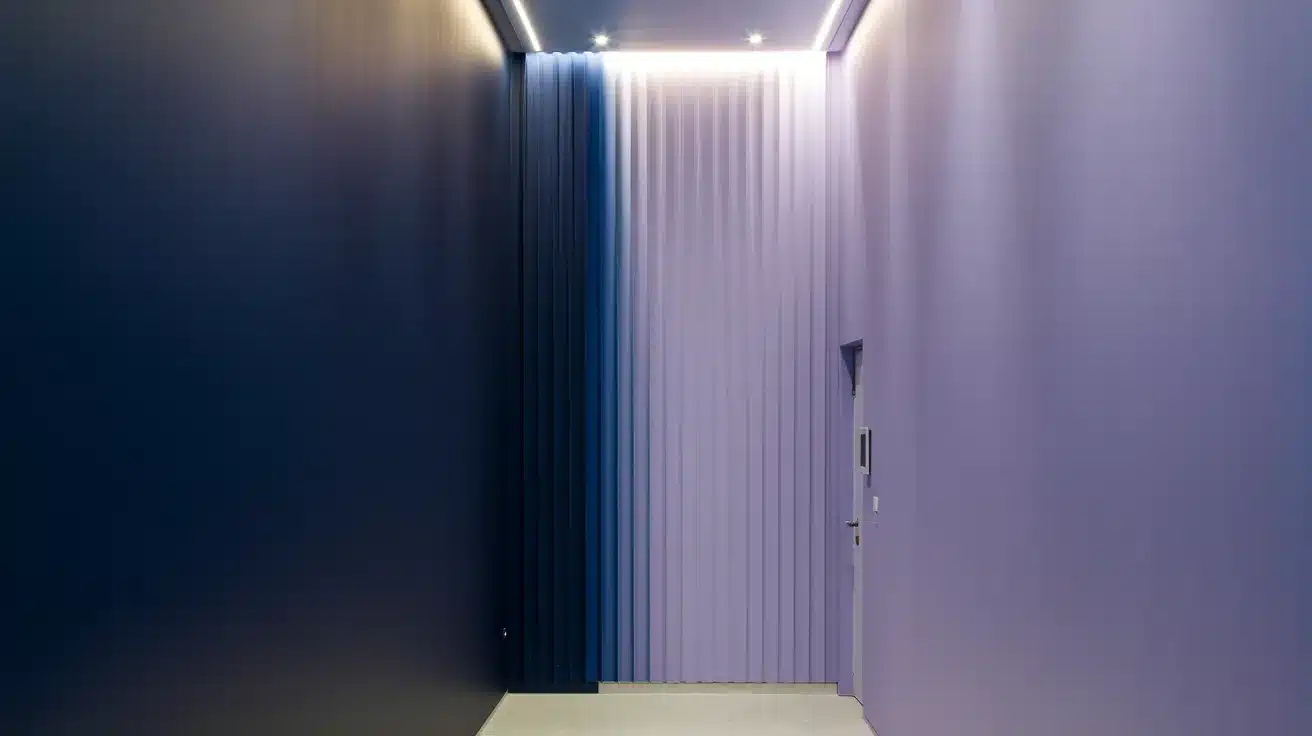
Apply your gradient from side to side instead of top to bottom. This technique visually heightens spaces with low ceilings. Start with your darkest shade on one side, transitioning to your lightest on the opposite wall. Ideal for narrow hallways and small bathrooms.
3. The Corner Blend
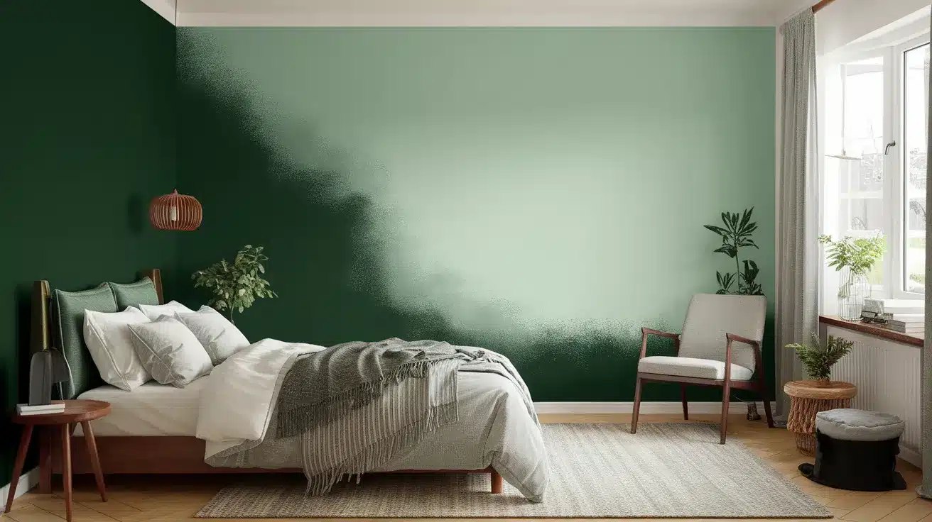
Concentrate your darkest color in one corner, then gradually lighten as you move outward in all directions. This creates a dramatic focal point perfect for accent walls behind beds or seating areas. The effect draws attention while adding depth to flat spaces.
4. The Sunset Ombre
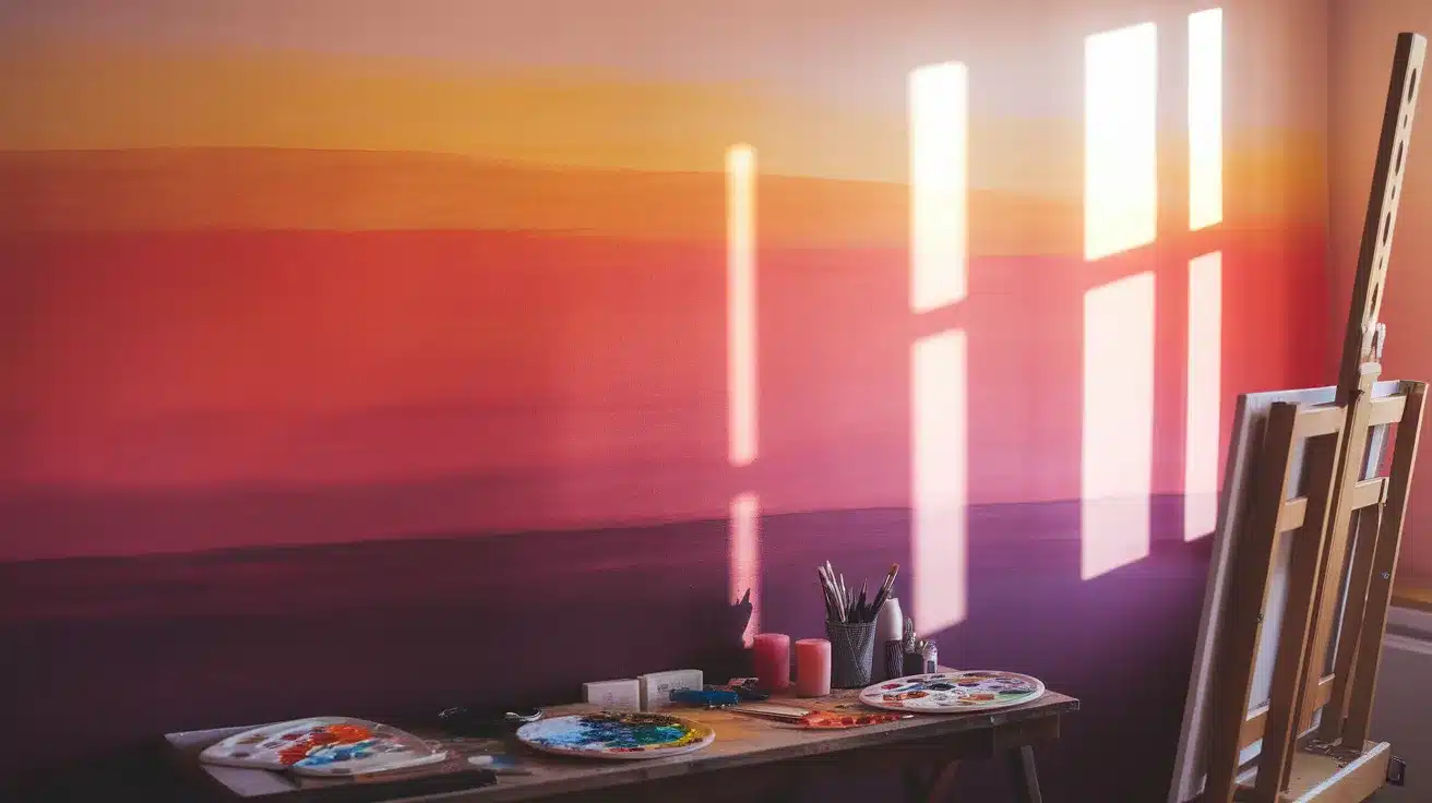
Use 3-4 complementary or analogous colors that blend like a sunset. Apply darkest shades at the bottom, transitioning through medium tones to lightest at the top. This creates a statement wall perfect for dining rooms or creative spaces with more visual impact.
5. The Subtle Two-Tone
Choose just two shades from the same color family, 1-2 steps apart. Apply darker shade to the bottom half and lighter to the top, blending extensively in the middle. Creates dimension without overwhelming the space—perfect for traditional homes and subtle design aesthetics.
Each of these methods can convert your space in a single weekend, creating professional-looking results without specialized skills. The technique you choose should complement your room’s size, lighting, and intended mood.
Now, let’s move on to selecting the perfect colors for your chosen ombre technique.
Choosing the Perfect Colors for Your Ombre Wall
Selecting the right colors is crucial for a successful ombre wall. Consider the mood you want to create—blues and greens for calming spaces, warm tones for energetic areas, or neutrals for grace.
Factor in your room’s lighting: north-facing rooms make colors appear cooler, while south-facing spaces intensify colors. Pull colors from existing furniture or decor for a cohesive look.
For the most professional effect, choose shades from the same color family with similar undertones. Avoid dramatically different undertones as they can create muddy transitions.
Always test your color combinations on a board before committing, viewing it in your room at different times of day to ensure the gradient achieves your desired effect.
The Ultimate DIY Guide to Creating Stunning Color Gradients
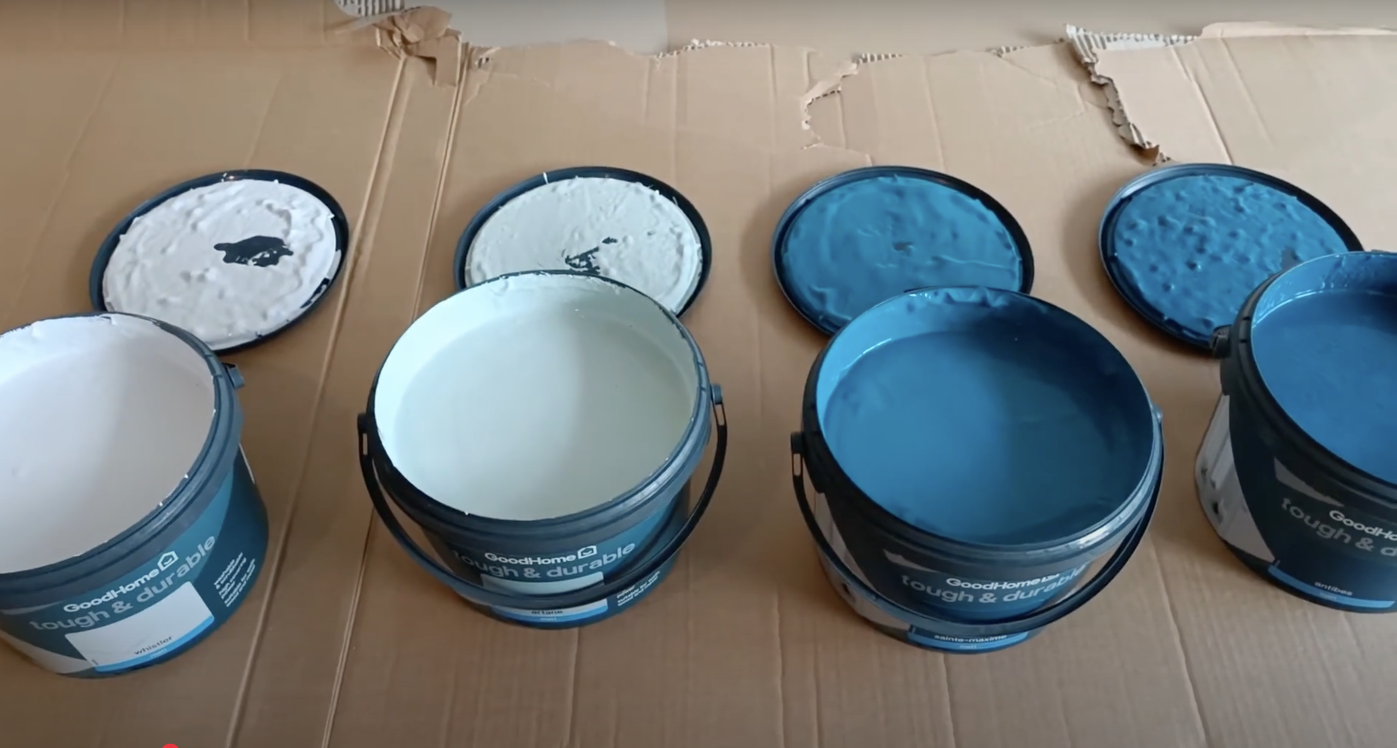
Materials You’ll Need:
| Item | Details |
|---|---|
| Paint | 4 graduated shades (dark to light) |
| Example: Antibes, St Maxim, Arane, and Whistler from Good Home at B&Q | |
| Tools | Quality paintbrushes (avoid bristle-shedding varieties) |
| Car cleaning sponge (cut into small pieces) | |
| Plastic trays for mixing colors | |
| Spray bottle with water | |
| Protection | Frog tape for clean edges |
| Cardboard/drop cloths for protection |
Step 1: Preparation
Begin by thoroughly cleaning your wall and filling any holes with spackling compound.
Once dry, apply Frog tape along all edges—ceiling, corners, skirting boards, and around outlets. This tape ensures crisp, clean lines when removed later. Protect nearby furniture and flooring with cardboard or drop cloths.
Before starting, arrange your four paint colors from darkest to lightest to visualize your gradient. Good preparation makes the difference between amateur and professional-looking results.
Step 2: Base Color Application
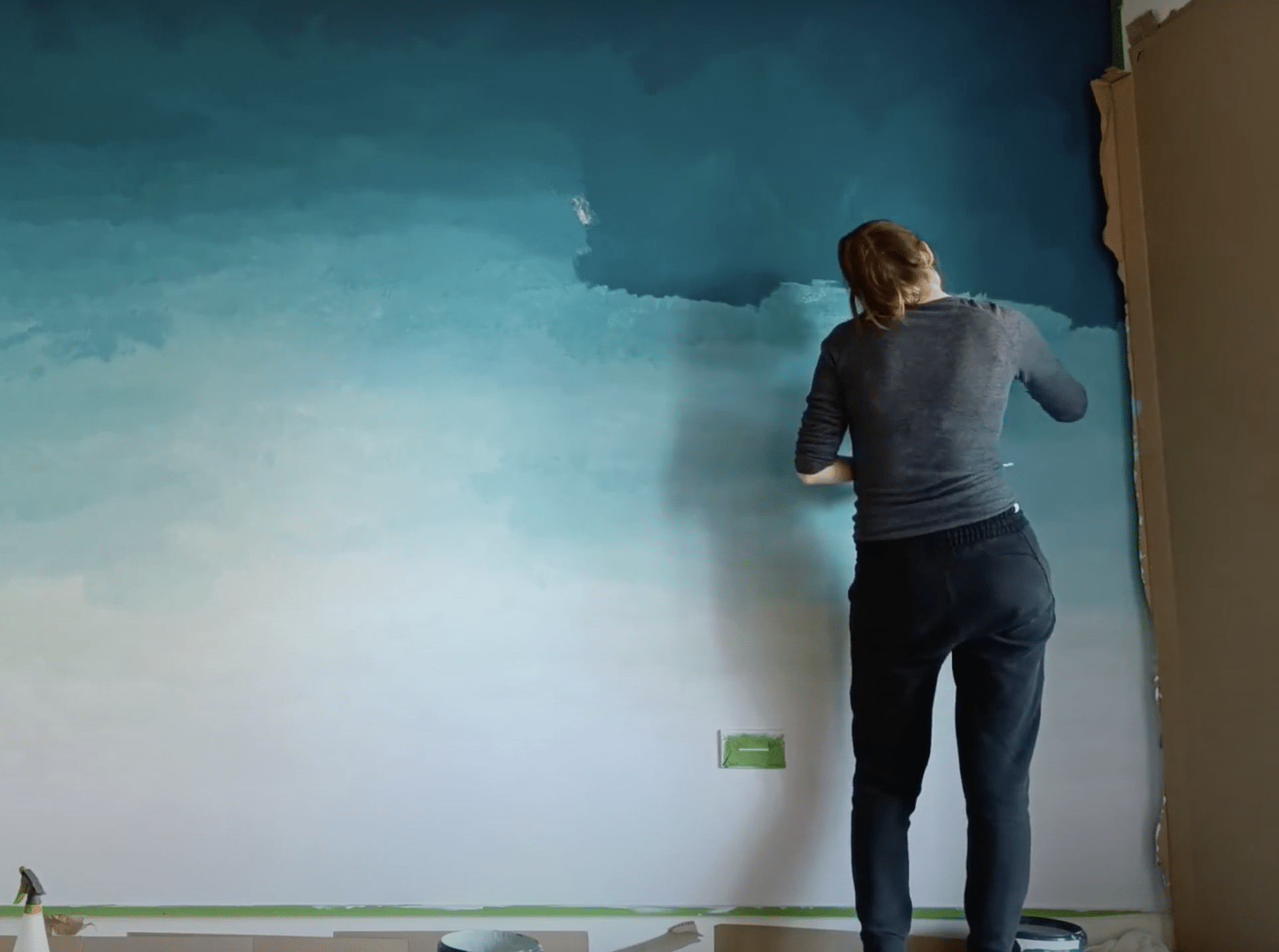
Mentally divide your wall into four equal horizontal sections. Start at the top with your darkest shade, applying it using loose, crisscross brush strokes for even coverage.
Continue downward with progressively lighter shades in each section. Focus solely on getting complete coverage in each section—don’t worry about blending yet.
These distinct color blocks create the foundation for your ombre effect. Work methodically to ensure consistent application throughout each section.
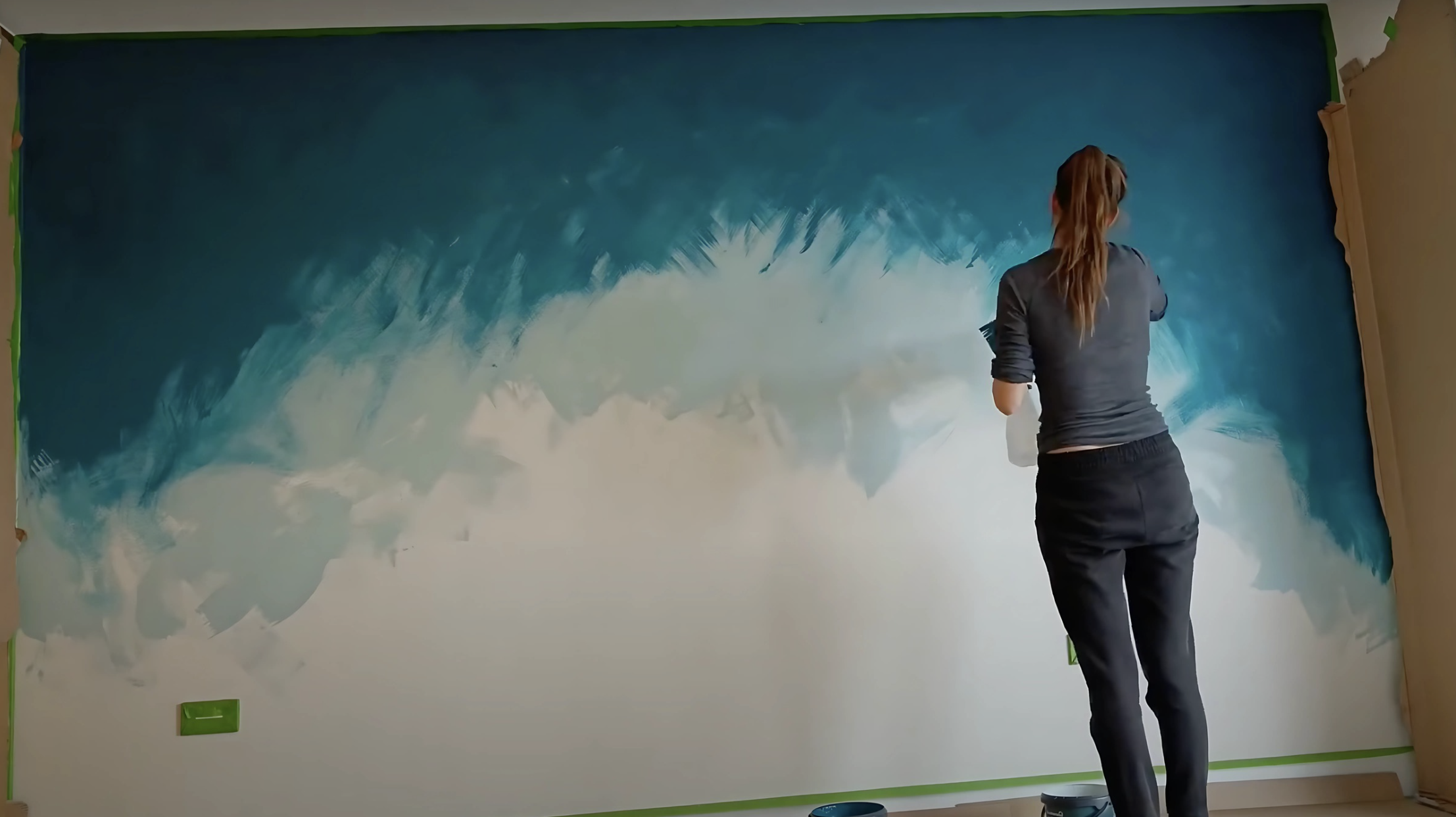
Step 3: Initial Blending
While paint remains wet, begin initial blending at the boundaries where colors meet. Spray a light mist of water along these transition areas to keep paint workable longer and thin it slightly.
Using crisscross brush motions, gently work adjacent colors together. Start with light pressure, gradually increasing as needed.
This first attempt will look somewhat patchy—completely normal at this stage. You’re simply softening the harsh lines between sections.
Step 4: Color Mixing
Create custom intermediate shades for more professional results.
In separate plastic trays, mix adjacent colors in different ratios: 75% darker with 25% lighter, 50/50 blends, and 25% darker with 75% lighter.
Apply these transitional mixes between your main colors, focusing on middle sections where contrast might be strongest. This approach creates a more gradual gradient than direct blending alone. The middle transition typically requires the most attention.
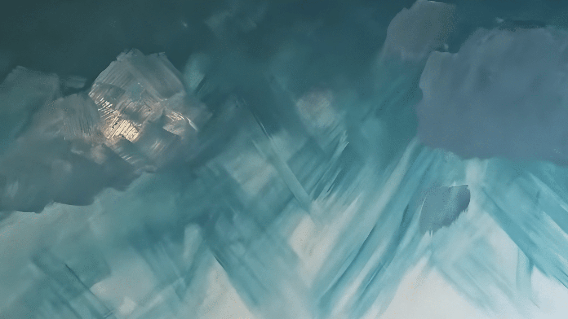
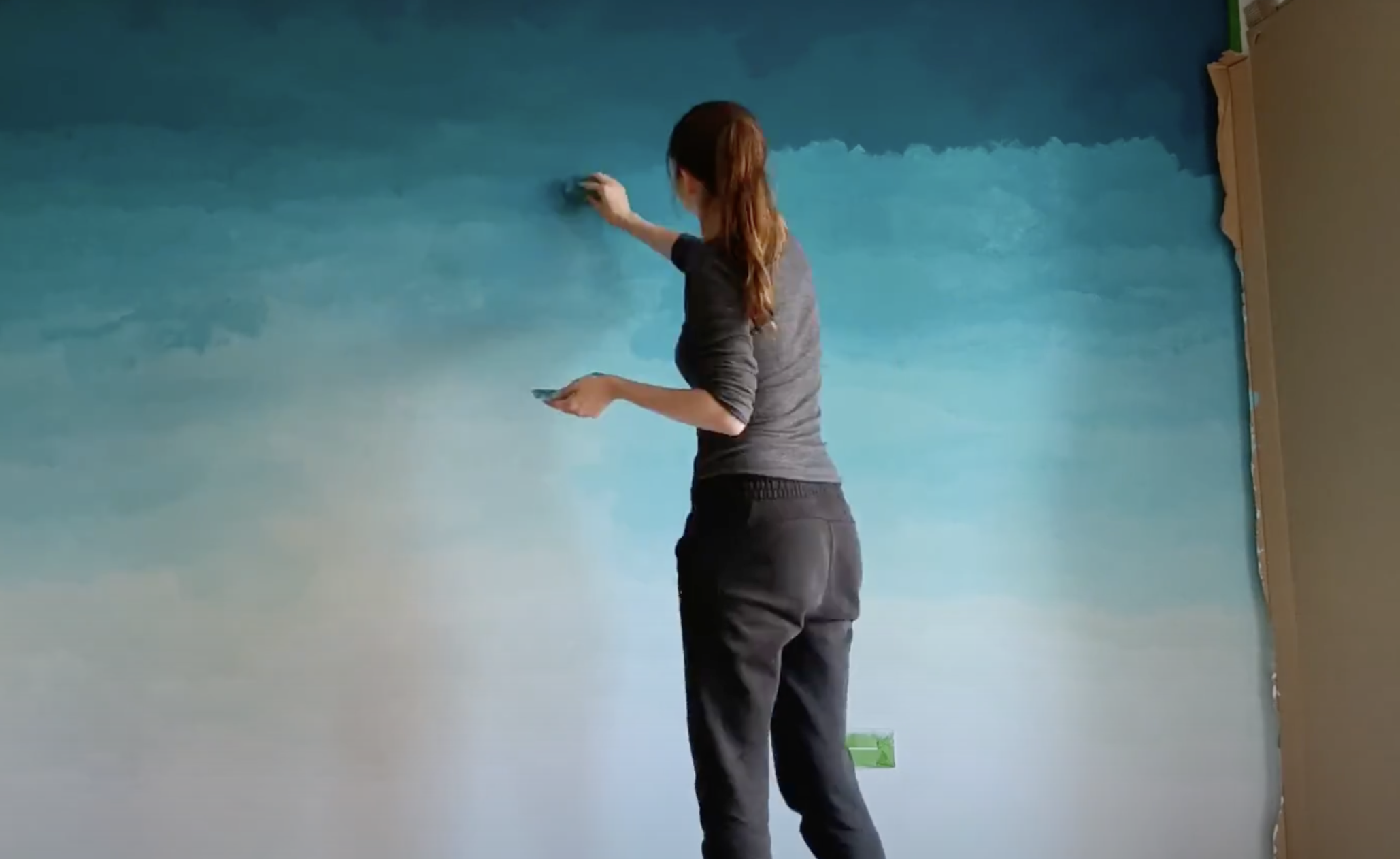
Step 5: Sponge Technique
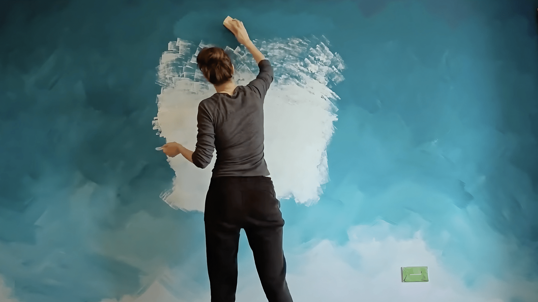
Cut a car cleaning sponge into small pieces (2-3 inches each) and dampen slightly. Now switch from brushes to these sponge pieces for significantly better results.
The sponge creates a soft, cloud-like effect impossible to achieve with brushes. Apply lighter colors as a base in areas needing correction, then gradually add darker shades using gentle dabbing motions.
The sponge’s texture naturally diffuses color edges for a professional-looking blend.
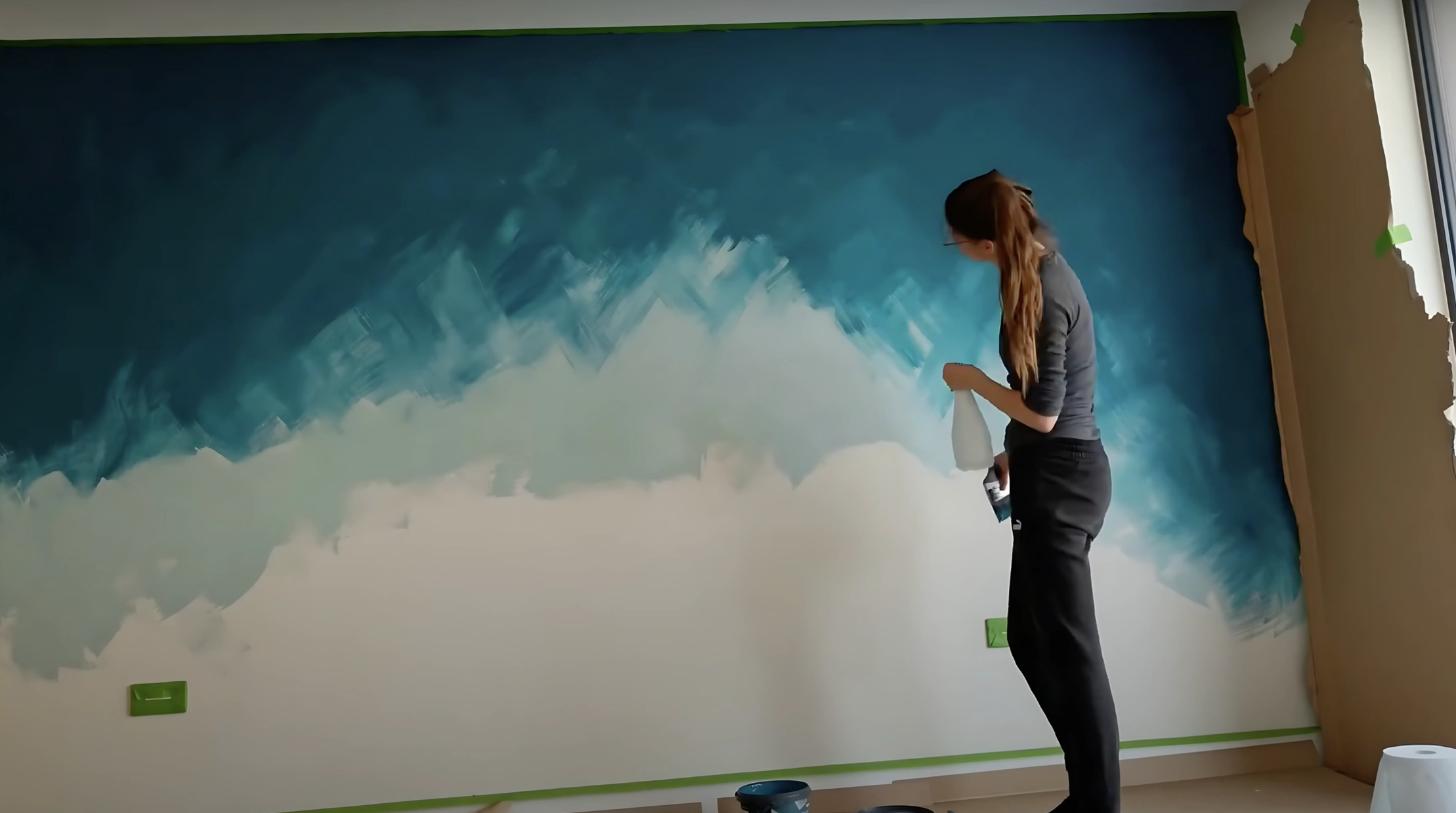
Step 6: Building the Gradient
Using your sponge pieces, build your gradient incrementally. Add small amounts of paint and layer gradually.
Focus on creating smooth transitions, particularly in the middle portion of the wall where it won’t be covered by furniture. Use light dabbing motions rather than wiping.
Remember that subtlety is key—multiple thin layers create a more natural look than fewer thick applications. Step back frequently to check your progress from different angles.
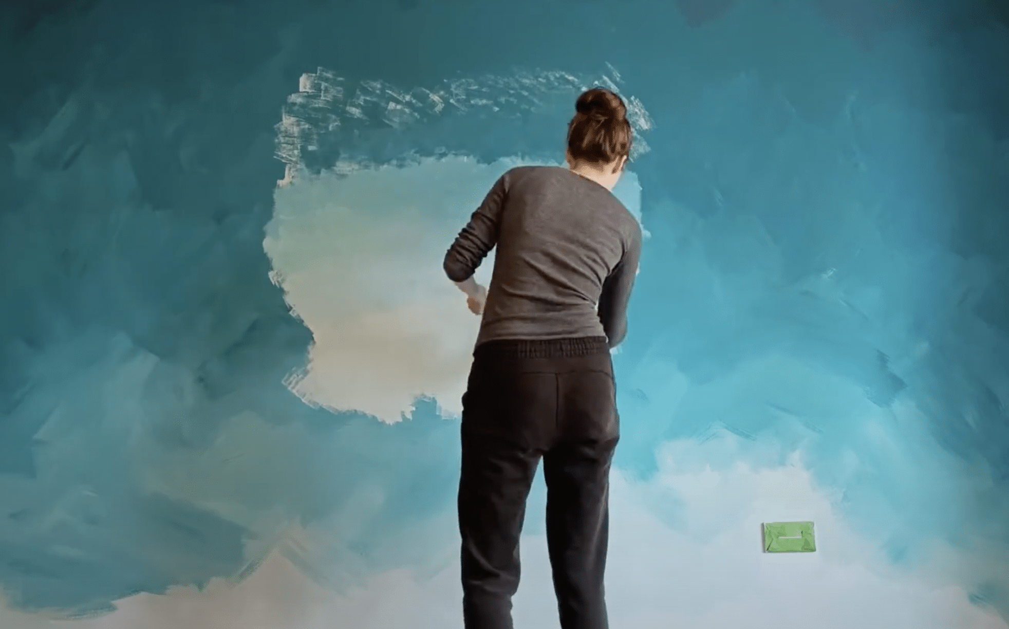
Step 7: Evaluating and Adjusting
After the paint dries (at least 6 hours), assess your wall from different distances and angles. Dry paint often looks different than wet, so you’ll likely notice areas needing adjustment.
Look for patches that appear too dark or light, or transitions that seem abrupt. Use sponge pieces to apply additional layers in these areas, gradually evening out inconsistencies.
This may require multiple sessions, so be patient—each adjustment brings you closer to perfection.
Step 8: Perfecting Transitions
Focus specifically on transitions between colors, particularly between your middle two shades, where contrast might be strongest. Use smaller sponge pieces to add tiny amounts of your custom-mixed intermediate colors precisely where needed.
Work in small sections, dabbing gently to blend any remaining harsh transitions. Step back frequently—what looks good up close might appear different from a distance.
Continue refining until the gradient flows seamlessly.
Step 9: Final Touches
Once your gradient looks promising, allow it to dry completely before making final refinements. Assess for any remaining inconsistencies, then make subtle adjustments with your smallest sponge pieces.
Focus on creating a perfectly seamless flow from dark to light. Pay special attention to edges near your Frog tape, ensuring the gradient extends properly to boundaries.
Exercise restraint—make only minimal changes to areas that truly need correction.
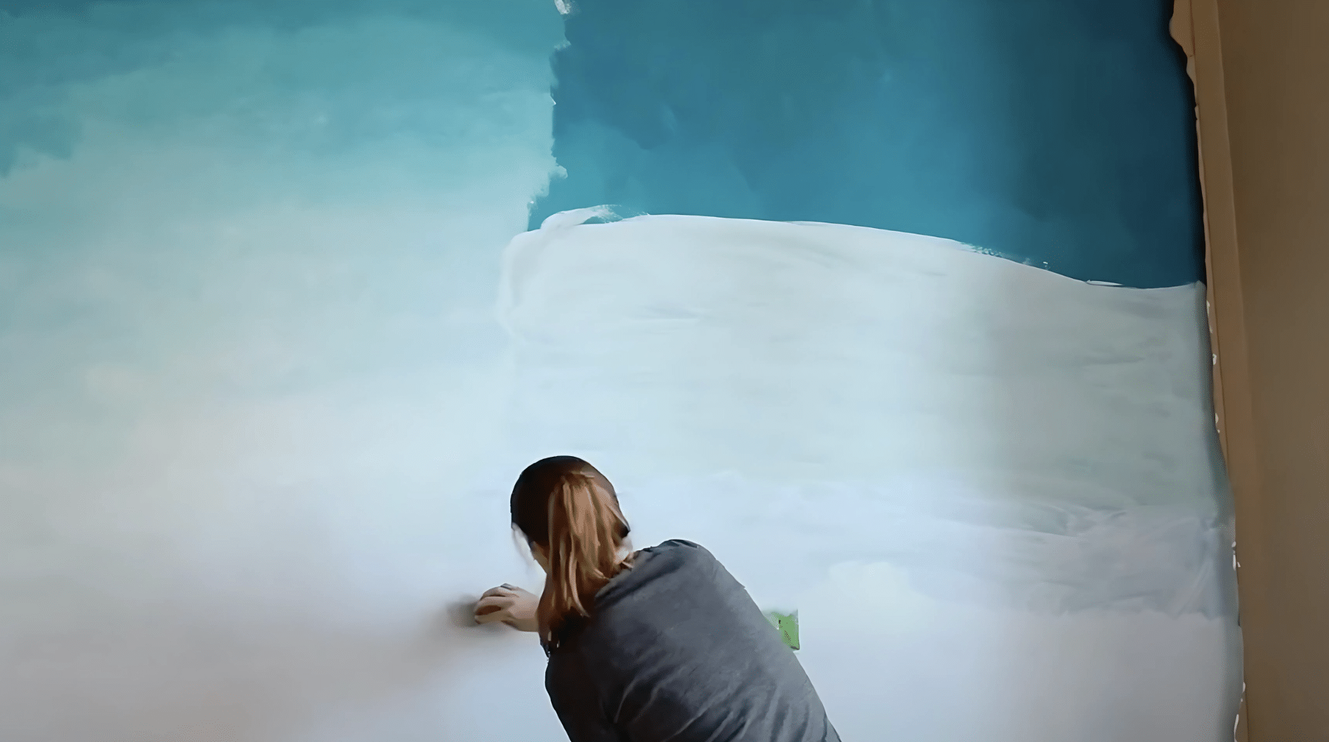
Step 10: Removing Tape and Final Assessment
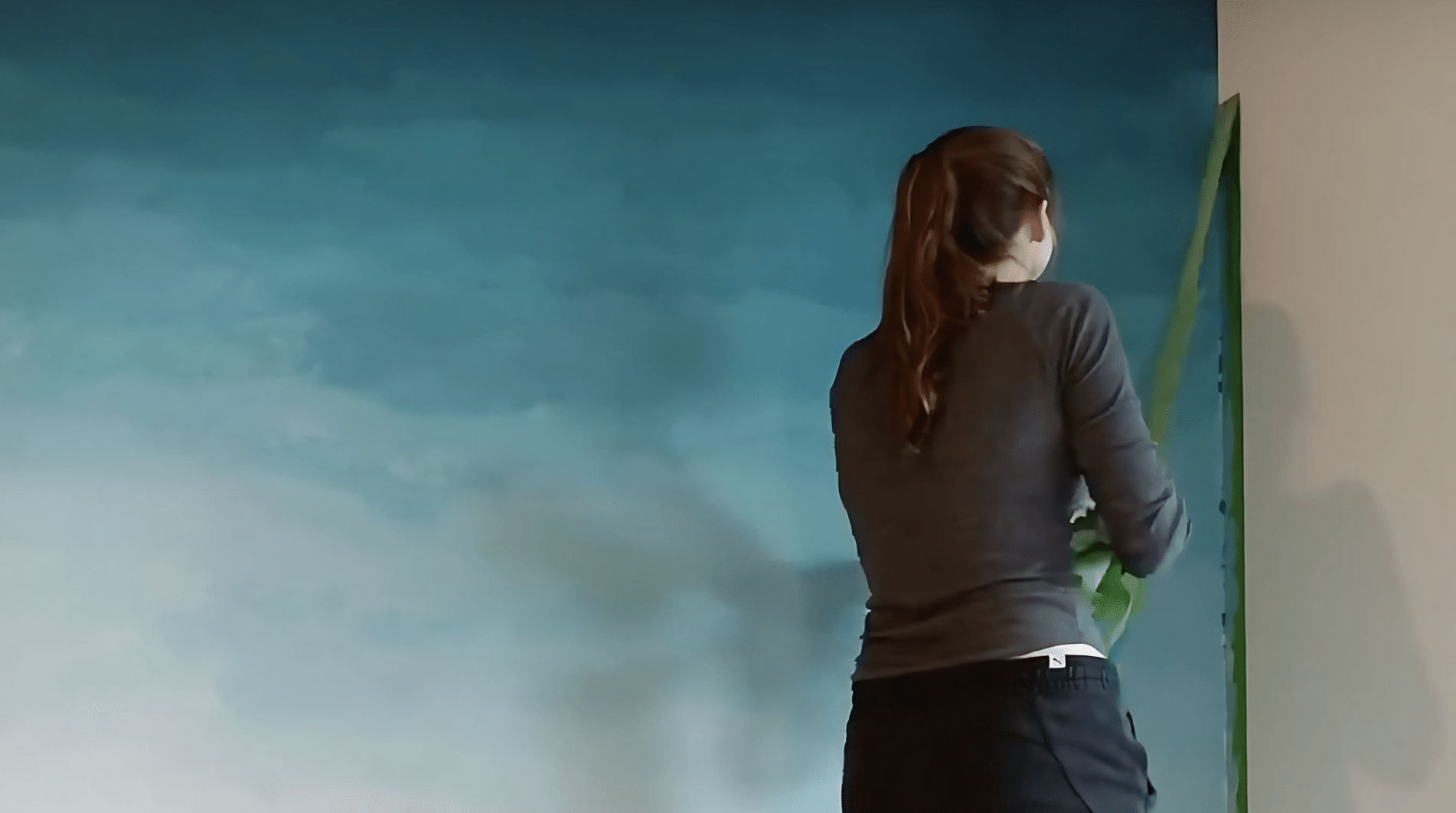
After the paint is thoroughly dry (at least 24 hours), carefully remove the Frog tape by pulling at a 45-degree angle.
Pull slowly to avoid damaging your crisp edges. Use a small artist’s brush for any touch-ups needed along edges. Return furniture to position and assess your ombre wall in the complete room setting.
Check the effect in different lighting conditions throughout the day to ensure it remains pleasing under all circumstances.
Video Tutorial
I want to acknowledge – Eco & Crafts –for the insightful video, which was a key reference in putting this guide together.
Tips for Success
- Choose colors carefully: Select shades that are closer in tone for easier blending
- Be patient: Expect to make multiple passes to achieve the perfect gradient
- Consider placement: Position your most dramatic gradient where it won’t be hidden by furniture
- Account for drying: Paint typically appears darker when dry than when wet
- Test first: Practice your technique on a piece of cardboard before committing to the wall
Creating an ombre wall takes patience and multiple attempts, but the stunning result converts an ordinary room into something extraordinary. The soft, gradual color transition adds depth and visual interest that simply can’t be achieved with solid paint colors.
Conclusion
An ombre wall converts more than just your physical space—it changes how a room feels and functions. The visual depth created by the gradient makes smaller rooms appear larger and gives larger rooms a sense of intimacy.
Your custom wall becomes an artistic focal point that sets the mood for the entire space. The subtle color transitions create a refined background that complements rather than competes with your furniture and decor.
The beauty of this technique lies in its uniqueness. Each ombre wall carries the distinct signature of its creator, guaranteeing your home will never look mass-produced or generic. The effort invested in perfecting your gradient yields lasting satisfaction each time you enter the room and experience the transformative power of color in motion.