Creating Luxury Interiors with Rich, Deep Tones
Luxury interiors don’t rely on instant impact. They work because the space feels balanced, deliberate and well considered. Using rich, deep tones gives rooms a clear atmosphere and purpose. These colours make light, texture and craftsmanship stand out, something pale schemes often struggle to achieve. When you use them correctly, deep tones become a practical design tool rather than a risky statement.
The Appeal of Rich, Deep Tones in Luxury Interiors
Deep colours carry visual weight, which explains their long-standing link to luxury interiors. When you wrap a room in navy, forest green or charcoal, the walls recede and create depth, allowing furniture and finishes to feel more sculptural. These tones also absorb light differently, softening edges and producing a cocooning effect that makes spaces feel calm. Unlike plain neutrals, darker hues hold warmth and complexity, which helps rooms feel bespoke. Use deep tones where you want intimacy and focus, such as areas designed for relaxation or conversation.
Choosing and pairing deep colours with confidence
You gain confidence with deep colour when you treat it as part of a balanced palette rather than a standalone feature. A moss green wall pairs naturally with warm wood floors because both sit comfortably within nature-inspired tones, while oxblood red tones work well alongside soft greys to prevent heaviness. Designers often offset jewel-toned blues with chalky whites or muted metals, so the colour reads rich, not overwhelming. Test samples at various times of day to understand how natural and artificial light alter the tone before committing.
Layering texture, light, and materials for luxe impact
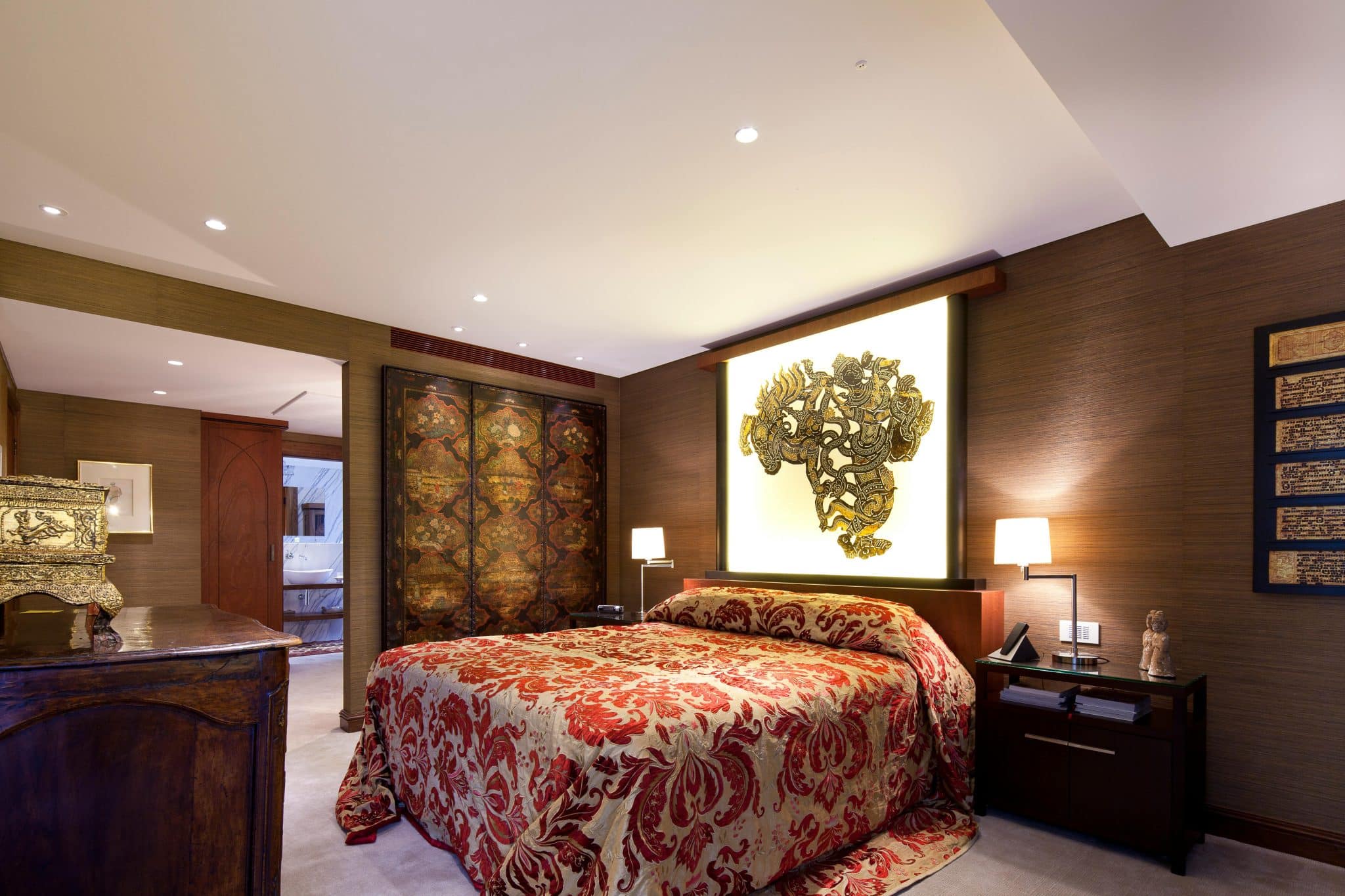
Rich colours show their best side when texture and light share equal attention. Velvet upholstery, brushed brass and timber grain add contrast against darker backdrops, giving the room dimension you can see and feel. Lighting plays a practical role too, as wall lights and table lamps create pools of warmth that stop deep walls from flattening the space. A feature wall finished with black aesthetic wallpaper can anchor the scheme, allowing polished metals and soft furnishings to stand out without competing for attention. Introduce finishes gradually so each layer earns its place.
Using deep hues in different rooms and spaces
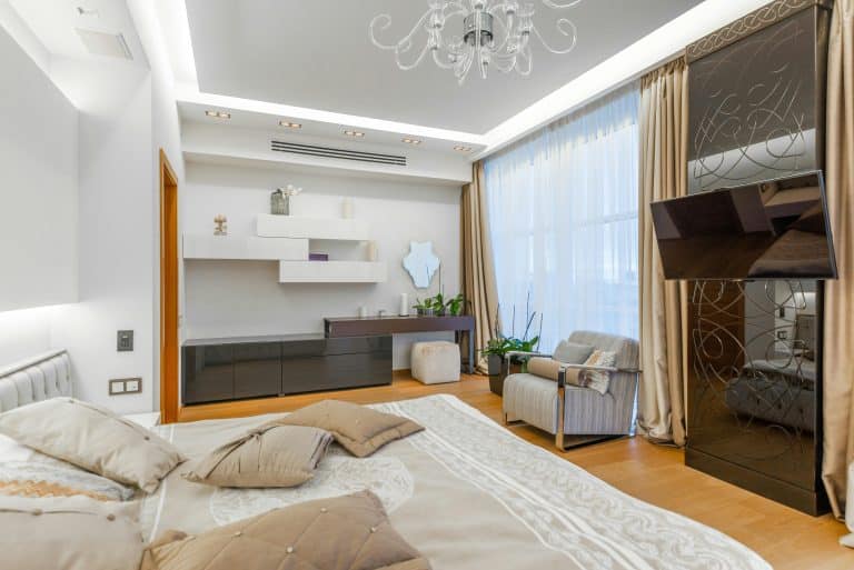
Different rooms need different balances of depth and brightness. In bedrooms, deep tones support rest by reducing visual noise, especially when paired with soft bedding and minimal furniture. Dining rooms benefit from darker walls because they frame the table and make gatherings feel more intimate, while living rooms use rich colour to ground open layouts and define zones. Adjust the amount of colour through paint, wallpaper or accessories depending on how much natural light the room receives.