

Looking for a paint color that brings a calm feel to any room while working with both warm and cool design elements?
Comfort Gray Sherwin-Williams is becoming a top choice for homeowners who want something more interesting than basic white but less dramatic than bold statement colors.
This popular shade addresses the common issue of finding a neutral that truly has character.
It delivers precisely what busy families need in their homes. The color works beautifully in any room while hiding minor scuffs and fingerprints better than stark white paint.
This review covers everything about Comfort Gray, including room applications, sampling techniques, coordinating furniture, and how lighting affects its appearance.
Comfort Gray Sherwin-Williams: Paint Color Basics
This versatile shade offers the perfect balance between color and neutrality, making it neither too bold nor too bland for most spaces.
| Paint Detail | Specification |
|---|---|
| Color Code | SW 6205 |
| Light Reflectance Value (LRV) | 54 |
| Hue Family | Green-Gray |
| Chroma | Low |
| Value | Medium-Light |
| Undertones | Blue |
| Position | Cool Neutral |
What Do These Terms Mean?
- Color Code: The specific number Sherwin-Williams uses to identify each paint color. Use this code when ordering to get the exact shade.
- Light Reflectance Value (LRV): A number from 0-100 that measures how much light a color reflects. Higher numbers mean brighter colors that reflect more light.
- Hue Family: The basic color category a paint belongs to. Green-Gray means it combines elements of both green and gray tones.
- Chroma: The intensity or purity of color. Low chroma means the paint has muted color saturation and appears subtle rather than bold.
- Value: How light or dark a color appears on a scale from black to white. Medium-Light value means the color is moderately bright.
- Undertones: Subtle color hints that show through paint. Blue undertones include hints of blue that give the color depth and coolness.
- Position: Where the color falls on the warm-to-cool spectrum. Cool Neutral means it leans cooler but remains balanced.
Why Choose SW Comfort Gray?
Comfort Gray Sherwin-Williams works across multiple design styles, from farmhouse to coastal to transitional spaces.
The blue undertones pair naturally with whites and sandy beiges, while the neutral base complements both traditional and modern elements without competing with furniture or artwork.
The gray-green tones create naturally soothing environments that work well in bedrooms, bathrooms, kitchens, and living areas.
This shade provides enough visual interest to prevent rooms from feeling sterile while maintaining a calm energy that’s especially valuable in busy households.
This color performs well in high-traffic areas and won’t show minor scuffs as readily as darker colors. The neutral nature and timeless appeal make it a smart long-term choice for families with children or pets.
7 Room Ideas for Comfort Gray
This popular shade works beautifully in every area of your home, from busy family spaces to quiet retreats. Here are seven specific ways to use this color effectively throughout different rooms.
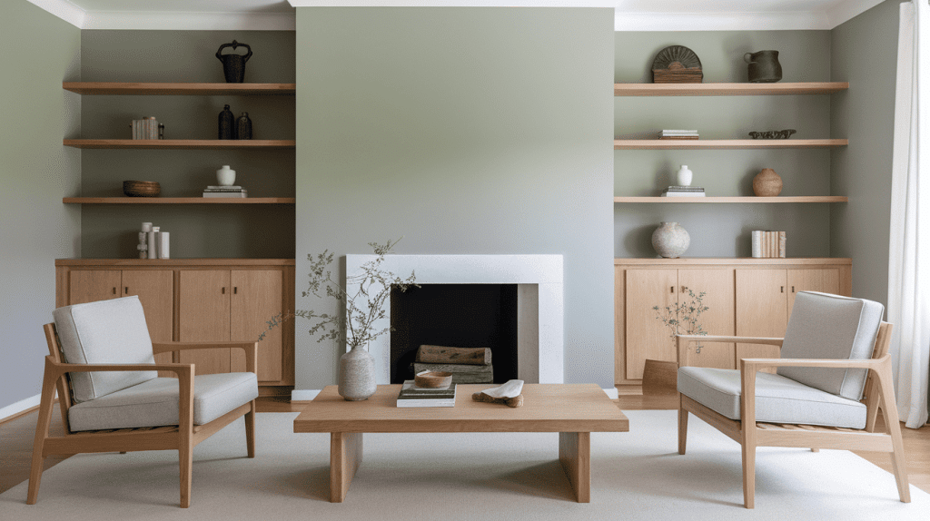
1. Main Living Areas
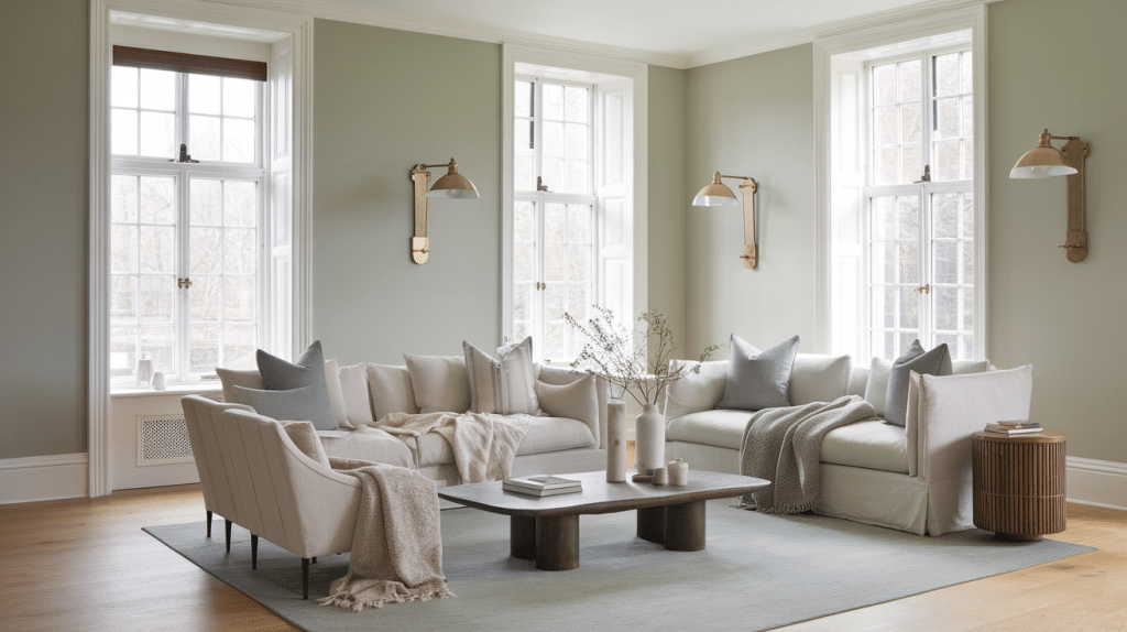
Comfort Gray Sherwin-Williams creates an ideal, calm, sophisticated backdrop for the main living spaces.
The color works beautifully with natural wood tones and layered textures like linen, wool, and rattan. Pair with white trim and warm metal accents in brass or aged bronze for a polished look.
2. Master Bedroom
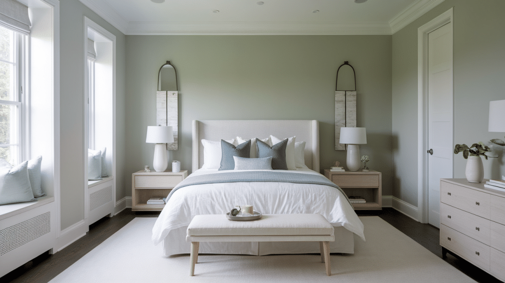
Perfect for creating a serene retreat, pairs with soft whites, dusty blues, and neutral bedding for a spa-like feel. Use on all walls for a full immersion effect or as an accent wall behind the bed for subtle drama.
3. Spa-Style Bathroom
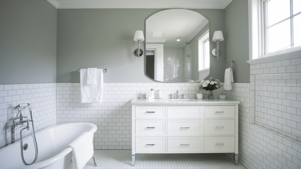
The cool undertones enhance spa vibes and create a great contrast with white subway tile and chrome fixtures. It works in both small and large bathrooms to create a fresh, clean feel that’s timeless yet modern.
4. Kitchen Cabinets
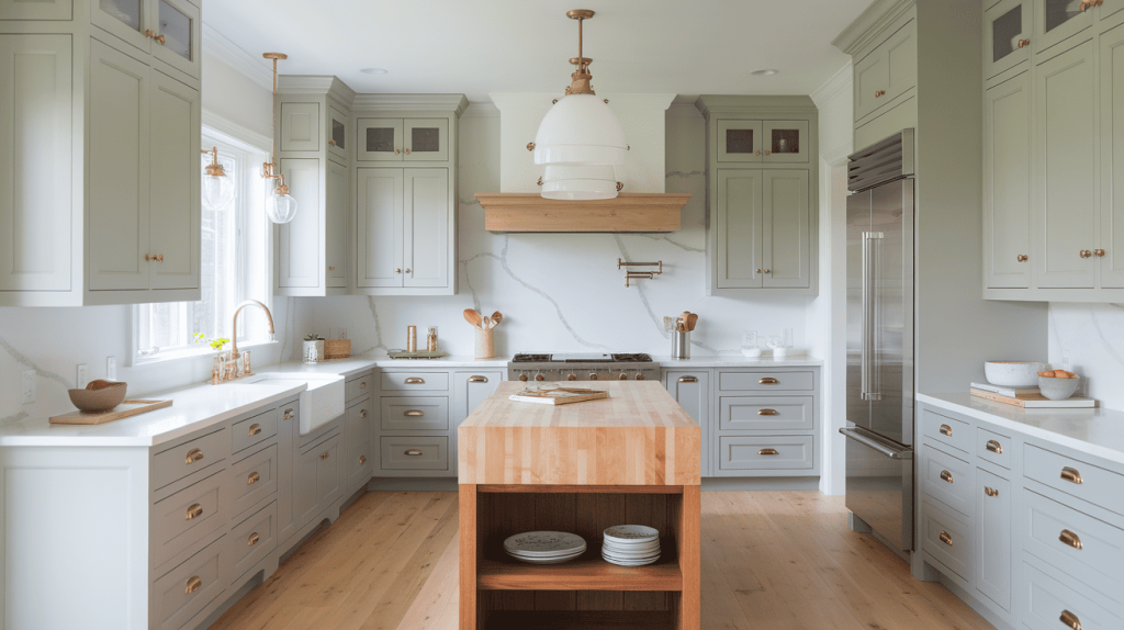
This color offers a sophisticated alternative to white cabinets while maintaining a modern yet timeless look. The paint pairs beautifully with butcher block, quartz, or marble countertops, making it versatile for various kitchen styles.
5. Formal Dining Space
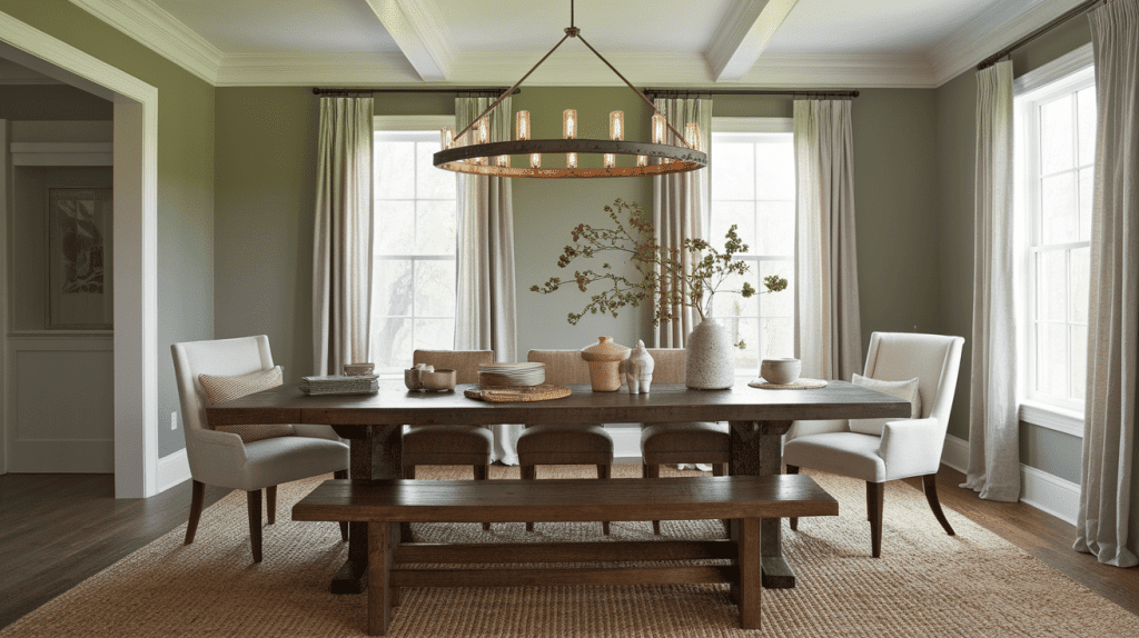
Creates a cozy atmosphere that complements darker woods and dramatic lighting fixtures. The color works well for both formal and casual dining spaces, providing the perfect backdrop for entertaining.
6. Utility Rooms
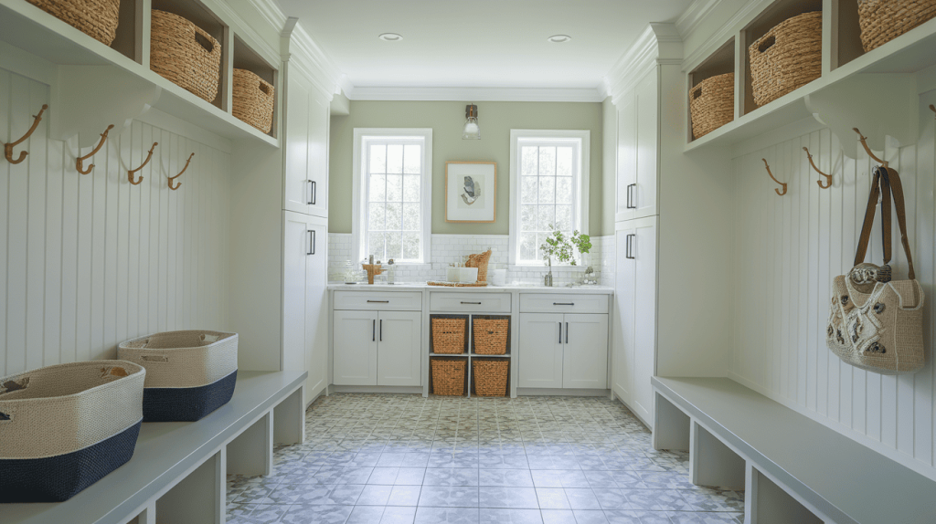
Adds personality to utility spaces while coordinating easily with tile floors and natural textures like baskets and wood hooks. Choose a durable finish for high-touch areas where the color will see daily use.
7. Home Exterior
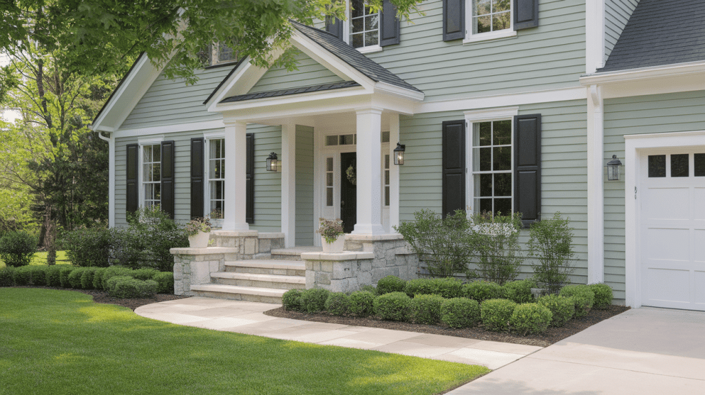
Comfort Gray Sherwin Williams works beautifully as an exterior paint choice that many homeowners overlook.
The color looks fresh with white trim, black shutters, and natural stone accents. It balances well with the surrounding greenery and adapts to changing outdoor light conditions throughout the day.
How to Sample Comfort Gray?
- Light changes how the color appears throughout the day
- Use large, removable samples (like Samplize) that stick to your wall – more accurate than small paint chips
- Purchase small containers of SW Comfort Gray and paint directly on the walls for the most accurate representation
- Paint samples on different walls in the same room – north-facing walls show different tones than south-facing ones
- Check samples in morning light, afternoon sun, and evening artificial light
- Hold samples next to your flooring, trim color, and furniture to ensure undertones work together
- Keep samples up for at least a week to see the color in different lighting conditions
Comfort Gray Furniture Pairing
Pairing the right materials and finishes with your paint creates spaces that feel thoughtfully designed.
The key is selecting furniture pieces that either complement or contrast beautifully with your wall color to achieve the desired mood in each room.
1. Light Wood Tones
Oak, maple, and pine furniture work beautifully with the color. The natural wood grains complement the colors’ organic feel, creating warm, welcoming spaces that feel both modern and timeless.
2. Rattan and Wicker
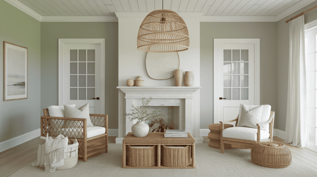
These materials enhance the coastal potential of SW Comfort Gray. Use them for accent chairs, baskets, or light fixtures to add texture and natural elements that pair perfectly with the blue undertones.
3. Darker Woods
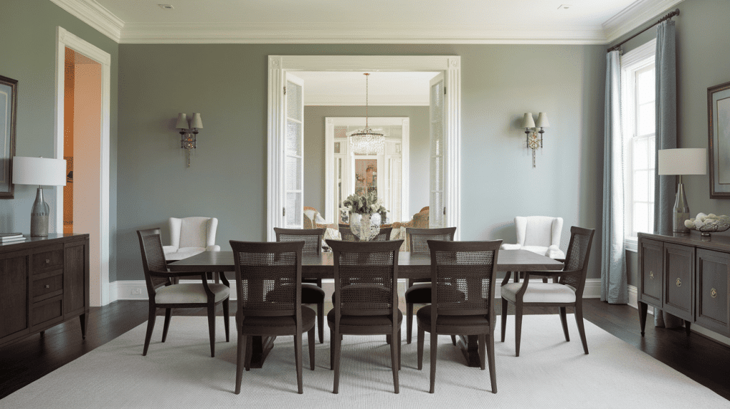
Walnut, cherry, and espresso finishes create a striking contrast against Comfort Gray Sherwin-Williams. This combination works well in more formal or traditional settings where you want depth and sophistication.
4. Metal Finishes
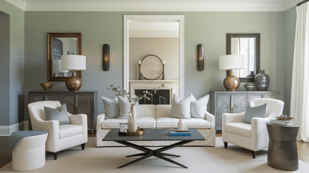
Brass, bronze, and black metals all pair well with this color. Choose based on your overall design style: brass for warmth, bronze for richness, or black for a modern contrast.
5. Upholstered Pieces
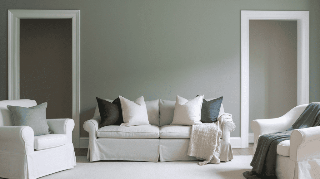
Soft linens and cottons in whites, creams, and other muted tones create a cohesive, calming palette. For accent pieces, deeper blues and greens work well as throw pillows and blankets to complement the paint’s undertones.
Comfort Gray vs Similar Colors
This color often gets compared to other popular neutral paint colors like Sea Salt, Oyster Bay, and Repose Gray. Understanding these differences helps you choose the right shade for your specific room and lighting conditions.
Comfort Gray vs Sea Salt
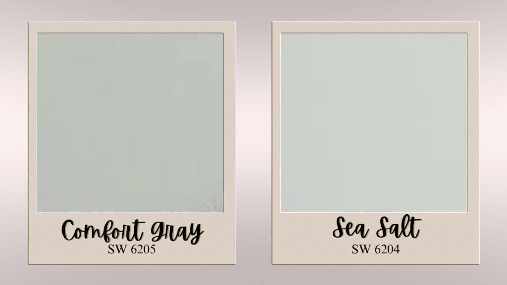
Sea Salt is lighter and more coastal than Comfort Gray Sherwin Williams with stronger blue undertones. It works better in rooms with limited natural light, while this color handles more dramatic lighting conditions.
| Feature | Comfort Gray | Sea Salt |
|---|---|---|
| LRV | 54 | 63 |
| Undertones | Blue | More blue, less green |
| Brightness | Medium-light | Lighter and airier |
| Applications | Versatile, all rooms | Coastal, bright spaces |
Comfort Gray vs Oyster Bay
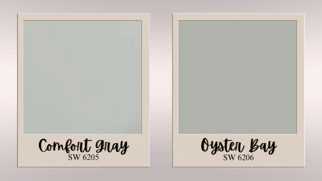
Oyster Bay is deeper and more green-focused than this paint color with richer color saturation. Choose Oyster Bay if you want more drama and color intensity in your space.
| Feature | Comfort Gray | Oyster Bay |
|---|---|---|
| LRV | 54 | 44 |
| Undertones | Blue | Stronger green |
| Brightness | Medium-light | Deeper, richer |
| Applications | Balanced spaces | Dramatic, bold looks |
Comfort Gray vs Repose-Gray
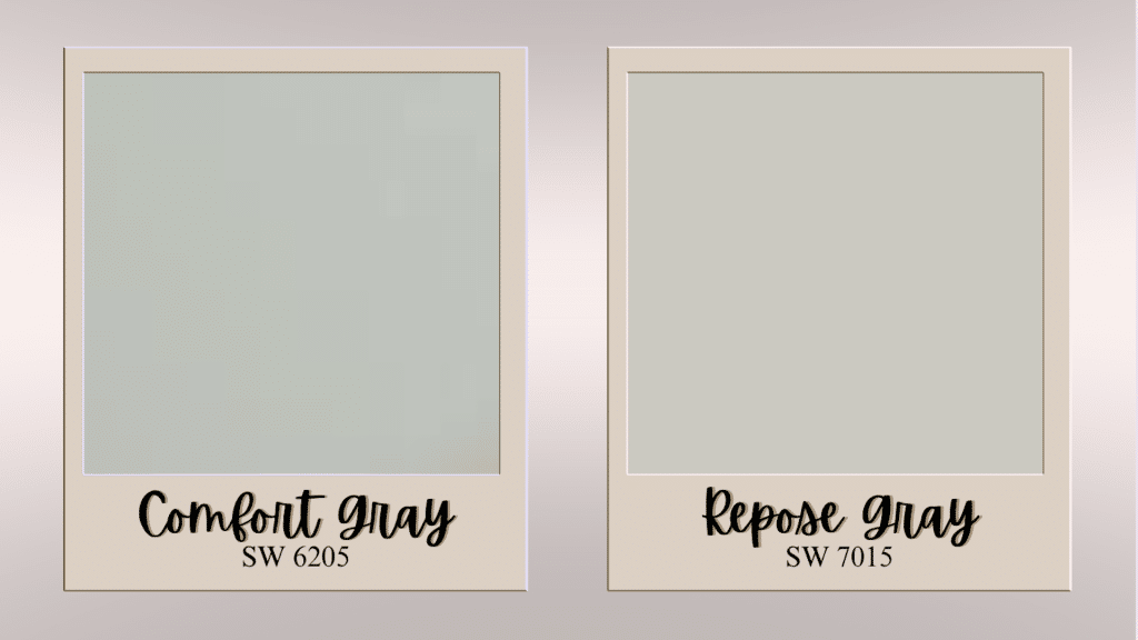
Repose Gray is a true greige without the blue-green undertones found in this color. Repose Gray works better in modern settings, while Comfort Gray Sherwin Williams suits both traditional and contemporary spaces.
| Feature | Comfort Gray | Repose Gray |
|---|---|---|
| LRV | 54 | 58 |
| Undertones | Blue-green | Beige (greige) |
| Brightness | Medium-light | Slightly brighter |
| Applications | Traditional and modern | Modern, minimalist |
How does Different Lighting Affect Comfort Gray?
North-Facing Rooms: SW Comfort Gray emphasizes cooler blue-gray tones. Works well for formal dining rooms or offices.
South-Facing Rooms: Southern light brings out green undertones, making the color feel warmer. Perfect for living rooms and bedrooms.
East-Facing Rooms: Morning light makes the color appear fresh. The color shifts from cool to warm tones throughout the day.
West-Facing Rooms: Creates dramatic daily changes from cool morning tones to warm evening undertones.
Artificial Lighting: Warm LED bulbs create a cozy ambiance, while cool LEDs produce a crisp, modern look.
The Bottom Line
Comfort Gray Sherwin-Williams stands out as a versatile paint choice that solves common decorating challenges.
This calming green-gray color brings character to any space without overwhelming your existing decor or furniture.
The subtle blue undertones prevent the flat appearance that many homeowners dislike about traditional gray paints.
From cozy bedrooms to dining rooms, this color adapts beautifully to your lighting conditions and design style.
The practical benefits make it especially appealing for busy families who need paint that looks good while hiding everyday wear.
Comfort Gray Sherwin-Williams creates calm, inviting spaces that feel both current and timeless. Take time to sample properly and enjoy watching this beautiful color redesign your rooms.