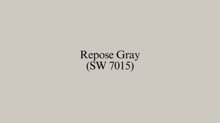
Best Cabinet Colors for Repose Gray Walls, Sherwin Williams
Are you struggling to find the perfect cabinet color that complements your Repose Gray walls?
You’re not alone in this design dilemma.
Many homeowners love their Repose Gray walls but struggle with similar cabinet options, such as light French gray and Repose gray, when creating a cohesive look.
The wrong cabinet choice can leave your kitchen looking flat or mismatched.
This guide showcases nine attractive cabinet color combinations that complement Repose Gray walls beautifully.
From crisp whites that brighten your space to bold, dark colors that create dramatic contrast, you’ll find the perfect match to create a kitchen that feels both timeless and personal for your home.
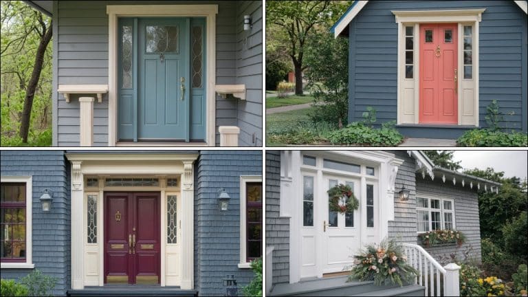
Why Does Repose Gray Need Cabinet Contrast?
Repose Gray’s complex undertones make cabinet selection more important than you might think. This beloved neutral contains subtle beige and greige undertones that can appear different under various lighting conditions.
Without proper contrast, your kitchen risks looking flat and monotonous. The right cabinet color creates visual interest and helps define different areas of your space.
Why contrast matters?
- Temperature Balance: Repose Gray leans slightly warm, making it essential to choose cabinet colors that either complement or balance this warmth.
- Light Reflection: Different cabinet colors affect how light bounces around your kitchen, with lighter cabinets reflecting more light.
- Design Definition: Contrasting cabinet colors help separate wall and storage elements, creating clear design boundaries that make your kitchen feel organized.
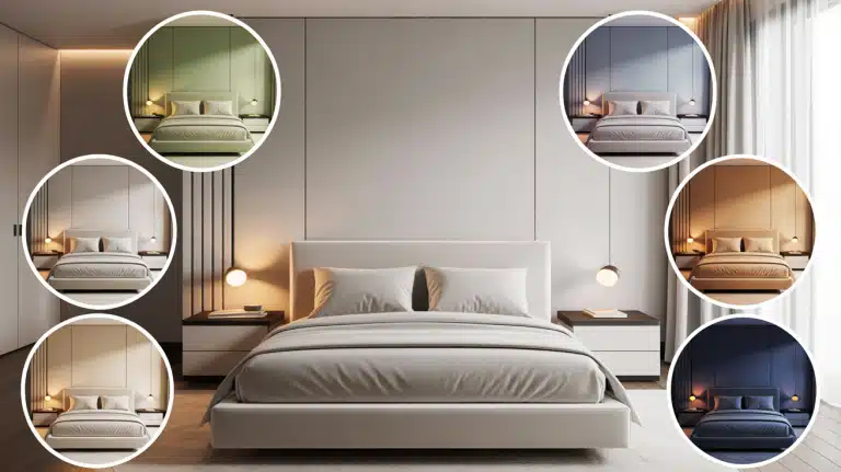
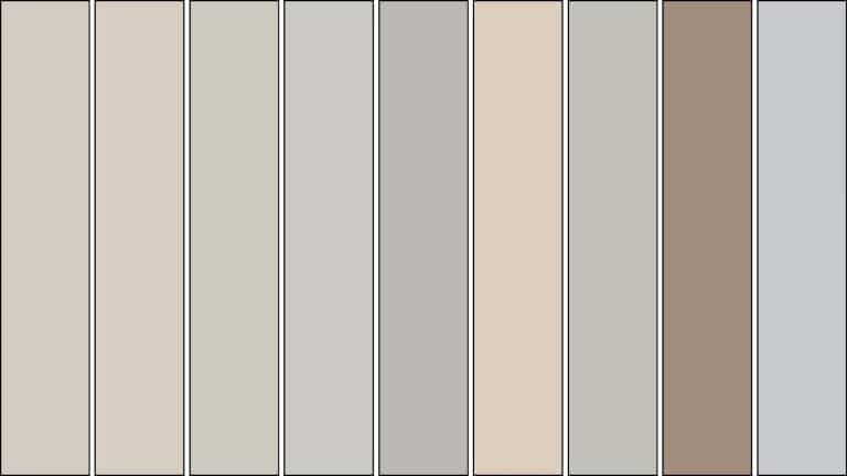
9 Best Cabinet Colors that Complement Repose Gray Wall
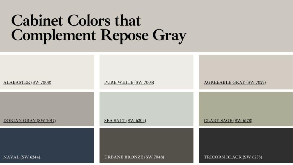
These nine cabinet colors convert kitchens with Repose Gray walls. Each choice brings distinct advantages, whether you want bright contrast, subtle harmony, or statement-making depth for your space.
1. Alabaster (SW 7008)
Alabaster creates a classic, timeless combination with Repose Gray walls. This warm white cabinet color provides clean contrast without feeling stark or cold.
Why it works:
- Complements Repose Gray’s warm undertones.
- Its soft tone enriches openness without overwhelming the room.
- Pairs well with both modern and traditional hardware.
- Creates an open, airy feeling.
Best applications: Traditional kitchens, farmhouse styles, and smaller spaces that need light reflection.
2. Pure White (SW 7005)
Pure White offers crisp, clean contrast that makes Repose Gray walls pop. This true white cabinet choice works especially well in contemporary kitchen designs.
Why it works:
- Its crisp tone highlights modern lines and sharpens details.
- Makes colorful backsplashes and accessories stand out.
- Pairs effortlessly with both sleek chrome and warm brass tones.
- Keeps the overall look crisp, polished, and timeless.
Best applications: Modern kitchens, spaces with abundant natural light, and homes featuring colorful decor elements.
3. Agreeable Gray (SW 7029)
Agreeable Gray cabinets create a sophisticated monochromatic look that’s anything but boring. This slightly lighter gray provides subtle contrast while maintaining color harmony.
Why it works:
- Creates depth without stark contrast.
- Maintains a cohesive color story.
- Works beautifully with stainless steel appliances.
- Offers flexibility for accent colors.
Best applications: Contemporary kitchens, open floor plans, and spaces that require subtle elaborateness.
4. Dorian Gray (SW 7017)
Dorian Gray offers more contrast than Agreeable Gray while staying within the same color family. This medium gray creates beautiful depth against Repose Gray walls. Add Sherwin-Williams Gray’s color with no undertones, for the trim to complete the look.
Why it works:
- Its mid-depth shade grounds the space, adding dimension.
- Creates a clean look, spa-like atmosphere.
- Hides fingerprints and wears better than lighter colors.
- Complements both warm and cool accent colors.
Best applications: Master bathrooms, butler’s pantries, and kitchens where a calm atmosphere is desired.
5. Sea Salt (SW 6204)
Sea Salt cabinets bring a gentle blue-green tint that creates a beautiful contrast with Repose Gray’s warm undertones. This soft color adds personality without overwhelming the space.
Why it works:
- Introduces subtle color while staying neutral.
- Creates a calming, coastal-inspired atmosphere.
- Complements natural wood elements beautifully.
- Works well with white or cream countertops.
Best applications: Coastal-style kitchens, breakfast nooks, and spaces that require a gentle color palette.
6. Clary Sage (SW 6178)
Clary Sage offers a more pronounced green undertone, creating a striking contrast with Repose Gray walls. This nature-inspired color brings life to kitchen spaces.
Why it works:
- Adds personality and character to neutral spaces.
- Creates a fresh, organic feeling.
- Pairs beautifully with natural materials.
- Offers excellent contrast without being overwhelming.
Best applications: In a Farmhouse kitchen, spaces with natural wood elements, and homes with garden views.
7. Naval (SW 6244)
Naval cabinets create a bold, polished contrast that makes Repose Gray walls feel lighter and brighter. This rich navy works especially well in larger kitchens.
Why it works:
- Creates a dramatic contrast that feels luxurious.
- Makes white countertops and backsplashes pop.
- Hides daily wear and fingerprints effectively.
- Adds richness and depth to kitchen designs.
Best applications: Large kitchens, formal dining areas, and spaces where you want to make a statement.
8. Urbane Bronze (SW 7048)
Urbane Bronze brings cultivated warmth that complements Repose Gray’s undertones beautifully. This rich brown-bronze color creates an upscale, custom look.
Why it works:
- Provides warm contrast that feels inviting.
- Creates a rich, expensive appearance.
- Works well with gold and brass hardware.
- Complements natural wood elements.
Best applications: Traditional kitchens, spaces with warm wood floors, and homes with classic architecture.
9. Tricorn Black (SW 6258)
Tricorn Black creates the most dramatic contrast possible with Repose Gray walls. This classic black works especially well in modern and transitional kitchen designs.
Why it works:
- Bold depth improves culture and defines cabinetry strongly.
- Makes Repose Gray walls appear lighter and warmer.
- Provides a timeless, refined look.
- Accents beautifully with matte metals or polished gold details.
Best applications: Large kitchens with plenty of natural light, modern designs, and spaces where you want bold contrast.
Final Thoughts
Choosing the right cabinet color to complement your Repose Gray walls can completely change your kitchen’s atmosphere.
Lighter shades, such as Alabaster and Pure White, create an airy, spacious feel, while medium grays offer subtle balance. Bold choices like Naval and Tricorn Black make striking statements.
Your decision should reflect your lifestyle, kitchen size, and the amount of natural light available.
Consider your preferred contrast level and whether you want calm neutrals or eye-catching drama. Each color pairing creates distinct moods, from serene to vibrant spaces.
Always test paint samples in your actual lighting conditions before making a decision. The perfect cabinet color will make your Repose Gray walls truly shine.
What questions do you have about creating your ideal kitchen color scheme?