Best Bedroom Colors: 17 Shades for Better Sleep
Staring at paint swatches for hours and still feeling unsure?
Most people pick a bedroom color based on a tiny chip under store lighting, then wonder why it looks completely wrong at home.
The color that looked perfect in the store can turn your bedroom into a space that feels off every single day. This post breaks down proven bedroom colors that actually work in real homes.
You’ll learn how room size and lighting affect your choice, which paint brands deliver the best results, and how to test colors before you commit.
No guesswork, just practical advice that helps you get it right the first time.
How to Choose the Right Bedroom Color?
Picking the right bedroom color is not just about what looks good online. You need to think about your actual room. Consider the size, the light it gets, and what you already own. A color that works in one bedroom might feel completely wrong in yours.
- Room size and ceiling height: Light colors make small rooms feel bigger, while darker shades add coziness to large spaces with high ceilings.
- Natural and artificial lighting: Test colors in morning and evening light, as north-facing rooms stay cooler while south-facing rooms get warmer throughout the day.
- Existing furniture, flooring, and fabrics: Your paint should complement wood tones, bedding colors, and floor materials already in the room rather than clash with them.
- Long-term appeal vs trend-based choices: Choose colors you can live with for 5 to 7 years instead of chasing what is popular right now on social media.
Best Bedroom Colors for Popular Design Styles
Different design styles call for other color approaches. Here’s a quick guide to match your bedroom color with your preferred style.
| Design Style | Best Bedroom Colors | Why It Works |
|---|---|---|
| Modern and Minimalist | Soft white, pale gray, charcoal gray, blue gray | Clean lines and neutral palettes let the architecture shine without visual clutter |
| Traditional and Classic | Warm cream, classic beige, navy blue, deep forest green | Rich, timeless colors create a sense of comfort and established style |
| Boho and Eclectic | Soft sage green, terracotta, muted olive, blush pink | Earthy tones and gentle colors provide a calm backdrop for layered textures and patterns |
| Farmhouse and Rustic | Warm cream, light greige, soft white, warm mocha brown | Natural, warm neutrals complement wood beams, shiplap, and vintage furniture |
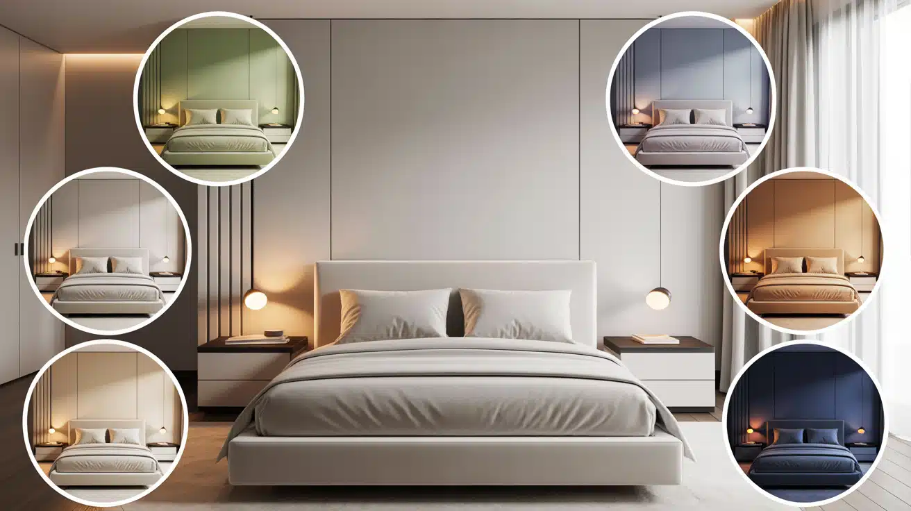
Best Bedroom Color Ideas That Work for Most Homes
These bedroom colors have proven their staying power in real homes. They work across different styles, lighting conditions, and room sizes. Here are 17 options that deliver both comfort and visual appeal.
1. Soft White
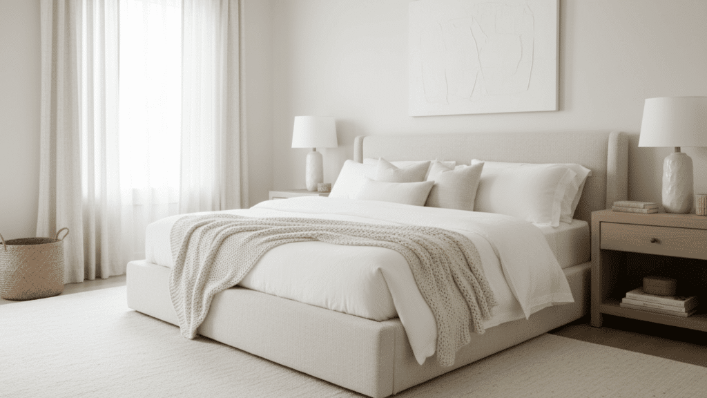
Soft white gives you a fresh, clean backdrop without the harshness of pure white. It reflects light well and makes small bedrooms feel more open. This shade works with any decor style you choose.
- Best for: Small bedrooms, rental properties, and spaces with limited natural light.
- Pairing tip: Layer in texture through linen curtains, woven baskets, and wood furniture to avoid a sterile look.
- Avoid: Using it in freezing, north-facing rooms where it can feel too clinical.
2. Warm Cream
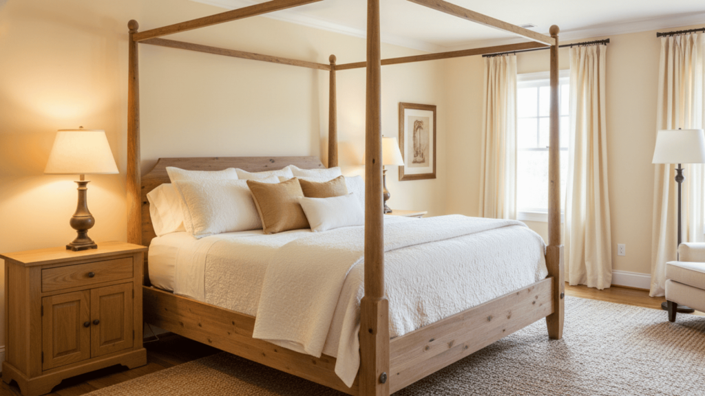
Warm cream brings softness to your walls without feeling cold or clinical. It has yellow undertones that create a welcoming atmosphere. This color pairs beautifully with natural wood furniture.
- Best for: Master bedrooms, guest rooms, and spaces with traditional furniture.
- Lighting note: Looks best in rooms with warm bulbs rather than cool white LED lighting.
- Style match: Works perfectly with farmhouse, cottage, and transitional decor styles.
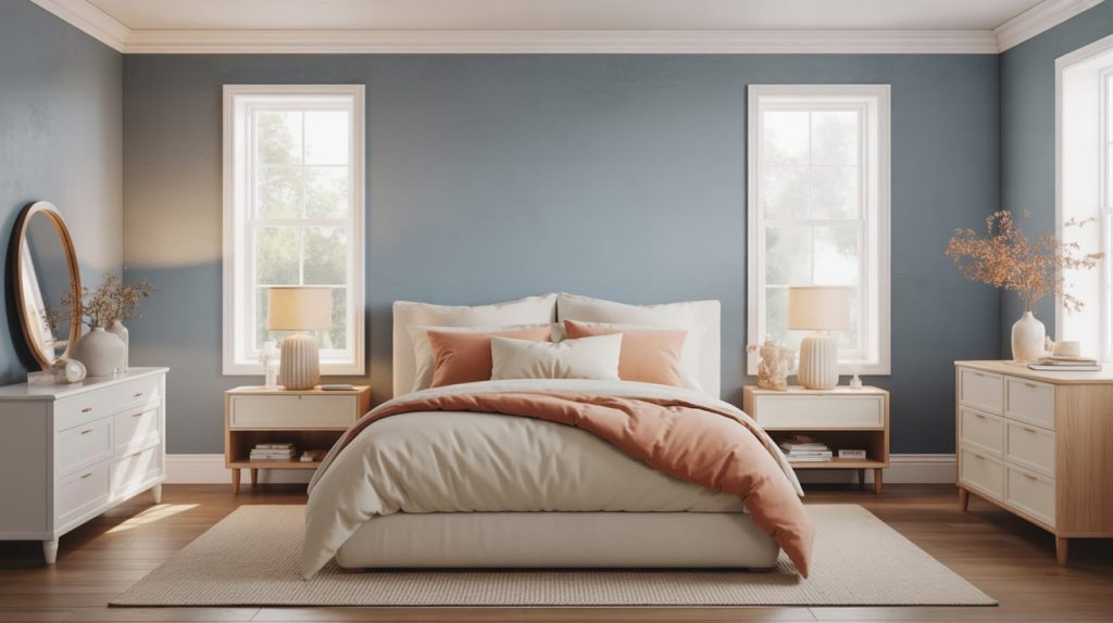
3. Soft Peach
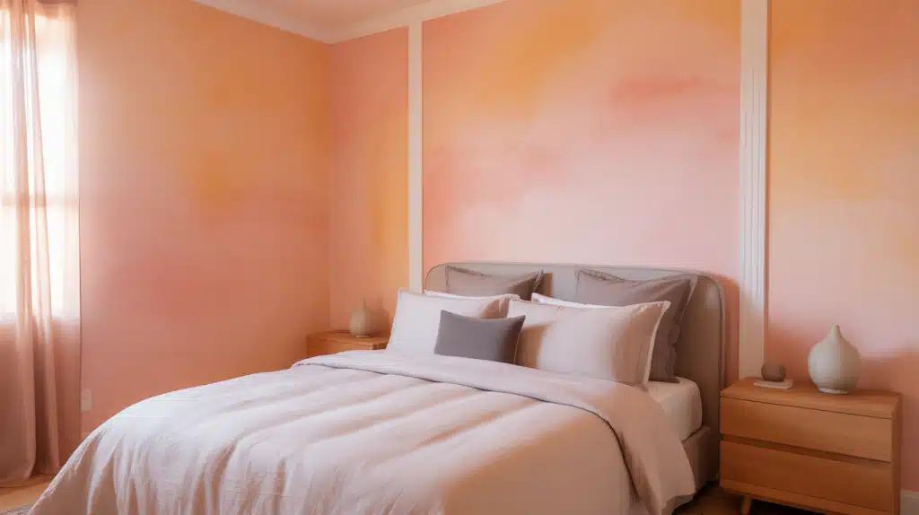
Soft peach adds gentle warmth and a touch of personality without being too bold. It has pink and orange tones that create a welcoming, upbeat mood. This color feels fresh and different while still being calming enough for sleep.
- Best for: Rooms with northern exposure, anyone wanting something cheerful but not bright, and spaces that feel too neutral.
- Unique advantage: Makes skin tones look healthier and more flattering in mirrors and photos.
- Modern styling: Pair with gray accents, white trim, and natural wood to keep it sophisticated rather than childish.
4. Pale Mint
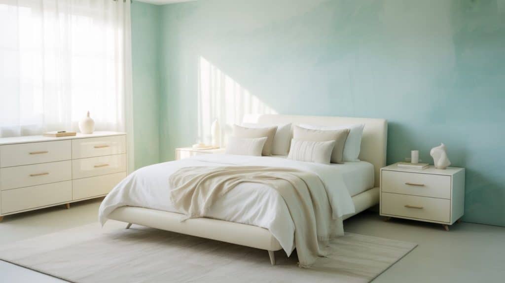
Pale mint brings a cool, refreshing feeling that stays light and airy. It has green and blue undertones that create a spa-like atmosphere. This color works surprisingly well as a neutral backdrop.
- Best for: Small bedrooms, hot and humid climates, and creating a clean, fresh vibe.
- Styling tip: Combine with white furniture and gold hardware for a modern look.
- Cooling effect: Makes warm rooms feel more comfortable without actually changing the temperature.
5. Soft Butter Yellow
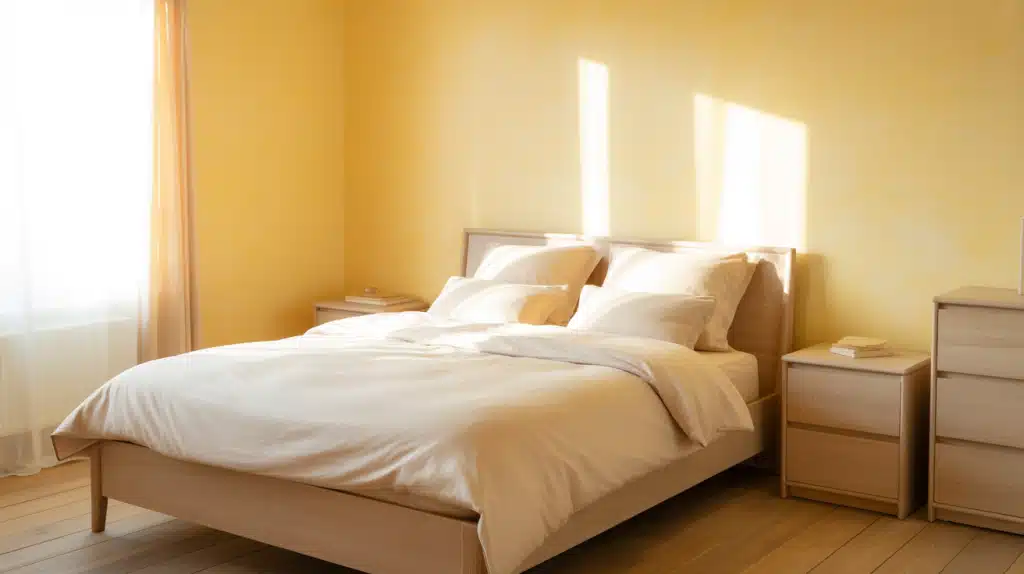
Soft butter yellow fills your bedroom with warmth and gentle energy. It has cream undertones that keep it from feeling too bright or childish. This color instantly makes dark rooms feel sunnier and more inviting.
- Best for: Basement bedrooms, rooms with limited windows, and anyone who struggles with morning energy.
- Mood benefit: Yellow tones naturally boost mood and make you feel more awake and positive.
- Balance it: Use white bedding and light wood furniture to prevent the color from overwhelming the space.
6. Blue Gray
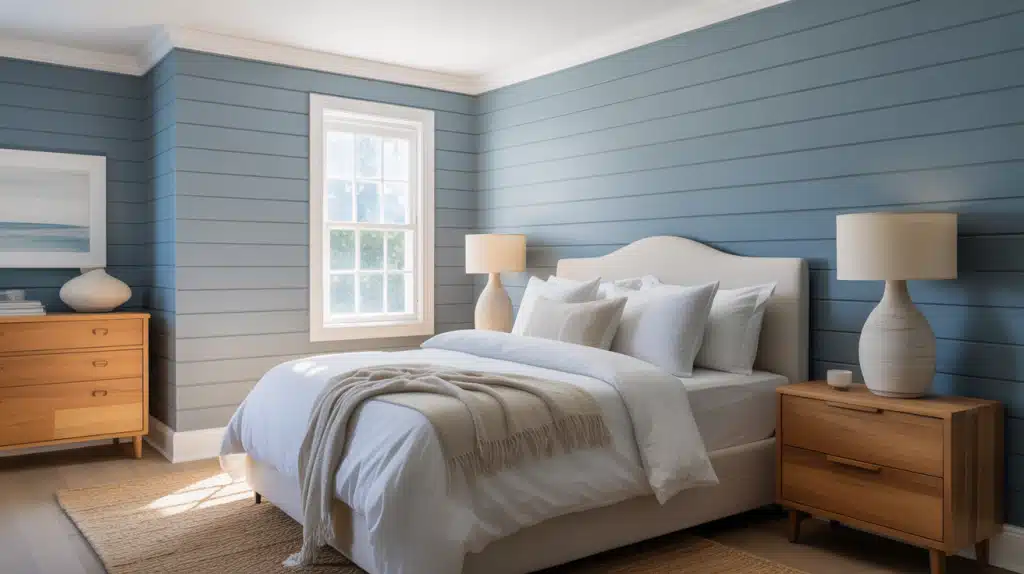
Blue gray brings a relaxing vibe with a hint of color interest. It feels more personal than plain gray but still stays neutral. This shade looks different throughout the day as light changes.
- Best for: Master suites, coastal-inspired rooms, and spaces that need a calming effect.
- Lighting note: Appears more blue in natural light and grayer under warm artificial light.
- Pro tip: Pair with crisp white bedding and natural wood to keep it from feeling too cool.
7. Soft Teal
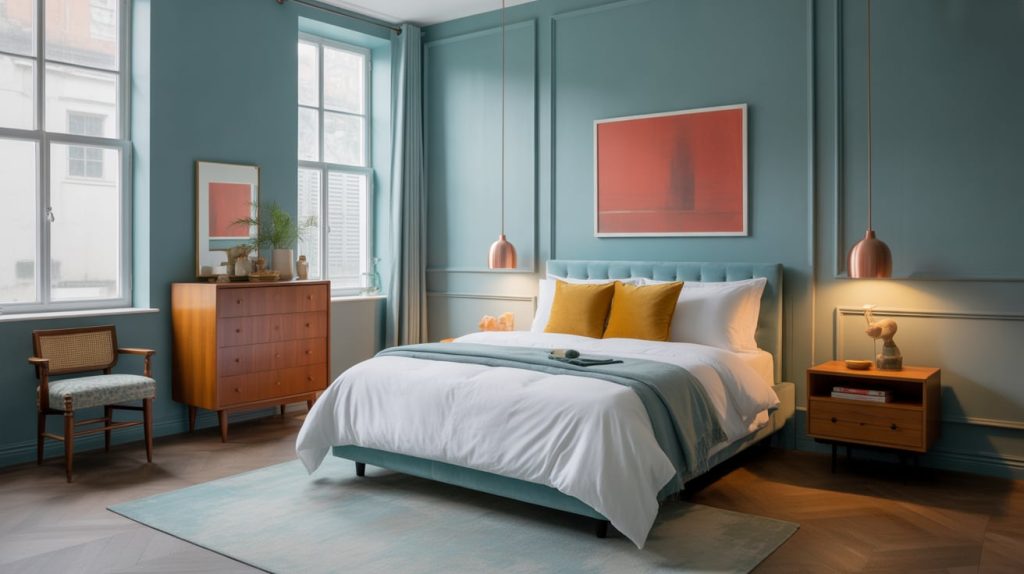
Soft teal gives you a blue-green mix that feels both fresh and grounded at the same time. It has more depth than mint but stays lighter than standard teal. This color works for people who want something interesting without going too bold.
- Best for: Creative spaces, bedrooms with vintage furniture, and anyone bored with typical neutrals.
- Unique quality: Looks completely different depending on your lighting, shifting from more blue to more green throughout the day.
- Bold pairing: Works surprisingly well with warm wood tones, copper fixtures, and mustard or coral accents for a modern eclectic look.
8. Muted Olive
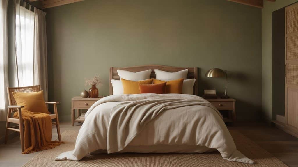
Muted olive adds depth and warmth without overwhelming your space. It feels grounded and sophisticated at the same time. This shade pairs well with natural materials like wood and linen.
- Best for: Larger bedrooms, rooms with high ceilings, and vintage-inspired spaces.
- Pairing suggestion: Use mustard or burnt orange accents for a warm, layered look.
- Tip: Apply a matte finish to reduce any intensity and enhance the earthy feel.
9. Dusty Blue
Dusty blue creates a serene, airy feeling that helps you wind down. It has just enough color to feel intentional without being loud. This shade complements both warm and cool decor elements.
- Best for: Primary bedrooms, nurseries, and rooms with white or light wood furniture.
- Pro tip: Add warmth through bedding in cream, tan, or soft peach tones.
- Lighting note: Needs at least moderate natural light to avoid looking flat or dull.
10. Navy Blue
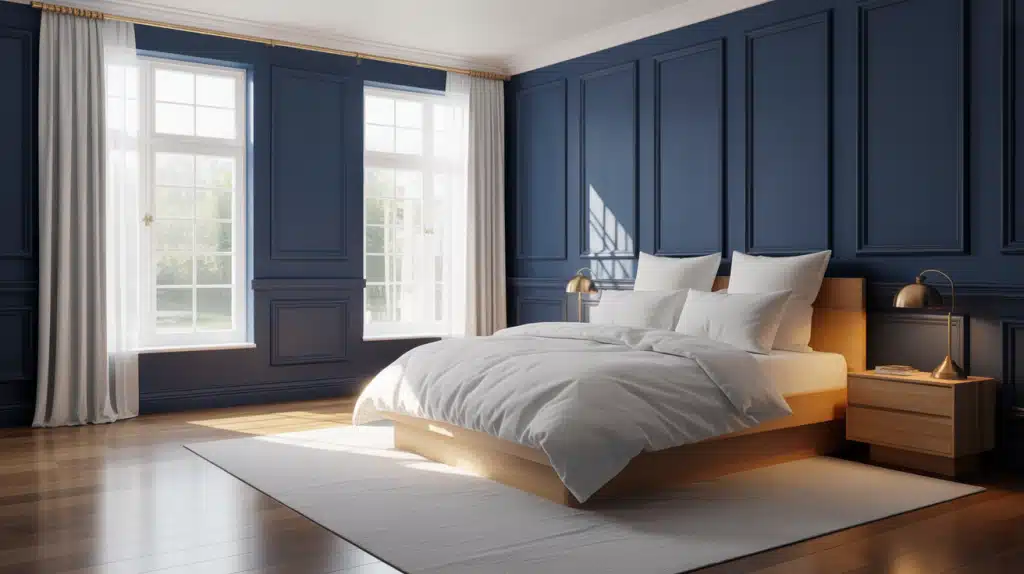
Navy blue makes a bold statement while still feeling restful. It works best in larger bedrooms with plenty of light. Balance this deep color with white bedding and light wood furniture.
- Best for: Spacious bedrooms, rooms with large windows, and modern traditional homes.
- Avoid: Small spaces or rooms with low ceilings where it can feel cramped.
- Pairing tip: Use brass or gold fixtures to warm up the calm tone.
11. Lavender Gray
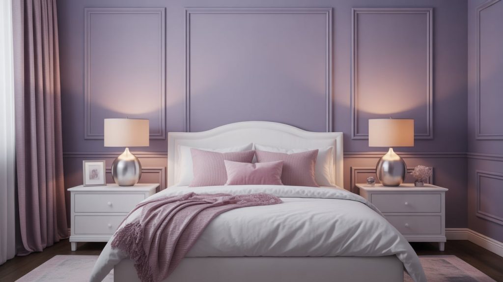
Lavender gray gives you a gentle hint of color with gray’s practicality. It adds personality without committing to a full purple bedroom. This shade feels both calming and slightly feminine.
- Best for: Teen bedrooms, guest rooms, and spaces that need a soft touch.
- Works well with: White furniture, silver accents, and soft pink or gray textiles.
- Consider: Testing in evening light, as the purple undertones become more visible at dusk.
12. Blush Pink
Blush pink is softer and more neutral than you might expect. It creates a warm, inviting space that works for adults, too. This color looks sophisticated when paired with gray or navy accents.
- Best for: Rooms with cool northern light, modern, feminine spaces, and guest bedrooms.
- Style match: Works in contemporary, glam, and French country interiors.
- Pro tip: Balance with darker elements like charcoal pillows or black picture frames.
13. Taupe
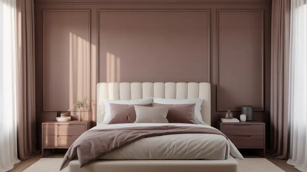
Taupe is an understated workhorse that never fails. It combines brown and gray for a color that feels both warm and modern. This shade works with almost any furniture color you own.
- Best for: Flexible spaces, homes you plan to sell, and bedrooms with mixed decor.
- Pairing suggestion: Layer different shades of taupe and cream for depth without contrast.
- Tip: Choose one with pink undertones for warmth or green undertones for coolness.
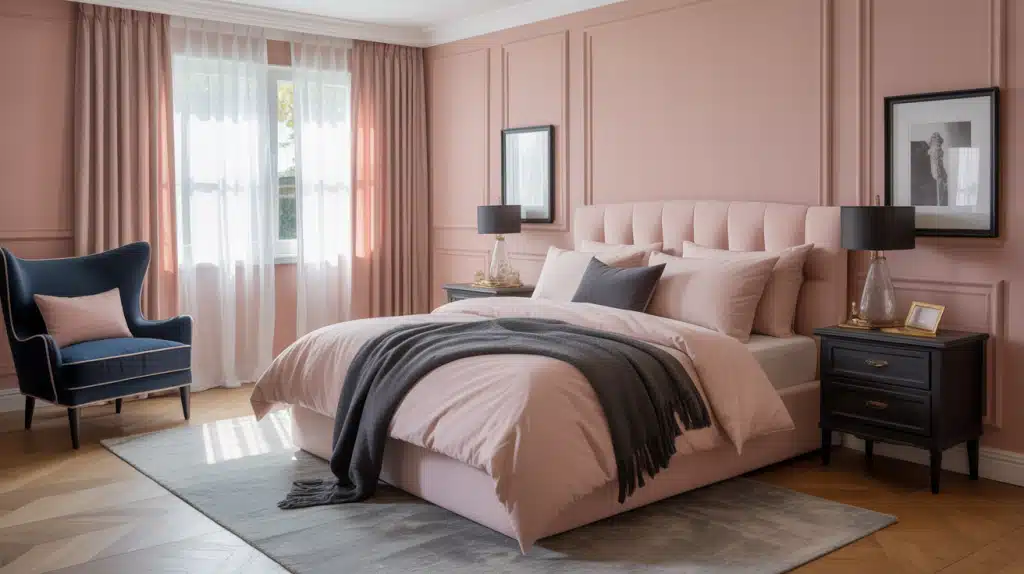
14. Terracotta
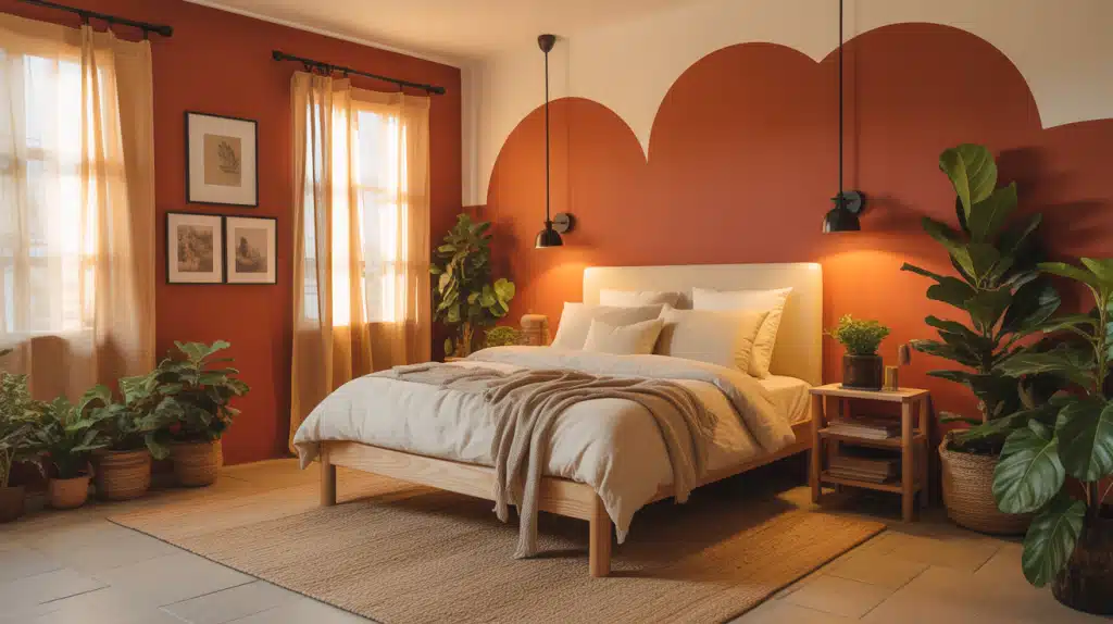
Terracotta brings warmth and earth tones to your bedroom walls. It creates a cozy atmosphere without feeling heavy or dark. This color pairs especially well with natural fiber rugs and plants.
- Best for: Southwest-style homes, boho bedrooms, and spaces with lots of plants.
- Works well with: Cream bedding, wicker furniture, and black metal accents.
- Lighting note: Looks richer in warm light and more muted in cool or dim conditions.
15. Charcoal Gray

Charcoal gray adds drama and sophistication to larger bedrooms. It makes white trim and light bedding pop beautifully. Use this color only if your room gets good natural light.
- Best for: Large master bedrooms, loft-style spaces, and modern industrial interiors.
- Avoid: Rooms smaller than 12×12 feet or with limited windows.
- Pro tip: Paint the ceiling a lighter gray to prevent the space from feeling too enclosed.
16. Deep Forest Green
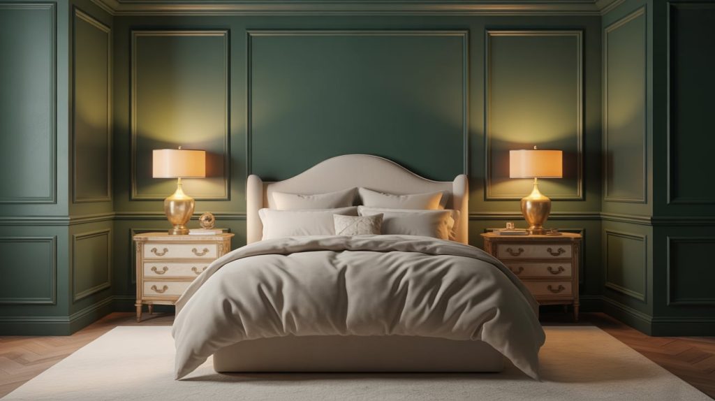
Deep forest green creates a rich, calming retreat. It feels luxurious and brings the outdoors inside your space. This color works best with brass or gold hardware and warm lighting.
- Best for: Traditional bedrooms, rooms with architectural details, and creating a cocooning effect.
- Pairing suggestion: Use cream or ivory bedding to lighten the overall mood.
- Style match: Perfect for English country, maximalist, and modern traditional styles.
17. Warm Mocha Brown
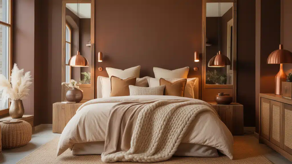
Warm mocha brown wraps your bedroom in cozy comfort. It makes the space feel intimate without being too dark. Pair this shade with cream or tan bedding to keep things balanced.
- Best for: Cold climates, rooms with lots of windows, and creating a hotel-like feel.
- Works well with: Natural wood tones, woven textures, and warm metallics like copper.
- Tip: Use plenty of layered lighting to avoid any cave-like feeling in the evening.
Best Bedroom Colors Based on Room Size and Light
Your room’s size and natural light should guide your color choice. What works in a bright, spacious bedroom can feel completely wrong in a small, dim space.
- Best shades for small bedrooms: Light colors like soft white, pale gray, and warm cream reflect light and make the room feel larger than it actually is.
- Colors that work well in large bedrooms: Deeper shades like navy blue, charcoal gray, or forest green add intimacy and prevent the space from feeling cold or empty.
- Low-light vs sun-filled spaces: Rooms with little natural light need warm colors like cream or beige, while sun-filled rooms can handle cooler tones like blue gray or sage green.
- Using contrast to enhance proportions: Paint one accent wall in a darker shade to add depth, or use lighter colors on the ceiling to make low ceilings appear higher.
Best Paint Brands for Bedroom Colors
The brand you choose affects how your color looks on the wall and how long it lasts. These five paint brands consistently deliver quality results for bedroom projects.
1. Sherwin-Williams
Sherwin-Williams offers reliable coverage and colors that look the same on your wall as they do on the sample card. Their paints hold up well to cleaning and wear over time. Most contractors and designers trust this brand for consistent results.
- Known for durability and balanced undertones
- Wide range of neutral and calming bedroom shades
2. Benjamin Moore
Benjamin Moore paints cost more but deliver richer color depth and smoother finishes. Their neutrals have complex undertones that change beautifully with the light throughout the day. This brand works especially well for creating sophisticated, layered bedroom looks.
- Premium finishes with excellent color depth
- Popular for soft neutrals and complex hues
3. Behr
Behr gives you solid quality at prices that fit most budgets. Their paint covers well in one or two coats, which saves you time and money. You can find this brand at Home Depot stores nationwide.
- Budget-friendly with strong coverage
- Ideal for DIY bedroom updates
4. Valspar
Valspar sits in the middle for both price and performance. They update their color palette regularly to include current trends. This brand works well when you want to try a bolder shade on just one accent wall.
- Good mid-range option with trend-forward colors
- Works well for accent walls
5. Farrow & Ball
Farrow & Ball uses high pigment levels that create depth you cannot get from standard paints. Their unique finishes have a soft, chalky quality that looks expensive. Choose this brand when you want your bedroom to feel truly special.
- Rich pigments and distinctive finishes
- Best for statement bedrooms
Bedroom Color Mistakes That Ruin the Look
Even small mistakes in choosing bedroom colors can lead to disappointing results. Here are the most common errors and why they matter.
| Mistake | The Problem |
|---|---|
| Skipping sample testing | Colors look completely different on your wall than on a tiny chip or screen |
| Ignoring undertones | Your beige turns peach, your gray looks purple, or your white feels cold |
| Choosing overly dark colors for low-light rooms | The room feels smaller, darker, and cave-like instead of relaxing |
| Forgetting about the paint finish | The color looks duller or shinier than expected and may be hard to clean |
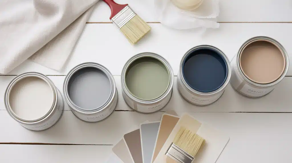
How to Test Bedroom Colors Before Painting
Testing paint colors before committing saves you time, money, and regret. Paint large sample boards or apply patches directly on your walls in different areas of the room.
View these samples in morning light, afternoon sun, and evening lamp light because colors shift dramatically throughout the day.
Hold your bedding, curtains, and throw pillows next to the samples to make sure everything works together.
Choose matte finishes for a soft, non-reflective look or eggshell for easier cleaning and a slight sheen that hides imperfections better.
Final Reflections
Choosing the best bedroom colors comes down to understanding your specific space.
The right shade depends on your room size, natural light, and existing furniture, not just what looks good online.
Test your top choices in different lighting throughout the day before painting the entire room.
Start with the colors we covered, narrow it down to three finalists, and live with samples for at least 48 hours. Your bedroom should feel like a retreat, and the right color makes that happen.
What color are you leaning toward for your bedroom? Drop a comment below and share your thoughts.