Are you struggling to create designs that feel naturally cohesive? Your answer might be colored, sitting next to each other on the color wheel.
Imagine walking through a forest in autumn—those reds, oranges, and yellows that blend so perfectly. That’s the magic of analogous colors in action.
These color combinations create designs that feel balanced without trying too hard. The best part? They’re almost impossible to get wrong.
In this guide, you’ll learn how brands like Dropbox and Instagram use analogous colors, practical ways to apply them in your work, and simple tips to avoid common mistakes.
Whether working on your living room or your next social media post, these examples and techniques will help you create designs that catch the eye and feel right.
What Exactly Are Analogous Colors?
Analogous colors are any three colors that sit next to each other on the color wheel.
You’ve created an analogous color scheme when you pick one color and then select its neighbors on both sides. It’s as simple as that!
To spot them easily, look at a color wheel and choose any three colors with no spaces between them.
For example, if you pick blue as your main color, then blue-green and blue-purple would make up your analogous set.
Some of the most used analogous color combinations include:
- Blue, blue-green, and green (think ocean scenes)
- Red, red-orange, and orange (sunset vibes)
- Purple, red-purple, and red (rich, regal feelings)
- Yellow, yellow-green, and green (spring freshness)
- Orange, yellow-orange, and yellow (warm, sunny mood)
These combinations appear all around us in nature – from the blues and greens of a mountain lake to the reds and oranges of autumn leaves.
How They Compare to Other Color Schemes?

Complementary Colors: The Bold Contrast
Complementary colors sit opposite each other on the color wheel (blue/orange, red/green). They create strong visual tension and make each other appear more vibrant when placed together.
Use these when you need something to pop or stand out dramatically, like for buttons or headlines.
Triadic Colors: Vibrant Energy
Triadic schemes use three colors equally spaced around the color wheel, forming a triangle. They offer good contrast while maintaining balance.
These combinations feel lively, playful, and diverse—perfect for designs that need energy and variety.
Analogous Colors: Natural Harmony
Analogous colors create a gentle, cohesive look, unlike the bold contrast of complementary colors or the energetic mix of triadic schemes.
They guide the eye smoothly without jarring transitions. This makes them ideal for creating moods, atmospheres, or spaces where comfort matters most.
Your choice depends on your goal: drama (complementary), energy (triadic), or harmony (analogous).
Real-World Examples of Analogous Colors
1. Nature’s Perfect Palette

Look around, and you’ll spot analogous colors everywhere in nature. The sky during sunset shifts through blues, purples, pinks, and oranges in a smooth transition.
Mountain landscapes blend blues and greens with touches of blue-green in between. Plants like succulents often display green, blue-green, and blue variations in one leaf.
These natural examples show why analogous colors feel so right to our eyes – we’re used to seeing them work together in the world around us.
2. Brands That Nail Analogous Color Schemes

Several major brands use analogous colors to create their visual identity:
- Dropbox uses blues and purples in its branding to create a trustworthy yet creative feel
- Slack combines multiple shades that include purple, pink, and red-purple for an upbeat, friendly vibe
- Microsoft Edge uses various blues and teals in its logo and interface
- Mastercard brings together reds and oranges for an energetic, warm appearance
- Instagram blends purples, pinks, and oranges in their logo to create a memorable, contemporary look
These brands understand that analogous colors help create a cohesive identity that feels natural and pleasing.
3. Art History’s Analogous Masterpieces
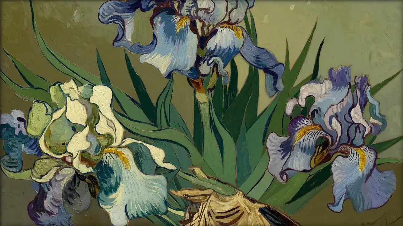
Artists have used analogous color schemes for centuries. Vincent Van Gogh’s “Irises in a Vase” is a perfect example, using greens, blue-greens, blues, and blue purples as his main colors.
The genius touch? He added small bits of yellow-green to certain areas of the leaves, creating a subtle contrast that makes the painting pop.
By studying how these colors work together in nature, branding, and art, you can better understand their power in your designs.
Creating an Analogous Color Scheme
1. Start With Your Main Color
Pick a dominant color that sets the tone for your design. This will be the most prominent color, so choose one that fits your brand, mood, or personal style.
2. Add Supporting Colors
Select the two neighboring colors on the wheel. For example, if blue is your main color, use blue-green and blue-purple as complements. You can extend the scheme to four or five colors for variety but keep harmony in mind.
3. Follow the 60-30-10 Rule
- 60% – Main color (background or dominant element)
- 30% – Secondary color (furniture, secondary elements)
- 10% – Accent color (decorative highlights)
This balance keeps the design visually appealing.
4. Use Neutrals for Contrast
Add white, black, or gray to prevent the scheme from feeling flat. Adjusting tints (white), shades (black), or tones (gray) can create depth and variety while maintaining cohesion.
A mix of vibrant hues and neutral touches makes an analogous color scheme both harmonious and engaging.
Applications Of Analogous Colors in Different Design Fields
| Design Field | Applications |
|---|---|
| Interior Design | Used in living rooms, bedrooms, kitchens, and home offices to create cohesive and calming spaces. |
| Graphic Design | Applied in social media posts, banners, and ads to maintain visual consistency and brand identity. |
| Art & Painting | It helps in mixing paint to create smooth transitions and harmonious compositions. |
| Web Design | Used in website themes and UI elements for a visually appealing and user-friendly experience. |
Tips for Working with Analogous Colors
-
Use one color in a lighter or darker shade for contrast.
-
Highlight a focal point with the most vibrant hue.
-
Add white for lighter tints and black for deeper shades.
-
Mix tints, tones, and shades for depth.
-
Balance warm (reds/oranges) and cool (blues/greens) tones.
-
Use neutrals to soften overly warm or cool schemes.
-
Introduce textures or patterns for visual interest.
-
Ensure strong contrast between text and background.
Test designs for color blindness compatibility.
Avoid These Analogous Color Mistakes

1. Using Too Many Colors in the Scheme
Keep your analogous scheme focused by sticking to a maximum of 3-5 colors. Adding too many colors—even if they’re adjacent to the color wheel—can make your design feel chaotic rather than harmonious.
When your palette gets too wide, the special connection between analogous colors gets lost, and your design loses its cohesive feel.
2. Lacking Sufficient Contrast
Many designers fall into the trap of creating beautiful but flat designs with analogous colors. Since these colors naturally blend well, they can lack the contrast needed to guide the eye or highlight important elements.
Make sure to create contrast through value (light/dark differences), even if your hues are similar.
3. Ignoring the Function of the Space/Design
Always match your color choices to the purpose of your design. A bedroom needs restful, calming colors, while a kitchen might benefit from more energetic ones.
Similarly, a warning sign needs high visibility, while a luxury brand website might need subtlety. Even the most beautiful analogous scheme will fail if it fights against the function of your space or design.
4. Poor Color Proportions
Balance matters! Using your colors in awkward proportions can throw off your entire design. Avoid splitting colors equally (like 33% each for three colors), which often looks unintentional.
Instead, follow principles like the 60-30-10 rule, where your main color dominates, your secondary color supports, and your third color accents. This creates a more natural, pleasing visual hierarchy.
Conclusion
Now, you have all the tools to create stunning designs with analogous colors. Remember that these neighboring hues naturally work together, making them perfect for beginners and pros alike.
As you experiment with analogous color schemes, keep these key points in mind: start with a strong primary color, follow the 60-30-10 rule for balance, and add contrast through tints and tones.
Are you ready to apply this knowledge? Look around your home or current project and identify opportunities for analogous colors.
For your next social media post, consider a blue-green-teal combination or a yellow-orange-red scheme for your living room accent wall.
We’d love to see what you create! Share your analogous color designs in the comments below.